Normal view

Kubernetes Services, Rolling Updates, and Namespaces

22 August 2025 at 23:45

In our previous lesson, you saw Kubernetes automatically replace a crashed Pod. That's powerful, but it reveals a fundamental challenge: if Pods come and go with new IP addresses each time, how do other parts of your application find them reliably?

Today we'll solve this networking puzzle and tackle a related production challenge: how do you deploy updates without breaking your users? We'll work with a realistic data pipeline scenario where a PostgreSQL database needs to stay accessible while an ETL application gets updated.

By the end of this tutorial, you'll be able to:

  • Explain why Services exist and how they provide stable networking for changing Pods
  • Perform zero-downtime deployments using rolling updates
  • Use Namespaces to separate different environments
  • Understand when your applications need these production-grade features

The Moving Target Problem

Let's extend what you built in the previous tutorial to see why we need more than just Pods and Deployments.. You deployed a PostgreSQL database and connected to it directly using kubectl exec. Now imagine you want to add a Python ETL script that connects to that database automatically every hour.

Here's the challenge: your ETL script needs to connect to PostgreSQL, but it doesn't know the database Pod's IP address. Even worse, that IP address changes every time Kubernetes restarts the database Pod.

You could try to hardcode the current Pod IP into your ETL script, but this breaks the moment Kubernetes replaces the Pod. You'd be back to manually updating configuration every time something restarts, which defeats the purpose of container orchestration.

This is where Services come in. A Service acts like a stable phone number for your application. Other Pods can always reach your database using the same address, even when the actual database Pod gets replaced.

How Services Work

Think of a Service as a reliable middleman. When your ETL script wants to talk to PostgreSQL, it doesn't need to hunt down the current Pod's IP address. Instead, it just asks for "postgres" and the Service handles finding and connecting to whichever PostgreSQL Pod is currently running. When you create a Service for your PostgreSQL Deployment:

  1. Kubernetes assigns a stable IP address that never changes
  2. DNS gets configured so other Pods can use a friendly name instead of remembering IP addresses
  3. The Service tracks which Pods are healthy and ready to receive traffic
  4. When Pods change, the Service automatically updates its routing without any manual intervention

Your ETL script can connect to postgres:5432 (a DNS name) instead of an IP address. Kubernetes handles all the complexity of routing that request to whichever PostgreSQL Pod is currently running.

Building a Realistic Pipeline

Let's set up that data pipeline and see Services in action. We'll create both the database and the ETL application, then demonstrate how they communicate reliably even when Pods restart.

Start Your Environment

First, make sure you have a Kubernetes cluster running. A cluster is your pool of computing resources - in Minikube's case, it's a single-node cluster running on your local machine.

If you followed the previous tutorial, you can reuse that environment. If not, you'll need Minikube installed - follow the installation guide if needed.

Start your cluster:

minikube start

Notice in the startup logs how Minikube mentions components like 'kubelet' and 'apiserver' - these are the cluster components working together to create your computing pool.

Set up kubectl access using an alias (this mimics how you'll work with production clusters):

alias kubectl="minikube kubectl --"

Verify your cluster is working:

kubectl get nodes

Deploy PostgreSQL with a Service

Let's start by cleaning up any leftover resources from the previous tutorial and creating our database with proper Service networking:

kubectl delete deployment hello-postgres --ignore-not-found=true

Now create the PostgreSQL deployment:

kubectl create deployment postgres --image=postgres:13
kubectl set env deployment/postgres POSTGRES_DB=pipeline POSTGRES_USER=etl POSTGRES_PASSWORD=mysecretpassword

The key step is creating a Service that other applications can use to reach PostgreSQL:

kubectl expose deployment postgres --port=5432 --target-port=5432 --name=postgres

This creates a ClusterIP Service. ClusterIP is the default type of Service that provides internal networking within your cluster - other Pods can reach it, but nothing outside the cluster can access it directly. The --port=5432 means other applications connect on port 5432, and --target-port=5432 means traffic gets forwarded to port 5432 inside the PostgreSQL Pod.

Verify Service Networking

Let's verify that the Service is working. First, check what Kubernetes created:

kubectl get services

You'll see output like:

NAME         TYPE        CLUSTER-IP      EXTERNAL-IP   PORT(S)    AGE
kubernetes   ClusterIP   10.96.0.1       <none>        443/TCP    1h
postgres     ClusterIP   10.96.123.45    <none>        5432/TCP   30s

The postgres Service has its own stable IP address (10.96.123.45 in this example). This IP never changes, even when the underlying PostgreSQL Pod restarts.

The Service is now ready for other applications to use. Any Pod in your cluster can reach PostgreSQL using the hostname postgres, regardless of which specific Pod is running the database. We'll see this in action when we create the ETL application.

Create the ETL Application

Now let's create an ETL application that connects to our database. We'll use a modified version of the ETL script from our Docker Compose tutorials - it's the same database connection logic, but adapted to run continuously in Kubernetes.
First, clone the tutorial repository and navigate to the ETL application:

git clone https://github.com/dataquestio/tutorials.git
cd tutorials/kubernetes-services-starter

This folder contains two important files:

  • app.py: the ETL script that connects to PostgreSQL
  • Dockerfile: instructions for packaging the script in a container

Build the ETL image in Minikube's Docker environment so Kubernetes can run it directly:

# Point your Docker CLI to Minikube's Docker daemon
eval $(minikube -p minikube docker-env)

# Build the image
docker build -t etl-app:v1 .

Using a version tag (v1) instead of latest makes it easier to demonstrate rolling updates later.

Now, create the Deployment and set environment variables so the ETL app can connect to the postgres Service:

kubectl create deployment etl-app --image=etl-app:v1
kubectl set env deployment/etl-app \
  DB_HOST=postgres \
  DB_PORT=5432 \
  DB_USER=etl \
  DB_PASSWORD=mysecretpassword \
  DB_NAME=pipeline

Scale the deployment to 2 replicas:

kubectl scale deployment etl-app --replicas=2

Check that everything is running:

kubectl get pods

You should see the PostgreSQL Pod and two ETL application Pods all in "Running" status.

Verify the Service Connection

Let's quickly verify that our ETL application can reach the database using the Service name by running the ETL script manually:

kubectl exec deployment/etl-app -- python3 app.py

You should see output showing the ETL script successfully connecting to PostgreSQL using postgres as the hostname. This demonstrates the Service providing stable networking - the ETL Pod found the database without needing to know its specific IP address.

Zero-Downtime Updates with Rolling Updates

Here's where Kubernetes really shines in production environments. Let's say you need to deploy a new version of your ETL application. In traditional deployment approaches, you might need to stop all instances, update them, and restart everything. This creates downtime.

Kubernetes rolling updates solve this by gradually replacing old Pods with new ones, ensuring some instances are always running to handle requests.

Watch a Rolling Update in Action

First, let's set up a way to monitor what's happening. Open a second terminal and run:

# Make sure you have the kubectl alias in this terminal too
alias kubectl="minikube kubectl --"

# Watch the logs from all ETL Pods
kubectl logs -f -l app=etl-app --all-containers --tail=50

Leave this running. Back in your main terminal, rebuild a new version and tell Kubernetes to use it:

# Ensure your Docker CLI is still pointed at Minikube
eval $(minikube -p minikube docker-env)

# Build v2 of the image
docker build -t etl-app:v2 .

# Trigger the rolling update to v2
kubectl set image deployment/etl-app etl-app=etl-app:v2

Watch what happens in both terminals:

  • In the logs terminal: You'll see some Pods stopping and new ones starting with the updated image
  • In the main terminal: Run kubectl get pods -w to watch Pods being created and terminated in real-time

The -w flag keeps the command running and shows changes as they happen. You'll see something like:

NAME                       READY   STATUS    RESTARTS   AGE
etl-app-5d8c7b4f6d-abc123  1/1     Running   0          2m
etl-app-5d8c7b4f6d-def456  1/1     Running   0          2m
etl-app-7f9a8c5e2b-ghi789  1/1     Running   0          10s    # New Pod
etl-app-5d8c7b4f6d-abc123  1/1     Terminating  0       2m     # Old Pod stopping

Press Ctrl+C to stop watching when the update completes.

What Just Happened?

Kubernetes performed a rolling update with these steps:

  1. Created new Pods with the updated image tag (v2)
  2. Waited for new Pods to be ready and healthy
  3. Terminated old Pods one at a time
  4. Repeated until all Pods were updated

At no point were all your application instances offline. If this were a web service behind a Service, users would never notice the deployment happening.

You can check the rollout status and history:

kubectl rollout status deployment/etl-app
kubectl rollout history deployment/etl-app

The history shows your deployments over time, which is useful for tracking what changed and when.

Environment Separation with Namespaces

So far, everything we've created lives in Kubernetes' "default" namespace. In real projects, you typically want to separate different environments (development, staging, production, CI/CD) or different teams' work. Namespaces provide this isolation.

Think of Namespaces as separate workspaces within the same cluster. Resources in different Namespaces can't directly see each other, which prevents accidental conflicts and makes permissions easier to manage.

This solves real problems you encounter as applications grow. Imagine you're developing a new feature for your ETL pipeline - you want to test it without risking your production data or accidentally breaking the version that's currently processing real business data. With Namespaces, you can run a complete copy of your entire pipeline (database, ETL scripts, everything) in a "staging" environment that's completely isolated from production. You can experiment freely, knowing that crashes or bad data in staging won't affect the production system that your users depend on.

Create a Staging Environment

Let's create a completely separate staging environment for our pipeline:

kubectl create namespace staging

Now deploy the same applications into the staging namespace by adding -n staging to your commands:

# Deploy PostgreSQL in staging
kubectl create deployment postgres --image=postgres:13 -n staging
kubectl set env deployment/postgres \
  POSTGRES_DB=pipeline POSTGRES_USER=etl POSTGRES_PASSWORD=stagingpassword -n staging
kubectl expose deployment postgres --port=5432 --target-port=5432 --name=postgres -n staging

# Deploy ETL app in staging (use the image you built earlier)
kubectl create deployment etl-app --image=etl-app:v1 -n staging
kubectl set env deployment/etl-app \
  DB_HOST=postgres DB_PORT=5432 DB_USER=etl DB_PASSWORD=stagingpassword DB_NAME=pipeline -n staging
kubectl scale deployment etl-app --replicas=2 -n staging

See the Separation in Action

Now you have two complete environments. Compare them:

# Production environment (default namespace)
kubectl get pods

# Staging environment
kubectl get pods -n staging

# All resources in staging
kubectl get all -n staging

# See all Pods across all namespaces at once
kubectl get pods --all-namespaces

Notice that each environment has its own set of Pods, Services, and Deployments. They're completely isolated from each other.

Cross-Namespace DNS

Within the staging namespace, applications still connect to postgres:5432 just like in production. But if you needed an application in staging to connect to a Service in production, you'd use the full DNS name: postgres.default.svc.cluster.local.

The pattern is: <service-name>.<namespace>.svc.<cluster-domain>

Here, svc is a fixed keyword that stands for "service", and cluster.local is the default cluster domain. This reveals an important concept: even though you're running Minikube locally, you're working with a real Kubernetes cluster - it just happens to be a single-node cluster running on your machine. In production, you'd have multiple nodes, but the DNS structure works exactly the same way.

This means:

  • postgres reaches the postgres Service in the current namespace
  • postgres.staging.svc reaches the postgres Service in the staging namespace from anywhere
  • postgres.default.svc reaches the postgres Service in the default namespace from anywhere

Understanding Clusters and Scheduling

Before we wrap up, let's briefly discuss some concepts that are important to understand conceptually, even though you won't work with them directly in local development.

Clusters and Node Pools

As a quick refresher, a Kubernetes cluster is a set of physical or virtual machines that work together to run containerized applications. It’s made up of a control plane that manages the cluster and worker nodes to handle the workload. In production Kubernetes environments (like Google GKE or Amazon EKS), these nodes are often grouped into node pools with different characteristics:

  • Standard pool: General-purpose nodes for most applications
  • High-memory pool: Nodes with lots of RAM for data processing jobs
  • GPU pool: Nodes with graphics cards for machine learning workloads
  • Spot/preemptible pool: Cheaper nodes that can be interrupted, good for fault-tolerant batch jobs

Pod Scheduling

Kubernetes automatically decides which node should run each Pod based on:

  • Resource requirements: CPU and memory requests/limits
  • Node capacity: Available resources on each node
  • Affinity rules: Preferences about which nodes to use or avoid
  • Constraints: Requirements like "only run on SSD-equipped nodes"

You rarely need to think about this in local development with Minikube (which only has one node), but it becomes important when running production workloads across multiple machines.

Optional: See Scheduling in Action

If you're curious, you can see a simple example of how scheduling works even in your single-node Minikube cluster:

# "Cordon" your node, marking it as unschedulable for new Pods
kubectl cordon node/minikube

# Try to create a new Pod
kubectl run test-scheduling --image=nginx

# Check if it's stuck in Pending status
kubectl get pods test-scheduling

You should see the Pod stuck in "Pending" status because there are no available nodes to schedule it on.

# "Uncordon" the node to make it schedulable again
kubectl uncordon node/minikube

# The Pod should now get scheduled and start running
kubectl get pods test-scheduling

Clean up the test Pod:

kubectl delete pod test-scheduling

This demonstrates Kubernetes' scheduling system, though you'll mostly encounter this when working with multi-node production clusters.

Cleaning Up

When you're done experimenting:

# Clean up default namespace
kubectl delete deployment postgres etl-app
kubectl delete service postgres

# Clean up staging namespace
kubectl delete namespace staging

# Or stop Minikube entirely
minikube stop

Key Takeaways

You've now experienced three fundamental production capabilities:

Services solve the moving target problem. When Pods restart and get new IP addresses, Services provide stable networking that applications can depend on. Your ETL script connects to postgres:5432 regardless of which specific Pod is running the database.

Rolling updates enable zero-downtime deployments. Instead of stopping everything to deploy updates, Kubernetes gradually replaces old Pods with new ones. This keeps your applications available during deployments.

Namespaces provide environment separation. You can run multiple copies of your entire stack (development, staging, production) in the same cluster while keeping them completely isolated.

These patterns scale from simple applications to complex microservices architectures. A web application with a database uses the same Service networking concepts, just with more components. A data pipeline with multiple processing stages uses the same rolling update strategy for each component.

Next, you'll learn about configuration management with ConfigMaps and Secrets, persistent storage for stateful applications, and resource management to ensure your applications get the CPU and memory they need.

Introduction to Kubernetes

18 August 2025 at 23:29

Up until now you’ve learned about Docker containers and how they solve the "works on my machine" problem. But once your projects involve multiple containers running 24/7, new challenges appear, ones Docker alone doesn't solve.

In this tutorial, you'll discover why Kubernetes exists and get hands-on experience with its core concepts. We'll start by understanding a common problem that developers face, then see how Kubernetes solves it.

By the end of this tutorial, you'll be able to:

  • Explain what problems Kubernetes solves and why it exists
  • Understand the core components: clusters, nodes, pods, and deployments
  • Set up a local Kubernetes environment
  • Deploy a simple application and see self-healing in action
  • Know when you might choose Kubernetes over Docker alone

Why Does Kubernetes Exist?

Let's imagine a realistic scenario that shows why you might need more than just Docker.

You're building a data pipeline with two main components:

  1. A PostgreSQL database that stores your processed data
  2. A Python ETL script that runs every hour to process new data

Using Docker, you've containerized both components and they work perfectly on your laptop. But now you need to deploy this to a production server where it needs to run reliably 24/7.

Here's where things get tricky:

What happens if your ETL container crashes? With Docker alone, it just stays crashed until someone manually restarts it. You could configure VM-level monitoring and auto-restart scripts, but now you're building container management infrastructure yourself.

What if the server fails? You'd need to recreate everything on a new server. Again, you could write scripts to automate this, but you're essentially rebuilding what container orchestration platforms already provide.

The core issue is that you end up writing custom infrastructure code to handle container failures, scaling, and deployments across multiple machines.

This works fine for simple deployments, but becomes complex when you need:

  • Application-level health checks and recovery
  • Coordinated deployments across multiple services
  • Dynamic scaling based on actual workload metrics

How Kubernetes Helps

Before we get into how Kubernetes helps, it’s important to understand that it doesn’t replace Docker. You still use Docker to build container images. What Kubernetes adds is a way to run, manage, and scale those containers automatically in production.

Kubernetes acts like an intelligent supervisor for your containers. Instead of telling Docker exactly what to do ("run this container"), you tell Kubernetes what you want the end result to look like ("always keep my ETL pipeline running"), and it figures out how to make that happen.

If your ETL container crashes, Kubernetes automatically starts a new one. If the entire server fails, Kubernetes can move your containers to a different server. If you need to handle more data, Kubernetes can run multiple copies of your ETL script in parallel.

The key difference is that Kubernetes shifts you from manual container management to automated container management.

The tradeoff? Kubernetes adds complexity, so for single-machine projects Docker Compose is often simpler. But for systems that need to run reliably over time and scale, the complexity is worth it.

How Kubernetes Thinks

To use Kubernetes effectively, you need to understand how it approaches container management differently than Docker.

When you use Docker directly, you think in imperative terms, meaning that you give specific commands about exactly what should happen:

docker run -d --name my-database postgres:13
docker run -d --name my-etl-script python:3.9 my-script.py

You're telling Docker exactly which containers to start, where to start them, and what to call them.

Kubernetes, on the other hand, uses a declarative approach. This means you describe what you want the final state to look like, and Kubernetes figures out how to achieve and maintain that state. For example: "I want a PostgreSQL database to always be running" or "I want my ETL script to run reliably.”

This shift from "do this specific thing" to "maintain this desired state" is fundamental to how Kubernetes operates.

Here's how Kubernetes maintains your desired state:

  1. You declare what you want using configuration files or commands
  2. Kubernetes stores your desired state in its database
  3. Controllers continuously monitor the actual state vs. desired state
  4. When they differ, Kubernetes takes action to fix the discrepancy
  5. This process repeats every few seconds, forever

This means that if something breaks your containers, Kubernetes will automatically detect the problem and fix it without you having to intervene.

Core Building Blocks

Kubernetes organizes everything using several key concepts. We’ll discuss the foundational building blocks here, and address more nuanced and complex concepts in a later tutorial.

Cluster

A cluster is a group of machines that work together as a single system. Think of it as your pool of computing resources that Kubernetes can use to run your applications. The important thing to understand is that you don't usually care which specific machine runs your application. Kubernetes handles the placement automatically based on available resources.

Nodes

Nodes are the individual machines (physical or virtual) in your cluster where your containers actually run. You'll mostly interact with the cluster as a whole rather than individual nodes, but it's helpful to understand that your containers are ultimately running on these machines.

Note: We'll cover the details of how nodes work in a later tutorial. For now, just think of them as the computing resources that make up your cluster.

Pods: Kubernetes' Atomic Unit

Here's where Kubernetes differs significantly from Docker. While Docker thinks in terms of individual containers, Kubernetes' smallest deployable unit is called a Pod.

A Pod typically contains:

  • At least one container
  • Shared networking so containers in the Pod can communicate using localhost
  • Shared storage volumes that all containers in the Pod can access

Most of the time, you'll have one container per Pod, but the Pod abstraction gives Kubernetes a consistent way to manage containers along with their networking and storage needs.

Pods are ephemeral, meaning they come and go. When a Pod fails or gets updated, Kubernetes replaces it with a new one. This is why you rarely work with individual Pods directly in production (we'll cover how applications communicate with each other in a future tutorial).

Deployments: Managing Pod Lifecycles

Since Pods are ephemeral, you need a way to ensure your application keeps running even when individual Pods fail. This is where Deployments come in.

A Deployment is like a blueprint that tells Kubernetes:

  • What container image to use for your application
  • How many copies (replicas) you want running
  • How to handle updates when you deploy new versions

When you create a Deployment, Kubernetes automatically creates the specified number of Pods. If a Pod crashes or gets deleted, the Deployment immediately creates a replacement. If you want to update your application, the Deployment can perform a rolling update, replacing old Pods one at a time with new versions. This is the key to Kubernetes' self-healing behavior: Deployments continuously monitor the actual number of running Pods and work to match your desired number.

Setting Up Your First Cluster

To understand how these concepts work in practice, you'll need a Kubernetes cluster to experiment with. Let's set up a local environment and deploy a simple application.

Prerequisites

Before we start, make sure you have Docker Desktop installed and running. Minikube uses Docker as its default driver to create the virtual environment for your Kubernetes cluster.

If you don't have Docker Desktop yet, download it from docker.com and make sure it's running before proceeding.

Install Minikube

Minikube creates a local Kubernetes cluster perfect for learning and development. Install it by following the official installation guide for your operating system.

You can verify the installation worked by checking the version:

minikube version

Start Your Cluster

Now you're ready to start your local Kubernetes cluster:

minikube start

This command downloads a virtual machine image (if it's your first time), starts the VM using Docker, and configures a Kubernetes cluster inside it. The process usually takes a few minutes.

You'll see output like:

😄  minikube v1.33.1 on Darwin 14.1.2
✨  Using the docker driver based on existing profile
👍  Starting control plane node minikube in cluster minikube
🚜  Pulling base image ...
🔄  Restarting existing docker container for "minikube" ...
🐳  Preparing Kubernetes v1.28.3 on Docker 24.0.7 ...
🔎  Verifying Kubernetes components...
🌟  Enabled addons: storage-provisioner, default-storageclass
🏄  Done! kubectl is now configured to use "minikube" cluster and "default" namespace by default

Set Up kubectl Access

Now that your cluster is running, you can use kubectl to interact with it. We'll use the version that comes with Minikube rather than installing it separately to ensure compatibility:

minikube kubectl -- version

You should see version information for both the client and server.

While you could type minikube kubectl -- before every command, the standard practice is to create an alias. This mimics how you'll work with kubectl in cloud environments where you just type kubectl:

alias kubectl="minikube kubectl --"

Why use an alias? In production environments (AWS EKS, Google GKE, etc.), you'll install kubectl separately and use it directly. By practicing with the kubectl command now, you're building the right muscle memory. The alias lets you use standard kubectl syntax while ensuring you're talking to your local Minikube cluster.

Add this alias to your shell profile (.bashrc, .zshrc, etc.) if you want it to persist across terminal sessions.

Verify Your Cluster

Let's make sure everything is working:

kubectl cluster-info

You should see something like:

Kubernetes control plane is running at <https://192.168.49.2:8443>
CoreDNS is running at <https://192.168.49.2:8443/api/v1/namespaces/kube-system/services/kube-dns:dns/proxy>

Now check what's running in your cluster:

kubectl get nodes

You should see one node (your Minikube VM):

NAME       STATUS   ROLES           AGE   VERSION
minikube   Ready    control-plane   2m    v1.33.1

Perfect! You now have a working Kubernetes cluster.

Deploy Your First Application

Let's deploy a PostgreSQL database to see Kubernetes in action. We'll create a Deployment that runs a postgres container. We'll use PostgreSQL because it's a common component in data projects, but the steps are the same for any container.

Create the deployment:

kubectl create deployment hello-postgres --image=postgres:13
kubectl set env deployment/hello-postgres POSTGRES_PASSWORD=mysecretpassword

Check what Kubernetes created for you:

kubectl get deployments

You should see:

NAME             READY   UP-TO-DATE   AVAILABLE   AGE
hello-postgres   1/1     1            1           30s

Note: If you see 0/1 in the READY column, that's normal! PostgreSQL needs the environment variable to start properly. The deployment will automatically restart the Pod once we set the password, and you should see it change to 1/1 within a minute.

Now look at the Pods:

kubectl get pods

You'll see something like:

NAME                              READY   STATUS    RESTARTS   AGE
hello-postgres-7d8757c6d4-xyz123  1/1     Running   0          45s

Notice how Kubernetes automatically created a Pod with a generated name. The Deployment is managing this Pod for you.

Connect to Your Application

Your PostgreSQL database is running inside the cluster. There are two common ways to interact with it:

Option 1: Using kubectl exec (direct container access)

kubectl exec -it deployment/hello-postgres -- psql -U postgres

This connects you directly to a PostgreSQL session inside the container. The -it flags give you an interactive terminal. You can run SQL commands directly:

postgres=# SELECT version();
postgres=# \q

Option 2: Using port forwarding (local connection)

kubectl port-forward deployment/hello-postgres 5432:5432

Leave this running and open a new terminal. Now you can connect using any PostgreSQL client on your local machine as if the database were running locally on port 5432. Press Ctrl+C to stop the port forwarding when you're done.

Both approaches work well. kubectl exec is faster for quick database tasks, while port forwarding lets you use familiar local tools. Choose whichever feels more natural to you.

Let's break down what you just accomplished:

  1. You created a Deployment - This told Kubernetes "I want PostgreSQL running"
  2. Kubernetes created a Pod - The actual container running postgres
  3. The Pod got scheduled to your Minikube node (the single machine in your cluster)
  4. You connected to the database - Either directly with kubectl exec or through port forwarding

You didn't have to worry about which node to use, how to start the container, or how to configure networking. Kubernetes handled all of that based on your simple deployment command.

Next, we'll see the real magic: what happens when things go wrong.

The Magic Moment: Self-Healing

You've deployed your first application, but you haven't seen Kubernetes' most powerful feature yet. Let's break something on purpose and watch Kubernetes automatically fix it.

Break Something on Purpose

First, let's see what's currently running:

kubectl get pods

You should see your PostgreSQL Pod running:

NAME                              READY   STATUS    RESTARTS   AGE
hello-postgres-7d8757c6d4-xyz123  1/1     Running   0          5m

Now, let's "accidentally" delete this Pod. In a traditional Docker setup, this would mean your database is gone until someone manually restarts it:

kubectl delete pod hello-postgres-7d8757c6d4-xyz123

Replace hello-postgres-7d8757c6d4-xyz123 with your actual Pod name from the previous command.

You'll see:

pod "hello-postgres-7d8757c6d4-xyz123" deleted

Watch the Magic Happen

Immediately check your Pods again:

kubectl get pods

You'll likely see something like this:

NAME                              READY   STATUS    RESTARTS   AGE
hello-postgres-7d8757c6d4-abc789  1/1     Running   0          10s

Notice what happened:

  • The Pod name changed - Kubernetes created a completely new Pod
  • It's already running - The replacement happened automatically
  • It happened immediately - No human intervention required

If you're quick enough, you might catch the Pod in ContainerCreating status as Kubernetes spins up the replacement.

What Just Happened?

This is Kubernetes' self-healing behavior in action. Here's the step-by-step process:

  1. You deleted the Pod - The container stopped running
  2. The Deployment noticed - It continuously monitors the actual vs desired state
  3. State mismatch detected - Desired: 1 Pod running, Actual: 0 Pods running
  4. Deployment took action - It immediately created a new Pod to match the desired state
  5. Balance restored - Back to 1 Pod running, as specified in the Deployment

This entire process took seconds and required no human intervention.

Test It Again

Let's verify the database is working in the new Pod:

kubectl exec deployment/hello-postgres -- psql -U postgres -c "SELECT version();"

Perfect! The database is running normally. The new Pod automatically started with the same configuration (PostgreSQL 13, same password) because the Deployment specification didn't change.

What This Means

This demonstrates Kubernetes' core value: turning manual, error-prone operations into automated, reliable systems. In production, if a server fails at 3 AM, Kubernetes automatically restarts your application on a healthy server within seconds, much faster than alternatives that require VM startup time and manual recovery steps.

You experienced the fundamental shift from imperative to declarative management. You didn't tell Kubernetes HOW to fix the problem - you only specified WHAT you wanted ("keep 1 PostgreSQL Pod running"), and Kubernetes figured out the rest.

Next, we'll wrap up with essential tools and guidance for your continued Kubernetes journey.

Cleaning Up

When you're finished experimenting, you can clean up the resources you created:

# Delete the PostgreSQL deployment
kubectl delete deployment hello-postgres

# Stop your Minikube cluster (optional - saves system resources)
minikube stop

# If you want to completely remove the cluster (optional)
minikube delete

The minikube stop command preserves your cluster for future use while freeing up system resources. Use minikube delete only if you want to start completely fresh next time.

Wrap Up and Next Steps

You've successfully set up a Kubernetes cluster, deployed an application, and witnessed self-healing in action. You now understand why Kubernetes exists and how it transforms container management from manual tasks into automated systems.

Now you're ready to explore:

  • Services - How applications communicate within clusters
  • ConfigMaps and Secrets - Managing configuration and sensitive data
  • Persistent Volumes - Handling data that survives Pod restarts
  • Advanced cluster management - Multi-node clusters, node pools, and workload scheduling strategies
  • Security and access control - Understanding RBAC and IAM concepts

The official Kubernetes documentation is a great resource for diving deeper.

Remember the complexity trade-off: Kubernetes is powerful but adds operational overhead. Choose it when you need high availability, automatic scaling, or multi-server deployments. For simple applications running on a single machine, Docker Compose is often the better choice. Many teams start with Docker Compose and migrate to Kubernetes as their reliability and scaling requirements grow.

Now you have the foundation to make informed decisions about when and how to use Kubernetes in your data projects.

How to Use Jupyter Notebook: A Beginner’s Tutorial

23 October 2025 at 19:31

Jupyter Notebook is an incredibly powerful tool for interactively developing and presenting data science projects. It combines code, visualizations, narrative text, and other rich media into a single document, creating a cohesive and expressive workflow.

This guide will give you a step-by-step walkthrough on installing Jupyter Notebook locally and creating your first data project. If you're new to Jupyter Notebook, we recommed you follow our split screen interactive Learn and Install Jupyter Notebook project to learn the basics quickly.

What is Jupyter Notebook?


Jupyter

At its core, a notebook is a document that blends code and its output seamlessly. It allows you to run code, display the results, and add explanations, formulas, and charts all in one place. This makes your work more transparent, understandable, and reproducible.

Jupyter Notebooks have become an essential part of the data science workflow in companies and organizations worldwide. They enable data scientists to explore data, test hypotheses, and share insights efficiently.

As an open-source project, Jupyter Notebooks are completely free. You can download the software directly from the Project Jupyter website or as part of the Anaconda data science toolkit.

While Jupyter Notebooks support multiple programming languages, this article will focus on using Python, as it is the most common language used in data science. However, it's worth noting that other languages like R, Julia, and Scala are also supported.

If your goal is to work with data, using Jupyter Notebooks will streamline your workflow and make it easier to communicate and share your results.

How to Follow This Tutorial

To get the most out of this tutorial, familiarity with programming, particularly Python and pandas, is recommended. However, even if you have experience with another language, the Python code in this article should be accessible.

Jupyter Notebooks can also serve as a flexible platform for learning pandas and Python. In addition to the core functionality, we'll explore some exciting features:

  • Cover the basics of installing Jupyter and creating your first notebook
  • Delve deeper into important terminology and concepts
  • Explore how notebooks can be shared and published online
  • Demonstrate the use of Jupyter Widgets, Jupyter AI, and discuss security considerations

By the end of this tutorial, you'll have a solid understanding of how to set up and utilize Jupyter Notebooks effectively, along with exposure to powerful features like Jupyter AI, while keeping security in mind.

Note: This article was written as a Jupyter Notebook and published in read-only form, showcasing the versatility of notebooks. Most of our programming tutorials and Python courses were created using Jupyter Notebooks.

Example: Data Analysis in a Jupyter Notebook

First, we will walk through setup and a sample analysis to answer a real-life question. This will demonstrate how the flow of a notebook makes data science tasks more intuitive for us as we work, and for others once it’s time to share our work.

So, let’s say you’re a data analyst and you’ve been tasked with finding out how the profits of the largest companies in the US changed historically. You find a data set of Fortune 500 companies spanning over 50 years since the list’s first publication in 1955, put together from Fortune’s public archive. We’ve gone ahead and created a CSV of the data you can use here.

As we shall demonstrate, Jupyter Notebooks are perfectly suited for this investigation. First, let’s go ahead and install Jupyter.

Installation


Installation

The easiest way for a beginner to get started with Jupyter Notebooks is by installing Anaconda.

Anaconda is the most widely used Python distribution for data science and comes pre-loaded with all the most popular libraries and tools.

Some of the biggest Python libraries included in Anaconda are Numpy, pandas, and Matplotlib, though the full 1000+ list is exhaustive.

Anaconda thus lets us hit the ground running with a fully stocked data science workshop without the hassle of managing countless installations or worrying about dependencies and OS-specific installation issues (read: Installing on Windows).

To get Anaconda, simply:

  • Download the latest version of Anaconda for Python.
  • Install Anaconda by following the instructions on the download page and/or in the executable.

If you are a more advanced user with Python already installed on your system, and you would prefer to manage your packages manually, you can just use pip3 to install it directly from your terminal:

pip3 install jupyter

Creating Your First Notebook


Installation

In this section, we’re going to learn to run and save notebooks, familiarize ourselves with their structure, and understand the interface. We’ll define some core terminology that will steer you towards a practical understanding of how to use Jupyter Notebooks by yourself and set us up for the next section, which walks through an example data analysis and brings everything we learn here to life.

Running Jupyter

On Windows, you can run Jupyter via the shortcut Anaconda adds to your start menu, which will open a new tab in your default web browser that should look something like the following screenshot:


Jupyter control panel

This isn’t a notebook just yet, but don’t panic! There’s not much to it. This is the Notebook Dashboard, specifically designed for managing your Jupyter Notebooks. Think of it as the launchpad for exploring, editing and creating your notebooks.

Be aware that the dashboard will give you access only to the files and sub-folders contained within Jupyter’s start-up directory (i.e., where Jupyter or Anaconda is installed). However, the start-up directory can be changed.

It is also possible to start the dashboard on any system via the command prompt (or terminal on Unix systems) by entering the command jupyter notebook; in this case, the current working directory will be the start-up directory.

With Jupyter Notebook open in your browser, you may have noticed that the URL for the dashboard is something like https://localhost:8888/tree. Localhost is not a website, but indicates that the content is being served from your local machine: your own computer.

Jupyter’s Notebooks and dashboard are web apps, and Jupyter starts up a local Python server to serve these apps to your web browser, making it essentially platform-independent and opening the door to easier sharing on the web.

(If you don't understand this yet, don't worry — the important point is just that although Jupyter Notebooks opens in your browser, it's being hosted and run on your local machine. Your notebooks aren't actually on the web until you decide to share them.)

The dashboard’s interface is mostly self-explanatory — though we will come back to it briefly later. So what are we waiting for? Browse to the folder in which you would like to create your first notebook, click the New drop-down button in the top-right and select Python 3(ipykernel):


Jupyter control panel

Hey presto, here we are! Your first Jupyter Notebook will open in new tab — each notebook uses its own tab because you can open multiple notebooks simultaneously.

If you switch back to the dashboard, you will see the new file Untitled.ipynb and you should see some green text that tells you your notebook is running.

What is an .ipynb File?

The short answer: each .ipynb file is one notebook, so each time you create a new notebook, a new .ipynb file will be created.

The longer answer: Each .ipynb file is an Interactive PYthon NoteBook text file that describes the contents of your notebook in a format called JSON. Each cell and its contents, including image attachments that have been converted into strings of text, is listed therein along with some metadata.

You can edit this yourself (if you know what you are doing!) by selecting Edit > Edit Notebook Metadata from the menu bar in the notebook. You can also view the contents of your notebook files by selecting Edit from the controls on the dashboard.

However, the key word there is can. In most cases, there's no reason you should ever need to edit your notebook metadata manually.

The Notebook Interface

Now that you have an open notebook in front of you, its interface will hopefully not look entirely alien. After all, Jupyter is essentially just an advanced word processor.

Why not take a look around? Check out the menus to get a feel for it, especially take a few moments to scroll down the list of commands in the command palette, which is the small button with the keyboard icon (or Ctrl + Shift + P).


JNew Jupyter Notebook

There are two key terms that you should notice in the menu bar, which are probably new to you: Cell and Kernel. These are key terms for understanding how Jupyter works, and what makes it more than just a word processor. Here's a basic definition of each:

  • The kernel in a Jupyter Notebook is like the brain of the notebook. It’s the "computational engine" that runs your code. When you write code in a notebook and ask it to run, the kernel is what takes that code, processes it, and gives you the results. Each notebook is connected to a specific kernel that knows how to run code in a particular programming language, like Python.

  • A cell in a Jupyter Notebook is like a block or a section where you write your code or text (notes). You can write a piece of code or some explanatory text in a cell, and when you run it, the code will be executed, or the text will be rendered (displayed). Cells help you organize your work in a notebook, making it easier to test small chunks of code and explain what’s happening as you go along.

Cells

We’ll return to kernels a little later, but first let’s come to grips with cells. Cells form the body of a notebook. In the screenshot of a new notebook in the section above, that box with the green outline is an empty cell. There are two main cell types that we will cover:

  • A code cell contains code to be executed in the kernel. When the code is run, the notebook displays the output below the code cell that generated it.
  • A Markdown cell contains text formatted using Markdown and displays its output in-place when the Markdown cell is run.

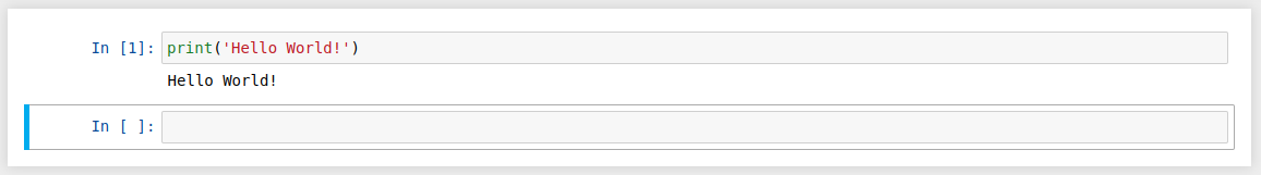
The first cell in a new notebook defaults to a code cell. Let’s test it out with a classic "Hello World!" example.

Type print('Hello World!') into that first cell and click the Run button in the toolbar above or press Ctrl + Enter on your keyboard.

The result should look like this:


Jupyter Notebook showing the results of <code>print('Hello World!')</code>

When we run the cell, its output is displayed directly below the code cell, and the label to its left will have changed from In [ ] to In [1].

Like the contents of a cell, the output of a code cell also becomes part of the document. You can always tell the difference between a code cell and a Markdown cell because code cells have that special In [ ] label on their left and Markdown cells do not.

The In part of the label is simply short for Input, while the label number inside [ ] indicates when the cell was executed on the kernel — in this case the cell was executed first.

Run the cell again and the label will change to In [2] because now the cell was the second to be run on the kernel. Why this is so useful will become clearer later on when we take a closer look at kernels.

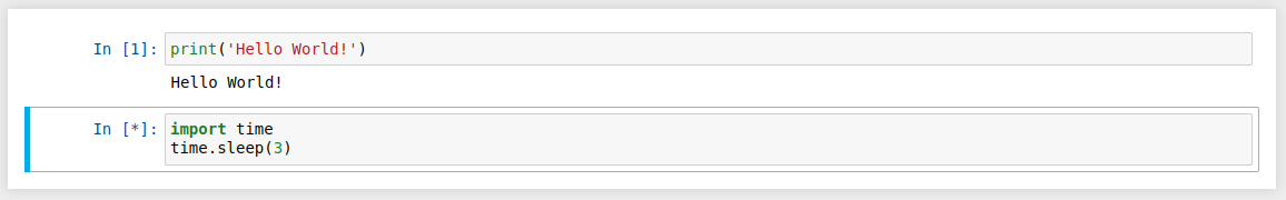
From the menu bar, click Insert and select Insert Cell Below to create a new code cell underneath your first one and try executing the code below to see what happens. Do you notice anything different compared to executing that first code cell?

import time
time.sleep(3)

This code doesn’t produce any output, but it does take three seconds to execute. Notice how Jupyter signifies when the cell is currently running by changing its label to In [*].


Jupyter Notebook showing the results of <code>time.sleep(3)</code>

In general, the output of a cell comes from any text data specifically printed during the cell's execution, as well as the value of the last line in the cell, be it a lone variable, a function call, or something else. For example, if we define a function that outputs text and then call it, like so:

def say_hello(recipient):
    return 'Hello, {}!'.format(recipient)
say_hello('Tim')

We will get the following output below the cell:

'Hello, Tim!'

You’ll find yourself using this feature a lot in your own projects, and we’ll see more of its usefulness later on.


Cell execution in Jupyter Notebook

Keyboard Shortcuts

One final thing you may have noticed when running your cells is that their border turns blue after it's been executed, whereas it was green while you were editing it. In a Jupyter Notebook, there is always one active cell highlighted with a border whose color denotes its current mode:

  • Green outline — cell is in "edit mode"
  • Blue outline — cell is in "command mode"

So what can we do to a cell when it's in command mode? So far, we have seen how to run a cell with Ctrl + Enter, but there are plenty of other commands we can use. The best way to use them is with keyboard shortcuts.

Keyboard shortcuts are a very popular aspect of the Jupyter environment because they facilitate a speedy cell-based workflow. Many of these are actions you can carry out on the active cell when it’s in command mode.

Below, you’ll find a list of some of Jupyter’s keyboard shortcuts. You don't need to memorize them all immediately, but this list should give you a good idea of what’s possible.

  • Toggle between command mode (blue) and edit mode (green) with Esc and Enter, respectively.
  • While in command mode, press:
    • Up and Down keys to scroll up and down your cells.
    • A or B to insert a new cell above or below the active cell.
    • M to transform the active cell to a Markdown cell.
    • Y to set the active cell to a code cell.
    • D + D (D twice) to delete the active cell.
    • Z to undo cell deletion.
    • Hold Shift and press Up or Down to select multiple cells at once. You can also click and Shift + Click in the margin to the left of your cells to select a continuous range.
      • With multiple cells selected, press Shift + M to merge your selection.
  • While in edit mode, press:
    • Ctrl + Enter to run the current cell.
    • Shift + Enter to run the current cell and move to the next cell (or create a new one if there isn’t a next cell)
    • Alt + Enter to run the current cell and insert a new cell below.
    • Ctrl + Shift + – to split the active cell at the cursor.
    • Ctrl + Click to create multiple simultaneous cursors within a cell.

Go ahead and try these out in your own notebook. Once you’re ready, create a new Markdown cell and we’ll learn how to format the text in our notebooks.

Markdown

Markdown is a lightweight, easy to learn markup language for formatting plain text. Its syntax has a one-to-one correspondence with HTML tags, so some prior knowledge here would be helpful but is definitely not a prerequisite.

Remember that this article was written in a Jupyter notebook, so all of the narrative text and images you have seen so far were achieved writing in Markdown. Let’s cover the basics with a quick example:

# This is a level 1 heading

## This is a level 2 heading

This is some plain text that forms a paragraph. Add emphasis via **bold** or __bold__, and *italic* or _italic_.

Paragraphs must be separated by an empty line.

* Sometimes we want to include lists.
* Which can be bulleted using asterisks.

1. Lists can also be numbered.
2. If we want an ordered list.

[It is possible to include hyperlinks](https://www.dataquest.io)

Inline code uses single backticks: `foo()`, and code blocks use triple backticks:
```
bar()
```
Or can be indented by 4 spaces:
```
    foo()
```

And finally, adding images is easy: ![Alt text](https://www.dataquest.io/wp-content/uploads/2023/02/DQ-Logo.svg)

Here's how that Markdown would look once you run the cell to render it:


Markdown syntax example

When attaching images, you have three options:

  • Use a URL to an image on the web.
  • Use a local URL to an image that you will be keeping alongside your notebook, such as in the same git repo.
  • Add an attachment via Edit > Insert Image; this will convert the image into a string and store it inside your notebook .ipynb file. Note that this will make your .ipynb file much larger!

There is plenty more to Markdown, especially around hyperlinking, and it’s also possible to simply include plain HTML. Once you find yourself pushing the limits of the basics above, you can refer to the official guide from Markdown's creator, John Gruber, on his website.

Kernels

Behind every notebook runs a kernel. When you run a code cell, that code is executed within the kernel. Any output is returned back to the cell to be displayed. The kernel’s state persists over time and between cells — it pertains to the document as a whole and not just to individual cells.

For example, if you import libraries or declare variables in one cell, they will be available in another. Let’s try this out to get a feel for it. First, we’ll import a Python package and define a function in a new code cell:

import numpy as np

def square(x):
    return x * x

Once we’ve executed the cell above, we can reference np and square in any other cell.

x = np.random.randint(1, 10)
y = square(x)
print('%d squared is %d' % (x, y))
7 squared is 49

This will work regardless of the order of the cells in your notebook. As long as a cell has been run, any variables you declared or libraries you imported will be available in other cells.


Screenshot demonstrating you can access variables from different cells

You can try it yourself. Let’s print out our variables again in a new cell:

print('%d squared is %d' % (x, y))
7 squared is 49

No surprises here! But what happens if we specifically change the value of y?

y = 10
print('%d squared is %d' % (x, y))

If we run the cell above, what do you think would happen?

Will we get an output like: 7 squared is 49 or 7 squared is 10? Let's think about this step-by-step. Since we didn't run x = np.random.randint(1, 10) again, x is still equal to 7 in the kernel. And once we've run the y = 10 code cell, y is no longer equal to the square of x in the kernel; it will be equal to 10 and so our output will look like this:

7 squared is 10


Screenshot showing how modifying the value of a variable has an effect on subsequent code execution

Most of the time when you create a notebook, the flow will be top-to-bottom. But it’s common to go back to make changes. When we do need to make changes to an earlier cell, the order of execution we can see on the left of each cell, such as In [6], can help us diagnose problems by seeing what order the cells have run in.

And if we ever wish to reset things, there are several incredibly useful options from the Kernel menu:

  • Restart: restarts the kernel, thus clearing all the variables etc that were defined.
  • Restart & Clear Output: same as above but will also wipe the output displayed below your code cells.
  • Restart & Run All: same as above but will also run all your cells in order from first to last.

If your kernel is ever stuck on a computation and you wish to stop it, you can choose the Interrupt option.

Choosing a Kernel

You may have noticed that Jupyter gives you the option to change kernel, and in fact there are many different options to choose from. Back when you created a new notebook from the dashboard by selecting a Python version, you were actually choosing which kernel to use.

There are kernels for different versions of Python, and also for over 100 languages including Java, C, and even Fortran. Data scientists may be particularly interested in the kernels for R and Julia, as well as both imatlab and the Calysto MATLAB Kernel for Matlab.

The SoS kernel provides multi-language support within a single notebook.

Each kernel has its own installation instructions, but will likely require you to run some commands on your computer.

Example Analysis

Now that we’ve looked at what a Jupyter Notebook is, it’s time to look at how they’re used in practice, which should give us clearer understanding of why they are so popular.

It’s finally time to get started with that Fortune 500 dataset mentioned earlier. Remember, our goal is to find out how the profits of the largest companies in the US changed historically.

It’s worth noting that everyone will develop their own preferences and style, but the general principles still apply. You can follow along with this section in your own notebook if you wish, or use this as a guide to creating your own approach.

Naming Your Notebooks

Before you start writing your project, you’ll probably want to give it a meaningful name. Click the file name Untitled in the top part of your screen screen to enter a new file name, and then hit the Save icon—a floppy disk, which looks like a rectangle with the upper-right corner removed.

Note that closing the notebook tab in your browser will not "close" your notebook in the way closing a document in a traditional application will. The notebook’s kernel will continue to run in the background and needs to be shut down before it is truly "closed"—though this is pretty handy if you accidentally close your tab or browser!

If the kernel is shut down, you can close the tab without worrying about whether it is still running or not.

The easiest way to do this is to select File > Close and Halt from the notebook menu. However, you can also shutdown the kernel either by going to Kernel > Shutdown from within the notebook app or by selecting the notebook in the dashboard and clicking Shutdown (see image below).


A running notebook

Setup

It’s common to start off with a code cell specifically for imports and setup, so that if you choose to add or change anything, you can simply edit and re-run the cell without causing any side-effects.

We'll import pandas to work with our data, Matplotlib to plot our charts, and Seaborn to make our charts prettier. It’s also common to import NumPy but in this case, pandas imports it for us.

%matplotlib inline

import pandas as pd
import matplotlib.pyplot as plt
import seaborn as sns 

sns.set(style="darkgrid")

That first line of code (%matplotlib inline) isn’t actually a Python command, but uses something called a line magic to instruct Jupyter to capture Matplotlib plots and render them in the cell output. We'll talk a bit more about line magics later, and they're also covered in our advanced Jupyter Notebooks tutorial.

For now, let’s go ahead and load our fortune 500 data.

df = pd.read_csv('fortune500.csv')

It’s sensible to also do this in a single cell, in case we need to reload it at any point.

Save and Checkpoint

Now that we’re started, it’s best practice to save regularly. Pressing Ctrl + S will save our notebook by calling the Save and Checkpoint command, but what is this "checkpoint" thing all about?

Every time we create a new notebook, a checkpoint file is created along with the notebook file. It is located within a hidden subdirectory of your save location called .ipynb_checkpoints and is also a .ipynb file.

By default, Jupyter will autosave your notebook every 120 seconds to this checkpoint file without altering your primary notebook file. When you Save and Checkpoint, both the notebook and checkpoint files are updated. Hence, the checkpoint enables you to recover your unsaved work in the event of an unexpected issue.

You can revert to the checkpoint from the menu via File > Revert to Checkpoint.

Investigating our Dataset

Now we’re really rolling! Our notebook is safely saved and we’ve loaded our data set df into the most-used pandas data structure, which is called a DataFrame and basically looks like a table. What does ours look like?

df.head()
Year Rank Company Revenue (in millions) Profit (in millions)
0 1955 1 General Motors 9823.5 806
1 1955 2 Exxon Mobil 5661.4 584.8
2 1955 3 U.S. Steel 3250.4 195.4
3 1955 4 General Electric 2959.1 212.6
4 1955 5 Esmark 2510.8 19.1
df.tail()
Year Rank Company Revenue (in millions) Profit (in millions)
25495 2005 496 Wm. Wrigley Jr. 3648.6 493
25496 2005 497 Peabody Energy 3631.6 175.4
25497 2005 498 Wendy’s International 3630.4 57.8
25498 2005 499 Kindred Healthcare 3616.6 70.6
25499 2005 500 Cincinnati Financial 3614.0 584

Looking good. We have the columns we need, and each row corresponds to a single company in a single year.

Let’s just rename those columns so we can more easily refer to them later.

df.columns = ['year', 'rank', 'company', 'revenue', 'profit']

Next, we need to explore our dataset. Is it complete? Did pandas read it as expected? Are any values missing?

len(df)
25500

Okay, that looks good—that’s 500 rows for every year from 1955 to 2005, inclusive.

Let’s check whether our data set has been imported as we would expect. A simple check is to see if the data types (or dtypes) have been correctly interpreted.

df.dtypes

year         int64 
rank         int64 
company     object 
revenue    float64 
profit      object 
dtype: object

Uh oh! It looks like there’s something wrong with the profits column—we would expect it to be a float64 like the revenue column. This indicates that it probably contains some non-integer values, so let’s take a look.

non_numberic_profits = df.profit.str.contains('[^0-9.-]')
df.loc[non_numberic_profits].head()
year rank company revenue profit
228 1955 229 Norton 135.0 N.A.
290 1955 291 Schlitz Brewing 100.0 N.A.
294 1955 295 Pacific Vegetable Oil 97.9 N.A.
296 1955 297 Liebmann Breweries 96.0 N.A.
352 1955 353 Minneapolis-Moline 77.4 N.A.

Just as we suspected! Some of the values are strings, which have been used to indicate missing data. Are there any other values that have crept in?

set(df.profit[non_numberic_profits])
{'N.A.'}

That makes it easy to know that we're only dealing with one type of missing value, but what should we do about it? Well, that depends how many values are missing.

len(df.profit[non_numberic_profits])
369

It’s a small fraction of our data set, though not completely inconsequential as it's still around 1.5%.

If rows containing N.A. are roughly uniformly distributed over the years, the easiest solution would just be to remove them. So let’s have a quick look at the distribution.

bin_sizes, _, _ = plt.hist(df.year[non_numberic_profits], bins=range(1955, 2006))

Missing value distribution

At a glance, we can see that the most invalid values in a single year is fewer than 25, and as there are 500 data points per year, removing these values would account for less than 4% of the data for the worst years. Indeed, other than a surge around the 90s, most years have fewer than half the missing values of the peak.

For our purposes, let’s say this is acceptable and go ahead and remove these rows.

df = df.loc[~non_numberic_profits]
df.profit = df.profit.apply(pd.to_numeric)

We should check that worked.

len(df)
25131
df.dtypes
year         int64 
rank         int64 
company     object 
revenue    float64 
profit     float64 
dtype: object

Great! We have finished our data set setup.

If we were going to present your notebook as a report, we could get rid of the investigatory cells we created, which are included here as a demonstration of the flow of working with notebooks, and merge relevant cells (see the Advanced Functionality section below for more on this) to create a single data set setup cell.

This would mean that if we ever mess up our data set elsewhere, we can just rerun the setup cell to restore it.

Plotting with matplotlib

Next, we can get to addressing the question at hand by plotting the average profit by year. We might as well plot the revenue as well, so first we can define some variables and a method to reduce our code.

group_by_year = df.loc[:, ['year', 'revenue', 'profit']].groupby('year')
avgs = group_by_year.mean()
x = avgs.index
y1 = avgs.profit
def plot(x, y, ax, title, y_label):
    ax.set_title(title)
    ax.set_ylabel(y_label)
    ax.plot(x, y)
    ax.margins(x=0, y=0)

Now let's plot!

fig, ax = plt.subplots()
plot(x, y1, ax, 'Increase in mean Fortune 500 company profits from 1955 to 2005', 'Profit (millions)')

Increase in mean Fortune 500 company profits from 1955 to 2005

Wow, that looks like an exponential, but it’s got some huge dips. They must correspond to the early 1990s recession and the dot-com bubble. It’s pretty interesting to see that in the data. But how come profits recovered to even higher levels post each recession?

Maybe the revenues can tell us more.

y2 = avgs.revenue
fig, ax = plt.subplots()
plot(x, y2, ax, 'Increase in mean Fortune 500 company revenues from 1955 to 2005', 'Revenue (millions)')

Increase in mean Fortune 500 company revenues from 1955 to 2005

That adds another side to the story. Revenues were not as badly hit—that’s some great accounting work from the finance departments.

With a little help from Stack Overflow, we can superimpose these plots with +/- their standard deviations.

def plot_with_std(x, y, stds, ax, title, y_label):
    ax.fill_between(x, y - stds, y + stds, alpha=0.2)
    plot(x, y, ax, title, y_label)
fig, (ax1, ax2) = plt.subplots(ncols=2)
title = 'Increase in mean and std Fortune 500 company %s from 1955 to 2005'
stds1 = group_by_year.std().profit.values
stds2 = group_by_year.std().revenue.values
plot_with_std(x, y1.values, stds1, ax1, title % 'profits', 'Profit (millions)')
plot_with_std(x, y2.values, stds2, ax2, title % 'revenues', 'Revenue (millions)')
fig.set_size_inches(14, 4)
fig.tight_layout()

jupyter-notebook-tutorial_48_0

That’s staggering, the standard deviations are huge! Some Fortune 500 companies make billions while others lose billions, and the risk has increased along with rising profits over the years.

Perhaps some companies perform better than others; are the profits of the top 10% more or less volatile than the bottom 10%?

There are plenty of questions that we could look into next, and it’s easy to see how the flow of working in a notebook can match one’s own thought process. For the purposes of this tutorial, we'll stop our analysis here, but feel free to continue digging into the data on your own!

This flow helped us to easily investigate our data set in one place without context switching between applications, and our work is immediately shareable and reproducible. If we wished to create a more concise report for a particular audience, we could quickly refactor our work by merging cells and removing intermediary code.

Jupyter Widgets

Jupyter Widgets are interactive components that you can add to your notebooks to create a more engaging and dynamic experience. They allow you to build interactive GUIs directly within your notebooks, making it easier to explore and visualize data, adjust parameters, and showcase your results.

To get started with Jupyter Widgets, you'll need to install the ipywidgets package. You can do this by running the following command in your Jupter terminal or command prompt:

pip3 install ipywidgets

Once installed, you can import the ipywidgets module in your notebook and start creating interactive widgets. Here's an example that demonstrates how to create an interactive plot with a slider widget to select the year range:

import ipywidgets as widgets
from IPython.display import display

def update_plot(year_range):
    start_year, end_year = year_range
    mask = (x >= start_year) & (x <= end_year)

    fig, ax = plt.subplots(figsize=(10, 6))
    plot(x[mask], y1[mask], ax, f'Increase in mean Fortune 500 company profits from {start_year} to {end_year}', 'Profit (millions)')
    plt.show()

year_range_slider = widgets.IntRangeSlider(
    value=[1955, 2005],
    min=1955,
    max=2005,
    step=1,
    description='Year range:',
    continuous_update=False
)

widgets.interact(update_plot, year_range=year_range_slider)

Below is the output:


widget-slider

In this example, we create an IntRangeSlider widget to allow the user to select a year range. The update_plot function is called whenever the widget value changes, updating the plot with the selected year range.

Jupyter Widgets offer a wide range of controls, such as buttons, text boxes, dropdown menus, and more. You can also create custom widgets by combining existing widgets or building your own from scratch.

Jupyter Terminal

Jupyter Notebook also offers a powerful terminal interface that allows you to interact with your notebooks and the underlying system using command-line tools. The Jupyter terminal provides a convenient way to execute system commands, manage files, and perform various tasks without leaving the notebook environment.

To access the Jupyter terminal, you can click on the New button in the Jupyter Notebook interface and select Terminal from the dropdown menu. This will open a new terminal session within the notebook interface.

With the Jupyter terminal, you can:

  • Navigate through directories and manage files using common command-line tools like cd, ls, mkdir, cp, and mv.
  • Install packages and libraries using package managers such as pip or conda.
  • Run system commands and scripts to automate tasks or perform advanced operations.
  • Access and modify files in your notebook's working directory.
  • Interact with version control systems like Git to manage your notebook projects.

To make the most out of the Jupyter terminal, it's beneficial to have a basic understanding of command-line tools and syntax. Familiarizing yourself with common commands and their usage will allow you to leverage the full potential of the Jupyter terminal in your notebook workflow.

Using terminal to add password:

The Jupyter terminal provides a convenient way to add password protection to your notebooks. By running the command jupyter notebook password in the terminal, you can set up a password that will be required to access your notebook server.

This extra layer of security ensures that only authorized users with the correct password can view and interact with your notebooks, safeguarding your sensitive data and intellectual property. Incorporating password protection through the Jupyter terminal is a simple yet effective measure to enhance the security of your notebook environment.

Jupyter Notebook vs. JupyterLab

So far, we’ve explored how Jupyter Notebook helps you write and run code interactively. But Jupyter Notebook isn’t the only tool in the Jupyter ecosystem—there’s also JupyterLab, a more advanced interface designed for users who need greater flexibility in their workflow. JupyterLab offers features like multiple tabs, built-in terminals, and an enhanced workspace, making it a powerful option for managing larger projects. Let’s take a closer look at how JupyterLab compares to Jupyter Notebook and when you might want to use it.

Key Differences

Feature Jupyter Notebook JupyterLab
User Interface Simplistic and focused on one notebook at a time. Modern, with a tabbed interface that supports multiple notebooks, terminals, and files simultaneously.
Customization Limited customization options. Highly customizable with built-in extensions and split views.
Integration Primarily for coding notebooks. Combines notebooks, text editors, terminals, and file viewers in a single workspace.
Extensions Requires manual installation of nbextensions. Built-in extension manager for easier installation and updates.
Performance Lightweight but may become laggy with large notebooks. More resource-intensive but better suited for large projects and workflows.

When to Use Each Tool

Jupyter Notebook: Best for quick, lightweight tasks such as testing code snippets, learning Python, or running small, standalone projects. Its simple interface makes it an excellent choice for beginners.

JupyterLab: If you’re working on larger projects that require multiple files, integrating terminals, or keeping documentation open alongside your code, JupyterLab provides a more powerful environment.

How to Install and Learn More

Jupyter Notebook and JupyterLab can be installed on the same system, allowing you to switch between them as needed. To install JupyterLab, run:

pip install jupyterlab

To launch JupyterLab, enter jupyter lab in your terminal. If you’d like to explore more about its features, visit the official JupyterLab documentation for detailed guides and customization tips.

Sharing Your Notebook

When people talk about sharing their notebooks, there are generally two paradigms they may be considering.

Most often, individuals share the end-result of their work, much like this article itself, which means sharing non-interactive, pre-rendered versions of their notebooks. However, it is also possible to collaborate on notebooks with the aid of version control systems such as Git or online platforms like Google Colab.

Before You Share

A shared notebook will appear exactly in the state it was in when you export or save it, including the output of any code cells. Therefore, to ensure that your notebook is share-ready, so to speak, there are a few steps you should take before sharing:

  • Click Cell > All Output > Clear
  • Click Kernel > Restart & Run All
  • Wait for your code cells to finish executing and check ran as expected

This will ensure your notebooks don’t contain intermediary output, have a stale state, and execute in order at the time of sharing.

Exporting Your Notebooks

Jupyter has built-in support for exporting to HTML and PDF as well as several other formats, which you can find from the menu under File > Download As.

If you wish to share your notebooks with a small private group, this functionality may well be all you need. Indeed, as many researchers in academic institutions are given some public or internal webspace, and because you can export a notebook to an HTML file, Jupyter Notebooks can be an especially convenient way for researchers to share their results with their peers.

But if sharing exported files doesn’t cut it for you, there are also some immensely popular methods of sharing .ipynb files more directly on the web.

GitHub

With the number of public Jupyter Notebooks on GitHub exceeding 12 million in April of 2023, it is surely the most popular independent platform for sharing Jupyter projects with the world. While it's unfortunate, it appears changes to the code search API has made it impossible for this notebook to collect accurate data for the number of publicly available Jupyter Notebooks past April of 2023.

GitHub has integrated support for rendering .ipynb files directly both in repositories and gists on its website. If you aren’t already aware, GitHub is a code hosting platform for version control and collaboration for repositories created with Git. You’ll need an account to use their services, but standard accounts are free.

Once you have a GitHub account, the easiest way to share a notebook on GitHub doesn’t actually require Git at all. Since 2008, GitHub has provided its Gist service for hosting and sharing code snippets, which each get their own repository. To share a notebook using Gists:

  • Sign in and navigate to gist.github.com.
  • Open your .ipynb file in a text editor, select all and copy the JSON inside.
  • Paste the notebook JSON into the gist.
  • Give your Gist a filename, remembering to add .iypnb or this will not work.
  • Click either Create secret gist or Create public gist.

This should look something like the following:

Creating a Gist

If you created a public Gist, you will now be able to share its URL with anyone, and others will be able to fork and clone your work.

Creating your own Git repository and sharing this on GitHub is beyond the scope of this tutorial, but GitHub provides plenty of guides for you to get started on your own.

An extra tip for those using git is to add an exception to your .gitignore for those hidden .ipynb_checkpoints directories Jupyter creates, so as not to commit checkpoint files unnecessarily to your repo.

Nbviewer

Having grown to render hundreds of thousands of notebooks every week by 2015, NBViewer is the most popular notebook renderer on the web. If you already have somewhere to host your Jupyter Notebooks online, be it GitHub or elsewhere, NBViewer will render your notebook and provide a shareable URL along with it. Provided as a free service as part of Project Jupyter, it is available at nbviewer.jupyter.org.

Initially developed before GitHub’s Jupyter Notebook integration, NBViewer allows anyone to enter a URL, Gist ID, or GitHub username/repo/file and it will render the notebook as a webpage. A Gist’s ID is the unique number at the end of its URL; for example, the string of characters after the last backslash in https://gist.github.com/username/50896401c23e0bf417e89cd57e89e1de. If you enter a GitHub username or username/repo, you will see a minimal file browser that lets you explore a user’s repos and their contents.

The URL NBViewer displays when displaying a notebook is a constant based on the URL of the notebook it is rendering, so you can share this with anyone and it will work as long as the original files remain online — NBViewer doesn’t cache files for very long.

If you don't like Nbviewer, there are other similar options — here's a thread with a few to consider from our community.

Extras: Jupyter Notebook Extensions

We've already covered everything you need to get rolling in Jupyter Notebooks, but here are a few extras worth knowing about.

What Are Extensions?

Extensions are precisely what they sound like — additional features that extend Jupyter Notebooks's functionality. While a base Jupyter Notebook can do an awful lot, extensions offer some additional features that may help with specific workflows, or that simply improve the user experience.

For example, one extension called "Table of Contents" generates a table of contents for your notebook, to make large notebooks easier to visualize and navigate around.

Another one, called "Variable Inspector", will show you the value, type, size, and shape of every variable in your notebook for easy quick reference and debugging.

Another, called "ExecuteTime" lets you know when and for how long each cell ran — this can be particularly convenient if you're trying to speed up a snippet of your code.

These are just the tip of the iceberg; there are many extensions available.

Where Can You Get Extensions?

To get the extensions, you need to install Nbextensions. You can do this using pip and the command line. If you have Anaconda, it may be better to do this through Anaconda Prompt rather than the regular command line.

Close Jupyter Notebooks, open Anaconda Prompt, and run the following command:

pip install jupyter_contrib_nbextensions && jupyter contrib nbextension install

Once you've done that, start up a notebook and you should seen an Nbextensions tab. Clicking this tab will show you a list of available extensions. Simply tick the boxes for the extensions you want to enable, and you're off to the races!

Installing Extensions

Once Nbextensions itself has been installed, there's no need for additional installation of each extension. However, if you've already installed Nbextensons but aren't seeing the tab, you're not alone. This thread on Github details some common issues and solutions.

Extras: Line Magics in Jupyter

We mentioned magic commands earlier when we used %matplotlib inline to make Matplotlib charts render right in our notebook. There are many other magics we can use, too.

How to Use Magics in Jupyter

A good first step is to open a Jupyter Notebook, type %lsmagic into a cell, and run the cell. This will output a list of the available line magics and cell magics, and it will also tell you whether "automagic" is turned on.

  • Line magics operate on a single line of a code cell
  • Cell magics operate on the entire code cell in which they are called

If automagic is on, you can run a magic simply by typing it on its own line in a code cell, and running the cell. If it is off, you will need to put % before line magics and %% before cell magics to use them.

Many magics require additional input (much like a function requires an argument) to tell them how to operate. We'll look at an example in the next section, but you can see the documentation for any magic by running it with a question mark, like so:%matplotlib?

When you run the above cell in a notebook, a lengthy docstring will pop up onscreen with details about how you can use the magic.

A Few Useful Magic Commands

We cover more in the advanced Jupyter tutorial, but here are a few to get you started:

Magic Command What it does
%run Runs an external script file as part of the cell being executed.


For example, if %run myscript.py appears in a code cell, myscript.py will be executed by the kernel as part of that cell.

%timeit Counts loops, measures and reports how long a code cell takes to execute.
%writefile Save the contents of a cell to a file.


For example, %savefile myscript.py would save the code cell as an external file called myscript.py.

%store Save a variable for use in a different notebook.
%pwd Print the directory path you're currently working in.
%%javascript Runs the cell as JavaScript code.

There's plenty more where that came from. Hop into Jupyter Notebooks and start exploring using %lsmagic!

Final Thoughts

Starting from scratch, we have come to grips with the natural workflow of Jupyter Notebooks, delved into IPython’s more advanced features, and finally learned how to share our work with friends, colleagues, and the world. And we accomplished all this from a notebook itself!

It should be clear how notebooks promote a productive working experience by reducing context switching and emulating a natural development of thoughts during a project. The power of using Jupyter Notebooks should also be evident, and we covered plenty of leads to get you started exploring more advanced features in your own projects.

If you’d like further inspiration for your own Notebooks, Jupyter has put together a gallery of interesting Jupyter Notebooks that you may find helpful and the Nbviewer homepage links to some really fancy examples of quality notebooks.

If you’d like to learn more about this topic, check out Dataquest's interactive Python Functions and Learn Jupyter Notebook course, and our Data Analyst in Python, and Data Scientist in Python paths that will help you become job-ready in a matter of months.

More Great Jupyter Notebooks Resources

Project Tutorial: Star Wars Survey Analysis Using Python and Pandas

11 August 2025 at 23:17

In this project walkthrough, we'll explore how to clean and analyze real survey data using Python and pandas, while diving into the fascinating world of Star Wars fandom. By working with survey results from FiveThirtyEight, we'll uncover insights about viewer preferences, film rankings, and demographic trends that go beyond the obvious.

Survey data analysis is a critical skill for any data analyst. Unlike clean, structured datasets, survey responses come with unique challenges: inconsistent formatting, mixed data types, checkbox responses that need strategic handling, and missing values that tell their own story. This project tackles these real-world challenges head-on, preparing you for the messy datasets you'll encounter in your career.

Throughout this tutorial, we'll build professional-quality visualizations that tell a compelling story about Star Wars fandom, demonstrating how proper data cleaning and thoughtful visualization design can transform raw survey data into stakeholder-ready insights.

Why This Project Matters

Survey analysis represents a core data science skill applicable across industries. Whether you're analyzing customer satisfaction surveys, employee engagement data, or market research, the techniques demonstrated here form the foundation of professional data analysis:

  • Data cleaning proficiency for handling messy, real-world datasets
  • Boolean conversion techniques for survey checkbox responses
  • Demographic segmentation analysis for uncovering group differences
  • Professional visualization design for stakeholder presentations
  • Insight synthesis for translating data findings into business intelligence

The Star Wars theme makes learning enjoyable, but these skills transfer directly to business contexts. Master these techniques, and you'll be prepared to extract meaningful insights from any survey dataset that crosses your desk.

By the end of this tutorial, you'll know how to:

  • Clean messy survey data by mapping yes/no columns and converting checkbox responses
  • Handle unnamed columns and create meaningful column names for analysis
  • Use boolean mapping techniques to avoid data corruption when re-running Jupyter cells
  • Calculate summary statistics and rankings from survey responses
  • Create professional-looking horizontal bar charts with custom styling
  • Build side-by-side comparative visualizations for demographic analysis
  • Apply object-oriented Matplotlib for precise control over chart appearance
  • Present clear, actionable insights to stakeholders

Before You Start: Pre-Instruction

To make the most of this project walkthrough, follow these preparatory steps:

Review the Project

Access the project and familiarize yourself with the goals and structure: Star Wars Survey Project

Access the Solution Notebook

You can view and download it here to see what we'll be covering: Solution Notebook

Prepare Your Environment

  • If you're using the Dataquest platform, everything is already set up for you
  • If working locally, ensure you have Python with pandas, matplotlib, and numpy installed
  • Download the dataset from the FiveThirtyEight GitHub repository

Prerequisites

  • Comfortable with Python basics and pandas DataFrames
  • Familiarity with dictionaries, loops, and methods in Python
  • Basic understanding of Matplotlib (we'll use intermediate techniques)
  • Understanding of survey data structure is helpful, but not required

New to Markdown? We recommend learning the basics to format headers and add context to your Jupyter notebook: Markdown Guide.

Setting Up Your Environment

Let's begin by importing the necessary libraries and loading our dataset:

import pandas as pd
import numpy as np
import matplotlib.pyplot as plt
%matplotlib inline

The %matplotlib inline command is Jupyter magic that ensures our plots render directly in the notebook. This is essential for an interactive data exploration workflow.

star_wars = pd.read_csv("star_wars.csv")
star_wars.head()

Setting Up Environment for Star Wars Data Project

Our dataset contains survey responses from over 1,100 respondents about their Star Wars viewing habits and preferences.

Learning Insight: Notice the unnamed columns (Unnamed: 4, Unnamed: 5, etc.) and extremely long column names? This is typical of survey data exported from platforms like SurveyMonkey. The unnamed columns actually represent different movies in the franchise, and cleaning these will be our first major task.

The Data Challenge: Survey Structure Explained

Survey data presents unique structural challenges. Consider this typical survey question:

"Which of the following Star Wars films have you seen? Please select all that apply."

This checkbox-style question gets exported as multiple columns where:

  • Column 1 contains "Star Wars: Episode I The Phantom Menace" if selected, NaN if not
  • Column 2 contains "Star Wars: Episode II Attack of the Clones" if selected, NaN if not
  • And so on for all six films...

This structure makes analysis difficult, so we'll transform it into clean boolean columns.

Data Cleaning Process

Step 1: Converting Yes/No Responses to Booleans

Survey responses often come as text ("Yes"/"No") but boolean values (True/False) are much easier to work with programmatically:

yes_no = {"Yes": True, "No": False, True: True, False: False}

for col in [
    "Have you seen any of the 6 films in the Star Wars franchise?",
    "Do you consider yourself to be a fan of the Star Wars film franchise?",
    "Are you familiar with the Expanded Universe?",
    "Do you consider yourself to be a fan of the Star Trek franchise?"
]:
    star_wars[col] = star_wars[col].map(yes_no, na_action='ignore')

Learning Insight: Why the seemingly redundant True: True, False: False entries? This prevents overwriting data when re-running Jupyter cells. Without these entries, if you accidentally run the cell twice, all your True values would become NaN because the mapping dictionary no longer contains True as a key. This is a common Jupyter pitfall that can silently destroy your analysis!

Step 2: Transforming Movie Viewing Data

The trickiest part involves converting the checkbox movie data. Each unnamed column represents whether someone has seen a specific Star Wars episode:

movie_mapping = {
    "Star Wars: Episode I  The Phantom Menace": True,
    np.nan: False,
    "Star Wars: Episode II  Attack of the Clones": True,
    "Star Wars: Episode III  Revenge of the Sith": True,
    "Star Wars: Episode IV  A New Hope": True,
    "Star Wars: Episode V The Empire Strikes Back": True,
    "Star Wars: Episode VI Return of the Jedi": True,
    True: True,
    False: False
}

for col in star_wars.columns[3:9]:
    star_wars[col] = star_wars[col].map(movie_mapping)

Step 3: Strategic Column Renaming

Long, unwieldy column names make analysis difficult. We'll rename them to something manageable:

star_wars = star_wars.rename(columns={
    "Which of the following Star Wars films have you seen? Please select all that apply.": "seen_1",
    "Unnamed: 4": "seen_2",
    "Unnamed: 5": "seen_3",
    "Unnamed: 6": "seen_4",
    "Unnamed: 7": "seen_5",
    "Unnamed: 8": "seen_6"
})

We'll also clean up the ranking columns:

star_wars = star_wars.rename(columns={
    "Please rank the Star Wars films in order of preference with 1 being your favorite film in the franchise and 6 being your least favorite film.": "ranking_ep1",
    "Unnamed: 10": "ranking_ep2",
    "Unnamed: 11": "ranking_ep3",
    "Unnamed: 12": "ranking_ep4",
    "Unnamed: 13": "ranking_ep5",
    "Unnamed: 14": "ranking_ep6"
})

Analysis: Uncovering the Data Story

Which Movie Reigns Supreme?

Let's calculate the average ranking for each movie. Remember, in ranking questions, lower numbers indicate higher preference:

mean_ranking = star_wars[star_wars.columns[9:15]].mean().sort_values()
print(mean_ranking)
ranking_ep5    2.513158
ranking_ep6    3.047847
ranking_ep4    3.272727
ranking_ep1    3.732934
ranking_ep2    4.087321
ranking_ep3    4.341317

The results are decisive: Episode V (The Empire Strikes Back) emerges as the clear fan favorite with an average ranking of 2.51. The original trilogy (Episodes IV-VI) significantly outperforms the prequel trilogy (Episodes I-III).

Movie Viewership Patterns

Which movies have people actually seen?

total_seen = star_wars[star_wars.columns[3:9]].sum()
print(total_seen)
seen_1    673
seen_2    571
seen_3    550
seen_4    607
seen_5    758
seen_6    738

Episodes V and VI lead in viewership, while the prequels show notably lower viewing numbers. Episode III has the fewest viewers at 550 respondents.

Professional Visualization: From Basic to Stakeholder-Ready

Creating Our First Chart

Let's start with a basic visualization and progressively enhance it:

plt.bar(range(6), star_wars[star_wars.columns[3:9]].sum())

This creates a functional chart, but it's not ready for stakeholders. Let's upgrade to object-oriented Matplotlib for precise control:

fig, ax = plt.subplots(figsize=(6,3))
rankings = ax.barh(mean_ranking.index, mean_ranking, color='#fe9b00')

ax.set_facecolor('#fff4d6')
ax.set_title('Average Ranking of Each Movie')

for spine in ['top', 'right', 'bottom', 'left']:
    ax.spines[spine].set_visible(False)

ax.invert_yaxis()
ax.text(2.6, 0.35, '*Lowest rank is the most\n liked', fontstyle='italic')

plt.show()

Star Wars Average Ranking for Each Movie

Learning Insight: Think of fig as your canvas and ax as a panel or chart area on that canvas. Object-oriented Matplotlib might seem intimidating initially, but it provides precise control over every visual element. The fig object handles overall figure properties while ax controls individual chart elements.

Advanced Visualization: Gender Comparison

Our most sophisticated visualization compares rankings and viewership by gender using side-by-side bars:

# Create gender-based dataframes
males = star_wars[star_wars["Gender"] == "Male"]
females = star_wars[star_wars["Gender"] == "Female"]

# Calculate statistics for each gender
male_ranking_avgs = males[males.columns[9:15]].mean()
female_ranking_avgs = females[females.columns[9:15]].mean()
male_tot_seen = males[males.columns[3:9]].sum()
female_tot_seen = females[females.columns[3:9]].sum()

# Create side-by-side comparison
ind = np.arange(6)
height = 0.35
offset = ind + height

fig, ax = plt.subplots(1, 2, figsize=(8,4))

# Rankings comparison
malebar = ax[0].barh(ind, male_ranking_avgs, color='#fe9b00', height=height)
femalebar = ax[0].barh(offset, female_ranking_avgs, color='#c94402', height=height)
ax[0].set_title('Movie Rankings by Gender')
ax[0].set_yticks(ind + height / 2)
ax[0].set_yticklabels(['Episode 1', 'Episode 2', 'Episode 3', 'Episode 4', 'Episode 5', 'Episode 6'])
ax[0].legend(['Men', 'Women'])

# Viewership comparison
male2bar = ax[1].barh(ind, male_tot_seen, color='#ff1947', height=height)
female2bar = ax[1].barh(offset, female_tot_seen, color='#9b052d', height=height)
ax[1].set_title('# of Respondents by Gender')
ax[1].set_xlabel('Number of Respondents')
ax[1].legend(['Men', 'Women'])

plt.show()

Star Wars Movies Ranking by Gender

Learning Insight: The offset technique (ind + height) is the key to creating side-by-side bars. This shifts the female bars slightly down from the male bars, creating the comparative effect. The same axis limits ensure fair visual comparison between charts.

Key Findings and Insights

Through our systematic analysis, we've discovered:

Movie Preferences:

  • Episode V (Empire Strikes Back) emerges as the definitive fan favorite across all demographics
  • The original trilogy significantly outperforms the prequels in both ratings and viewership
  • Episode III receives the lowest ratings and has the fewest viewers

Gender Analysis:

  • Both men and women rank Episode V as their clear favorite
  • Gender differences in preferences are minimal but consistently favor male engagement
  • Men tended to rank Episode IV slightly higher than women
  • More men have seen each of the six films than women, but the patterns remain consistent

Demographic Insights:

  • The ranking differences between genders are negligible across most films
  • Episodes V and VI represent the franchise's most universally appealing content
  • The stereotype about gender preferences in sci-fi shows some support in engagement levels, but taste preferences remain remarkably similar

The Stakeholder Summary

Every analysis should conclude with clear, actionable insights. Here's what stakeholders need to know:

  • Episode V (Empire Strikes Back) is the definitive fan favorite with the lowest average ranking across all demographics
  • Gender differences in movie preferences are minimal, challenging common stereotypes about sci-fi preferences
  • The original trilogy significantly outperforms the prequels in both critical reception and audience reach
  • Male respondents show higher overall engagement with the franchise, having seen more films on average

Beyond This Analysis: Next Steps

This dataset contains rich additional dimensions worth exploring:

  • Character Analysis: Which characters are universally loved, hated, or controversial across the fanbase?
  • The "Han Shot First" Debate: Analyze this infamous Star Wars controversy and what it reveals about fandom
  • Cross-Franchise Preferences: Explore correlations between Star Wars and Star Trek fandom
  • Education and Age Correlations: Do viewing patterns vary by demographic factors beyond gender?

This project perfectly balances technical skill development with engaging subject matter. You'll emerge with a polished portfolio piece demonstrating data cleaning proficiency, advanced visualization capabilities, and the ability to transform messy survey data into actionable business insights.

Whether you're team Jedi or Sith, the data tells a compelling story. And now you have the skills to tell it beautifully.

If you give this project a go, please share your findings in the Dataquest community and tag me (@Anna_Strahl). I'd love to see what patterns you discover!

More Projects to Try

We have some other project walkthrough tutorials you may also enjoy:

What’s the best way to learn Power BI?

6 August 2025 at 00:43

There are lots of great reasons why you should learn Microsoft Power BI. Adding Power BI to your resume is a powerful boost to your employability—pun fully intended!

But once you've decided you want to learn Power BI, what's the best way to actually do it? This question matters more than you might think. With so many learning options available—from expensive bootcamps to free YouTube tutorials—choosing the wrong approach can cost you time, money, and motivation. If you do some research online, you'll quickly discover that there are a wide variety of options, and a wide variety of price tags!

The best way to learn Power BI depends on your learning style, budget, and timeline. In this guide, we'll break down the most popular approaches so you can make an informed decision and start building valuable data visualization skills as efficiently as possible.

How to learn Power BI: The options

In general, the available options boil down to various forms of these learning approaches:

  1. In a traditional classroom setting
  2. Online with a video-based course
  3. On your own
  4. Online with an interactive, project-based platform

Let’s take a look at each of these options to assess the pros and cons, and what types of learners each approach might be best for.

1. Traditional classroom setting

One way to learn Microsoft Power BI is to embrace traditional education: head to a local university or training center that offers Microsoft Power BI training and sign up. Generally, these courses take the form of single- or multi-day workshops where you bring your laptop and a teacher walks you through the fundamentals, and perhaps a project or two, as you attempt to follow along.

Pros

This approach does have one significant advantage over the others, at least if you get a good teacher: you have an expert on hand who you can ask questions and get an immediate response.

However, it also frequently comes with some major downsides.

Cons

The first is cost. While costs can vary, in-person training tends to be one of the most expensive learning options. A three-day course in Power BI at ONLC training centers across the US, for example, costs $1,795 – and that’s the “early bird” price! Even shorter, more affordable options tend to start at over $500.

Another downside is convenience. With in-person classes you have to adhere to a fixed schedule. You have to commute to a specific location (which also costs money). This can be quite a hassle to arrange, particularly if you’re already a working professional looking to change careers or simply add skills to your resume – you’ll have to somehow juggle your work and personal schedules with the course’s schedule. And if you get sick, or simply have an “off” day, there’s no going back and retrying – you’ll simply have to find some other way to learn any material you may have missed.

Overall

In-person learning may be a good option for learners who aren’t worried about how much they’re spending, and who strongly value being able to speak directly with a teacher in an in-person environment.

If you choose to go this route, be sure you’ve checked out reviews of the course and the instructor beforehand!

2. Video-based online course

A more common approach is to enroll in a Power BI online course or Power BI online training program that teaches you Power BI skills using videos. Many learners choose platforms like EdX or Coursera that offer Microsoft Power BI courses using lecture recordings from universities to make higher education more broadly accessible.

Pros

This approach can certainly be attractive, and one advantage of going this route is that, assuming you choose a course that was recorded at a respected institution, you can be reasonably sure you’re getting information that is accurate.

However, it also has a few disadvantages.

Cons

First, it’s generally not very efficient. While some folks can watch a video of someone using software and absorb most of the content on the first try, most of us can’t. We’ll watch a video lecture, then open up Power BI to try things for ourselves and discover we have to go back to the video, skipping around to find this or that section to be able to perform the right steps on our own machine.

Similarly, many online courses test your knowledge between videos with fill-in-the-blank and multiple-choice quizzes. These can mislead learners into thinking they’ve grasped the video content. But getting a 100

Second, while online courses tend to be more affordable than in-person courses, they can still get fairly expensive. Often, they’re sold on the strength of the university brand that’ll be on the certificate you get for completing the course, which can be misleading. Employers don’t care about those sorts of certificates. When it comes to Microsoft Power BI, Microsoft’s own PL-300 certification is the only one that really carries any weight.

Some platforms address these video-based learning challenges by combining visual instruction with immediate hands-on practice. For example, Dataquest's Learn to Visualize Data in Power BI course lets you practice creating charts and dashboards as concepts are introduced, eliminating the back-and-forth between videos and software.

Lastly, online courses also sometimes come with the same scheduling headaches as in-person courses, requiring you to wait to begin the course at a certain date, or to be online at certain times. That’s certainly still easier than commuting, but it can be a hassle – and frustrating if you’d like to start making progress now, but your course session is still a month away.

Overall

Online courses can be a good option for learners who tend to feel highly engaged by lectures, or who aren’t particularly concerned with learning in the fastest or most efficient way.

3. On your own

Another approach is to learn Power BI on your own, essentially constructing your own curriculum via the variety of free learning materials that exist online. This might include following an introduction Power BI tutorial series on YouTube, working through blog posts, or simply jumping into Power BI and experimenting while Googling/asking AI what you need to learn as you go.

Pros

This approach has some obvious advantages. The first is cost: if you find the right materials and work through them in the right order, you can end up learning Power BI quite effectively without paying a dime.

This approach also engages you in the learning process by forcing you to create your own curriculum. And assuming you’re applying everything in the software as you learn, it gets you engaged in hands-on learning, which is always a good thing.

Cons

However, the downside to that is that it can be far less efficient than learning from the curated materials found in Power BI courses. If you’re not already a Power BI expert, constructing a curriculum that covers everything, and covers everything in the right order, is likely to be difficult. In all likelihood, you’ll discover there are gaps in your knowledge you’ll have to go back and fill in.

Overall

This approach is generally not going to be the fastest or simplest way to learn Power BI, but it can be a good choice for learners who simply cannot afford to pay for a course, or for learners who aren’t in any kind of rush to add Power BI to their skillset.

4. Interactive, project-based platform

Our final option is to use interactive Power BI courses that are not video-based. Platforms like Dataquest use a split-screen interface to introduce and demonstrate concepts on one side of the screen, embedding a fully functional version of Power BI on the other side of the screen. This approach works particularly well for Power BI courses for beginners because you can apply what you're learning as you're learning it, right in the comfort of your own browser!

Pros

At least in the case of Dataquest, these courses are punctuated with more open-ended guided projects that challenge you to apply what you've learned to build real projects that can ultimately be part of your portfolio for job applications.

The biggest advantage of this approach is its efficiency. There's no rewatching videos or scanning around required, and applying concepts in the software immediately as you're learning them helps the lessons "stick" much faster than they otherwise might.

For example, Dataquest's workspace management course teaches collaboration and deployment concepts through actual workspace scenarios, giving you practical experience with real-world Power BI administration tasks.

Similarly, the projects force you to synthesize and reinforce what you’ve learned in ways that a multiple-choice quiz simply cannot. There’s no substitute for learning by doing, and that’s what these platforms aim to capitalize on.

In a way, it’s a bit of the best of both worlds: you get course content that’s been curated and arranged by experts so you don’t have to build your own curriculum, but you also get immediate hands-on experience with Power BI, and build projects that you can polish up and use when it’s time to start applying for jobs.

These types of online learning platforms also typically allow you to work at your own pace. For example, it’s possible to start and finish Dataquest’s Power Bi skill path in a week if you have the time and you’re dedicated, or you can work through it slowly over a period of weeks or months.

When you learn, and how long your sessions last, is totally up to you, which makes it easier to fit this kind of learning into any schedule.

Cons

The interactive approach isn’t without downsides, of course. Learners who aren’t comfortable with reading may prefer other approaches. And although platforms like Dataquest tend to be more affordable than other online courses, they’re generally not free.

Overall

We feel that the interactive, learn-by-doing approach is likely to be the best and most efficient path for most learners.

Understanding DAX: A key Power BI skill to master

Regardless of which learning approach you choose, there's one particular Power BI skill that deserves special attention: DAX (Data Analysis Expressions). If you're serious about becoming proficient with Power BI, you'll want to learn DAX as part of your studies―but not right away.

DAX is Power BI's formula language that allows you to create custom calculations, measures, and columns. Think of it as Excel formulas, but significantly more powerful. While you can create basic visualizations in Power BI without DAX, it's what separates beginners from advanced users who can build truly dynamic and insightful reports.

Why learning DAX matters

Here's why DAX skills are valuable:

  • Advanced calculations: Create complex metrics like year-over-year growth, moving averages, and custom KPIs
  • Dynamic filtering: Build reports that automatically adjust based on user selections or date ranges
  • Career advancement: DAX knowledge is often what distinguishes intermediate from beginner Power BI users in job interviews
  • Problem-solving flexibility: Handle unique business requirements that standard visualizations can't address

The good news? You don't need to learn DAX immediately. Focus on picking up Power BI's core features first, then gradually introduce DAX functions as your projects require more sophisticated analysis. Dataquest's Learn Data Modeling in Power BI course introduces DAX concepts in a practical, project-based context that makes these formulas easier to understand and apply.

Choosing the right starting point for beginners

If you're completely new to data analysis tools, choosing the right Power BI course for beginners requires some additional considerations beyond just the learning format.

What beginners should look for

The best beginner-friendly Power BI training programs share several key characteristics:

  • No prerequisites assumed: Look for courses that start with basics like importing data and understanding the Power BI interface
  • Hands-on practice from day one: Avoid programs that spend too much time on theory before letting you actually use the software
  • Real datasets: The best learning happens with actual business data, not contrived examples
  • Portfolio projects: Choose programs that help you build work samples you can show to potential employers
  • Progressive complexity: Start with simple visualizations before moving to advanced features like DAX

For complete beginners, we recommend starting with foundational concepts before diving into specialized training. Dataquest's Introduction to Data Analysis Using Microsoft Power BI is designed specifically for newcomers, covering everything from connecting to data sources to creating your first dashboard with no prior experience required!

Common beginner mistakes to avoid

Many people starting their Power BI learning journey tend to make these costly mistakes:

  • Jumping into advanced topics too quickly: Learn the basics before attempting complex DAX formulas
  • Focusing only on pretty visuals: Learn proper data modeling principles from the start
  • Skipping hands-on practice: Reading about Power BI isn't the same as actually using it
  • Not building a portfolio: Save and polish your practice projects for job applications

Remember, everyone starts somewhere. The goal isn't to become a Power BI expert overnight, but to build a solid foundation you can expand upon as your skills grow.

What's the best way to learn Power BI and how long will it take?

After comparing all these approaches, we believe the best way to learn Power BI for most people is through an interactive, hands-on platform that combines expert-curated content with immediate practical application.

Of course, how long it takes you to learn Power BI may depend on how much time you can commit to the process. The basics of Power BI can be learned in a few hours, but developing proficiency with its advanced features can take weeks or months, especially if you want to take full advantage of capabilities like DAX formulas and custom integrations.

In general, however, a learner who can dedicate five hours per week to learning Power BI on Dataquest can expect to be competent enough to build complete end-to-end projects and potentially start applying for jobs within a month.

Ready to discover the most effective way to learn Power BI? Start with Dataquest's Power BI skill path today and experience the difference that hands-on, project-based learning can make.

Advanced Concepts in Docker Compose

5 August 2025 at 19:16

If you completed the previous Intro to Docker Compose tutorial, you’ve probably got a working multi-container pipeline running through Docker Compose. You can start your services with a single command, connect a Python ETL script to a Postgres database, and even persist your data across runs. For local development, that might feel like more than enough.

But when it's time to hand your setup off to a DevOps team or prepare it for staging, new requirements start to appear. Your containers need to be more reliable, your configuration more portable, and your build process more maintainable. These are the kinds of improvements that don’t necessarily change what your pipeline does, but they make a big difference in how safely and consistently it runs—especially in environments you don’t control.

In this tutorial, you'll take your existing Compose-based pipeline and learn how to harden it for production use. That includes adding health checks to prevent race conditions, using multi-stage Docker builds to reduce image size and complexity, running as a non-root user to improve security, and externalizing secrets with environment files.

Each improvement will address a common pitfall in container-based workflows. By the end, your project will be something your team can safely share, deploy, and scale.

Getting Started

Before we begin, let’s clarify one thing: if you’ve completed the earlier tutorials, you should already have a working Docker Compose setup with a Python ETL script and a Postgres database. That’s what we’ll build on in this tutorial.

But if you’re jumping in fresh (or your setup doesn’t work anymore) you can still follow along. You’ll just need a few essentials in place:

  • A simple app.py Python script that connects to Postgres (we won’t be changing the logic much).
  • A Dockerfile that installs Python and runs the script.
  • A docker-compose.yaml with two services: one for the app, one for Postgres.

You can write these from scratch, but to save time, we’ve provided a starter repo with minimal boilerplate.

Once you’ve got that working, you’re ready to start hardening your containerized pipeline.

Add a Health Check to the Database

At this point, your project includes two main services defined in docker-compose.yaml: a Postgres database and a Python container that runs your ETL script. The services start together, and your script connects to the database over the shared Compose network.

That setup works, but it has a hidden risk. When you run docker compose up, Docker starts each container, but it doesn’t check whether those services are actually ready. If Postgres takes a few seconds to initialize, your app might try to connect too early and either fail or hang without a clear explanation.

To fix that, you can define a health check that monitors the readiness of the Postgres container. This gives Docker an explicit test to run, rather than relying on the assumption that "started" means "ready."

Postgres includes a built-in command called pg_isready that makes this easy to implement. You can use it inside your Compose file like this:

services:
  db:
    image: postgres:15
    healthcheck:
      test: ["CMD", "pg_isready", "-U", "postgres"]
      interval: 5s
      timeout: 2s
      retries: 5

This setup checks whether Postgres is accepting connections. Docker will retry up to five times, once every five seconds, before giving up. If the service responds successfully, Docker will mark the container as “healthy.”

To coordinate your services more reliably, you can also add a depends_on condition to your app service. This ensures your ETL script won’t even try to start until the database is ready:

  app:
    build: .
    depends_on:
      db:
        condition: service_healthy

Once you've added both of these settings, try restarting your stack with docker compose up. You can check the health status with docker compose ps, and you should see the Postgres container marked as healthy before the app container starts running.

This one change can prevent a whole category of race conditions that show up only intermittently—exactly the kind of problem that makes pipelines brittle in production environments. Health checks help make your containers functional and dependable.

Optimize Your Dockerfile with Multi-Stage Builds

As your project evolves, your Docker image can quietly grow bloated with unnecessary files like build tools, test dependencies, and leftover cache. It’s not always obvious, especially when the image still “works.” But over time, that bulk slows things down and adds maintenance risk.

That’s why many teams use multi-stage builds: they offer a cleaner, more controlled way to produce smaller, production-ready containers. This technique lets you separate the build environment (where you install and compile everything) from the runtime environment (the lean final image that actually runs your app). Instead of trying to remove unnecessary files or shrink things manually, you define two separate stages and let Docker handle the rest.

Let’s take a quick look at what that means in practice. Here’s a simplified example of what your current Dockerfile might resemble:

FROM python:3.10-slim

WORKDIR /app
COPY app.py .
RUN pip install psycopg2-binary

CMD ["python", "app.py"]

Now here’s a version using multi-stage builds:

# Build stage
FROM python:3.10-slim AS builder

WORKDIR /app
COPY app.py .
RUN pip install --target=/tmp/deps psycopg2-binary

# Final stage
FROM python:3.10-slim

WORKDIR /app
COPY --from=builder /app/app.py .
COPY --from=builder /tmp/deps /usr/local/lib/python3.10/site-packages/

CMD ["python", "app.py"]

The first stage installs your dependencies into a temporary location. The second stage then starts from a fresh image and copies in only what’s needed to run the app. This ensures the final image is small, clean, and free of anything related to development or testing.

Why You Might See a Warning Here

You might see a yellow warning in your IDE about vulnerabilities in the python:3.10-slim image. These come from known issues in upstream packages. In production, you’d typically pin to a specific patch version or scan images as part of your CI pipeline.

For now, you can continue with the tutorial. But it’s helpful to know what these warnings mean and how they fit into professional container workflows. We'll talk more about container security in later steps.

To try this out, rebuild your image using a version tag so it doesn’t overwrite your original:

docker build -t etl-app:v2 .

If you want Docker Compose to use this tagged image, update your Compose file to use image: instead of build::

app:
  image: etl-app:v2

This tells Compose to use the existing etl-app:v2 image instead of building a new one.

On the other hand, if you're still actively developing and want Compose to rebuild the image each time, keep using:

app:
  build: .

In that case, you don’t need to tag anything, just run:

docker compose up --build

That will rebuild the image from your local Dockerfile automatically.

Both approaches work. During development, using build: is often more convenient because you can tweak your Dockerfile and rebuild on the fly. When you're preparing something reproducible for handoff, though, switching to image: makes sense because it locks in a specific version of the container.

This tradeoff is one reason many teams use multiple Compose files:

  • A base docker-compose.yml for production (using image:)
  • A docker-compose.dev.yml for local development (with build:)
  • And sometimes even a docker-compose.test.yml to replicate CI testing environments

This setup keeps your core configuration consistent while letting each environment handle containers in the way that fits best.

You can check the difference in size using:

docker images

Even if your current app is tiny, getting used to multi-stage builds now sets you up for smoother production work later. It separates concerns more clearly, reduces the chance of leaking dev tools into production, and gives you tighter control over what goes into your images.

Some teams even use this structure to compile code in one language and run it in another base image entirely. Others use it to enforce security guidelines by ensuring only tested, minimal files end up in deployable containers.

Whether or not the image size changes much in this case, the structure itself is the win. It gives you portability, predictability, and a cleaner build process without needing to micromanage what’s included.

A single-stage Dockerfile can be tidy on paper, but everything you install or download, even temporarily, ends up in the final image unless you carefully clean it up. Multi-stage builds give you a cleaner separation of concerns by design, which means fewer surprises, fewer manual steps, and less risk of shipping something you didn’t mean to.

Run Your App as a Non-Root User

By default, most containers, including the ones you’ve built so far, run as the root user inside the container. That’s convenient for development, but it’s risky in production. Even if an attacker can’t break out of the container, root access still gives them elevated privileges inside it. That can be enough to install software, run background processes, or exploit your infrastructure for malicious purposes, like launching DDoS attacks or mining cryptocurrency. In shared environments like Kubernetes, this kind of access is especially dangerous.

The good news is that you can fix this with just a few lines in your Dockerfile. Instead of running as root, you’ll create a dedicated user and switch to it before the container runs. In fact, some platforms require non-root users to work properly. Making the switch early can prevent frustrating errors later on, while also improving your security posture.

In the final stage of your Dockerfile, you can add:

RUN useradd -m etluser
USER etluser

This creates a minimal user (-m) and tells Docker to use that account when the container runs. If you’ve already refactored your Dockerfile using multi-stage builds, this change goes in the final stage, after dependencies are copied in and right before the CMD.

To confirm the change, you can run a one-off container that prints the current user:

docker compose run app whoami

You should see:

etluser

This confirms that your container is no longer running as root. Since this command runs in a new container and exits right after, it works even if your main app script finishes quickly.

One thing to keep in mind is file permissions. If your app writes to mounted volumes or tries to access system paths, switching away from root can lead to permission errors. You likely won’t run into that in this project, but it’s worth knowing where to look if something suddenly breaks after this change.

This small step has a big impact. Many modern platforms—including Kubernetes and container registries like Docker Hub—warn you if your images run as root. Some environments even block them entirely. Running as a non-root user improves your pipeline’s security posture and helps future-proof it for deployment.

Externalize Configuration with .env Files

In earlier steps, you may have hardcoded your Postgres credentials and database name directly into your docker-compose.yaml. That works for quick local tests, but in a real project, it’s a security risk.

Storing secrets like usernames and passwords directly in version-controlled files is never safe. Even in private repos, those credentials can easily leak or be accidentally reused. That’s why one of the first steps toward securing your pipeline is externalizing sensitive values into environment variables.

Docker Compose makes this easy by automatically reading from a .env file in your project directory. This is where you store sensitive environment variables like database passwords, without exposing them in your versioned YAML.

Here’s what a simple .env file might look like:

POSTGRES_USER=postgres
POSTGRES_PASSWORD=postgres
POSTGRES_DB=products
DB_HOST=db

Then, in your docker-compose.yaml, you reference those variables just like before:

environment:
  POSTGRES_USER: ${POSTGRES_USER}
  POSTGRES_PASSWORD: ${POSTGRES_PASSWORD}
  POSTGRES_DB: ${POSTGRES_DB}
  DB_HOST: ${DB_HOST}

This change doesn’t require any new flags or commands. As long as your .env file lives in the same directory where you run docker compose up, Compose will pick it up automatically.

But your .env file should never be committed to version control. Instead, add it to your .gitignore file to keep it private. To make your project safe and shareable, create a .env.example file with the same variable names but placeholder values:

POSTGRES_USER=your_username
POSTGRES_PASSWORD=your_password
POSTGRES_DB=your_database

Anyone cloning your project can copy that file, rename it to .env, and customize it for their own use, without risking real secrets or overwriting someone else’s setup.

Externalizing secrets this way is one of the simplest and most important steps toward writing secure, production-ready Docker projects. It also lays the foundation for more advanced workflows down the line, like secret injection from CI/CD pipelines or cloud platforms. The more cleanly you separate config and secrets from your code, the easier your project will be to scale, deploy, and share safely.

Optional Concepts: Going Even Further

The features you’ve added so far, health checks, multi-stage builds, non-root users, and .env files, go a long way toward making your pipeline production-ready. But there are a few more Docker and Docker Compose capabilities that are worth knowing, even if you don’t need to implement them right now.

Resource Constraints

One of those is resource constraints. In shared environments, or when testing pipelines in CI, you might want to restrict how much memory or CPU a container can use. Docker Compose supports this through optional fields like mem_limit and cpu_shares, which you can add to any service:

app:
  build: .
  mem_limit: 512m
  cpu_shares: 256

These aren’t enforced strictly in all environments (and don’t work on Docker Desktop without extra configuration), but they become important as you scale up or move into Kubernetes.

Logging

Another area to consider is logging. By default, Docker Compose captures all stdout and stderr output from each container. For most pipelines, that’s enough: you can view logs using docker compose logs or see them live in your terminal. In production, though, logs are often forwarded to a centralized service, written to a mounted volume, or parsed automatically for errors. Keeping your logs structured and focused (especially if you use Python’s logging module) makes that transition easier later on.

Kubernetes

Many of the improvements you’ve made in this tutorial map directly to concepts in Kubernetes:

  • Health checks become readiness and liveness probes
  • Non-root users align with container securityContext settings
  • Environment variables and .env files lay the groundwork for using Secrets and ConfigMaps

Even if you’re not deploying to Kubernetes yet, you’re already building the right habits. These are the same tools and patterns that production-grade pipelines depend on.

You don’t need to learn everything at once, but when you're ready to make that leap, you'll already understand the foundations.

Wrap-Up

You started this tutorial with a Docker Compose stack that worked fine for local development. By now, you've made it significantly more robust without changing what your pipeline actually does. Instead, you focused on how it runs, how it’s configured, and how ready it is for the environments where it might eventually live.

To review, we:

  • Added a health check to make sure services only start when they’re truly ready.
  • Rewrote your Dockerfile using a multi-stage build, slimming down your image and separating build concerns from runtime needs.
  • Hardened your container by running it as a non-root user and moved configuration into a .env file to make it safer and more shareable.

These are the kinds of improvements developers make every day when preparing pipelines for staging, production, or CI. Whether you’re working in Docker, Kubernetes, or a cloud platform, these patterns are part of the job.

If you’ve made it this far, you’ve done more than just containerize a data workflow: you’ve taken your first steps toward running it with confidence, consistency, and professionalism. In the next project, you’ll put all of this into practice by building a fully productionized ETL stack from scratch.

SQL Certification: 15 Recruiters Reveal If It’s Worth the Effort

25 July 2025 at 01:17

Will getting a SQL certification actually help you get a data job? There's a lot of conflicting answers out there, but we're here to clear the air.

In this article, we’ll dispel some of the myths regarding SQL certifications, shed light on how hiring managers view these certificates, and back up our claims with actual data. We'll also explore why SQL skills are more important than ever in the era of artificial intelligence and machine learning.

Do You Need a SQL Certification for an AI or Data Science Job?

It Depends. Learning SQL is more important than ever if you want to get a job in data, especially with the rapid advancements in artificial intelligence (AI) and machine learning (ML). For example, SQL skills are essential for accessing and preparing the massive datasets needed to train cutting-edge ML models, analyzing model performance, and deriving insights from AI outputs. But do you need an actual certificate to prove this knowledge? It depends on your desired role in the data science and AI field. 

When You DON'T Need a Certificate

Are you planning to work as a data analyst, data engineer, AI/ML engineer, or data scientist? 

Then, the answer is: No, you do not need a SQL certificate. You most certainly need SQL skills for these jobs, but a certification won’t be required. In fact, it probably won’t even help.

Here’s why.

What Hiring Managers Have to Say About SQL Certification

I interviewed several data science hiring managers, recruiters, and other professionals for our data science career guide. I asked them about the skills and qualifications they wanted to see in good job candidates for data science and AI roles.

Throughout my 200 pages of interview transcripts, the term “SQL” is mentioned a lot. It's clearly a skill that most hiring managers want to see, especially as data becomes the fuel for AI and ML models. But the terms “certification” and “certificate”? Those words don’t appear in the transcripts at all

Not a single person I spoke to thought certificates were important enough to even mention. Not even once!

In other words, the people who hire data analysts, data scientists and AI/ML engineers typically don’t care about certifications. Having a SQL certificate on your resume isn’t likely to impact their decision one way or the other.

Why Aren’t AI and Data Science Recruiters Interested in Certificates?

For starters, certificates in the industry are widely available and heavily promoted. But most AI and data science employers aren’t impressed with them. Why not? 

The short answer is that there’s no “standard” certification for SQL. Plus, there are so many different online and offline SQL certification options that employers struggle to determine whether these credentials actually mean anything, especially in the rapidly evolving fields of AI and data science.

Rather than relying on a single piece of paper that may or may not equate to actual skills, it’s easier for employers to simply look at an applicant’s project portfolio. Tangible proof of real-world experience working with SQL for AI and data science applications is a more reliable representation of skills compared to a generic certification. 

The Importance of SQL Skills for AI and Machine Learning

While certifications may not be necessary, the SQL skills they aim to validate are a requirement for anyone working with data, especially now that AI is everywhere.

Here are some of the key ways SQL powers today's most cutting-edge AI applications:

  • Training Data Preparation: ML models are only as good as the data they're trained on. SQL is used heavily in feature engineering―extracting, transforming and selecting the most predictive data attributes to optimize model performance.
  • Data Labeling and Annotation: For supervised machine learning approaches, SQL is used to efficiently label large training datasets and associated relevant metadata.
  • Model Evaluation and Optimization: Data scientists and ML engineers use SQL to pull in holdout test data, calculate performance metrics, and analyze errors to iteratively improve models.
  • Deploying AI Applications: Once a model is trained, SQL is used to feed in real-world data, return predictions, and log performance for AI systems running in production.

As you can see, SQL is an integral part of the AI workflow, from experimentation to deployment. That's why demonstrating SQL skills is so important for AI and data science jobs, even if a formal certification isn't required.

The Exception

For most roles in AI and data science, having a SQL certification isn’t necessary. But there are exceptions to this rule. 

For example, if you want to work in database administration as opposed to data science or AI/ML engineering, a certificate might be required. Likewise, if you’re looking at a very specific company or industry, getting SQL certified could be helpful.  

Which Flavor?

There are many "flavors" of SQL tied to different database systems and tools commonly used in enterprise AI and ML workflows. So, there may be official certifications associated with the specific type of SQL a company uses that are valuable, or even mandatory.

For example, if you’re applying for a database job at a company that uses Microsoft’s SQL Server to support their AI initiatives, earning one of Microsoft’s Azure Database Administrator certificates could be helpful. If you’re applying for a job at a company that uses Oracle for their AI infrastructure, getting an Oracle Database SQL certification may be required.

Cloud SQL

SQL Server certifications like Microsoft's Azure Database Administrator Associate are in high demand as more AI moves to the cloud. For companies leveraging Oracle databases for AI applications, the Oracle Autonomous Database Cloud 2025 Professional certification is highly valued.

So while database admin roles are more of an exception, even here skills and experience tend to outweigh certifications. Most AI-focused companies care mainly about your ability to efficiently manage the flow and storage of training data, not a piece of paper.

Most AI and Data Science Jobs Don’t Require Certification

Let’s be clear, though. For the vast majority of AI and data science roles, specific certifications are not usually required. The different variations of SQL rarely differ too much from “base” SQL. Thus, most employers won’t be concerned about whether you’ve mastered a particular brand’s proprietary tweaks.

As a general rule, AI and data science recruiters just want to see proof that you've got the fundamental SQL skills to access and filter datasets. Certifications don't really prove that you have a particular skill, so the best way to demonstrate your SQL knowledge on a job application is to include projects that show off your SQL mastery in an AI or data science context.

Is a SQL Certification Worth it for AI and Data Science?

It depends. Ask yourself: Is the certification program teaching you the SQL skills that are valuable for AI and data science applications, or just giving you a bullet point for your LinkedIn? The former can be worth it. The latter? Not so much. 

The price of the certification is also an important consideration. Not many people have thousands to spend on a SQL certification. Even if you do, there’s no good reason to invest that much; the return on your investment just won't be there. You can learn SQL interactively, get hands-on with real AI and data science projects, and earn a SQL certification for a much lower price on platforms like Dataquest.

What SQL Certificate Is Best?

As mentioned above, there’s a good chance you don’t need a SQL certificate. But if you do feel you need one, or you'd just like to have one, here are some of the best SQL certifications available with a focus on AI and data science applications:

Dataquest’s SQL Courses

These are great options for learning SQL for AI, data science and data analysis. You'll get hands-on with real SQL databases and we'll show you how to write queries to pull, filter, and analyze the data you need. For example, you can use the skills you'll gain to analyze the massive datasets used in cutting-edge AI and ML applications. All of our SQL courses offer certifications that you can add to your LinkedIn after you’ve completed them. They also include guided projects that you can complete and add to your GitHub and resume to showcase your SQL skills to potential employers!

If you complete the Dataquest SQL courses and want to go deeper into AI and ML, you can enroll in the Data Scientist in Python path.

Microsoft’s Azure Database Administrator Certificate

This is a great option if you're applying to database administrator jobs at companies that use Microsoft SQL Server to support their AI initiatives. The Azure certification is the newest and most relevant certification related to Microsoft SQL Server.

Oracle Database SQL Certification

This could be a good certification for anyone who’s interested in database jobs at companies that use Oracle.

Cloud Platform SQL Certifications

AWS Certified Database - Specialty: Essential if you're targeting companies that use Amazon's database services. Covers RDS, Aurora, DynamoDB, and other AWS data services. Learn more about the AWS Database Specialty certification.

Google Cloud Professional Data Engineer: Valuable for companies using BigQuery and Google's data ecosystem. BigQuery has become incredibly popular for analytics workloads. Check out the Google Cloud Data Engineer certification.

Snowflake SnowPro Core: Increasingly important as Snowflake becomes the go-to cloud data warehouse for many companies. This isn't traditional SQL, but it's SQL-based and highly relevant. Explore Snowflake's certification program.

Koenig SQL Certifications

Koenig offers a variety of SQL-related certification programs, although they tend to be quite pricey (over $1,500 USD for most programs). Most of these certifications are specific to particular database technologies (think Microsoft SQL Server) rather than being aimed at building general SQL knowledge. Thus, they’re best for those who know they’ll need training in a specific type of database for a job as a database administrator.

Are University, edX, or Coursera Certifications in SQL Too Good to Be True for AI and Data Science? 

Unfortunately, Yes.

Interested in a more general SQL certifications? You could get certified through a university-affiliated program. These certification programs are available either online or in-person. For example, there’s a Stanford program at EdX. And programs affiliated with UC Davis and the University of Michigan can be found at Coursera.

These programs appear to offer some of the prestige of a university degree without the expense or the time commitment. Unfortunately, AI and data science hiring managers don’t usually see them that way.

stanford university campus
This is Stanford University. Unfortunately, getting a Stanford certificate from EdX will not trick employers into thinking you went here.

Why Employers Aren’t Impressed with SQL Certificates from Universities

Employers know that a Stanford certificate and a Stanford degree are very different things. These programs rarely include the rigorous testing or substantial AI and data science project work that would impress recruiters. 

The Flawed University Formula for Teaching SQL

Most online university certificate programs follow a basic formula:

  • Watch video lectures to learn the material.
  • Take multiple-choice or fill-in-the-blank quizzes to test your knowledge.
  • If you complete any kind of hands-on project, it is ungraded, or graded by other learners in your cohort.

This format is immensely popular because it is the best way for universities to monetize their course material. All they have to do is record some lectures, write a few quizzes, and then hundreds of thousands of students can move through the courses with no additional effort or expense required. 

It's easy and profitable for the universities. That doesn't mean it's necessarily effective for teaching the SQL skills needed for real-world AI and data science work, though, and employers know it. 

With many of these certification providers, it’s possible to complete an online programming certification without ever having written or run a line of code! So you can see why a certification like this doesn’t hold much weight with recruiters.

How Can I Learn the SQL Skills Employers Want for AI and Data Science Jobs?

Getting hands-on experience with writing and running SQL queries is imperative for aspiring AI and data science practitioners. So is working with real-world projects. The best way to learn these critical professional skills is by doing them, not by watching a professor talk about them.

That’s why at Dataquest, we have an interactive online platform that lets you write and run real SQL queries on real data right from your browser window. As you’re learning new SQL concepts, you’ll be immediately applying them to relevant data science and AI problems. And you don't have to worry about getting stuck because Dataquest provides an AI coding assistant to answer your SLQ questions. This is hands-down the best way to learn SQL.

After each course, you’ll be asked to synthesize your new learning into a longer-form guided project. This is something that you can customize and put on your resume and GitHub once you’re finished. We’ll give you a certificate, too, but that probably won’t be the most valuable takeaway. Of course, the best way to determine if something is worth it is always to try it for yourself. At Dataquest, you can sign up for a free account and dive right into learning the SQL skills you need to succeed in the age of AI, with the help of our AI coding assistant.

dataquest sql learning platform looks like this
This is how we teach SQL at Dataquest

How to Learn Python (Step-By-Step) in 2025

29 October 2025 at 19:13

When I first tried to learn Python, I spent months memorizing rules, staring at errors, and questioning whether coding was even right for me. Almost every beginner hits this wall.

Thankfully, there’s a better way to learn Python. This guide condenses everything I’ve learned over the past decade (the shortcuts, mistakes, and proven methods) into a simple, step-by-step approach.

I know it works because I’ve been where you are. I started with a history degree and zero coding experience. Ten years later, I’m a machine learning engineer, a data science consultant, and the founder of Dataquest.

Let’s get started.

The Problem With Most Learning Resources

Most Python courses are broken. They make you memorize rules and syntax for weeks before you ever get to build anything interesting.

I know because I went through it myself. I had to sit through boring lectures, read books that would put me to sleep, and follow exercises that felt pointless. All I wanted to do was jump straight into the fun parts. Things like building websites, experimenting with AI, or analyzing data.

No matter how hard I tried, Python felt like an alien language. That’s why so many beginners give up before seeing results.

But there’s a more effective approach that keeps you motivated and gets results faster.

A Better Way

Think of learning Python like learning a spoken language. You don’t start by memorizing every rule. Instead, you begin speaking, celebrate small wins, and learn as you go.

The best advice I can give is to learn the basics, then immediately dive into a project that excites you. That is where real learning happens. For example, you could build a tool, design a simple app, or explore a creative idea. Suddenly, what once felt confusing and frustrating now becomes fun and motivating.

This is exactly how we built Dataquest. Our Python courses get you coding fast, with less memorization and more doing. You’ll start writing Python code in a matter of minutes.

Now, I’ve distilled this approach into five simple steps. Follow them, and you will learn Python faster, enjoy the process, and build projects you can be proud of.

How to Learn Python from Scratch in 2025

Step 1: Identify What Motivates You

Learning Python is much easier when you’re excited about what you’re building. Motivation turns long hours into enjoyable progress.

I remember struggling to stay awake while memorizing basic syntax as a beginner. But when I started a project I actually cared about, I could code for hours without noticing the time.

The key takeaway? Focus on what excites you. Pick one or two areas of Python that spark your curiosity and dive in.

Here are some broad areas where Python shines. Think about which ones interest you most:

  1. Data Science and Machine Learning
  2. Mobile Apps
  3. Websites
  4. Video Games
  5. Hardware / Sensors / Robots
  6. Data Processing and Analysis
  7. Automating Work Tasks
You can build this robot after you learn some Python.
Yes, you can make robots like this one using the Python programming language! This one is from the Raspberry Pi Cookbook.

Step 2: Learn Just Enough Python to Start Building

Begin with the essential Python syntax. Learn just enough to get started, then move on. A couple of weeks is usually enough, no more than a month.

Most beginners spend too much time here and get frustrated. This is why many people quit.

Here are some great resources to learn the basics without getting stuck:

Most people pick up the rest naturally as they work on projects they enjoy. Focus on the basics, then let your projects teach you the rest. You’ll be surprised how much you learn just by doing.

Want to skip the trial-and-error and learn from hands-on projects? Browse our Python learning paths designed for beginners who want to build real skills fast.

Step 3: Start Doing Structured Projects

Once you’ve learned the basic syntax, start doing Python projects. Using what you’ve learned right away helps you remember it.

It’s better to begin with structured or guided projects until you feel comfortable enough to create your own.

Guided Projects

Here are some fun examples from Dataquest. Which one excites you?

Structured Project Resources

You don’t need to start in a specific place. Let your interests guide you.

Are you interested in general data science or machine learning? Do you want to build something specific, like an app or website?

Here are some recommended resources for inspiration, organized by category:

1. Data Science and Machine Learning
  • Dataquest — Learn Python and data science through interactive exercises. Analyze a variety of engaging datasets, from CIA documents and NBA player stats to X-ray images. Progress to building advanced algorithms, including neural networks, decision trees, and computer vision models.
  • Scikit-learn Documentation — Scikit-learn is the main Python machine learning library. It has some great documentation and tutorials.
  • CS109A — This is a Harvard class that teaches Python for data science. They have some of their projects and other materials online.
2. Mobile Apps
  • Kivy Guide — Kivy is a tool that lets you make mobile apps with Python. They have a guide for getting started.
  • BeeWare — Create native mobile and desktop applications in Python. The BeeWare project provides tools for building beautiful apps for any platform.
3. Websites
  • Bottle Tutorial — Bottle is another web framework for Python. Here’s a guide for getting started with it.
  • How To Tango With Django — A guide to using Django, a complex Python web framework.
4. Video Games
  • Pygame Tutorials — Here’s a list of tutorials for Pygame, a popular Python library for making games.
  • Making Games with Pygame — A book that teaches you how to make games using Python.
  • Invent Your Own Computer Games with Python — A book that walks you through how to make several games using Python.
  • Example of a game that can be built using Python
    An example of a game you can make with Pygame. This is Barbie Seahorse Adventures 1.0, by Phil Hassey.
5. Hardware / Sensors / Robots
6. Data Processing and Analysis
  • Pandas Getting Started Guide — An excellent resource to learn the basics of pandas, one of the most popular Python libraries for data manipulation and analysis.
  • NumPy Tutorials — Learn how to work with arrays and perform numerical operations efficiently with this core Python library for scientific computing.
  • Guide to NumPy, pandas, and Data Visualization — Dataquest’s free comprehensive collection of tutorials, practice problems, cheat sheets, and projects to build foundational skills in data analysis and visualization.
7. Automating Work Tasks

Projects are where most real learning happens. They challenge you, keep you motivated, and help you build skills you can show to employers. Once you’ve done a few structured projects, you’ll be ready to start your own projects.

Step 4: Work on Your Own Projects

Once you’ve done a few structured projects, it’s time to take it further. Working on your own projects is the fastest way to learn Python.

Start small. It’s better to finish a small project than get stuck on a huge one.

A helpful statement to remember: progress comes from consistency, not perfection.

Finding Project Ideas

It can feel tricky to come up with ideas. Here are some ways to find interesting projects:

  1. Extend the projects you were working on before and add more functionality.
  2. Check out our list of Python projects for beginners.
  3. Go to Python meetups in your area and find people working on interesting projects.
  4. Find guides on contributing to open source or explore trending Python repositories for inspiration.
  5. See if any local nonprofits are looking for volunteer developers. You can explore opportunities on platforms like Catchafire or Volunteer HQ.
  6. Extend or adapt projects other people have made. Explore interesting repositories on Awesome Open Source.
  7. Browse through other people’s blog posts to find interesting project ideas. Start with Python posts on DEV Community.
  8. Think of tools that would make your everyday life easier. Then, build them.

Independent Python Project Ideas

1. Data Science and Machine Learning

  • A map that visualizes election polling by state
  • An algorithm that predicts the local weather
  • A tool that predicts the stock market
  • An algorithm that automatically summarizes news articles
Example of a map that can be built using Python
Try making a more interactive version of this map from RealClear Polling.

2. Mobile Apps

  • An app to track how far you walk every day
  • An app that sends you weather notifications
  • A real-time, location-based chat

3. Website Projects

  • A site that helps you plan your weekly meals
  • A site that allows users to review video games
  • A note-taking platform

4. Python Game Projects

  • A location-based mobile game, in which you capture territory
  • A game in which you solve puzzles through programming

5. Hardware / Sensors / Robots Projects

  • Sensors that monitor your house remotely
  • A smarter alarm clock
  • A self-driving robot that detects obstacles

6. Data Processing and Analysis Projects

  • A tool to clean and preprocess messy CSV files for analysis
  • An analysis of movie trends, such as box office performance over decades
  • An interactive visualization of wildlife migration patterns by region

7. Work Automation Projects

  • A script to automate data entry
  • A tool to scrape data from the web

The key is to pick one project and start. Don’t wait for the perfect idea.

My first independent project was adapting an automated essay-scoring algorithm from R to Python. It wasn’t pretty, but finishing it gave me confidence and momentum.

Getting Unstuck

Running into problems and getting stuck is part of the learning process. Don’t get discouraged. Here are some resources to help:

  • StackOverflow — A community question and answer site where people discuss programming issues. You can find Python-specific questions here.
  • Google — The most commonly used tool of any experienced programmer. Very useful when trying to resolve errors. Here’s an example.
  • Official Python Documentation — A good place to find reference material on Python.
  • Use an AI-Powered Coding Assistant — AI assistants save time by helping you troubleshoot tricky code without scouring the web for solutions. Claude Code has become a popular coding assistant.

Step 5: Keep Working on Harder Projects

As you succeed with independent projects, start tackling harder and bigger projects. Learning Python is a process, and momentum is key.

Once you feel confident with your current projects, find new ones that push your skills further. Keep experimenting and learning. This is how growth happens.

Your Python Learning Roadmap

Learning Python is a journey. By breaking it into stages, you can progress from a complete beginner to a job-ready Python developer without feeling overwhelmed. Here’s a practical roadmap you can follow:

Weeks 1–2: Learn Python Basics

Start by understanding Python’s core syntax and fundamentals. At this stage, it’s less about building complex projects and more about getting comfortable with the language.

During these first weeks, focus on:

  • Understanding Python syntax, variables, and data types
  • Learning basic control flow: loops, conditionals, and functions
  • Practicing small scripts that automate simple tasks, like a calculator or a weekly budget tracker
  • Using beginner-friendly resources like tutorials, interactive courses, and cheat sheets

By the end of this stage, you should feel confident writing small programs and understanding Python code you read online.

Weeks 3–6: Complete 2–3 Guided Projects

Now that you know the basics, it’s time to apply them. Guided projects help you see how Python works in real scenarios, reinforcing concepts through practice.

Try projects such as:

  • A simple web scraper that collects information from a website
  • A text-based game like “Guess the Word”
  • A small data analysis project using a dataset of interest

Along the way:

  • Track your code using version control like Git
  • Focus on understanding why your code works, not just copying solutions
  • Use tutorials or examples from Dataquest to guide your learning

By completing these projects, you’ll gain confidence in building functional programs and using Python in practical ways.

Months 2–3: Build Independent Projects

Once you’ve mastered guided projects, start designing your own. Independent projects are where real growth happens because they require problem-solving, creativity, and research.

Ideas to get started:

  • A personal website or portfolio
  • A small automation tool to save time at work or school
  • A data visualization project using public datasets

Tips for success:

  • Start small. Finishing a project is more important than making it perfect
  • Research solutions online and debug your code independently
  • Begin building a portfolio to showcase your work

By the end of this stage, you’ll have projects you can show to employers or share online.

Months 4–6: Specialize in Your Chosen Field

With a few projects under your belt, it’s time to focus on the area you’re most interested in. Specialization allows you to deepen your skills and prepare for professional work.

Steps to follow:

  • Identify your focus: data science, web development, AI, automation, or something else
  • Learn relevant libraries and frameworks in depth (e.g., Pandas for data, Django for web, TensorFlow for AI)
  • Tackle more complex projects that push your problem-solving abilities

At this stage, your portfolio should start reflecting your specialization and show a clear progression in your skills.

Month 6 and Beyond: Apply Your Skills Professionally

Now it’s time to put your skills to work. Whether you’re aiming for a full-time job, freelancing, or contributing to open-source projects, your experience matters.

Focus on:

  • Polishing your portfolio and sharing it on GitHub, a personal website, or LinkedIn
  • Applying for jobs, internships, or freelance opportunities
  • Continuing to learn through open-source projects, advanced tutorials, or specialized certifications
  • Experimenting and building new projects to challenge yourself

Remember: Python is a lifelong skill. Momentum comes from consistency, curiosity, and practice. Even seasoned developers are always learning.

The Best Way to Learn Python in 2025

Wondering what the best way to learn Python is? The truth is, it depends on your learning style. However, there are proven approaches that make the process faster, more effective, and way more enjoyable.

Whether you learn best by following tutorials, referencing cheat sheets, reading books, or joining immersive bootcamps, there’s a resource that will help you stay motivated and actually retain what you learn. Below, we’ve curated the top resources to guide you from complete beginner to confident Python programmer.

Online Courses

Most online Python courses rely heavily on video lectures. While these can be informative, they’re often boring and don’t give you enough practice. Dataquest takes a completely different approach.

With our courses, you start coding from day one. Instead of passively watching someone else write code, you learn by doing in an interactive environment that gives instant feedback. Lessons are designed around projects, so you’re applying concepts immediately and building a portfolio as you go.

Top Python Courses

The key difference? With Dataquest, you’re not just watching. You’re building, experimenting, and learning in context.

Tutorials

If you like learning at your own pace, our Python tutorials are perfect. They cover everything from writing functions and loops to using essential libraries like Pandas, NumPy, and Matplotlib. Plus, you’ll find tutorials for automating tasks, analyzing data, and solving real-world problems.

Top Python Tutorials

Cheat Sheets

Even the best coders need quick references. Our Python cheat sheet is perfect for keeping the essentials at your fingertips:

  • Common syntax and commands
  • Data structures and methods
  • Useful libraries and shortcuts

Think of it as your personal Python guide while coding. You can also download it as a PDF to have a handy reference anytime, even offline.

Books

Books are great if you prefer in-depth explanations and examples you can work through at your own pace.

Top Python Books

Bootcamps

For those who want a fully immersive experience, Python bootcamps can accelerate your learning.

Top Python Bootcamps

  • General Assembly – Data science bootcamp with hands-on Python projects.
  • Le Wagon – Full-stack bootcamp with strong Python and data science focus.
  • Flatiron School – Intensive programs with real-world projects and career support.
  • Springboard – Mentor-guided bootcamps with Python and data science tracks, some with job guarantees.
  • Coding Dojo – Multi-language bootcamp including Python, ideal for practical skill-building.

Mix and match these resources depending on your learning style. By combining hands-on courses, tutorials, cheat sheets, books, and bootcamps, you’ll have everything you need to go from complete beginner to confident Python programmer without getting bored along the way.

9 Learning Tips for Python Beginners

Learning Python from scratch can feel overwhelming at first, but a few practical strategies can make the process smoother and more enjoyable. Here are some tips to help you stay consistent, motivated, and effective as you learn:

1. Practice Consistently

Consistency beats cramming. Even dedicating 30–60 minutes a day to coding will reinforce your understanding faster than occasional marathon sessions. Daily practice helps concepts stick and makes coding feel natural over time.

2. Build Projects Early

Don’t wait until you “know everything.” Start building small projects from the beginning. Even simple programs, like a calculator or a to-do list app, teach you more than memorizing syntax ever will. Projects also keep learning fun and tangible.

3. Break Problems Into Smaller Steps

Large problems can feel intimidating. Break them into manageable steps and tackle them one at a time. This approach helps you stay focused and reduces the feeling of being stuck.

4. Experiment and Make Mistakes

Mistakes are part of learning. Try changing code, testing new ideas, and intentionally breaking programs to see what happens. Each error is a lesson in disguise and helps you understand Python more deeply.

5. Read Code from Others

Explore [open-source projects](https://pypi.org/), tutorials, and sample code. Seeing how others structure programs, solve problems, and write functions gives you new perspectives and improves your coding style.

6. Take Notes

Writing down key concepts, tips, and tricks helps reinforce learning. Notes can be a quick reference when you’re stuck, and they also provide a record of your progress over time.

7. Use Interactive Learning

Interactive platforms and exercises help you learn by doing, not just by reading. Immediate feedback on your code helps you understand mistakes and internalize solutions faster.

8. Set Small, Achievable Goals

Set realistic goals for each session or week. Completing these small milestones gives a sense of accomplishment and keeps motivation high.

9. Review and Reflect

Regularly review your past projects and exercises. Reflecting on what you’ve learned helps solidify knowledge and shows how far you’ve come, which is especially motivating for beginners.

7 Common Beginner Mistakes in Python

Learning Python is exciting, but beginners often stumble on the same issues. Knowing these common mistakes ahead of time can save you frustration and keep your progress steady.

Mistake Description Solution
1. Overthinking Code Beginners often try to write complex solutions right away. Break tasks into smaller steps and tackle them one at a time.
2. Ignoring Errors Errors are not failures—they're learning opportunities. Skipping them slows progress. Read error messages carefully, Google them, or ask in forums like StackOverflow. Debugging teaches you how Python really works.
3. Memorizing Without Doing Memorizing syntax alone doesn't help. Python is learned by coding. Immediately apply what you learn in small scripts or mini-projects.
4. Not Using Version Control Beginners often don't track their code changes, making it hard to experiment or recover from mistakes. Start using Git early. Even basic GitHub workflows help you organize code and showcase projects.
5. Jumping Between Too Many Resources Switching between multiple tutorials, courses, or books can be overwhelming. Pick one structured learning path first, and stick with it until you've built a solid foundation.
6. Avoiding Challenges Sticking only to easy exercises slows growth. Tackle projects slightly above your comfort level to learn faster and gain confidence.
7. Neglecting Python Best Practices Messy, unorganized code is harder to debug and expand. Follow simple practices early: meaningful variable names, consistent indentation, and writing functions for repetitive tasks.

Why Learning Python is Worth It

Python isn’t just another programming language. It’s one of the most versatile and beginner-friendly languages out there. Learning Python can open doors to countless opportunities, whether you want to advance your career, work on interesting projects, or just build useful tools for yourself.

Here’s why Python is so valuable:

Python Can Be Used Almost Anywhere

Python’s versatility makes it a tool for many different fields. Some examples include:

  • Data and Analytics – Python is a go-to for analyzing, visualizing, and making sense of data using libraries like Pandas, NumPy, and Matplotlib.
  • Web Development – Build websites and web apps with frameworks like Django or Flask.
  • Automation and Productivity – Python can automate repetitive tasks, helping you save time at work or on personal projects.
  • Game Development – Create simple games or interactive experiences with libraries like Pygame or Tkinter.
  • Machine Learning and AI – Python is a favorite for AI and ML projects, thanks to libraries like TensorFlow, PyTorch, and Scikit-learn.

Python Boosts Career Opportunities

Python is one of the most widely used programming languages across industries, which means learning it can significantly enhance your career prospects. Companies in tech, finance, healthcare, research, media, and even government rely on Python to build applications, analyze data, automate workflows, and power AI systems.

Knowing Python makes you more marketable and opens doors to a variety of exciting, high-demand roles, including:

  • Data Scientist – Analyze data, build predictive models, and help businesses make data-driven decisions
  • Data Analyst – Clean, process, and visualize data to uncover insights and trends
  • Machine Learning Engineer – Build and deploy AI and machine learning models
  • Software Engineer / Developer – Develop applications, websites, and backend systems
  • Web Developer – Use Python frameworks like Django and Flask to build scalable web applications
  • Automation Engineer / Scripting Specialist – Automate repetitive tasks and optimize workflows
  • Business Analyst – Combine business knowledge with Python skills to improve decision-making
  • DevOps Engineer – Use Python for automation, system monitoring, and deployment tasks
  • Game Developer – Create games and interactive experiences using libraries like Pygame
  • Data Engineer – Build pipelines and infrastructure to manage and process large datasets
  • AI Researcher – Develop experimental models and algorithms for cutting-edge AI projects
  • Quantitative Analyst (Quant) – Use Python to analyze financial markets and develop trading strategies

Even outside technical roles, Python gives you a huge advantage. Automate tasks, analyze data, or build internal tools, and you’ll stand out in almost any job.

Learning Python isn’t just about a language; it’s about gaining a versatile, in-demand, and future-proof skill set.

Python Makes Learning Other Skills Easier

Python’s readability and simplicity make it easier to pick up other programming languages later. It also helps you understand core programming concepts that transfer to any technology or framework.

In short, learning Python gives you tools to solve problems, explore your interests, and grow your career. No matter what field you’re in.

Final Thoughts

Python is always evolving. No one fully masters it. That means you will always be learning and improving.

Six months from now, your early code may look rough. That is a sign you are on the right track.

If you like learning on your own, you can start now. If you want more guidance, our courses are designed to help you learn fast and stay motivated. You will write code within minutes and complete real projects in hours.

If your goal is to build a career as a business analyst, data analyst, data engineer, or data scientist, our career paths are designed to get you there. With structured lessons, hands-on projects, and a focus on real-world skills, you can go from complete beginner to job-ready in a matter of months.

Now it is your turn. Take the first step!

FAQs

Is Python still popular in 2025?

Yes. Python is the most popular programming language, and its popularity has never been higher. As of October 2025, it ranks #1 on the TIOBE Programming Community index:

Top ten programming languages as of October 2025 according to TIOBE

Even with the rise of AI tools changing how people code, Python remains one of the most useful programming languages in the world. Many AI tools and apps are built with Python, and it’s widely used for machine learning, data analysis, web development, and automation.

Python has also become a “glue language” for AI projects. Developers use it to test ideas, build quick prototypes, and connect different systems. Companies continue to hire Python developers, and it’s still one of the easiest languages for beginners to learn.

Even with all the new AI trends, Python isn’t going away. It’s actually become even more important and in-demand than ever.

How long does it take to learn Python?

If you want a quick answer: you can learn the basics of Python in just a few weeks.

But if you want to get a job as a programmer or data scientist, it usually takes about 4 to 12 months to learn enough to be job-ready. (This is based on what students in our Python for Data Science career path have experienced.)

Of course, the exact time depends on your background and how much time you can dedicate to studying. The good news is that it may take less time than you think, especially if you follow an effective learning plan.

Can I use LLMs to learn Python?

Yes! LLMs can be helpful tools for learning Python. You can use it to get explanations of concepts, understand error messages, and even generate small code examples. It gives quick answers and instant feedback while you practice.

However, LLMs work best when used alongside a structured learning path or course. This way, you have a clear roadmap and know which topics to focus on next. Combining an LLM with hands-on coding practice will help you learn faster and remember more.

Is Python hard to learn?

Python is considered one of the easiest programming languages for beginners. Its syntax is clean and easy to read (almost like reading English) which makes it simple to write and understand code.

That said, learning any programming language takes time and practice. Some concepts, like object-oriented programming or working with data libraries, can be tricky at first. The good news is that with regular practice, tutorials, and small projects, most learners find Python easier than they expected and very rewarding.

Can I teach myself Python?

Yes, you can! Many people successfully teach themselves Python using online resources. The key is to stay consistent, practice regularly, and work on small projects to apply what you’ve learned.

While there are many tutorials and videos online, following a structured platform like Dataquest makes learning much easier. Dataquest guides you step-by-step, gives hands-on coding exercises, and tracks your progress so you always know what to learn next.

Project Tutorial: Finding Heavy Traffic Indicators on I-94

22 July 2025 at 22:12

In this project walkthrough, we'll explore how to use data visualization techniques to uncover traffic patterns on Interstate 94, one of America's busiest highways. By analyzing real-world traffic volume data along with weather conditions and time-based factors, we'll identify key indicators of heavy traffic that could help commuters plan their travel times more effectively.

Traffic congestion is a daily challenge for millions of commuters. Understanding when and why heavy traffic occurs can help drivers make informed decisions about their travel times, and help city planners optimize traffic flow. Through this hands-on analysis, we'll discover surprising patterns that go beyond the obvious rush-hour expectations.

Throughout this tutorial, we'll build multiple visualizations that tell a comprehensive story about traffic patterns, demonstrating how exploratory data visualization can reveal insights that summary statistics alone might miss.

What You'll Learn

By the end of this tutorial, you'll know how to:

  • Create and interpret histograms to understand traffic volume distributions
  • Use time series visualizations to identify daily, weekly, and monthly patterns
  • Build side-by-side plots for effective comparisons
  • Analyze correlations between weather conditions and traffic volume
  • Apply grouping and aggregation techniques for time-based analysis
  • Combine multiple visualization types to tell a complete data story

Before You Start: Pre-Instruction

To make the most of this project walkthrough, follow these preparatory steps:

  1. Review the Project

    Access the project and familiarize yourself with the goals and structure: Finding Heavy Traffic Indicators Project.

  2. Access the Solution Notebook

    You can view and download it here to see what we'll be covering: Solution Notebook

  3. Prepare Your Environment

    • If you're using the Dataquest platform, everything is already set up for you
    • If working locally, ensure you have Python with pandas, matplotlib, and seaborn installed
    • Download the dataset from the UCI Machine Learning Repository
  4. Prerequisites

New to Markdown? We recommend learning the basics to format headers and add context to your Jupyter notebook: Markdown Guide.

Setting Up Your Environment

Let's begin by importing the necessary libraries and loading our dataset:

import pandas as pd
import matplotlib.pyplot as plt
import seaborn as sns
%matplotlib inline

The %matplotlib inline command is Jupyter magic that ensures our plots render directly in the notebook. This is essential for an interactive data exploration workflow.

traffic = pd.read_csv('Metro_Interstate_Traffic_Volume.csv')
traffic.head()
   holiday   temp  rain_1h  snow_1h  clouds_all weather_main  \
0      NaN  288.28      0.0      0.0          40       Clouds
1      NaN  289.36      0.0      0.0          75       Clouds
2      NaN  289.58      0.0      0.0          90       Clouds
3      NaN  290.13      0.0      0.0          90       Clouds
4      NaN  291.14      0.0      0.0          75       Clouds

      weather_description            date_time  traffic_volume
0      scattered clouds  2012-10-02 09:00:00            5545
1        broken clouds  2012-10-02 10:00:00            4516
2      overcast clouds  2012-10-02 11:00:00            4767
3      overcast clouds  2012-10-02 12:00:00            5026
4        broken clouds  2012-10-02 13:00:00            4918

Our dataset contains hourly traffic volume measurements from a station between Minneapolis and St. Paul on westbound I-94, along with weather conditions for each hour. Key columns include:

  • holiday: Name of holiday (if applicable)
  • temp: Temperature in Kelvin
  • rain_1h: Rainfall in mm for the hour
  • snow_1h: Snowfall in mm for the hour
  • clouds_all: Percentage of cloud cover
  • weather_main: General weather category
  • weather_description: Detailed weather description
  • date_time: Timestamp of the measurement
  • traffic_volume: Number of vehicles (our target variable)

Learning Insight: Notice the temperatures are in Kelvin (around 288K = 15°C = 59°F). This is unusual for everyday use but common in scientific datasets. When presenting findings to stakeholders, you might want to convert these to Fahrenheit or Celsius for better interpretability.

Initial Data Exploration

Before diving into visualizations, let's understand our dataset structure:

traffic.info()
<class 'pandas.core.frame.DataFrame'>
RangeIndex: 48204 entries, 0 to 48203
Data columns (total 9 columns):
 #   Column               Non-Null Count  Dtype
---  ------               --------------  -----
 0   holiday              61 non-null     object
 1   temp                 48204 non-null  float64
 2   rain_1h              48204 non-null  float64
 3   snow_1h              48204 non-null  float64
 4   clouds_all           48204 non-null  int64
 5   weather_main         48204 non-null  object
 6   weather_description  48204 non-null  object
 7   date_time            48204 non-null  object
 8   traffic_volume       48204 non-null  int64
dtypes: float64(3), int64(2), object(4)
memory usage: 3.3+ MB

We have nearly 50,000 hourly observations spanning several years. Notice that the holiday column has only 61 non-null values out of 48,204 rows. Let's investigate:

traffic['holiday'].value_counts()
holiday
Labor Day                    7
Christmas Day                6
Thanksgiving Day             6
Martin Luther King Jr Day    6
New Years Day                6
Veterans Day                 5
Columbus Day                 5
Memorial Day                 5
Washingtons Birthday         5
State Fair                   5
Independence Day             5
Name: count, dtype: int64

Learning Insight: At first glance, you might think the holiday column is nearly useless with so few values. But actually, holidays are only marked at midnight on the holiday itself. This is a great example of how understanding your data's structure can make a big difference: what looks like missing data might actually be a deliberate design choice. For a complete analysis, you'd want to expand these holiday markers to cover all 24 hours of each holiday.

Let's examine our numeric variables:

traffic.describe()
              temp       rain_1h       snow_1h    clouds_all  traffic_volume
count  48204.000000  48204.000000  48204.000000  48204.000000    48204.000000
mean     281.205870      0.334264      0.000222     49.362231     3259.818355
std       13.338232     44.789133      0.008168     39.015750     1986.860670
min        0.000000      0.000000      0.000000      0.000000        0.000000
25%      272.160000      0.000000      0.000000      1.000000     1193.000000
50%      282.450000      0.000000      0.000000     64.000000     3380.000000
75%      291.806000      0.000000      0.000000     90.000000     4933.000000
max      310.070000   9831.300000      0.510000    100.000000     7280.000000

Key observations:

  • Temperature ranges from 0K to 310K (that 0K is suspicious and likely a data quality issue)
  • Most hours have no precipitation (75th percentile for both rain and snow is 0)
  • Traffic volume ranges from 0 to 7,280 vehicles per hour
  • The mean (3,260) and median (3,380) traffic volumes are similar, suggesting relatively symmetric distribution

Visualizing Traffic Volume Distribution

Let's create our first visualization to understand traffic patterns:

plt.hist(traffic["traffic_volume"])
plt.xlabel("Traffic Volume")
plt.title("Traffic Volume Distribution")
plt.show()

Traffic Distribution

Learning Insight: Always label your axes and add titles! Your audience shouldn't have to guess what they're looking at. A graph without context is just pretty colors.

The histogram reveals a striking bimodal distribution with two distinct peaks:

  • One peak near 0-1,000 vehicles (low traffic)
  • Another peak around 4,000-5,000 vehicles (high traffic)

This suggests two distinct traffic regimes. My immediate hypothesis: these correspond to day and night traffic patterns.

Day vs. Night Analysis

Let's test our hypothesis by splitting the data into day and night periods:

# Convert date_time to datetime format
traffic['date_time'] = pd.to_datetime(traffic['date_time'])

# Create day and night dataframes
day = traffic.copy()[(traffic['date_time'].dt.hour >= 7) &
                     (traffic['date_time'].dt.hour < 19)]

night = traffic.copy()[(traffic['date_time'].dt.hour >= 19) |
                       (traffic['date_time'].dt.hour < 7)]

Learning Insight: I chose 7 AM to 7 PM as "day" hours, which gives us equal 12-hour periods. This is somewhat arbitrary and you might define rush hours differently. I encourage you to experiment with different definitions, like 6 AM to 6 PM, and see how it affects your results. Just keep the periods balanced to avoid skewing your analysis.

Now let's visualize both distributions side by side:

plt.figure(figsize=(11,3.5))

plt.subplot(1, 2, 1)
plt.hist(day['traffic_volume'])
plt.xlim(-100, 7500)
plt.ylim(0, 8000)
plt.title('Traffic Volume: Day')
plt.ylabel('Frequency')
plt.xlabel('Traffic Volume')

plt.subplot(1, 2, 2)
plt.hist(night['traffic_volume'])
plt.xlim(-100, 7500)
plt.ylim(0, 8000)
plt.title('Traffic Volume: Night')
plt.ylabel('Frequency')
plt.xlabel('Traffic Volume')

plt.show()

Traffic by Day and Night

Perfect! Our hypothesis is confirmed. The low-traffic peak corresponds entirely to nighttime hours, while the high-traffic peak occurs during daytime. Notice how I set the same axis limits for both plots—this ensures fair visual comparison.

Let's quantify this difference:

print(f"Day traffic mean: {day['traffic_volume'].mean():.0f} vehicles/hour")
print(f"Night traffic mean: {night['traffic_volume'].mean():.0f} vehicles/hour")
Day traffic mean: 4762 vehicles/hour
Night traffic mean: 1785 vehicles/hour

Day traffic is nearly 3x higher than night traffic on average!

Monthly Traffic Patterns

Now let's explore seasonal patterns by examining traffic by month:

day['month'] = day['date_time'].dt.month
by_month = day.groupby('month').mean(numeric_only=True)

plt.plot(by_month['traffic_volume'], marker='o')
plt.title('Traffic volume by month')
plt.xlabel('Month')
plt.show()

Traffic by Month

The plot reveals:

  • Winter months (Jan, Feb, Nov, Dec) have notably lower traffic
  • A dramatic dip in July that seems anomalous

Let's investigate that July anomaly:

day['year'] = day['date_time'].dt.year
only_july = day[day['month'] == 7]

plt.plot(only_july.groupby('year').mean(numeric_only=True)['traffic_volume'])
plt.title('July Traffic by Year')
plt.show()

Traffic by Year

Learning Insight: This is a perfect example of why exploratory visualization is so valuable. That July dip? It turns out I-94 was completely shut down for several days in July 2016. Those zero-traffic days pulled down the monthly average dramatically. This is a reminder that outliers can significantly impact means so always investigate unusual patterns in your data!

Day of Week Patterns

Let's examine weekly patterns:

day['dayofweek'] = day['date_time'].dt.dayofweek
by_dayofweek = day.groupby('dayofweek').mean(numeric_only=True)

plt.plot(by_dayofweek['traffic_volume'])

# Add day labels for readability
days = ['Mon', 'Tue', 'Wed', 'Thu', 'Fri', 'Sat', 'Sun']
plt.xticks(range(len(days)), days)
plt.xlabel('Day of Week')
plt.ylabel('Traffic Volume')
plt.title('Traffic by Day of Week')
plt.show()

Traffic by Day of Week

Clear pattern: weekday traffic is significantly higher than weekend traffic. This aligns with commuting patterns because most people drive to work Monday through Friday.

Hourly Patterns: Weekday vs. Weekend

Let's dig deeper into hourly patterns, comparing business days to weekends:

day['hour'] = day['date_time'].dt.hour
business_days = day.copy()[day['dayofweek'] <= 4]  # Monday-Friday
weekend = day.copy()[day['dayofweek'] >= 5]        # Saturday-Sunday

by_hour_business = business_days.groupby('hour').mean(numeric_only=True)
by_hour_weekend = weekend.groupby('hour').mean(numeric_only=True)

plt.figure(figsize=(11,3.5))

plt.subplot(1, 2, 1)
plt.plot(by_hour_business['traffic_volume'])
plt.xlim(6,20)
plt.ylim(1500,6500)
plt.title('Traffic Volume By Hour: Monday–Friday')

plt.subplot(1, 2, 2)
plt.plot(by_hour_weekend['traffic_volume'])
plt.xlim(6,20)
plt.ylim(1500,6500)
plt.title('Traffic Volume By Hour: Weekend')

plt.show()

Traffic by Hour

The patterns are strikingly different:

  • Weekdays: Clear morning (7 AM) and evening (4-5 PM) rush hour peaks
  • Weekends: Gradual increase through the day with no distinct peaks
  • Best time to travel on weekdays: 10 AM (between rush hours)

Weather Impact Analysis

Now let's explore whether weather conditions affect traffic:

weather_cols = ['clouds_all', 'snow_1h', 'rain_1h', 'temp', 'traffic_volume']
correlations = day[weather_cols].corr()['traffic_volume'].sort_values()
print(correlations)
clouds_all       -0.032932
snow_1h           0.001265
rain_1h           0.003697
temp              0.128317
traffic_volume    1.000000
Name: traffic_volume, dtype: float64

Surprisingly weak correlations! Weather doesn't seem to significantly impact traffic volume. Temperature shows the strongest correlation at just 13%.

Let's visualize this with a scatter plot:

plt.figure(figsize=(10,6))
sns.scatterplot(x='traffic_volume', y='temp', hue='dayofweek', data=day)
plt.ylim(230, 320)
plt.show()

Traffic Analysis

Learning Insight: When I first created this scatter plot, I got excited seeing distinct clusters. Then I realized the colors just correspond to our earlier finding—weekends (darker colors) have lower traffic. This is a reminder to always think critically about what patterns actually mean, not just that they exist!

Let's examine specific weather conditions:

by_weather_main = day.groupby('weather_main').mean(numeric_only=True).sort_values('traffic_volume')

plt.barh(by_weather_main.index, by_weather_main['traffic_volume'])
plt.axvline(x=5000, linestyle="--", color="k")
plt.show()

Traffic Analysis and Weather Impact Analysis

Learning Insight: This is a critical lesson in data analysis and you should always check your sample sizes! Those weather conditions with seemingly high traffic volumes? They only have 1-4 data points each. You can't draw reliable conclusions from such small samples. The most common weather conditions (clear skies, scattered clouds) have thousands of data points and show average traffic levels.

Key Findings and Conclusions

Through our exploratory visualization, we've discovered:

Time-Based Indicators of Heavy Traffic:

  1. Day vs. Night: Daytime (7 AM - 7 PM) has 3x more traffic than nighttime
  2. Day of Week: Weekdays have significantly more traffic than weekends
  3. Rush Hours: 7-8 AM and 4-5 PM on weekdays show highest volumes
  4. Seasonal: Winter months (Jan, Feb, Nov, Dec) have lower traffic volumes

Weather Impact:

  • Surprisingly minimal correlation between weather and traffic volume
  • Temperature shows weak positive correlation (13%)
  • Rain and snow show almost no correlation
  • This suggests commuters drive regardless of weather conditions

Best Times to Travel:

  • Avoid: Weekday rush hours (7-8 AM, 4-5 PM)
  • Optimal: Weekends, nights, or mid-day on weekdays (around 10 AM)

Next Steps

To extend this analysis, consider:

  1. Holiday Analysis: Expand holiday markers to cover all 24 hours and analyze holiday traffic patterns
  2. Weather Persistence: Does consecutive hours of rain/snow affect traffic differently?
  3. Outlier Investigation: Deep dive into the July 2016 shutdown and other anomalies
  4. Predictive Modeling: Build a model to forecast traffic volume based on time and weather
  5. Directional Analysis: Compare eastbound vs. westbound traffic patterns

This project perfectly demonstrates the power of exploratory visualization. We started with a simple question, “what causes heavy traffic?,” and through systematic visualization, uncovered clear patterns. The weather findings surprised me; I expected rain and snow to significantly impact traffic. This reminds us to let data challenge our assumptions!

More Projects to Try

We have some other project walkthrough tutorials you may also enjoy:

Pretty graphs are nice, but they're not the point. The real value of exploratory data analysis comes when you dig deep enough to actually understand what's happening in your data that will allow you can make smart decisions based on what you find. Whether you're a commuter planning your route or a city planner optimizing traffic flow, these insights provide actionable intelligence.

If you give this project a go, please share your findings in the Dataquest community and tag me (@Anna_Strahl). I'd love to see what patterns you discover!

Happy analyzing!

Intro to Docker Compose

17 July 2025 at 00:09

As your data projects grow, they often involve more than one piece, like a database and a script. Running everything by hand can get tedious and error-prone. One service needs to start before another. A missed environment variable can break the whole flow.

Docker Compose makes this easier. It lets you define your full setup in one file and run everything with a single command.

In this tutorial, you’ll build a simple ETL (Extract, Transform, Load) workflow using Docker Compose. It includes two services:

  1. PostgreSQL container that stores product data,
  2. Python container that loads and processes that data.

You’ll learn how to define multi-container apps, connect services, and test your full stack locally, all with a single Compose command.

If you completed the previous Docker tutorial, you’ll recognize some parts of this setup, but you don’t need that tutorial to succeed here.

What is Docker Compose?

By default, Docker runs one container at a time using docker run commands, which can get long and repetitive. That works for quick tests, but as soon as you need multiple services, or just want to avoid copy/paste errors, it becomes fragile.

Docker Compose simplifies this by letting you define your setup in a single file: docker-compose.yaml. That file describes each service in your app, how they connect, and how to configure them. Once that’s in place, Compose handles the rest: it builds images, starts containers in the correct order, and connects everything over a shared network, all in one step.

Compose is just as useful for small setups, like a script and a database, with fewer chances for error.

To see how that works in practice, we’ll start by launching a Postgres database with Docker Compose. From there, we’ll add a second container that runs a Python script and connects to the database.

Run Postgres with Docker Compose (Single Service)

Say your team is working with product data from a new vendor. You want to spin up a local PostgreSQL database so you can start writing and testing your ETL logic before deploying it elsewhere. In this early phase, it’s common to start with minimal data, sometimes even a single test row, just to confirm your pipeline works end to end before wiring up real data sources.

In this section, we’ll spin up a Postgres database using Docker Compose. This sets up a local environment we can reuse as we build out the rest of the pipeline.

Before adding the Python ETL script, we’ll start with just the database service. This “single service” setup gives us a clean, isolated container that persists data using a Docker volume and can be connected to using either the terminal or a GUI.

Step 1: Create a project folder

In your terminal, make a new folder for this project and move into it:

mkdir compose-demo
cd compose-demo

You’ll keep all your Docker Compose files and scripts here.

Step 2: Write the Docker Compose file

Inside the folder, create a new file called docker-compose.yaml and add the following content:

services:
  db:
    image: postgres:15
    container_name: local_pg
    environment:
      POSTGRES_USER: postgres
      POSTGRES_PASSWORD: postgres
      POSTGRES_DB: products
    ports:
      - "5432:5432"
    volumes:
      - pgdata:/var/lib/postgresql/data

volumes:
  pgdata:

This defines a service named db that runs the official postgres:15 image, sets some environment variables, exposes port 5432, and uses a named volume for persistent storage.

Tip: If you already have PostgreSQL running locally, port 5432 might be in use. You can avoid conflicts by changing the host port. For example:

ports:
  - "5433:5432"

This maps port 5433 on your machine to port 5432 inside the container.
You’ll then need to connect to localhost:5433 instead of localhost:5432.

If you did the “Intro to Docker” tutorial, this configuration should look familiar. Here’s how the two approaches compare:

docker run command docker-compose.yaml equivalent
--name local_pg container_name: local_pg
-e POSTGRES_USER=postgres environment: section
-p 5432:5432 ports: section
-v pgdata:/var/lib/postgresql/data volumes: section
postgres:15 image: postgres:15

With this Compose file in place, we’ve turned a long command into something easier to maintain, and we’re one step away from launching our database.

Step 3: Start the container

From the same folder, run:

docker compose up

Docker will read the file, pull the Postgres image if needed, create the volume, and start the container. You should see logs in your terminal showing the database initializing. If you see a port conflict error, scroll back to Step 2 for how to change the host port.

You can now connect to the database just like before, either by using:

  • docker compose exec db bash to get inside the container, or
  • connecting to localhost:5432 using a GUI like DBeaver or pgAdmin.

From there, you can run psql -U postgres -d products to interact with the database.

Step 4: Shut it down

When you’re done, press Ctrl+C to stop the container. This sends a signal to gracefully shut it down while keeping everything else in place, including the container and volume.

If you want to clean things up completely, run:

docker compose down

This stops and removes the container and network, but leaves the volume intact. The next time you run docker compose up, your data will still be there.

We’ve now launched a production-grade database using a single command! Next, we’ll write a Python script to connect to this database and run a simple data operation.

Write a Python ETL Script

In the earlier Docker tutorial, we loaded a CSV file into Postgres using the command line. That works well when the file is clean and the schema is known, but sometimes we need to inspect, validate, or transform the data before loading it.

This is where Python becomes useful.

In this step, we’ll write a small ETL script that connects to the Postgres container and inserts a new row. It simulates the kind of insert logic you'd run on a schedule, and keeps the focus on how Compose helps coordinate it.

We’ll start by writing and testing the script locally, then containerize it and add it to our Compose setup.

Step 1: Install Python dependencies

To connect to a PostgreSQL database from Python, we’ll use a library called psycopg2. It’s a reliable, widely-used driver that lets our script execute SQL queries, manage transactions, and handle database errors.

We’ll be using the psycopg2-binary version, which includes all necessary build dependencies and is easier to install.

From your terminal, run:

pip install psycopg2-binary

This installs the package locally so you can run and test your script before containerizing it. Later, you’ll include the same package inside your Docker image.

Step 2: Start building the script

Create a new file in the same folder called app.py. You’ll build your script step by step.

Start by importing the required libraries and setting up your connection settings:

import psycopg2
import os

Note: We’re importing psycopg2 even though we installed psycopg2-binary. What’s going on here?
The psycopg2-binary package installs the same core psycopg2 library, just bundled with precompiled dependencies so it’s easier to install. You still import it as psycopg2 in your code because that’s the actual library name. The -binary part just refers to how it’s packaged, not how you use it.

Next, in the same app.py file, define the database connection settings. These will be read from environment variables that Docker Compose supplies when the script runs in a container.

If you’re testing locally, you can override them by setting the variables inline when running the script (we’ll see an example shortly).

Add the following lines:

db_host = os.getenv("DB_HOST", "db")
db_port = os.getenv("DB_PORT", "5432")
db_name = os.getenv("POSTGRES_DB", "products")
db_user = os.getenv("POSTGRES_USER", "postgres")
db_pass = os.getenv("POSTGRES_PASSWORD", "postgres")

Tip: If you changed the host port in your Compose file (for example, to 5433:5432), be sure to set DB_PORT=5433 when testing locally, or the connection may fail.

To override the host when testing locally:

DB_HOST=localhost python app.py

To override both the host and port:

DB_HOST=localhost DB_PORT=5433 python app.py

We use "db" as the default hostname because that’s the name of the Postgres service in your Compose file. When the pipeline runs inside Docker, Compose connects both containers to the same private network, and the db hostname will automatically resolve to the correct container.

Step 3: Insert a new row

Rather than loading a dataset from CSV or SQL, you’ll write a simple ETL operation that inserts a single new row into the vegetables table. This simulates a small “load” job like you might run on a schedule to append new data to a growing table.

Add the following code to app.py:

new_vegetable = ("Parsnips", "Fresh", 2.42, 2.19)

This tuple matches the schema of the table you’ll create in the next step.

Step 4: Connect to Postgres and insert the row

Now add the logic to connect to the database and run the insert:

try:
    conn = psycopg2.connect(
        host=db_host,
        port=int(db_port), # Cast to int since env vars are strings
        dbname=db_name,
        user=db_user,
        password=db_pass
    )
    cur = conn.cursor()

    cur.execute("""
        CREATE TABLE IF NOT EXISTS vegetables (
            id SERIAL PRIMARY KEY,
            name TEXT,
            form TEXT,
            retail_price NUMERIC,
            cup_equivalent_price NUMERIC
        );
    """)

    cur.execute(
        """
        INSERT INTO vegetables (name, form, retail_price, cup_equivalent_price)
        VALUES (%s, %s, %s, %s);
        """,
        new_vegetable
    )

    conn.commit()
    cur.close()
    conn.close()
    print(f"ETL complete. 1 row inserted.")

except Exception as e:
    print("Error during ETL:", e)

This code connects to the database using your earlier environment variable settings.
It then creates the vegetables table (if it doesn’t exist) and inserts the sample row you defined earlier.

If the table already exists, Postgres will leave it alone thanks to CREATE TABLE IF NOT EXISTS. This makes the script safe to run more than once without breaking.

Note: This script will insert a new row every time it runs, even if the row is identical. That’s expected in this example, since we’re focusing on how Compose coordinates services, not on deduplication logic. In a real ETL pipeline, you’d typically add logic to avoid duplicates using techniques like:

  • checking for existing data before insert,
  • using ON CONFLICT clauses,
  • or cleaning the table first with TRUNCATE.

We’ll cover those patterns in a future tutorial.

Step 5: Run the script

If you shut down your Postgres container in the previous step, you’ll need to start it again before running the script. From your project folder, run:

docker compose up -d

The -d flag stands for “detached.” It tells Docker to start the container and return control to your terminal so you can run other commands, like testing your Python script.

Once the database is running, test your script by running:

python app.py

If everything is working, you should see output like:

ETL complete. 1 row inserted.

If you get an error like:

could not translate host name "db" to address: No such host is known

That means the script can’t find the database. Scroll back to Step 2 for how to override the hostname when testing locally.

You can verify the results by connecting to the database service and running a quick SQL query. If your Compose setup is still running in the background, run:

docker compose exec db psql -U postgres -d products

This opens a psql session inside the running container. Then try:

SELECT * FROM vegetables ORDER BY id DESC LIMIT 5;

You should see the most recent row, Parsnips , in the results. To exit the session, type \q.

In the next step, you’ll containerize this Python script, add it to your Compose setup, and run the whole ETL pipeline with a single command.

Build a Custom Docker Image for the ETL App

So far, you’ve written a Python script that runs locally and connects to a containerized Postgres database. Now you’ll containerize the script itself, so it can run anywhere, even as part of a larger pipeline.

Before we build it, let’s quickly refresh the difference between a Docker image and a Docker container. A Docker image is a blueprint for a container. It defines everything the container needs: the base operating system, installed packages, environment variables, files, and the command to run. When you run an image, Docker creates a live, isolated environment called a container.

You’ve already used prebuilt images like postgres:15. Now you’ll build your own.

Step 1: Create a Dockerfile

Inside your compose-demo folder, create a new file called Dockerfile (no file extension). Then add the following:

FROM python:3.10-slim

WORKDIR /app

COPY app.py .

RUN pip install psycopg2-binary

CMD ["python", "app.py"]

Let’s walk through what this file does:

  • FROM python:3.10-slim starts with a minimal Debian-based image that includes Python.
  • WORKDIR /app creates a working directory where your code will live.
  • COPY app.py . copies your script into that directory inside the container.
  • RUN pip install psycopg2-binary installs the same Postgres driver you used locally.
  • CMD [...] sets the default command that will run when the container starts.

Step 2: Build the image

To build the image, run this from the same folder as your Dockerfile:

docker build -t etl-app .

This command:

  • Uses the current folder (.) as the build context
  • Looks for a file called Dockerfile
  • Tags the resulting image with the name etl-app

Once the build completes, check that it worked:

docker images

You should see etl-app listed in the output.

Step 3: Try running the container

Now try running your new container:

docker run etl-app

This will start the container and run the script, but unless your Postgres container is still running, it will likely fail with a connection error.

That’s expected.

Right now, the Python container doesn’t know how to find the database because there’s no shared network, no environment variables, and no Compose setup. You’ll fix that in the next step by adding both services to a single Compose file.

Update the docker-compose.yaml

Earlier in the tutorial, we used Docker Compose to define and run a single service: a Postgres database. Now that our ETL app is containerized, we’ll update our existing docker-compose.yaml file to run both services — the database and the app — in a single, connected setup.

Docker Compose will handle building the app, starting both containers, connecting them over a shared network, and passing the right environment variables, all in one command. This setup makes it easy to swap out the app or run different versions just by updating the docker-compose.yaml file.

Step 1: Add the app service to your Compose file

Open docker-compose.yaml and add the following under the existing services: section:

  app:
    build: .
    depends_on:
      - db
    environment:
      POSTGRES_USER: postgres
      POSTGRES_PASSWORD: postgres
      POSTGRES_DB: products
      DB_HOST: db

This tells Docker to:

  • Build the app using the Dockerfile in your current folder
  • Wait for the database to start before running
  • Pass in environment variables so the app can connect to the Postgres container

You don’t need to modify the db service or the volumes: section — leave those as they are.

Step 2: Run and verify the full stack

With both services defined, we can now start the full pipeline with a single command:

docker compose up --build -d

This will rebuild our app image (if needed), launch both containers in the background, and connect them over a shared network.

Once the containers are up, check the logs from your app container to verify that it ran successfully:

docker compose logs app

Look for this line:

ETL complete. 1 row inserted.

That means the app container was able to connect to the database and run its logic successfully.

If you get a database connection error, try running the command again. Compose’s depends_on ensures the database starts first, but doesn’t wait for it to be ready. In production, you’d use retry logic or a wait-for-it script to handle this more gracefully.

To confirm the row was actually inserted into the database, open a psql session inside the running container:

docker compose exec db psql -U postgres -d products

Then run a quick SQL query:

SELECT * FROM vegetables ORDER BY id DESC LIMIT 5;

You should see your most recent row (Parsnips) in the output. Type \q to exit.

Step 3: Shut it down

When you're done testing, stop and remove the containers with:

docker compose down

This tears down both containers but leaves your named volume (pgdata) intact so your data will still be there next time you start things up.

Clean Up and Reuse

To run your pipeline again, just restart the services:

docker compose up

Because your Compose setup uses a named volume (pgdata), your database will retain its data between runs, even after shutting everything down.

Each time you restart the pipeline, the app container will re-run the script and insert the same row unless you update the script logic. In a real pipeline, you'd typically prevent that with checks, truncation, or ON CONFLICT clauses.

You can now test, tweak, and reuse this setup as many times as needed.

Push Your App Image to Docker Hub (optional)

So far, our ETL app runs locally. But what if we want to run it on another machine, share it with a teammate, or deploy it to the cloud?

Docker makes that easy through container registries, which are places where we can store and share Docker images. The most common registry is Docker Hub, which offers free accounts and public repositories. Note that this step is optional and mostly useful if you want to experiment with sharing your image or using it on another computer.

Step 1: Create a Docker Hub account

If you don’t have one yet, go to hub.docker.com and sign up for a free account. Once you’re in, you can create a new repository (for example, etl-app).

Step 2: Tag your image

Docker images need to be tagged with your username and repository name before you can push them. For example, if your username is myname, run:

docker tag etl-app myname/etl-app:latest

This gives your local image a new name that points to your Docker Hub account.

Step 3: Push the image

Log in from your terminal:

docker login

Then push the image:

docker push myname/etl-app:latest

Once it’s uploaded, you (or anyone else) can pull and run the image from anywhere:

docker pull myname/etl-app:latest

This is especially useful if you want to:

  • Share your ETL container with collaborators
  • Use it in cloud deployments or CI pipelines
  • Back up your work in a versioned registry

If you're not ready to create an account, you can skip this step and your image will still work locally as part of your Compose setup.

Wrap-Up and Next Steps

You’ve built and containerized a complete data pipeline using Docker Compose.

Along the way, you learned how to:

  • Build and run custom Docker images
  • Define multi-service environments with a Compose file
  • Pass environment variables and connect services
  • Use volumes for persistent storage
  • Run, inspect, and reuse your full stack with one command

This setup mirrors how real-world data pipelines are often prototyped and tested because Compose gives you a reliable, repeatable way to build and share these workflows.

Where to go next

Here are a few ideas for expanding your project:

  • Schedule your pipeline: Use something like Airflow to run the job on a schedule.
  • Add logging or alerts: Log ETL status to a file or send notifications if something fails.
  • Transform data or add validations: Add more steps to your script to clean, enrich, or validate incoming data.
  • Write tests: Validate that your script does what you expect, especially as it grows.
  • Connect to real-world data sources: Pull from APIs or cloud storage buckets and load the results into Postgres.

Once you’re comfortable with Docker Compose, you’ll be able to spin up production-like environments in seconds, which is a huge win for testing, onboarding, and deployment.

If you're hungry to learn even more, check out our next tutorial: Advanced Concepts in Docker Compose.

DevOps with Matthias Thierbach

22 July 2025 at 04:23

DevOps is a Process

The explicit measures podcast unpacks what does DevOps mean. It’s not a software it is a way of thinking. Matthias is the creator and inventor of our now beloved TMDL format. This conversation will blow your mind as you learn about DevOps with Microsoft Fabric.

📺 Playlist Overview

  • Total Videos: 4
  • Theme: DevOps strategies and practices in Power BI
  • Guest: Mathias Thierbach
  • Audience: Power BI professionals and teams interested in CI/CD, DataOps, and DevOps methodologies

🔗 Videos in the Playlist

  1. Deep Dive on CI/CD Branching Strategy – Ep.436
    Provides a detailed look at branching strategies for continuous integration and deployment in Power BI projects.
  2. DataOps is the Future of Power BI Teams – Ep.435
    Discusses how DataOps principles can streamline Power BI team workflows and improve collaboration.
  3. Top Down and Bottom Up DevOps – Ep.434
    Explores different approaches to implementing DevOps in Power BI environments, from leadership-driven to grassroots efforts.
  4. DevOps and You, Your Team, and Your Data – Ep.433
    Introduces the foundational concepts of DevOps in Power BI and how they impact individuals, teams, and data governance.

Listen on Apple Podcasts

Listen on Apple Podcasts

Listen on Spotify

Power Query with Alex Powers

22 July 2025 at 03:57

Power Query with the original Power[s]

Alex Powers is a staple in the Power BI community. Especially when it comes to working with Power Query. We had a super fun time unpacking all the rich features of Power Query with Alex in this series.

📋 Playlist Summary

Alex Powers joins Power BI Tips to explore advanced techniques and essential skills in Power Query, aimed at maximizing performance and deepening understanding of this data engineering tool.

▶ Videos in the Playlist

  1. Max Performance in Power Query – Ep. 422
    • Duration: 1:09:00
    • Description: A deep dive into optimizing Power Query for maximum performance.
  2. Power Query, Skills to Know and Learn – Ep. 421
    • Duration: 1:03:09
    • Description: Covers essential skills and knowledge areas for mastering Power Query.

Listen on Apple Podcasts

Listen on Apple Podcasts

Listen on Spotify

Data Science with Ginger Grant

22 July 2025 at 03:18

🔬Data Science and Fabric

Tommy and Mike had a blast discussing the state of Data Science as it relates to Fabric. Microsoft is pushing into Data Engineering and Data Science by adding easy to use experiences. Learn from MVPs where you should invest your time with Fabric as it relates to Data Science.

Follow us on LinkedIn

Ginger Grant

Mike Carlo

Tommy Puglia

🎓 Playlist Overview

This 4-episode series explores how data scientists can adapt to new technologies like Microsoft Fabric, the relevance of Power BI in data science, and whether traditional BI tools are being replaced. Each episode is about an hour long and offers deep insights for professionals navigating the modern data landscape.


📺 Video Summaries with Links

  1. Education for a Data Scientist in the Age of Fabric? – Ep.418
    • Duration: 1:04:59
    • Explores how the educational path for data scientists is shifting with the rise of Microsoft Fabric and integrated analytics platforms.
  2. Is Now the Time for Data Scientists to Switch to Fabric? – Ep.417
    • Duration: 1:04:10
    • Discusses the pros and cons of transitioning to Microsoft Fabric and whether it’s the right time for data scientists to make the move.
  3. Should Data Scientists Care about PBI? – Ep.416
    • Duration: 1:04:16
    • Evaluates the importance of Power BI in the data science workflow and its potential to enhance data storytelling and visualization.
  4. Data Science Platforms Replacing Traditional BI? – Ep.415
    • Duration: 1:01:02
    • Analyzes whether modern data science platforms are overtaking traditional business intelligence tools in functionality and relevance.

Listen on Apple Podcasts

Listen on Apple Podcasts

Listen on Spotify

Overcoming Challenges in the Center of Excellence

31 July 2024 at 05:50

Starting a center of excellence (COE) can feel daunting. We face political challenges. This article pushes to explore the challenges of a COE and some recommendations to handle these challenges.

The Importance of Attention to Detail

Microsoft does a great job in outlining the key aspects of COE. For more details on this topic check out the Fabric adoption roadmap found here. A summary of those items are in the list below:

I strongly feel that documenting the result of these conversations is a huge win. The documentation can be used to show leadership that you have a solid plan. Discussing these topics pushes towards a health data culture. Lastly, when you bring documentation to leadership you show thought of aspects that drive success.

Foundational Attributes for Success

The optics of the COE matter. COE performance and leadership are crucial, as they can impact the entire organization. Don’t underestimate the value of setting clear goals. Taking time to identify pain points with your current organization structure help with planning process for the COE.

  • Setting clear goals
  • Addressing pain points that you see, plan to solve those pain points
  • Just start, don’t worry about making the COE perfect, plan for adjustments

Sometimes I feel that people try to over plan. Therefore, read up on the best practices provided by Microsoft’s documentation, write down your decisions then get moving! I have observed just by communicating and developing the plan really creates some momentum. Bear in mind it won’t be perfect in the first iteration. Plan on being flexible to adjust the COE to the organizations needs.

Recommendations for Overcoming Challenges

  • Attention to Detail: Paying attention to aspect you can control of the COE’s performance. Engage leadership so they support the development of the COE. Remember the COE is a vote in the direction of better data culture for your company.
  • Setting Clear Goals: Defining clear goals helps the team align towards a unified direction. Address pain points that could derail or distract from the creation of the COE. Connect the success of the COE to Objectives and Key Results (OKRs) outlined by the leadership team.
  • Regular Communication with Executives: Regular communication with the executive team helps remove mis-aligned expectations. When you win let leadership know, they can promote your success. Success means more buy-in from the company.
  • Feedback: Gathering feedback and pivot. Have empath for the process and be willing to adjust. If something is not working within the COE try something new. Ask others involved in the COE for recommendations, some of the smartest people are the ones you already work with.

For more thoughts on the COE and overcoming those challenges check out our episode on the explicit measures podcast.

Exploring the Power of Semantic Link

27 July 2024 at 05:33

Semantic link is one of the most promising technologies coming from the Microsoft Power BI and Fabric team. Semantic link has the potential to automate so many redundant tasks and tedious work. Automating and using code enables BI developers to free up time for more value-added work. Join Stephanie Bruno and Mike Carlo as they do a thorough demo of using Semantic Link.

Understanding Semantic Link

Semantic link is a powerful tool that allows direct access and manipulation of data within semantic models using code and notebooks. It offers automation, streamlined data extraction, and centralized data management within models. Throughout this workshop, we’ll delve into the diverse functionalities of semantic link and its potential benefits for data scientists, analysts, engineers, and fabric admins.

A Deep Dive into Semantic Link

This demo covers a range of topics, including:

  • Accessing and visualizing a Power BI report within a notebook
  • Exploring the list of reports in a workspace
  • Retrieving insights about tables and columns in a semantic model
  • Listing and comprehending measures within a semantic model
  • Visualizing and understanding table relationships
  • Utilizing semantic link for data access and manipulation

Live Demos and Practical Demonstrations

Our expert presenter, Stephanie Bruno, will lead live demonstrations and hands-on exercises to illustrate the practical applications of semantic link. The demos will encompass:

  • Creating a new notebook and connecting it to a workspace
  • Retrieving and visualizing reports within the notebook
  • Exploring tables, columns, and measures within a semantic model
  • Understanding and visualizing table relationships
  • Accessing and manipulating data using semantic link
  • Employing DAX magic to write and evaluate DAX expressions

The Impact of Semantic Link in Action

Throughout the workshop, we’ll showcase how semantic link empowers data scientists to access and utilize measures without the need to reconstruct complex logic. Additionally, we’ll highlight the seamless integration of semantic link with Python, facilitating efficient data manipulation and analysis.

More where that came from

If you like this type of training and content, join us over at Training.tips for 60+ hours of additional training.

Tips+ Designer and Theme Generator Tutorial: Automatic Visual Objects with AI

29 April 2024 at 16:00

Welcome to today’s tutorial where we’ll explore an exciting feature implemented to streamline your background creation process in Power BI. If you’ve ever found yourself spending too much time tweaking and aligning visual elements, this AI-powered solution will be a game-changer for you. This new feature continues to simplify the report visualization experience and open doors for other teams to decide on the visualizations, develop the look & feel, and pass off a pbip object to Data Engineers or BI Developers to easily add data into.

If you prefer to follow along via video, you can check out the full walkthrough on the PowerBI.tips YouTube video here:

Background

Designing the look & feel of a report typically begins with tools like PowerPoint, Adobe XD, Illustrator, or Figma, where we craft our initial background designs. Whether simple boxes or intricate layouts, these designs serve as the canvas for our data stories. We decide what visuals we want, how many objects we want on a page, and how much real estate to assign. A lot of time is spent doing this. However, once you have this background image, you still have to create all the visual objects and nudge them into place.

Introducing Visual Auto-Layout AI Feature

Now, with the Power BI Tips+ Theme Generator you now have a tool that can recognize these design elements and automatically generate visual objects, saving you precious time and effort!

Step 1: Access the Power BI Theme Generator

Navigate to the Power BI Theme Generator, where you can upload your background images. Its extremely easy to generate new pages, and quickly upload your image to each page.

Step 2: Let AI Do the Heavy Lifting

With a click of a button our AI auto-layout feature identifies the background elements and aligns visual objects accordingly. This means no more manual adjustments or tedious alignment tasks. You can do this on a page by page level OR have the Visuals AI generate all images on all pages with just a click of a button!

Step 3: Customize Your Visualizations

Once the visual objects are generated, all that’s left to do is select the visualizations you want to insert into each space. Enjoy the flexibility to choose the perfect visual representation for your data insights.

Step 4: Download and Implement

Getting this into a Power BI report is as easily as downloading the PBIX file. This file will contain all your customized background and visualizations. And as always, you can enhance your Theme file with any preconfigured setting just by adding that to your Theme Generator file. After that, just extract the files and open your Power BI report by opening the .pbip file. Voila! Your professionally designed background with perfectly aligned visuals is ready to add data to!

Conclusion

By leveraging the power of AI, you’ve not only saved valuable time but also unlocked new possibilities for creativity and efficiency in your data visualization journey. With this streamlined process, you can focus more on crafting compelling data stories and less on manual design tasks.

I hope you found today’s tutorial insightful. Stay tuned for our next tutorial, where we’ll explore another exciting feature that enhances your Power BI experience. Until then, happy visualizing!

Tips+ Designer and Theme Generator Tutorial: Gallery Project Copy & Edit

27 February 2024 at 22:18

Introduction

Welcome to today’s tutorial where we dive into the powerful capabilities of the Power BI Tips+ Theme Generator. In this post, we won’t just download a project from the Gallery; instead, we’ll guide you through the process of copying and editing a project file using the Power BI Tips+ Theme Generator. Today, we’ll focus on the Framed Orange theme to showcase the flexibility and customization options available.

If you prefer to follow along via video, you can check out the full walkthrough on the PowerBI.tips YouTube video here:

Step 1: Copy and Edit Project File

Start by selecting the Framed Orange theme in the Power BI Tips+ Gallery. Click on “Copy and Edit” to open the project file. The Gallery project will open this project in your workspace and show you all the pages and visualizations in the Wireframe area.

Step 2: Customizing Project

Upon opening the file, you’ll notice wireframes representing the background and areas where visualizations will go. These project files contain all of the backgrounds, visuals and theme properties. In this case we have a palette and visualization properties set, so they are also imported. In our example, a gray border is applied to all visuals and a suite of colors is found in the palette.

Step 3: Applying Changes

Make changes to the project file as needed. In this tutorial, we’ll curve the edges of visualizations in the properties area, and bring in our own custom color palette. Easily add hex codes of your preferred colors to personalize the project.

Step 4: Preselecting Visualizations

As you navigate back to the Wireframes section you can see how easy it is to add the visuals to the predefined visual objects. You aren’t locked into these though and you can easily change the size and position. We’ve thought of that too! On Page 3 of this project, for instance, the project file has a large table.

Instead of using that, you can choose from predefined templates of visual objects to easily apply to the background. This feature makes it easy to align and space visualizations appropriately.

Pick the one that suites you best, and apply it to your background. Now that we have that, we can choose which visuals we want to add for easily dropping our data into.

Setting up a background, and perfectly aligned visuals to create beautiful reports has never been easier!

Step 5: Downloading the Modified pbip File

Download the modified project file (pbip) file to your computer. Extract the files and open the PBI file in Power BI Desktop. You will see that all of our properties, new theme, and background are all applied to the report.

Step 6: Adding Data

Load your data or use a sample dataset to see the visualizations populated. Drag and drop or select visualizations to add your data into the pre-configured fields.

Step 7: Exploring My Files Section

Did you realize you missed a few properties or colors, or maybe wanted to add one more page? Not a problem, you can go back and tweak the project file any time you want, because its yours! Discover the My Files section in the Power BI Tips+ Theme Generator, where you can explore and update all settings and properties for your current and future projects.

Conclusion:

With the Power BI Tips+ Theme Generator, you can effortlessly customize and enhance your Power BI reports without spending large amounts of time tweaking all the visualization settings for every report you create. Use the Tips+ Theme Generator to create amazing templates to use over and over again!

Stay tuned for our next tutorial, where we’ll delve into the exciting new AI features within the Power BI Tips+ Gallery. Elevate your reporting game with simplicity and efficiency!

Tips+ Designer and Theme Generator Tutorial: Gallery Project Download for Easy Theme Solutions

29 January 2024 at 15:30

Welcome to today’s tutorial where we’ll explore the Power BI Tips+ Theme Generator and its incredible features designed to streamline your Power BI report building experience. In this walkthrough, we’ll guide you through the process of getting started with the Power BI Tips+ Gallery, focusing on the Sunset theme. By the end of this tutorial, you’ll be able to effortlessly integrate our pre-configured Gallery Projects into your Power BI reports. It doesn’t get easier than this!

If you prefer to follow along via video, you can check out the full walkthrough on the PowerBI.tips YouTube video here:

Accessing Power BI Tips+ Gallery

Step 1: To begin, head over to powerbi.tips and navigate to Tools > “Themes New” section. Select the “Gallery” and you will notice the collection of Gallery Projects (A Gallery Project is comprised of a background, theme, and Power BI visuals all in one package). Highlight the Sunset theme for today’s demonstration, and select the “download .pbip Project”

This file includes everything you need to create or alter your Power BI report visual aesthetics. After the download is complete, extract all files to your directory of choice.

Extract & Open the Project in Power BI Desktop

Step 2: Open the .pbip File by double-clicking on it. This will automatically launch Power BI Desktop! Ready to start working on adding data to your report?

Step 3: Load Data in Power BI Desktop. For this tutorial, we’ll use the financials dataset. Simply click on the desired dataset and load it into the report.

Once we have the data loaded we can navigate to any of the pages. You will see that you already have a pre-configured background, visuals on the page, and a theme of colors that were created using the Tips+ Theme Generator!

Apply Your Data

Step 4: The report consists of overview tabs in yellow, red, pink, and purple, along with a dimensions tab. You can easily remove the initial description page to focus on your data. Because you already have visualizations aligned and on the report canvas, all you need to do is select the visual and click on the columns you want to add!

Step 5: If a specific visualization doesn’t suit your needs, feel free to change its type as these are the standard Power BI visualizations. If something doesn’t align directly to your expectations, you can always adjust the properties, or change the theme itself in the Tips+ Theme Generator! We’ll walk through how to customize these pre-configured packages in our next tutorial. “Gallery – Customized Projects”

Conclusion

Congratulations! You’ve successfully integrated pre-configured Tips+ Gallery Project into your Power BI report using the Power BI Tips+ Theme Generator Gallery. This powerful tool simplifies the report-building process, saving you time and effort. Explore all the features available in the Tips+ Theme Generator to enhance the visual appeal of your reports effortlessly. Stay tuned for more tips and features in our upcoming tutorials. Happy reporting!

Creative Thinking in Fabric & Power BI

18 January 2024 at 23:06

In podcast #286 we take the time to review an older video of John Cleese giving a talk about the Creative Process in Management. We thought this would be an outstanding conversation to draw parallels to the Business Intelligence world. There are so many different areas we can apply creative thinking in implementing Fabric & Power BI solutions.

You can check out that video by John Cleese here -> https://youtu.be/Pb5oIIPO62g?si=66KNV2I8p5ZlESzz

Episode 286 – Creativity in Power BI

Talking Points:

  • What is Creativity, and what strategies can we use to be more creative?
  • Discussion centered around the concept of being creative in handling data, building reports and fostering a data culture.
  • Emphasize that creativity is not a talent but a mode of operation and discussed its relevance in the field of Business Intelligence.

Key Topics:

Where does creativity lie:

  • Discussed the distinction between open and closed states.
  • Strategies to foster creativity and measure its benefits.
  • Dedicated time for creative thinking, challenging the conventional to-do list approach.
  • Creating an oasis of quiet for pondering and problem-solving.
  • Embracing humor as a catalyst for transitioning from closed to open thinking.

Overcoming Barriers:

  • Identifying common obstacles to creativity within organizations dealing with technology and data.
  • Evaluating the balance between analytical rigor and creative exploration in Power BI.

Applications and Tips:

  • Exploring creativity in the adoption of BI practices, report building, and its application in day-to-day operations.
  • Building reports with an open mindset.
  • Allowing time for pondering before making decisions.
  • Encouraging positive collaboration within a community.
  • Applying the “art of the possible” by exploring new ideas.

Meeting Creativity:

  • Examining the impact and value of injecting creativity into BI processes for organizational growth.
  • Introducing humor in meetings to foster creativity.
  • Building on ideas without fear of right or wrong.
  • Utilizing random connections for innovative solutions.
  • Creating a positive environment by avoiding negativity.

Report Building Process:

  • Front-loading creativity in requirements gathering.
  • Incorporating creative thinking in model design and building calculations for visuals.

This podcast episode is a treasure trove of insights for BI professionals looking to infuse creativity into their work, ultimately contributing to more innovative and effective business intelligence solutions. You can listen to the full conversation on the Explicit Measures podcast here:

As a special add-on for your enjoyment Tommy came up with a whole slew of jokes in the same vein that John Cleese told in the presentation. Feel free to use them in your next creative meeting!

Jokes Created by Tommy Puglia:

How many data scientists does it take to change a light bulb?
Three. One to replace the bulb, and two to model whether it was the most cost-effective light bulb choice.

How many machine learning experts does it take to change a light bulb?
Just one, but it will take thousands of tries to learn how to do it properly.

How many business analysts does it take to screw in a light bulb?
Two. One to assure everyone that everything is going according to the plan while the other screws the bulb into the water faucet.

How many BI consultants does it take to screw in a light bulb?
Only one, but they’ll first conduct a cost-benefit analysis to determine if the light bulb change will add value.

How many marketing analysts does it take to change a light bulb?
One, but they’ll also rebrand the room to make it look brighter.

How many sales analysts does it take to change a light bulb?
Just one, but they’ll convince you to upgrade to a smart bulb with a subscription plan.

How many data warehouse architects does it take to change a light bulb?
Two: one to change the bulb and another to ensure it integrates seamlessly with the existing lighting infrastructure.

How many AI developers does it take to change a light bulb?
They won’t. They’ll train a neural network to predict when the bulb will burn out and preemptively send a drone to replace it.

How many cloud storage experts does it take to change a light bulb?
None. They’ll just store light in the cloud and access it as needed.

How many Business Analysts does it take to screw in a light bulb?
Just one, but they will first interview everyone in the room to define the requirements for the ‘ideal light’ experience.

How many Data Analysts does it take to change a light bulb?
Two. One to replace the bulb, and the other to tell everyone how much brighter it could be with just a few more data points.

How many stakeholders does it take to change a light bulb?
Four. One to ask for a greener bulb, one to demand a cost-effective solution, one to insist on a smart bulb, and one to question why the bulb needs changing at all.

How many report requesters does it take to change a light bulb?
None. They’ll just ask for a daily report on the status of the light bulb but never actually replace it.

How many Data Analysts does it take to screw in a light bulb?
One, but by the time they’ve finished analyzing the best method, the technology for light bulbs has already changed.

How many stakeholders does it take to change a light bulb?
Five. One to change it and four to form a committee that debates whether it was better the old way.

How many report requesters does it take to change a light bulb?
None. They just keep requesting status updates on the darkness.

How many BI Consultants does it take to screw in a light bulb?
Two. One to assure the client that they’re leveraging cutting-edge lightbulb technology, and the other to outsource the actual screwing in to an intern.

How many BI Consultants does it take to change a light bulb at a large corporation?
An entire team, but the project will take three years and by the end, they’ll switch to a completely different kind of bulb.

Revolutionizing Power BI Theme Building with New AI Capabilities in Tips+

10 December 2023 at 02:32

In the dynamic world of data visualization, the PowerBI.Tips team has once again raised the bar. Today we’re introducing cutting-edge AI capabilities to simplify the Theme Building experience. We recognize the value of time in the fast-paced realm of analytics. So we’ve worked to implement innovative features designed to streamline the theme building process even more and enhance user efficiency.

Visuals AI: A Game-Changer in Background Customization

The PowerBI.Tips team understands that the right background sets the tone for a compelling data story. With the new “Visuals AI” button prominently placed in the top left corner of Wireframes, users can now harness the power of artificial intelligence to easily add visuals to their chosen background image. Choosing backgrounds from the Gallery makes this even easier to create visually appealing reports. This feature is a game-changer, automatically analyzing the selected page background and generating visuals that seamlessly fit into the designated spaces is an immense time saver!

No more tedious tweaking of visual sizes, spacing, or alignment after you’ve already done that on the background. “Visuals AI” takes care of it all. Users have the freedom to experiment with different backgrounds, simply applying a background image and choosing “Visuals AI”. This automatically generates visuals on all pages, or one page at a time. Don’t like the visual? It doesn’t matter, users can easily change visuals and the sizing stays the same. This not only saves valuable time but also empowers users to focus on the creative aspect of data presentation rather than getting bogged down in the intricacies of layout adjustments.

Streamlined Wireframe Building with Visual Layouts

Building a report page from scratch has never been easier, users now have the option to start with just the spaced visual objects. Leveraging the meticulously aligned, spaced, and sized visual frames generated by Visuals AI is a huge time saver. This feature is a boon for those who prefer a blank canvas or wish to bypass the Gallery background, providing a quick and efficient way to kickstart the report creation process.

Choosing this icon when on a page provides a large selection of pre-defined options.

This eliminates the need for users to manually arrange and adjust individual elements. The result is a significant time-saving that allows users to focus on the content and insights rather than the nitty-gritty of layout design.

Continuous Innovation for Time Savings

The commitment to enhancing the Theme Building experience doesn’t end here. The PowerBI.Tips team is actively exploring additional ways to integrate time-saving features into the Tips+ Theme Generator. Users can look forward to future enhancements that will further elevate the efficiency and creativity of their theme building endeavors.

Stay tuned for updates and join us on the ride as we continue to revolutionize Power BI Theme building! PowerBI.Tips will continue to push the boundaries of what’s possible with the latest advancements in artificial intelligence.

❌