Reading view

13 Best Data Analytics Bootcamps – Cost, Curriculum, and Reviews

Data analytics is one of the hottest career paths today. The market is booming, growing from \$82.23 billion in 2025 to an expected \$402.70 billion by 2032.

That growth means opportunities everywhere. But it also means bootcamps are popping up left and right to fill that demand, and frankly, not all of them are worth your time or money. It's tough to know which data analytics programs actually deliver value.

Not every bootcamp fits every learner, and not every “data program” is worth your time or money. Your background, goals, and learning style all matter when choosing the right path.

This guide is designed to cut through the noise. We’ll highlight the 13 best online data analytics bootcamps, break down costs, curriculum, and reviews, and help you find a program that can truly launch your career.

Why These Online Data Analytics Bootcamps Matter

Bootcamps are valuable because they focus on hands-on, practical skills from day one. Instead of learning theory in a vacuum, you work directly with the tools that data professionals rely on.

Most top programs teach Python, SQL, Excel, Tableau, and statistics through real datasets and guided projects. Many include mentorship, portfolio-building, career coaching, or certification prep.

The field is evolving quickly. Some bootcamps stay current and offer strong guidance, while others feel outdated or too surface-level. Choosing a well-built program ensures you learn in a structured way and develop skills that match what companies expect today.

What Will You Learn in a Data Analytics Bootcamp?

At its core, data analytics is growing because companies want clear, reliable insights. They need people who can clean data, write SQL queries, build dashboards, and explain results in a simple way.

A good data analytics bootcamp teaches you the technical and analytical skills you’ll need to turn raw data into clear, actionable insights.

The exact topics may vary by program, but most bootcamps cover these key areas:

Topic What You'll Learn
Data cleaning and preparation How to collect, organize, and clean datasets by handling missing values, fixing errors, and formatting data for analysis.
Programming for analysis Learn to use Python or R, along with libraries like Pandas, NumPy, and Matplotlib, to manipulate and visualize data.
Databases and SQL Write SQL queries to extract, filter, and join data from relational databases, one of the most in-demand data skills.
Statistics and data interpretation Understand descriptive and inferential statistics, regression, probability, and hypothesis testing to make data-driven decisions.
Data visualization and reporting Use tools like Tableau, Power BI, or Microsoft Excel to build dashboards and communicate insights clearly.
Business context and problem-solving Learn to frame business questions, connect data insights to goals, and present findings to non-technical audiences.

Some programs expand into machine learning, big data, or AI-powered analytics to help you stay ahead of new trends.

This guide focuses on the best online data analytics bootcamps, since they offer more flexibility and typically lower costs than in-person bootcamps.

1. Dataquest

Dataquest

Price: Free to start; paid plans available for full access (\$49 monthly and \$588 annual).

Duration: ~8 months (recommended 5 hours per week).

Format: Online, self-paced.

Rating: 4.79/5

Key Features:

  • Project-based learning with real data
  • 27 interactive courses and 18 guided projects
  • Learn Python, SQL, and statistics directly in the browser
  • Clear, structured progression for beginners
  • Portfolio-focused, challenge-based lessons

Dataquest’s Data Analyst in Python path isn’t a traditional bootcamp, but it delivers similar results for a much lower price.

You’ll learn by writing Python and SQL directly in your browser and using libraries like Pandas, Matplotlib, and NumPy. The lessons show you how to prepare datasets, write queries, and build clear visuals step by step.

As you move through the path, you practice web scraping, work with APIs, and learn basic probability and statistics.

Each topic includes hands-on coding tasks, so you apply every concept right away instead of reading long theory sections.

You also complete projects that simulate real workplace problems. These take you through cleaning, analyzing, and visualizing data from start to finish. By the end, you have practical experience across the full analysis process and a portfolio of projects to show your work to prospective employers.

Pros Cons
✅ Practical, hands-on learning directly in the browser ❌ Text-based lessons might not suit every learning style
✅ Beginner-friendly and structured for self-paced study ❌ Some sections can feel introductory for experienced learners
✅ Affordable compared to traditional bootcamps ❌ Limited live interaction or instructor time
✅ Helps you build a portfolio to showcase your skills ❌ Advanced learners may want deeper coverage in some areas

“Dataquest starts at the most basic level, so a beginner can understand the concepts. I tried learning to code before, using Codecademy and Coursera. I struggled because I had no background in coding, and I was spending a lot of time Googling. Dataquest helped me actually learn.” - Aaron Melton, Business Analyst at Aditi Consulting.

“Dataquest's platform is amazing. Cannot stress this enough, it's nice. There are a lot of guided exercises, as well as Jupyter Notebooks for further development. I have learned a lot in my month with Dataquest and look forward to completing it!” - Enrique Matta-Rodriguez.

2. CareerFoundry

CareerFoundry

Price: Around \$7,900 (payment plans available from roughly \$740/month).

Duration: 6–10 months (flexible pace, approx. 15–40 hours per week).

Format: 100% online, self-paced.

Rating: 4.66/5

Key Features:

  • Dual mentorship (mentor + tutor)
  • Hands-on, project-based curriculum
  • Specialization in Data Visualization or Machine Learning
  • Career support and job preparation course
  • Active global alumni network

CareerFoundry’s Data Analytics Program teaches the essential skills for working with data.

You’ll learn how to clean, analyze, and visualize information using Excel, SQL, and Python. The lessons also introduce key Python libraries like Pandas and Matplotlib, so you can work with real datasets and build clear visuals.

The program is divided into three parts: Intro to Data Analytics, Data Immersion, and Data Specialization. In the final stage, you choose a track in either Data Visualization or Machine Learning, depending on your interests and career goals.

Each part ends with a project that you add to your portfolio. Mentors and tutors review your work and give feedback, making it easier to understand how these skills apply in real situations.

Pros Cons
✅ Clear structure and portfolio-based learning ❌ Mentor quality can be inconsistent
✅ Good for beginners switching careers ❌ Some materials feel outdated
✅ Flexible study pace with steady feedback ❌ Job guarantee has strict conditions
✅ Supportive community and active alumni ❌ Occasional slow responses from support team

“The Data Analysis bootcamp offered by CareerFoundry will guide you through all the topics, but lets you learn at your own pace, which is great for people who have a full-time job or for those who want to dedicate 100% to the program. Tutors and Mentors are available either way, and are willing to assist you when needed.” - Jaime Suarez.

“I have completed the Data Analytics bootcamp and within a month I have secured a new position as data analyst! I believe the course gives you a very solid foundation to build off of.” - Bethany R.

3. Fullstack Academy

Fullstack Academy

Price: \$6,995 upfront (discounted from \$9,995); \$7,995 in installments; \$8,995 with a loan option.

Duration: 10 weeks full-time or 26 weeks part-time.

Format: Live online.

Rating: 4.79/5

Key Features:

  • Live, instructor-led format
  • Tableau certification prep included
  • GenAI lessons for analytics tasks
  • Capstone project with real datasets

Fullstack Academy’s Data Analytics Bootcamp teaches the practical skills needed for entry-level analyst roles.

You’ll learn Excel, SQL, Python, Tableau, ETL workflows, and GenAI tools that support data exploration and automation.

The curriculum covers business analytics, data cleaning, visualization, and applied Python for analysis.

You can study full-time for 10 weeks or join the part-time 26-week schedule. Both formats include live instruction, guided workshops, and team projects.

Throughout the bootcamp, you’ll work with tools like Jupyter Notebook, Tableau, AWS Glue, and ChatGPT while practicing real analyst tasks.

The program ends with a capstone project you can add to your portfolio. You also receive job search support, including resume help, interview practice, and guidance from career coaches for up to a year.

It’s a good fit if you prefer structured, instructor-led learning and want a clear path to an entry-level data role.

Pros Cons
✅ Strong live, instructor-led format ❌ Fixed class times may not suit everyone
✅ Clear full-time and part-time schedules ❌ Some students mention occasional admin or billing issues
✅ Tableau certification prep included ❌ Job-search results can vary
✅ Capstone project with real business data
✅ Career coaching after graduation

“The instructors are knowledgeable and the lead instructor imparted helpful advice from their extensive professional experiences. The student success manager and career coach were empathetic listeners and overall, kind people. I felt supported by the team in my education and post-graduation job search.” - Elaine.

“At first, I was anxious seeing the program, Tableau, SQL, all these things I wasn't very familiar with. Then going through the program and the way it was structured, it was just amazing. I got to learn all these new tools, and it wasn't very hard. Once I studied and applied myself, with the help of Dennis and the instructors and you guys, it was just amazing.” - Kirubel Hirpassa.

4. Coding Temple

Coding Temple

Price: \$6,000 upfront (discounted from \$10,000); ~\$250–\$280/month installment plan; \$9,000 deferred payment.

Duration: About 4 months.

Format: Live online + asynchronous.

Rating: 4.77/5

Key Features:

  • Daily live sessions and flexible self-paced content
  • LaunchPad access with 5,000 real-world projects
  • Lifetime career support
  • Job guarantee (refund if no job in 9 months)

Coding Temple’s Data Analytics Bootcamp teaches the core tools used in today’s analyst roles, including Excel, SQL, Python, R, Tableau, and introductory machine learning.

Each module builds skills in areas like data analysis, visualization, and database management.

The program combines live instruction with hands-on exercises so you can practice real analyst workflows. Over the four-month curriculum, you’ll complete short quizzes, guided labs, and projects using tools such as Jupyter Notebook, PostgreSQL, Pandas, NumPy, and Tableau.

You’ll finish the bootcamp with a capstone project and a polished portfolio. The school also provides ongoing career support, including resume reviews, interview prep, and technical coaching.

This program is ideal if you want structure, accountability, and substantial practice with real-world datasets.

Pros Cons
✅ Supportive instructors who explain concepts clearly ❌ Fast pace can feel intense for beginners
✅ Good mix of live classes and self-paced study ❌ Job-guarantee terms can be strict
✅ Strong emphasis on real projects and practical tools ❌ Some topics could use a bit more depth
✅ Helpful career support and interview coaching ❌ Can be challenging to balance with a full-time job
✅ Smaller class sizes make it easier to get help

"Enrolling in Coding Temple's Data Analytics program was a game-changer for me. The curriculum is not just about the basics; it's a deep dive that equips you with skills that are seriously competitive in the job market." - Ann C.

“The support and guidance I received were beyond anything I expected. Every staff member was encouraging, patient, and always willing to help, no matter how small the question.” - Neha Patel.

5. Springboard x Microsoft

Springboard

Price: \$8,900 upfront (discounted from \$11,300); \$1,798/month (month-to-month, max 6 months); deferred tuition \$253–\$475/month; loan financing available.

Duration: 6 months, part-time.

Format: 100% online and self-paced with weekly mentorship.

Rating: 4.6/5

Key Features:

  • Microsoft partnership
  • Weekly 1:1 mentorship
  • 33 mini-projects plus two capstones
  • New AI for Data Professionals units
  • Job guarantee with refund (terms apply)

Springboard's Data Analytics Bootcamp teaches the core tools used in analyst roles, with strong guidance and support throughout.

You’ll learn Excel, SQL, Python, Tableau, and structured problem-solving, applying each skill through short lessons and hands-on exercises.

The six-month program includes regular mentor calls, project work, and career development tasks. You’ll complete numerous exercises and two capstone projects that demonstrate end-to-end analysis skills.

You also learn how to use data to make recommendations, create clear visualizations, and present insights effectively.

The bootcamp concludes with a complete portfolio and job search support, including career coaching, mock interviews, networking guidance, and job search strategies.

It’s an ideal choice if you want a flexible schedule, consistent mentorship, and the added confidence of a job guarantee.

Pros Cons
✅ Strong mentorship structure with regular 1:1 calls ❌ Self-paced format requires steady discipline
✅ Clear project workflow with 33 mini-projects and 2 capstones ❌ Mentor quality can vary
✅ Useful strategic-thinking frameworks like hypothesis trees ❌ Less real-time instruction than fully live bootcamps
✅ Career coaching that focuses on networking and job strategy ❌ Job-guarantee eligibility has strict requirements
✅ Microsoft partnership and AI-focused learning units ❌ Can feel long if managing a full workload alongside the program

“Those capstone projects are the reason I landed my job. Working on these projects also trained me to do final-round technical interviews where you have to set up presentations in Tableau and show your code in SQL or Python." - Joel Antolijao, Data Analyst at FanDuel.

“Springboard was a monumental help in getting me into my career as a Data Analyst. The course is a perfect blend between the analytics curriculum and career support which makes the job search upon completion much more manageable.” - Kevin Stief.

6. General Assembly

General Assembly

Price: \$10,000 paid in full (discounted), \$16,450 standard tuition, installment plans from \$4,112.50, and loan options including interest-bearing (6.5

Duration: 12 weeks full-time or 32 weeks part-time

Format: Live online (remote) or on-campus at GA’s physical campuses (e.g., New York, London, Singapore) when available.

Rating: 4.31/5

Key Features:

  • Prep work included before the bootcamp starts
  • Daily instructor and TA office hours for extra support
  • Access to alumni events and workshops
  • Includes a professional portfolio with real data projects

General Assembly is one of the most popular data analytics bootcamps, with thousands of graduates each year and campuses across multiple major cities, teaching the core skills needed for entry-level analyst roles.

You’ll learn SQL, Python, Excel, Tableau, and Power BI, while practicing how to clean data, identify patterns, and present insights. The lessons are structured and easy to follow, providing clear guidance as you progress through each unit.

Throughout the program, you work with real datasets and build projects that showcase your full analysis process. Instructors and TAs are available during class and office hours, so you can get support whenever you need it. Both full-time and part-time schedules include hands-on work and regular feedback.

Career support continues after graduation, offering help with resumes, LinkedIn profiles, interviews, and job-search planning. You also gain access to a large global alumni network, which can make it easier to find opportunities.

This bootcamp is a solid choice if you want a structured program and a well-known school name to feature on your portfolio.

Pros Cons
✅ Strong global brand recognition ❌ Fast pace can be tough for beginners
✅ Large alumni network useful for job hunting ❌ Some reviews mention inconsistent instructor quality
✅ Good balance of theory and applied work ❌ Career support depends on the coach you're assigned
✅ Project-based structure helps build confidence ❌ Can feel expensive compared to self-paced alternatives

“The General Assembly course I took helped me launch my new career. My teachers were helpful and friendly. The job-seeking help after the program was paramount to my success post graduation. I highly recommend General Assembly to anyone who wants a tech career.” - Liam Willey.

“Decided to join the Data Analytics bootcamp with GA in 2022 and within a few months after completing it, I found myself in an analyst role which I could not be happier with.” - Marcus Fasan.

7. CodeOp

CodeOp

Price: €6,800 total with a €1,000 non-refundable downpayment; €800 discount for upfront payment; installment plans available, plus occasional partial or full scholarships.

Duration: 7 weeks full-time or 4 months part-time, plus a 3-month part-time remote residency.

Format: Live online, small cohorts, residency placement with a real organization.

Rating: 4.97/5

Key Features:

  • Designed specifically for women, trans, and nonbinary learners
  • Includes a guaranteed remote residency placement with a real organisation
  • Option to switch into the Data Science bootcamp mid-bootcamp
  • Small cohorts for closer instructor support and collaboration
  • Mandatory precourse work ensures everyone starts with the same baseline

CodeOp’s Data Analytics Bootcamp teaches the main tools used in analyst roles.

You’ll work with Python, SQL, Git, and data-visualization libraries while learning how to clean data, explore patterns, and build clear dashboards. Pre-course work covers Python basics, SQL queries, and version control, so everyone starts at the same level.

A major benefit is the residency placement. After the bootcamp, you spend three months working part-time with a real organization, handling real datasets, running queries, cleaning and preparing data, building visualizations, and presenting insights. Some students may also transition into the Data Science track if instructors feel they’re ready.

Career support continues after graduation, including resume and LinkedIn guidance, interview preparation, and job-search planning. You also join a large global alumni network, making it easier to find opportunities.

This program is a good choice if you want a structured format, hands-on experience, and a respected school name on your portfolio.

Pros Cons
✅ Inclusive program for women, trans, and nonbinary students ❌ Residency is unpaid
✅ Real company placement included ❌ Limited spots because placements are tied to availability
✅ Small class sizes and close support ❌ Fast pace can be hard for beginners
✅ Option to move into the Data Science track ❌ Classes follow CET time zone

“The school provides a great background to anyone who would like to change careers, transition into tech or just gain a new skillset. During 8 weeks we went thoroughly and deeply from the fundamentals of coding in Python to the practical use of data sciences and data analytics.” - Agata Swiniarska.

“It is a community that truly supports women++ who are transitioning to tech and even those who have already transitioned to tech.” - Maryrose Roque.

8. BrainStation

BrainStation

Price: Tuition isn’t listed on the official site, but CareerKarma reports it at \$3,950. BrainStation also offers scholarships, monthly installments, and employer sponsorship.

Duration: 8 weeks (one 3-hour class per week).

Format: Live online or in-person at BrainStation campuses (New York, London, Toronto, Vancouver, Miami).

Rating: 4.66/5

Key Features

  • Earn the DAC™ Data Analyst Certification
  • Learn from instructors who work at leading tech companies
  • Take live, project-based classes each week
  • Build a portfolio project for your resume
  • Join a large global alumni network

BrainStation’s Data Analytics Certification gives you a structured way to learn the core skills used in analyst roles.

You’ll work with Excel, SQL, MySQL, and Tableau while learning how to collect, clean, and analyze data. Each lesson focuses on a specific part of the analytics workflow, and you practice everything through hands-on exercises.

The course is taught live by professionals from companies like Amazon, Meta, and Microsoft. You work in small groups to practice new skills and complete a portfolio project that demonstrates your full analysis process.

Career support is available through their alumni community and guidance during the course. You also earn the DAC™ certification, which is recognized by many employers and helps show proof of your practical skills.

This program is ideal for learners who want a shorter, focused course with a strong industry reputation.

Pros Cons
✅ Strong live instructors with clear teaching ❌ Fast pace can feel overwhelming
✅ Great career support (resume, LinkedIn, mock interviews) ❌ Some topics feel rushed, especially SQL
✅ Hands-on portfolio project included ❌ Pricing can be unclear and varies by location
✅ Small breakout groups for practice ❌ Not ideal if you prefer slower, self-paced learning
✅ Recognized brand name and global alumni network ❌ Workload can be heavy alongside a job

“The highlight of my Data Analytics Course at BrainStation was working with the amazing Instructors, who were willing to go beyond the call to support the learning process.” - Nitin Goyal, Senior Business Value Analyst at Hootsuite.

“I thoroughly enjoyed this data course and equate it to learning a new language. I feel I learned the basic building blocks to help me with data analysis and now need to practice consistently to continue improving.” - Caroline Miller.

9. Le Wagon

Le Wagon

Price: Around €7,400 for the full-time online program (pricing varies by country). Financing options include deferred payment plans, loans, and public funding, depending on location.

Duration: 2 months full-time (400 hours) or 6 months part-time.

Format: Live online or in-person on 28+ global campuses.

Rating: 4.95/5

Le Wagon’s Data Analytics Bootcamp focuses on practical skills used in real analyst roles.

You’ll learn SQL, Python, Power BI, Google Sheets, and core data visualization methods. The course starts with prep work, so you enter with the basics already in place, making the main sessions smoother and easier to follow.

Most of the training is project-based. You’ll work with real datasets, build dashboards, run analyses, and practice tasks like cleaning data, writing SQL queries, and using Python for exploration.

The course also includes “project weeks,” where you’ll apply everything you’ve learned to solve a real problem from start to finish.

Career support continues after training. Le Wagon’s team will help you refine your CV, prepare for interviews, and understand the job market in your region. You’ll also join a large global alumni community that can support networking and finding opportunities.

It’s a good choice if you want a hands-on, project-focused bootcamp that emphasizes practical experience, portfolio-building, and ongoing career support.

Pros Cons
✅ Strong global network for finding jobs abroad ❌ Very fast pace; hard for beginners to keep up
✅ Learn by building real projects from start to finish ❌ Can be expensive compared to other options
✅ Good reputation, especially in Europe ❌ Teacher quality depends on your location
✅ Great for career-changers looking to start fresh ❌ You need to be very self-motivated to succeed

"An insane experience! The feeling of being really more comfortable technically, of being able to take part in many other projects. And above all, the feeling of truly being part of a passionate and caring community!" - Adeline Cortijos, Growth Marketing Manager at Aktio.

“I couldn’t be happier with my experience at this bootcamp. The courses were highly engaging and well-structured, striking the perfect balance between challenging content and manageable workload.” - Galaad Bastos.

10. Ironhack
Ironhack

Price: €8,000 tuition with a €750 deposit. Pay in 3 or 6 interest-free installments, or use a Climb Credit loan (subject to approval).

Duration: 9 weeks full-time or 24 weeks part-time

Format: Available online and on campuses in major European cities, including Amsterdam, Berlin, Paris, Barcelona, Madrid, and Lisbon.

Rating: 4.78/5

Key Features:

  • 60 hours of prework, including how to use tools like ChatGPT
  • Daily warm-up sessions before class
  • Strong focus on long lab blocks for hands-on practice
  • Active “Ironhacker for life” community
  • A full Career Week dedicated to job prep

Ironhack’s Data Analytics Bootcamp teaches the core skills needed for beginner analyst roles. Before the program begins, you complete prework covering Python, MySQL, Git, statistics, and basic data concepts, so you feel prepared even if you’re new to tech.

During the bootcamp, you’ll learn Python, SQL, data cleaning, dashboards, and simple machine learning. You also practice using AI tools like ChatGPT to streamline your work. Each day includes live lessons, lab time, and small projects, giving you hands-on experience with each concept.

By the end, you’ll complete several projects and build a final portfolio piece. Career Week provides support with resumes, LinkedIn, interviews, and job search planning. You’ll also join Ironhack’s global community, which can help with networking and finding new opportunities.

It’s a good choice if you want a structured, hands-on program that balances guided instruction with practical projects and strong career support.

Pros Cons
✅ Strong global campus network (Miami, Berlin, Barcelona, Paris, Lisbon, Amsterdam) ❌ Fast pace can be tough for beginners
✅ 60-hour prework helps level everyone before the bootcamp starts ❌ Some students want deeper coverage in a few topics
✅ Hands-on labs every day with clear structure ❌ Career support results vary depending on student effort
✅ Good community feel and active alumni network ❌ Intense schedule makes it hard to balance with full-time work

“Excellent choice to get introduced into Data Analytics. It's been only 4 weeks and the progress is exponential.” - Pepe.

“What I really value about the bootcamp is the experience you get: You meet a lot of people from all professional areas and that share the same topic such as Data Analytics. Also, all the community and staff of Ironhack really worries about how you feel with your classes and tasks and really help you get the most out of the experience.” - Josué Molina.

11. WBS Coding School

WBS CODING SCHOOL

Price: €7,500 tuition with installment plans. Free if you qualify for Germany’s Bildungsgutschein funding.

Duration: 13 weeks full-time.

Format: Live online only, with daily instructor-led sessions from 9:00 to 17:30.

Rating: 4.84/5

Key Features:

  • Includes PCEP certification prep
  • 1-year career support after graduation
  • Recorded live classes for easy review
  • Daily stand-ups and full-day structure
  • Backed by 40+ years of WBS TRAINING experience

WBS Coding School is a top data analytics bootcamp that teaches the core skills needed for analyst roles.

You’ll learn Python, SQL, Tableau, spreadsheets, Pandas, and Seaborn through short lessons and guided exercises. The combination of live classes and self-study videos makes the structure easy to follow.

From the start, you’ll practice real analyst tasks. You’ll write SQL queries, clean datasets with Pandas, create visualizations, build dashboards, and run simple A/B tests. You’ll also learn how to pull data from APIs and build small automated workflows.

In the final weeks, you’ll complete a capstone project that demonstrates your full workflow from data collection to actionable insights.

The program includes one year of career support, with guidance on CVs, LinkedIn profiles, interviews, and job search planning. As part of the larger WBS Training Group, you’ll also join a broad European community with strong hiring connections.

It’s a good choice if you want a structured program with hands-on projects and long-term career support, especially if you’re looking to connect with the European job market.

Pros Cons
✅ Strong live-online classes with good structure ❌ Very fast pace and can feel intense
✅ Good instructors mentioned often in reviews ❌ Teaching quality can vary by cohort
✅ Real projects and a solid final capstone ❌ Some students say support feels limited at times
✅ Active community and helpful classmates ❌ Career support could be more consistent
✅ Clear workflow training with SQL, Python, and Tableau ❌ Requires a full-time commitment that's hard to balance

“I appreciated that I could work through the platform at my own pace and still return to it after graduating. The career coaching part was practical too — they helped me polish my resume, LinkedIn profile, and interview skills, which was valuable.” - Semira Bener.

"I can confidently say that this bootcamp has equipped me with the technical and problem-solving skills to begin my career in data analytics." - Dana Abu Asi.

12. Greenbootcamps

Greenbootcamps

Price: Around \$14,000, but Greenbootcamps does not list its tuition.

Duration: 12 weeks full-time.

Format: Fully online, Monday to Friday from 9:00 to 18:00 (GMT).

Rating: 4.4/5

Key Features:

  • Free laptop you keep after the program
  • Includes sustainability & Green IT modules
  • Certification options: Microsoft Power BI, Azure, and AWS
  • Career coaching with a Europe-wide employer network
  • Scholarships for students from underrepresented regions

Greenbootcamps is a 12-week online bootcamp focused on practical data analytics skills.

You’ll learn Python, databases, data modeling, dashboards, and the soft skills needed for analyst roles. The program blends theory with daily hands-on tasks and real business use cases.

A unique part of this bootcamp is the Green IT component. You’re trained on how data, energy use, and sustainability work together. This can help you stand out in companies that focus on responsible tech practices.

You also get structured career support. Career coaches help with applications, interviews, and networking. Since the school works with employers across Europe, graduates often find roles within a few months. With a free laptop and the option to join using Germany’s education voucher, it’s an accessible choice for many learners.

It’s a good fit if you want a short, practical program with sustainability-focused skills and strong career support.

Pros Cons
✅ Free laptop you can keep ❌ No public pricing listed
✅ Sustainability training included ❌ Very few verified alumni reviews online
✅ Claims 9/10 job placement ❌ Long daily schedule (9 am–6 pm)
✅ Career coaching and employer network ❌ Limited curriculum transparency
✅ Scholarships for disadvantaged students

“One of the best Bootcamps in the market they are very supportive and helpful. it was a great experience.” - Mirou.

“I was impressed by the implication of Omar. He followed my journey from my initial questioning and he supported my application going beyond the offer. He provided motivational letter and follow up emails for every step. The process can be overwhelming if the help is not provided and the right service is very important.” - Roxana Miu.

13. Developers Institute

Developers Institute

Price: 23,000–26,000 ILS (approximately \$6,000–\$6,800 USD), depending on schedule and early-bird discounts. Tuition is paid in ILS.

Duration: 12 weeks full-time or 20 weeks part-time.

Format: Online, on-campus (Israel), or hybrid.

Rating: 4.94/5

Key Features:

  • Mandatory 40-hour prep course
  • AI-powered learning platform
  • Optional internship with partner startups
  • Online, on-campus, and hybrid formats
  • Fully taught in English

Developers Institute’s Data Analytics Bootcamp is designed for beginners who want clear structure and support.

You’ll start with a 40-hour prep course covering Python basics, SQL queries, data handling, and version control, so you’re ready for the main program.

Both part-time and full-time tracks include live lessons, hands-on exercises, and peer collaboration. You’ll learn Python for analysis, SQL for databases, and tools like Tableau and Power BI for building dashboards.

A key part of the program is the internship option. Full-time students can complete a 2–3 month placement with real companies, working on actual datasets. You’ll also use Octopus, their AI-powered platform, which offers an AI tutor, automatic code checking, and personalized quizzes.

Career support begins early and continues throughout the program. You’ll get guidance on resumes, LinkedIn, interview prep, and job applications.

It’s ideal for people who want a structured, supportive program with hands-on experience and real-world practice opportunities.

Pros Cons
✅ AI-powered learning platform that guides your practice ❌ Fast pace that can be hard for beginners
✅ Prep course that helps you start with the basics ❌ Career support can feel uneven
✅ Optional internship with real companies ❌ Tuition paid in ILS, which may feel unfamiliar
✅ Fully taught in English for international students ❌ Some lessons move quickly and need extra study

“I just finished a Data Analyst course in Developers Institute and I am really glad I chose this school. The class are super accurate, we were learning up-to date skills that employers are looking for.” - Anaïs Herbillon.

“Finished a full-time data analytics course and really enjoyed it! Doing the exercises daily helped me understand the material and build confidence. Now I’m looking forward to starting an internship and putting everything into practice. Excited for what’s next!” - Margo.

How to Choose the Right Data Analytics Bootcamp for You

Choosing the best data analytics bootcamp isn’t the same for everyone. A program that’s perfect for one person might not work well for someone else, depending on their schedule, learning style, and goals.

To help you find the right one for you, keep these tips in mind:

Tip #1: Look at the Projects You’ll Actually Build

Instead of only checking the curriculum list, look at project quality. A strong bootcamp shows examples of past student projects, not just generic “you’ll build dashboards.”

You want projects that use real datasets, include SQL, Python, and visualizations, and look like something you’d show in an interview. If the projects look too simple, your portfolio won’t stand out.

Tip #2: Check How “Job Ready” the Support Really is

Every bootcamp says they offer career help, but the level of support varies a lot. The best programs show real outcomes, have coaches who actually review your portfolio in detail, and provide mock interviews with feedback.

Some bootcamps only offer general career videos or automated resume scoring. Look for ones that give real human feedback and track student progress until you’re hired.

Tip #3: Pay Attention to the Weekly Workload

Bootcamps rarely say this clearly: the main difference between finishing strong and burning out is how realistic the weekly time requirement is.

If you work full-time, a 20-hour-per-week program might be too much. If you can commit more hours, choose a program with heavier practice because you’ll learn faster. Match the workload to your life, not the other way around.

Tip#4: See How Fast the Bootcamp Updates Content

Data analytics changes quickly. Some bootcamps don’t update their material for years.

Look for signs of recent updates, like new modules on AI, new Tableau features, or modern Python libraries. If the examples look outdated or the site shows old screenshots, the content probably is too.

Tip# 5: Check the Community, Not Just the Curriculum

A strong student community (Slack, Discord, alumni groups) is an underrated part of a good bootcamp.

Helpful communities make it easier to get unstuck, find study partners, and learn faster. Weak communities mean you’re basically studying alone.

Career Options After a Data Analytics Bootcamp

A data analytics bootcamp prepares you for several entry-level and mid-level roles.

Most graduates start in roles that focus on data cleaning, data manipulation, reporting, and simple statistical analysis. These jobs exist in tech, finance, marketing, healthcare, logistics, and many other industries.

Data Analyst

You work with R, SQL, Excel, Python, and other data analytics tools to find patterns and explain what the data means. This is the most common first role after a bootcamp.

Business Analyst

You analyze business processes, create reports, and help teams understand trends. This role focuses more on operations, KPIs, and communication with stakeholders.

Business Intelligence Analyst

You build dashboards in tools like Tableau or Power BI and turn data into clear visual insights. Business intelligence analyst is a good fit if you enjoy visualization and reporting.

Junior Data Engineer

Some graduates move toward data engineering if they enjoy working with databases, ETL pipelines, and automation. This path requires stronger technical skills but is possible with extra study.

Higher-level roles you can grow into

As you gain more experience, you can move into roles like data analytics consultant, product analyst, BI developer, or even data scientist if you continue to build skills in Python, machine learning, and model evaluation.

A bootcamp gives you the foundation. Your portfolio, projects, communication skills, and consistency will determine how far you grow in the field. Many graduates start as a data analyst or business analyst.

FAQs

Do you need math for data analytics?

You only need basic math. Simple statistics, averages, percentages, and basic probability are enough to start. You do not need calculus or advanced formulas.

How much do data analysts earn?

Entry-level salaries vary by location. In the US, new data analysts usually earn between \$60,000 and \$85,000. In Europe, salaries range from €35,000 to €55,000 depending on the country.

What is the difference between data analytics and data science?

Data analytics focuses on dashboards, SQL, Excel, and answering business questions. Data science includes machine learning, deep learning, and model building. Analytics is more beginner-friendly and faster to learn.

Is a data analyst bootcamp worth it?

It can be worth it if you want a faster way into tech and are ready to practice consistently. Bootcamps give structure, projects, career services, and a portfolio that helps with job applications.

How do bootcamps compare to a degree?

A degree in computer science takes years and focuses more on theory, while a data analytics bootcamp teaches practical skills in a shorter time. A bootcamp takes months and focuses on practical skills. For most entry-level data analyst jobs, a bootcamp plus a solid portfolio of projects is enough.

  •  

10 Best Data Science Certifications in 2026

Data science certifications are everywhere, but do they actually help you land a job?

We talked to 15 hiring managers who regularly hire data analysts and data scientists. We asked them what they look for when reviewing resumes, and the answer was surprising: not one of them mentioned certifications.

So if certificates aren’t what gets you hired, why even bother? The truth is, the right data science certification can do more than just sit on your resume. It can help you learn practical skills, tackle real-world projects, and show hiring managers that you can actually get the work done.

In this article, we’ve handpicked the data science certifications that are respected by employers and actually teach skills you can use on the job.

Whether you’re just starting out or looking to level up, these certification programs can help you stand out, strengthen your portfolio, and give you a real edge in today’s competitive job market.

1. Dataquest

Dataquest

  • Price: \$49 monthly or \$399 annually.
  • Duration: ~11 months at 5 hours per week, though you can go faster if you prefer.
  • Format: Online, self-paced, code-in-browser.
  • Rating: 4.79/5 on Course Report and 4.85 on Switchup.
  • Prerequisites: None. There is no application process.
  • Validity: No expiration.

Dataquest’s Data Scientist in Python Certificate is built for people who want to learn by doing. You write code from the start, get instant feedback, and work through a logical path that goes from beginner Python to machine learning.

The projects simulate real work and help you build a portfolio that proves your skills.

Why It Works Well

It’s beginner-friendly, structured, and doesn’t waste your time. Lessons are hands-on, everything runs in the browser, and the small steps make it easy to stay consistent. It’s one of the most popular data science programs out there.

Here are the key features:

  • Beginner-friendly, no coding experience required
  • 38 courses and 26 guided projects
  • Hands-on learning in the browser
  • Portfolio-ready projects
  • Clear, structured progression from basics to machine learning

What the Curriculum Covers

You’ll learn Python, data cleaning, analysis, visualization, SQL, APIs, and basic machine learning. Most courses include guided projects that show how the skills apply in real situations.

Pros Cons
✅ No setup needed, everything runs in the browser ❌ Not ideal if you prefer learning offline
✅ Short lessons that fit into small daily study sessions ❌ Limited video content
✅ Built-in checkpoints that help you track progress ❌ Advanced learners may want deeper specializations

I really love learning on Dataquest. I looked into a couple of other options and I found that they were much too handhold-y and fill in the blank relative to Dataquest’s method. The projects on Dataquest were key to getting my job. I doubled my income!

Victoria E. Guzik, Associate Data Scientist at Callisto Media

2. Microsoft

Microsoft Learn

  • Price: \$165 per attempt.
  • Duration: 100-minute exam, with optional and free self-study prep available through Microsoft Learn.
  • Format: Proctored online exam.
  • Rating: 4.2 on Coursera. Widely respected in cloud and ML engineering roles.
  • Prerequisites: Some Python and ML fundamentals are needed. If you’re brand-new to data science, this won’t be the easiest place to start.
  • Languages offered: English, Japanese, Chinese (Simplified), Korean, German, Chinese (Traditional), French, Spanish, Portuguese (Brazil), Italian.
  • Validity: 1 year. You must pass a free online renewal assessment annually.

Microsoft’s Azure Data Scientist Associate certification is for people who want to prove they can work with real ML tools in Azure, not just simple notebook tasks.

It’s best for those who already know Python and basic ML, and want to show they can train, deploy, and monitor models in a real cloud environment.

Why It Works Well

It’s recognized by employers and shows you can apply machine learning in a cloud setting. The learning paths are free, the curriculum is structured, and you can prepare at your own pace before taking the exam.

Here are the key features:

  • Well-known credential backed by Microsoft
  • Covers real cloud ML workflows
  • Free study materials available on Microsoft Learn
  • Focus on practical tasks like deployment and monitoring
  • Valid for 12 months before renewal is required

What the Certification Covers

You work through Azure Machine Learning, MLflow, model deployment, language model optimization, and data exploration. The exam tests how well you can build, automate, and maintain ML solutions in Azure.

You can also study ahead using Microsoft’s optional prework modules before scheduling the exam.

Pros Cons
✅ Recognized by employers who use Azure ❌ Less useful if your target companies that don't use Azure
✅ Shows you can work with real cloud ML workflows ❌ Not beginner-friendly without ML basics
✅ Strong official learning modules to prep for the exam ❌ Hands-on practice depends on your own Azure setup

This certification journey has been both challenging and rewarding, pushing me to expand my knowledge and skills in data science and machine learning on the Azure platform.

― Mohamed Bekheet

3. DASCA

DASCA

  • Price: \$950 (all-inclusive).
  • Duration: 120-minute-long exam.
  • Format: Online, remote-proctored exam.
  • Prerequisites: 4–5 years of applied experience + a relevant degree. Up to 6 months of prep is recommended, with a pace of around 8–10 hours per week.
  • Validity: 5 years.

DASCA’s SDS™ (Senior Data Scientist) is designed for people who already have real experience with data and want a credential that shows they’ve moved past entry-level tasks.

It highlights your ability to work with analytics, ML, and cloud tools in real business settings. If you’re looking to take on more senior or leadership roles, this one fits well.

Why It Works Well

SDS™ is vendor-neutral, so it isn’t tied to one cloud platform. It focuses on practical skills like building pipelines, working with large datasets, and using ML in real business settings.

The 6-month prep window also makes it manageable for busy professionals.

Here are the key features:

  • Senior-level credential with stricter eligibility
  • Comes with its own structured study kit and mock exam
  • Focuses on leadership and business impact, not just ML tools
  • Recognized as a more “prestigious” certification compared to open-enrollment options

What It Covers

The exam covers data science fundamentals, statistics, exploratory analysis, ML concepts, cloud and big data tools, feature engineering, and basic MLOps. It also includes topics like generative AI and recommendation systems.

You get structured study guides, practice questions, and a full mock exam through DASCA’s portal.

Pros Cons
✅ Covers senior-level topics like MLOps, cloud workflows, and business impact ❌ Eligibility requirements are high (4–5+ years needed)
✅ Includes structured study materials ❌ Prep materials are mostly reading, not interactive
✅ Strong global credibility as a vendor-neutral certification ❌ Very few public reviews, hard to judge employer perception
✅ Premium-feeling credential kit and digital badge ❌ Higher price compared to purely technical certs

I am a recent certified SDS (Senior Data Scientist) & it has worked out quite well for me. The support that I received from the DASCA team was also good. Their books (published by Wiley) were really helpful & of course, their virtual labs were great. I have already seen some job posts mentioning DASCA certified people, so I guess it’s good.

― Anonymous

4. AWS

AWS

  • Price: \$300 per attempt.
  • Duration: 180-minute exam.
  • Format: Proctored online or at a Pearson VUE center.
  • Prerequisites: Best for people with 2+ years of AWS ML experience. Not beginner-friendly.
  • Languages offered: English, Japanese, Korean, and Simplified Chinese.
  • Validity: 3 years.

AWS Certified Machine Learning – Specialty is for people who want to prove they can build, train, and deploy machine learning models in the AWS cloud.

It’s designed for those who already have experience with AWS services and want a credential that shows they can design end-to-end ML solutions, not just build models in a notebook.

Why It Works Well

It’s respected by employers and closely tied to real AWS workflows. If you already use AWS in your projects or job, this certification shows you can handle everything from data preparation to deployment.

AWS also provides solid practice questions and digital learning paths, so you can prep at your own pace.

Here are the key features:

  • Well-known AWS credential
  • Covers real cloud ML architecture and deployment
  • Free digital training and practice questions available
  • Tests practical skills like tuning, optimizing, and monitoring
  • Valid for 3 years

What the Certification Covers

The exam checks how well you can design, build, tune, and deploy ML solutions using AWS tools. You apply concepts across SageMaker, data pipelines, model optimization, deep learning workloads, and production workflows.

You can also prepare using AWS’s free digital courses, labs, and official practice question sets before scheduling the exam.

Note: AWS has announced that this certification will be retired, with the last exam date currently set for March 31, 2026.

Pros Cons
✅ Recognized credential for cloud machine learning engineers ❌ Requires 2+ years of AWS ML experience
✅ Covers real AWS workflows like training, tuning, and deployment ❌ Exam is long (180 minutes) and can feel intense
✅ Strong prep ecosystem (practice questions, digital courses, labs) ❌ Focused entirely on AWS, not platform-neutral
✅ Useful for ML engineers building production systems ❌ Higher cost compared to many other certifications

This certification helped me show employers I could operate ML workflows on AWS. It didn’t get me the job by itself, but it opened conversations.

― Anonymous

5. IBM

IBM

  • Price: Included with Coursera subscription.
  • Duration: 3–6 months at a flexible pace.
  • Format: Online professional certificate with hands-on labs.
  • Rating: 4.6/5 on Coursera.
  • Prerequisites: None, fully beginner-friendly.
  • Validity: No expiration.

IBM Data Science Professional Certificate is one of the most popular beginner-friendly programs.

It's for people who want a practical start in data analysis, Python, SQL, and basic machine learning. It skips heavy theory and puts you straight into real tools, cloud notebooks, and guided labs. You actually understand how the data science workflow feels in practice.

Why It Works Well

The program is simple to follow and teaches through short, hands-on tasks. It builds confidence step by step, which makes it easier to stay consistent.

Here are the key features:

  • Hands-on Python, Pandas, SQL, and Jupyter work
  • Everything runs in the cloud, no setup needed
  • Beginner-friendly lessons that build step by step
  • Covers data cleaning, visualization, and basic models
  • Finishes with a project to apply all skills

What the Certification Covers

You learn Python, Pandas, SQL, data visualization, databases, and simple machine learning methods.

You also complete a capstone project that uses real datasets, giving you experience with core data science skills like exploratory analysis and model building. The program ends with a capstone project where you apply all the skills you’ve learned.

Pros Cons
✅ Beginner-friendly and easy to follow ❌ Won't make you job-ready on its own
✅ Hands-on practice with Python, SQL, and Jupyter ❌ Some lessons feel shallow or rushed
✅ Runs fully in the cloud, no setup required ❌ Explanations can be minimal in later modules
✅ Good introduction to data cleaning, visualization, and basic models ❌ Not ideal for learners who want deeper theory
✅ Strong brand recognition from IBM ❌ You'll need extra projects and study to stand out

I found the course very useful … I got the most benefit from the code work as it helped the material sink in the most.

― Anonymous

6. Databricks

Databricks

  • Price: \$200 per attempt.
  • Duration: 90-minute proctored certification exam.
  • Format: Online or test center.
  • Prerequisites: None, but 6+ months of hands-on practice in Databricks is recommended.
  • Languages offered: English, Japanese, Brazilian Portuguese, and Korean.
  • Validity: 2 years.

The Databricks Certified Machine Learning Associate exam is for people who want to show they can handle basic machine learning tasks in Databricks.

It tests practical skills in data exploration, model development, and deployment using tools like AutoML, MLflow, and Unity Catalog.

Why It Works Well

This certification helps you show employers that you can work inside the Databricks Lakehouse and handle the essential steps of an ML workflow.

It’s a good choice now that more teams are moving their data and models to Databricks.

Here are the key features:

  • Focuses on real Databricks ML workflows
  • Covers data prep, feature engineering, model training, and deployment
  • Includes AutoML and core MLflow capabilities
  • Tests practical machine learning skills rather than theory
  • Valid for 2 years with required recertification

What the Certification Covers

The exam includes Databricks Machine Learning fundamentals, training and tuning models, workflow management, and deployment tasks.

You’re expected to explore data, build features, evaluate models, and understand how Databricks tools fit into the ML lifecycle. All machine learning code on the exam is in Python, with some SQL for data manipulation.

Databricks Certified Machine Learning Professional (Advanced)

This is the advanced version of the Associate exam. It focuses on building and managing production-level ML systems using Databricks, including scalable pipelines, advanced MLflow features, and full MLOps workflows.

  • Same exam price as the Associate (\$200)
  • Longer exam (120 minutes instead of 90)
  • Covers large-scale training, tuning, and deployment
  • Includes Feature Store, MLflow, and monitoring
  • Best for people with 1+ year of Databricks ML experience
Pros Cons
✅ Recognized credential for Databricks ML skills ❌ Exam can feel harder than expected
✅ Good for proving practical machine learning abilities ❌ Many questions are code-heavy and syntax-focused
✅ Useful for teams working in the Databricks Lakehouse ❌ Prep materials don't cover everything in the exam
✅ Strong alignment with real Databricks workflows ❌ Not very helpful if your company doesn't use Databricks
✅ Short exam and no prerequisites required ❌ Requires solid hands-on practice to pass

This certification helped me understand the whole Databricks ML workflow end to end. Spark, MLflow, model tuning, deployment, everything clicked.

― Rahul Pandey.

7. SAS

SAS

  • Price: Standard pricing varies by region. Students and educators can register through SAS Skill Builder to take certification exams for \$75.
  • Format: Online proctored exams via Pearson VUE or in-person at a test center.
  • Prerequisites: Must earn three SAS Specialist credentials first.
  • Validity: 5 years.

The SAS AI & Machine Learning Professional credential is an advanced choice for people who want a solid, traditional analytics path. It shows you can handle real machine learning work using SAS tools that are still big in finance, healthcare, and government.

It’s tougher than most certificates, but it’s a strong pick if you want something that carries weight in SAS-focused industries.

Why It Works Well

The program focuses on real analytics skills and gives you a credential recognized in fields where SAS remains a core part of the data science stack.

Here are the key features:

  • Recognized in industries that rely on SAS
  • Covers ML, forecasting, optimization, NLP, and computer vision
  • Uses SAS tools alongside open-source options
  • Good fit for advanced analytics roles
  • Useful for people aiming at regulated or traditional sectors

What the Certification Covers

It covers practical machine learning, forecasting, optimization, NLP, and computer vision. You learn to work with models, prepare data, tune performance, and understand how these workflows run on SAS Viya.

The focus is on applied analytics and the skills used in industries that rely on SAS.

What You Need to Complete

To earn this certification, you must complete three underlying credentials:

After completing all three, SAS awards the full AI & Machine Learning Professional credential.

Pros Cons
✅ Recognized in industries that still rely on SAS ❌ Not very useful for Python-focused roles
✅ Covers advanced ML, forecasting, and NLP ❌ Requires three separate exams to earn
✅ Strong option for finance, healthcare, and government ❌ Feels outdated for modern cloud ML workflows
✅ Uses SAS and some open-source tools ❌ Smaller community and fewer free resources

SAS certifications can definitely help you stand out in fields like pharma and banking. Many companies still expect SAS skills and value these credentials.

― Anonymous

8. Harvard

Harvard

  • Price: \$1,481.
  • Duration: 1 year 5 months.
  • Format: Online, 9-course professional certificate.
  • Prerequisites: None, but you should be comfortable learning R.
  • Validity: No expiration.

HarvardX’s Data Science Professional Certificate is a long, structured program.

It’s built for people who want a deep foundation in statistics, R programming, and applied data analysis. It feels closer to a mini-degree than a short data science certification.

Why It Works Well

It’s backed by Harvard University, which gives it strong name recognition. The curriculum moves at a steady pace. It starts with the basics and later covers modeling and machine learning.

The program uses real case studies, which help you see how data science skills apply to real problems.

Here are the key features:

  • University-backed professional certificate
  • Case-study-based teaching
  • Covers core statistical concepts
  • Includes R, data wrangling, and visualization
  • Strong academic structure and progression

What the Certification Covers

You learn R, data wrangling, visualization, and core statistical methods like probability, inference, and linear regression. Case studies include global health, crime data, the financial crisis, election results, and recommendation systems.

It ends with a capstone project that applies all the skills learned.

Pros Cons
✅ Recognized Harvard-backed professional certificate ❌ Long program compared to other certifications
✅ Strong foundation in statistics, R, and applied data analysis ❌ Entirely in R, which may not suit Python-focused learners
✅ Case-study approach using real datasets ❌ Some learners say explanations get thinner in later modules
✅ Covers core data science skills from basics to machine learning ❌ Not ideal for fast job-ready training
✅ Good academic structure for committed learners ❌ Requires consistent self-study across 9 courses

I am SO happy to have completed my studies at HarvardX and received my certificate!! It's been a long but exciting journey with lots of interesting projects and now I can be proud of this accomplishment! Thanks to the Kaggle community that kept up my spirits all along!

― Maryna Shut

9. Open Group

Open Group

  • Price: \$1,100 for Level 1; \$1,500 for Level 2 and Level 3 (includes Milestone Badges + Certification Fee). Re-certification costs \$350 every 3 years.
  • Duration: Varies by level and candidate; based on completing Milestones & board review.
  • Format: Experience-based pathway (Milestones → Application → Board Review).
  • Prerequisites: Evidence of professional data science work and completion of Milestone Badges.
  • Validity: 3 years, with recertification or a new level required afterward.

Open CDS (Certified Data Scientist) is a very different type of certification because it is fully based on real experience and peer review. There is no course to follow and no exam to memorize for. You prove your skills by showing real project work and presenting it to a review board.

It’s built for people who want a credential that reflects what they have actually done, not how well they perform on a test.

Why It Works Well

This certification focuses on what you’ve actually done. It is respected in enterprise settings because candidates must show real project work and business impact. Companies also like that it requires technical depth instead of a simple multiple-choice exam.

Here are the key features:

  • Peer-reviewed, experience-based certification
  • Vendor-neutral and recognized across industries
  • Validates real project work, not test performance
  • Structured into multiple levels (Certified → Master → Distinguished)
  • Strong fit for senior roles and enterprise environments

What the Certification Evaluates

It looks at your real data science work. You must show that you can frame business problems, work with different types of data, choose and use analytic methods, build and test models, and explain your results clearly.

It also checks that your projects create real business impact and that you can use common tools in practical settings.

How the Certification Works

Open CDS uses a multi-stage certification path:

  • Step One: Submit five Milestones with evidence from real data science projects
  • Step Two: Complete the full certification application
  • Step Three: Attend a peer-review board review

Open CDS includes three levels of recognition. Level 1 is the Certified Data Scientist. Level 2 is the Master Certified Data Scientist. Level 3 is the Distinguished Certified Data Scientist for those with long-term experience and leadership.

Pros Cons
✅ Experience-based and peer-reviewed ❌ Requires time to prepare project evidence
✅ No exams or multiple-choice tests ❌ Less common than cloud certifications
✅ Strong credibility in enterprise environments ❌ Limited public reviews and community tips
✅ Vendor-neutral and globally recognized ❌ Higher cost compared to typical certificates
✅ Focuses on real project work and business impact ❌ Renewal every 3 years adds ongoing cost

You fill a form and answer several questions (by describing them and not simply choosing an alternative), this package is reviewed by a Review Board, you are then interviewed by such board and only then you are certified. It was tougher and more demanding than getting my MCSE and/or VCP.

― Anonymous270

10. CAP

CAP

  • Price:
    • Application fee: \$55.
    • Exam fee: \$440 (INFORMS member) / \$640 (non-member).
    • Associate level (aCAP): \$150 (member) / \$245 (non-member).
  • Duration: 3 hours of exam time (plan for 4–5 hours total, including check-in and proctoring).
  • Format: Online-proctored or testing center, multiple choice.
  • Prerequisites: CAP requires 2–8 years of analytics experience (based on education level), while aCAP has no experience requirements.
  • Validity: 3 years, with Professional Development Units required for renewal.

The Certified Analytics Professional (CAP) from INFORMS is a respected, vendor-neutral credential that shows you can handle real analytics work, not just memorize tools.

It’s designed for people who want to prove they can take a business question, structure it properly, and deliver insights that matter. Think of it as a way to show you can think like an analytics professional, not just code.

Why It Works Well

CAP is popular because it focuses on skills many professionals find challenging. It tests problem framing, analytics strategy, communication, and real business impact. It’s one of the few certifications that goes beyond coding and focuses on practical judgment.

Here are the key features:

  • Focus on real-world analytics ability
  • Industry-recognized and vendor-neutral
  • Includes problem framing, data work, modeling, and deployment
  • Three levels for beginners to senior leaders
  • Widely respected in enterprise and government roles

What the Certification Covers

CAP is based on the INFORMS Analytics Framework, which includes:

  • Business problem framing
  • Analytics problem framing
  • Data exploration
  • Methodology selection
  • Model building
  • Deployment
  • Lifecycle management

The exam is multiple-choice and focuses on applied analytics, communication, and decision-making rather than algorithm memorization.

Pros Cons
✅ Respected in analytics-focused industries ❌ Not as well known in pure tech/data science circles
✅ Tests real problem-solving and communication skills ❌ Requires some experience unless you take aCAP
✅ Vendor-neutral, so it fits any career path ❌ Not a coding or ML-heavy certification

As an operations research analyst … I was impressed by the rigor of the CAP process. This certification stands above other data certifications.

― Jessica Weaver

What Actually Gets You Hired (It's Not the Certificate)

Certifications help you learn. They give you structure, practice, and confidence. But they don't get you hired.

Hiring managers care about one thing: Can you do the job?

The answer lives in your portfolio. If your projects show you can clean messy data, build working models, and explain your results clearly, you'll get interviews. If they're weak, having ten data science certificates won't save you.

What to Focus on Instead

Ask better questions:

  • Which program helps me build real projects?
  • Which one teaches applied skills, not just theory?
  • Which certification gives me portfolio pieces I can show employers?

Your portfolio, your projects, and your ability to solve real problems are what move you forward. A certificate can support that. It can't replace it.

How to Pick the Right Certification

If You're Starting from Zero

Choose beginner-friendly programs that teach Python, SQL, data cleaning, visualization, and basic statistics. Look for short lessons, hands-on practice, and real datasets.

Good fits: Dataquest, IBM, Harvard (if you're committed to the long path).

If You Already Work with Data

Pick professional programs that build practical experience through cloud tools, deployment workflows, and production-level skills.

Good fits: AWS, Azure, Databricks, DASCA

Match It to Your Career Path

Machine learning engineer: Focus on cloud ML and deployment (AWS, Azure, Databricks)

Data analyst: Learn Python, SQL, visualization, dashboards (Dataquest, IBM, CAP)

Data scientist: Balance statistics, ML, storytelling, and hands-on projects (Dataquest, Harvard, DASCA)

Data engineer: Study big data, pipelines, cloud infrastructure (AWS, Azure, Databricks)

Before You Commit, Ask:

  • How much time can I actually give this?
  • Do I want a guided program or an exam-prep path?
  • Does this teach the tools my target companies use?
  • How much hands-on practice is included?

Choose What Actually Supports Your Growth

The best data science certification strengthens your actual skills, fits your current level, and feels doable. It should build your confidence and your portfolio, but not overwhelm you or teach things you'll never use.

Pick the one that moves you forward. Then build something real with what you learn.

  •  

Introduction to Vector Databases using ChromaDB

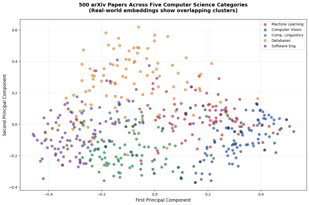
In the previous embeddings tutorial series, we built a semantic search system that could find relevant research papers based on meaning rather than keywords. We generated embeddings for 500 arXiv papers, implemented similarity calculations using cosine similarity, and created a search function that returned ranked results.

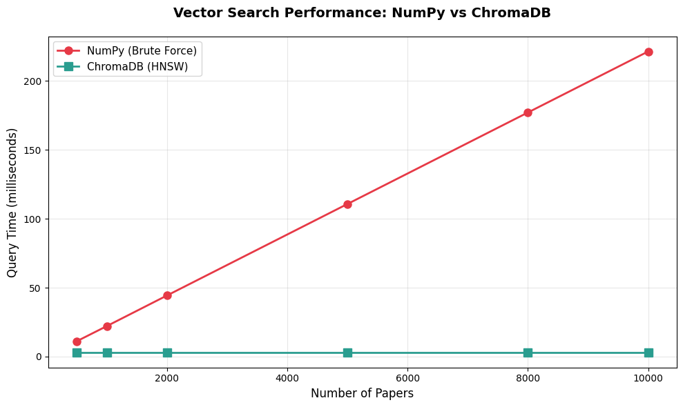
But here's the problem with that approach: our search worked by comparing the query embedding against every single paper in the dataset. For 500 papers, this brute-force approach was manageable. But what happens when we scale to 5,000 papers? Or 50,000? Or 500,000?

Why Brute-Force Won’t Work

Brute-force similarity search scales linearly. If we have 5,000 papers, checking all of them takes a noticeable amount of time. Scale to 50,000 papers and queries become painfully slower. At 500,000 papers, each search would become unusable. That's the reality of brute-force similarity search: query time grows directly with dataset size. This approach simply doesn't scale to production systems.

Vector databases solve this problem. They use specialized data structures called approximate nearest neighbor (ANN) indexes that can find similar vectors in milliseconds, even with millions of documents. Instead of checking every single embedding, they use clever algorithms to quickly narrow down to the most promising candidates.

This tutorial teaches you how to use ChromaDB, a local vector database perfect for learning and prototyping. We'll load 5,000 arXiv papers with their embeddings, build our first vector database collection, and discover exactly when and why vector databases provide real performance advantages over brute-force NumPy calculations.

What You'll Learn

By the end of this tutorial, you'll be able to:

  • Set up ChromaDB and create your first collection
  • Insert embeddings efficiently using batch patterns
  • Run vector similarity queries that return ranked results
  • Understand HNSW indexing and how it trades accuracy for speed
  • Filter results using metadata (categories, years, authors)
  • Compare performance between NumPy and ChromaDB at different scales
  • Make informed decisions about when to use a vector database

Most importantly, you'll understand the break-even point. We're not going to tell you "vector databases always win." We're going to show you exactly where they provide value and where simpler approaches work just fine.

Understanding the Dataset

For this tutorial series, we'll work with 5,000 research papers from arXiv spanning five computer science categories:

  • cs.LG (Machine Learning): 1,000 papers about neural networks, training algorithms, and ML theory
  • cs.CV (Computer Vision): 1,000 papers about image processing, object detection, and visual recognition
  • cs.CL (Computational Linguistics): 1,000 papers about NLP, language models, and text processing
  • cs.DB (Databases): 1,000 papers about data storage, query optimization, and database systems
  • cs.SE (Software Engineering): 1,000 papers about development practices, testing, and software architecture

These papers come with pre-generated embeddings from Cohere's API using the same approach from the embeddings series. Each paper is represented as a 1536-dimensional vector that captures its semantic meaning. The balanced distribution across categories will help us see how well vector search and metadata filtering work across different topics.

Setting Up Your Environment

First, create a virtual environment (recommended best practice):

python -m venv venv
source venv/bin/activate  # On Windows: venv\Scripts\activate

Using a virtual environment keeps your project dependencies isolated and prevents conflicts with other Python projects.

Now install the required packages. This tutorial was developed with Python 3.12.12 and the following versions:

# Developed with: Python 3.12.12
# chromadb==1.3.4
# numpy==2.0.2
# pandas==2.2.2
# scikit-learn==1.6.1
# matplotlib==3.10.0
# cohere==5.20.0
# python-dotenv==1.1.1

pip install chromadb numpy pandas scikit-learn matplotlib cohere python-dotenv

ChromaDB is lightweight and runs entirely on your local machine. No servers to configure, no cloud accounts to set up. This makes it perfect for learning and prototyping before moving to production databases.

You'll also need your Cohere API key from the embeddings series. Make sure you have a .env file in your working directory with:

COHERE_API_KEY=your_key_here

Downloading the Dataset

The dataset consists of two files you'll download and place in your working directory:

arxiv_papers_5k.csv download (7.7 MB)
Contains paper metadata: titles, abstracts, authors, publication dates, and categories

embeddings_cohere_5k.npy download (61.4 MB)
Contains 1536-dimensional embedding vectors for all 5,000 papers

Download both files and place them in the same directory as your Python script or notebook.

Let's verify the files loaded correctly:

import numpy as np
import pandas as pd

# Load the metadata
df = pd.read_csv('arxiv_papers_5k.csv')
print(f"Loaded {len(df)} papers")

# Load the embeddings
embeddings = np.load('embeddings_cohere_5k.npy')
print(f"Loaded embeddings with shape: {embeddings.shape}")
print(f"Each paper is represented by a {embeddings.shape[1]}-dimensional vector")

# Verify they match
assert len(df) == len(embeddings), "Mismatch between papers and embeddings!"

# Check the distribution across categories
print(f"\nPapers per category:")
print(df['category'].value_counts().sort_index())

# Look at a sample paper
print(f"\nSample paper:")
print(f"Title: {df['title'].iloc[0]}")
print(f"Category: {df['category'].iloc[0]}")
print(f"Abstract: {df['abstract'].iloc[0][:200]}...")
Loaded 5000 papers
Loaded embeddings with shape: (5000, 1536)
Each paper is represented by a 1536-dimensional vector

Papers per category:
category
cs.CL    1000
cs.CV    1000
cs.DB    1000
cs.LG    1000
cs.SE    1000
Name: count, dtype: int64

Sample paper:
Title: Optimizing Mixture of Block Attention
Category: cs.LG
Abstract: Mixture of Block Attention (MoBA) (Lu et al., 2025) is a promising building block for efficiently processing long contexts in LLMs by enabling queries to sparsely attend to a small subset of key-value...

We now have 5,000 papers with embeddings, perfectly balanced across five categories. Each embedding is 1536 dimensions, and papers and embeddings match exactly.

Your First ChromaDB Collection

A collection in ChromaDB is like a table in a traditional database. It stores embeddings along with associated metadata and provides methods for querying. Let's create our first collection:

import chromadb

# Initialize ChromaDB in-memory client (data only exists while script runs)
client = chromadb.Client()

# Create a collection
collection = client.create_collection(
    name="arxiv_papers",
    metadata={"description": "5000 arXiv papers from computer science"}
)

print(f"Created collection: {collection.name}")
print(f"Collection count: {collection.count()}")
Created collection: arxiv_papers
Collection count: 0

The collection starts empty. Now let's add our embeddings. But here's something critical you need to know: Production systems always batch operations, and for good reasons: memory efficiency, error handling, progress tracking, and the ability to process datasets larger than RAM. ChromaDB reinforces this best practice by enforcing a version-dependent maximum batch size per add() call (approximately 5,461 embeddings in ChromaDB 1.3.4).

Rather than viewing this as a limitation, think of it as ChromaDB nudging you toward production-ready patterns from day one. Let's implement proper batching:

# Prepare the data for ChromaDB
# ChromaDB wants: IDs, embeddings, metadata, and optional documents
ids = [f"paper_{i}" for i in range(len(df))]
metadatas = [
    {
        "title": row['title'],
        "category": row['category'],
        "year": int(str(row['published'])[:4]),  # Store year as integer for filtering
        "authors": row['authors'][:100] if len(row['authors']) <= 100 else row['authors'][:97] + "..."
    }
    for _, row in df.iterrows()
]
documents = df['abstract'].tolist()

# Insert in batches to respect the ~5,461 embedding limit
batch_size = 5000  # Safe batch size well under the limit
print(f"Inserting {len(embeddings)} embeddings in batches of {batch_size}...")

for i in range(0, len(embeddings), batch_size):
    batch_end = min(i + batch_size, len(embeddings))
    print(f"  Batch {i//batch_size + 1}: Adding papers {i} to {batch_end}")

    collection.add(
        ids=ids[i:batch_end],
        embeddings=embeddings[i:batch_end].tolist(),
        metadatas=metadatas[i:batch_end],
        documents=documents[i:batch_end]
    )

print(f"\nCollection now contains {collection.count()} papers")
Inserting 5000 embeddings in batches of 5000...
  Batch 1: Adding papers 0 to 5000

Collection now contains 5000 papers

Since our dataset has exactly 5,000 papers, we can add them all in one batch. But this batching pattern is essential knowledge because:

  1. If we had 8,000 or 10,000 papers, we'd need multiple batches
  2. Production systems always batch operations for efficiency
  3. It's good practice to think in batches from the start

The metadata we're storing (title, category, year, authors) will enable filtered searches later. ChromaDB stores this alongside each embedding, making it instantly available when we query.

Your First Vector Similarity Query

Now comes the exciting part: searching our collection using semantic similarity. But first, we need to address something critical: queries need to use the same embedding model as the documents.

If you mix models—say, querying Cohere embeddings with OpenAI embeddings—you'll either get dimension mismatch errors or, if the dimensions happen to align, results that are... let's call them "creatively unpredictable." The rankings won't reflect actual semantic similarity, making your search effectively random.

Our collection contains Cohere embeddings (1536 dimensions), so we'll use Cohere for queries too. Let's set it up:

from cohere import ClientV2
from dotenv import load_dotenv
import os

# Load your Cohere API key
load_dotenv()
cohere_api_key = os.getenv('COHERE_API_KEY')

if not cohere_api_key:
    raise ValueError(
        "COHERE_API_KEY not found. Make sure you have a .env file with your API key."
    )

co = ClientV2(api_key=cohere_api_key)
print("✓ Cohere API key loaded")

Now let's query for papers about neural network training:

# First, embed the query using Cohere (same model as our documents)
query_text = "neural network training and optimization techniques"

response = co.embed(
    texts=[query_text],
    model='embed-v4.0',
    input_type='search_query',
    embedding_types=['float']
)
query_embedding = np.array(response.embeddings.float_[0])

print(f"Query: '{query_text}'")
print(f"Query embedding shape: {query_embedding.shape}")

# Now search the collection
results = collection.query(
    query_embeddings=[query_embedding.tolist()],
    n_results=5
)

# Display the results
print(f"\nTop 5 most similar papers:")
print("=" * 80)

for i in range(len(results['ids'][0])):
    paper_id = results['ids'][0][i]
    distance = results['distances'][0][i]
    metadata = results['metadatas'][0][i]

    print(f"\n{i+1}. {metadata['title']}")
    print(f"   Category: {metadata['category']} | Year: {metadata['year']}")
    print(f"   Distance: {distance:.4f}")
    print(f"   Abstract: {results['documents'][0][i][:150]}...")
Query: 'neural network training and optimization techniques'
Query embedding shape: (1536,)

Top 5 most similar papers:
================================================================================

1. Training Neural Networks at Any Scale
   Category: cs.LG | Year: 2025
   Distance: 1.1162
   Abstract: This article reviews modern optimization methods for training neural networks with an emphasis on efficiency and scale. We present state-of-the-art op...

2. On the Convergence of Overparameterized Problems: Inherent Properties of the Compositional Structure of Neural Networks
   Category: cs.LG | Year: 2025
   Distance: 1.2571
   Abstract: This paper investigates how the compositional structure of neural networks shapes their optimization landscape and training dynamics. We analyze the g...

3. A Distributed Training Architecture For Combinatorial Optimization
   Category: cs.LG | Year: 2025
   Distance: 1.3027
   Abstract: In recent years, graph neural networks (GNNs) have been widely applied in tackling combinatorial optimization problems. However, existing methods stil...

4. Adam symmetry theorem: characterization of the convergence of the stochastic Adam optimizer
   Category: cs.LG | Year: 2025
   Distance: 1.3254
   Abstract: Beside the standard stochastic gradient descent (SGD) method, the Adam optimizer due to Kingma & Ba (2014) is currently probably the best-known optimi...

5. Distribution-Aware Tensor Decomposition for Compression of Convolutional Neural Networks
   Category: cs.CV | Year: 2025
   Distance: 1.3430
   Abstract: Neural networks are widely used for image-related tasks but typically demand considerable computing power. Once a network has been trained, however, i...

Let's talk about what we're seeing here. The results show exactly what we want:

The top 4 papers are all cs.LG (Machine Learning) and directly discuss neural network training, optimization, convergence, and the Adam optimizer. The 5th result is from Computer Vision but discusses neural network compression - still topically relevant.

The distances range from 1.12 to 1.34, which corresponds to cosine similarities of about 0.44 to 0.33. While these aren't the 0.8+ scores you might see in highly specialized single-domain datasets, they represent solid semantic matches for a multi-domain collection.

This is the reality of production vector search: Modern research papers share significant vocabulary overlap across fields. ML terminology appears in computer vision, NLP, databases, and software engineering papers. What we get is a ranking system that consistently surfaces relevant papers at the top, even if absolute similarity scores are moderate.

Why did we manually embed the query? Because our collection contains Cohere embeddings (1536 dimensions), queries must also use Cohere embeddings. If we tried using ChromaDB's default embedding model (all-MiniLM-L6-v2, which produces 384-dimensional vectors), we'd get a dimension mismatch error. Query embeddings and document embeddings must come from the same model. This is a fundamental rule in vector search.

About those distance values: ChromaDB uses squared L2 distance by default. For normalized embeddings (like Cohere's), there's a mathematical relationship: distance ≈ 2(1 - cosine_similarity). So a distance of 1.16 corresponds to a cosine similarity of about 0.42. That might seem low compared to theoretical maximums, but it's typical for real-world multi-domain datasets where vocabulary overlaps significantly.

Understanding What Just Happened

Let's break down what occurred behind the scenes:

1. Query Embedding
We explicitly embedded our query text using Cohere's API (the same model that generated our document embeddings). This is crucial because ChromaDB doesn't know or care what embedding model you used. It just stores vectors and calculates distances. If query embeddings don't match document embeddings (same model, same dimensions), search results will be garbage.

2. HNSW Index
ChromaDB uses an algorithm called HNSW (Hierarchical Navigable Small World) to organize embeddings. Think of HNSW as building a multi-level map of the vector space. Instead of checking all 5,000 papers, it uses this map to quickly navigate to the most promising regions.

3. Approximate Search
HNSW is an approximate nearest neighbor algorithm. It doesn't guarantee finding the absolute closest papers, but it finds very close papers extremely quickly. For most applications, this trade-off between perfect accuracy and blazing speed is worth it.

4. Distance Calculation
ChromaDB returns distances between the query and each result. By default, it uses squared Euclidean distance (L2), where lower values mean higher similarity. This is different from the cosine similarity we used in the embeddings series, but both metrics work well for comparing embeddings.

We'll explore HNSW in more depth later, but for now, the key insight is: ChromaDB doesn't check every single paper. It uses a smart index to jump directly to relevant regions of the vector space.

Why We're Storing Metadata

You might have noticed we're storing title, category, year, and authors as metadata alongside each embedding. While we won't use this metadata in this tutorial, we're setting it up now for future tutorials where we'll explore powerful combinations: filtering by metadata (category, year, author) and hybrid search approaches that combine semantic similarity with keyword matching.

For now, just know that ChromaDB stores this metadata efficiently alongside embeddings, and it becomes available in query results without any performance penalty.

The Performance Question: When Does ChromaDB Actually Help?

Now let's address the big question: when is ChromaDB actually faster than just using NumPy? Let's run a head-to-head comparison at our 5,000-paper scale.

First, let's implement the NumPy brute-force approach (what we built in the embeddings series):

from sklearn.metrics.pairwise import cosine_similarity
import time

def numpy_search(query_embedding, embeddings, top_k=5):
    """Brute-force similarity search using NumPy"""
    # Calculate cosine similarity between query and all papers
    similarities = cosine_similarity(
        query_embedding.reshape(1, -1),
        embeddings
    )[0]

    # Get top k indices
    top_indices = np.argsort(similarities)[::-1][:top_k]

    return top_indices

# Generate a query embedding (using one of our paper embeddings as a proxy)
query_embedding = embeddings[0]

# Test NumPy approach
start_time = time.time()
for _ in range(100):  # Run 100 queries to get stable timing
    top_indices = numpy_search(query_embedding, embeddings, top_k=5)
numpy_time = (time.time() - start_time) / 100 * 1000  # Convert to milliseconds

print(f"NumPy brute-force search (5000 papers): {numpy_time:.2f} ms per query")
NumPy brute-force search (5000 papers): 110.71 ms per query

Now let's compare with ChromaDB:

# Test ChromaDB approach (query using the embedding directly)
start_time = time.time()
for _ in range(100):
    results = collection.query(
        query_embeddings=[query_embedding.tolist()],
        n_results=5
    )
chromadb_time = (time.time() - start_time) / 100 * 1000

print(f"ChromaDB search (5000 papers): {chromadb_time:.2f} ms per query")
print(f"\nSpeedup: {numpy_time / chromadb_time:.1f}x faster")
ChromaDB search (5000 papers): 2.99 ms per query

Speedup: 37.0x faster

ChromaDB is 37x faster at 5,000 papers. That's the difference between a query taking 111ms versus 3ms. Let's visualize how this scales:

import matplotlib.pyplot as plt

# Scaling data based on actual 5k benchmark
# NumPy scales linearly (110.71ms / 5000 = 0.022142 ms per paper)
# ChromaDB stays flat due to HNSW indexing
dataset_sizes = [500, 1000, 2000, 5000, 8000, 10000]
numpy_times = [11.1, 22.1, 44.3, 110.7, 177.1, 221.4]  # ms (extrapolated from 5k benchmark)
chromadb_times = [3.0, 3.0, 3.0, 3.0, 3.0, 3.0]  # ms (stays constant)

plt.figure(figsize=(10, 6))
plt.plot(dataset_sizes, numpy_times, 'o-', linewidth=2, markersize=8,
         label='NumPy (Brute Force)', color='#E63946')
plt.plot(dataset_sizes, chromadb_times, 's-', linewidth=2, markersize=8,
         label='ChromaDB (HNSW)', color='#2A9D8F')

plt.xlabel('Number of Papers', fontsize=12)
plt.ylabel('Query Time (milliseconds)', fontsize=12)
plt.title('Vector Search Performance: NumPy vs ChromaDB',
          fontsize=14, fontweight='bold', pad=20)
plt.legend(loc='upper left', fontsize=11)
plt.grid(True, alpha=0.3)
plt.tight_layout()
plt.show()

# Calculate speedup at different scales
print("\nSpeedup at different dataset sizes:")
for size, numpy, chroma in zip(dataset_sizes, numpy_times, chromadb_times):
    speedup = numpy / chroma
    print(f"  {size:5d} papers: {speedup:5.1f}x faster")

Vector Search Performance - Numpy vs ChromaDB

Speedup at different dataset sizes:
    500 papers:   3.7x faster
   1000 papers:   7.4x faster
   2000 papers:  14.8x faster
   5000 papers:  36.9x faster
   8000 papers:  59.0x faster
  10000 papers:  73.8x faster

Note: These benchmarks were measured on a standard development machine with Python 3.12.12. Your actual query times will vary based on hardware, but the relative performance characteristics (flat scaling for ChromaDB vs linear for NumPy) will remain consistent.

This chart tells a clear story:

NumPy's time grows linearly with dataset size. Double the papers, double the query time. That's because brute-force search checks every single embedding.

ChromaDB's time stays flat regardless of dataset size. Whether we have 500 papers or 10,000 papers, queries take about 3ms in our benchmarks. These timings are illustrative (extrapolated from our 5k test on a standard development machine) and will vary based on your hardware and index configuration—but the core insight holds: ChromaDB query time stays relatively flat as your dataset grows, unlike NumPy's linear scaling.

The break-even point is around 1,000-2,000 papers. Below that, the overhead of maintaining an index might not be worth it. Above that, ChromaDB provides clear advantages that grow with scale.

Understanding HNSW: The Magic Behind Fast Queries

We've seen that ChromaDB is dramatically faster than brute-force search, but how does HNSW make this possible? Let's build intuition without diving into complex math.

The Basic Idea: Navigable Small Worlds

Imagine you're in a massive library looking for books similar to one you're holding. A brute-force approach would be to check every single book on every shelf. HNSW is like having a smart navigation system:

Layer 0 (Ground Level): Contains all embeddings, densely connected to nearby neighbors

Layer 1: Contains a subset of embeddings with longer-range connections

Layer 2: Even fewer embeddings with even longer connections

Layer 3: The top layer with just a few embeddings spanning the entire space

When we query, HNSW starts at the top layer (with very few points) and quickly narrows down to promising regions. Then it drops to the next layer and refines. By the time it reaches the ground layer, it's already in the right neighborhood and only needs to check a small fraction of the total embeddings.

The Trade-off: Accuracy vs Speed

HNSW is an approximate algorithm. It doesn't guarantee finding the absolute closest papers, but it finds very close papers very quickly. This trade-off is controlled by parameters:

  • ef_construction: How carefully the index is built (higher = better quality, slower build)
  • ef_search: How thoroughly queries search (higher = better recall, slower queries)
  • M: Number of connections per point (higher = better search, more memory)

ChromaDB uses sensible defaults that work well for most applications. Let's verify the quality of approximate search:

# Compare ChromaDB results to exact NumPy results
query_embedding = embeddings[100]

# Get top 10 from NumPy (exact)
numpy_results = numpy_search(query_embedding, embeddings, top_k=10)

# Get top 10 from ChromaDB (approximate)
chromadb_results = collection.query(
    query_embeddings=[query_embedding.tolist()],
    n_results=10
)

# Extract paper indices from ChromaDB results (convert "paper_123" to 123)
chromadb_indices = [int(id.split('_')[1]) for id in chromadb_results['ids'][0]]

# Calculate overlap
overlap = len(set(numpy_results) & set(chromadb_indices))

print(f"NumPy top 10 (exact): {numpy_results}")
print(f"ChromaDB top 10 (approximate): {chromadb_indices}")
print(f"\nOverlap: {overlap}/10 papers match")
print(f"Recall@10: {overlap/10*100:.1f}%")
NumPy top 10 (exact): [ 100  984  509 2261 3044  701 1055  830 3410 1311]
ChromaDB top 10 (approximate): [100, 984, 509, 2261, 3044, 701, 1055, 830, 3410, 1311]

Overlap: 10/10 papers match
Recall@10: 100.0%

With default settings, ChromaDB achieves 100% recall on this query, meaning it found exactly the same top 10 papers as the exact brute-force search. This high accuracy is typical for the dataset sizes we're working with. The approximate nature of HNSW becomes more noticeable at massive scales (millions of vectors), but even then, the quality is excellent for most applications.

Memory Usage and Resource Requirements

ChromaDB keeps its HNSW index in memory for fast access. Let's measure how much RAM our 5,000-paper collection uses:

# Estimate memory usage
embedding_memory = embeddings.nbytes / (1024 ** 2)  # Convert to MB

print(f"Memory usage estimates:")
print(f"  Raw embeddings: {embedding_memory:.1f} MB")
print(f"  HNSW index overhead: ~{embedding_memory * 0.5:.1f} MB (estimated)")
print(f"  Total (approximate): ~{embedding_memory * 1.5:.1f} MB")
Memory usage estimates:
  Raw embeddings: 58.6 MB
  HNSW index overhead: ~29.3 MB (estimated)
  Total (approximate): ~87.9 MB

For 5,000 papers with 1536-dimensional embeddings, we're looking at roughly 90-100MB of RAM. This scales linearly: 10,000 papers would be about 180-200MB, 50,000 papers about 900MB-1GB.

This is completely manageable for modern computers. Even a basic laptop can easily handle collections with tens of thousands of documents. The memory requirements only become a concern at massive scales (hundreds of thousands or millions of vectors), which is when you'd move to production vector databases designed for distributed deployment.

Important ChromaDB Behaviors to Know

Before we move on, let's cover some important behaviors that will save you debugging time:

1. In-Memory vs Persistent Storage

Our code uses chromadb.Client(), which creates an in-memory client. The collection only exists while the Python script runs. When the script ends, the data disappears.

For persistent storage, use:

# Persistent storage (data saved to disk)
client = chromadb.PersistentClient(path="./chroma_db")

This saves the collection to a local directory. Next time you run the script, the data will still be there.

2. Collection Deletion and Index Growth

ChromaDB's HNSW index grows but never shrinks. If we add 5,000 documents then delete 4,000, the index still uses memory for 5,000. The only way to reclaim this space is to create a new collection and re-add the documents we want to keep.

This is a known limitation with HNSW indexes. It's not a bug, it's a fundamental trade-off for the algorithm's speed. Keep this in mind when designing systems that frequently add and remove documents.

3. Batch Size Limits

Remember the ~5,461 embedding limit per add() call? This isn't ChromaDB being difficult; it's protecting you from overwhelming the system. Always batch your insertions in production systems.

4. Default Embedding Function

When you call collection.query(query_texts=["some text"]), ChromaDB automatically embeds your query using its default model (all-MiniLM-L6-v2). This is convenient but might not match the embeddings you added to the collection.

For production systems, you typically want to:

  • Use the same embedding model for queries and documents
  • Either embed queries yourself and use query_embeddings, or configure ChromaDB's embedding function to match your model

Comparing Results: Query Understanding

Let's run a few different queries to see how well vector search understands intent:

queries = [
    "machine learning model evaluation metrics",
    "how do convolutional neural networks work",
    "SQL query optimization techniques",
    "testing and debugging software systems"
]

for query in queries:
    # Embed the query
    response = co.embed(
        texts=[query],
        model='embed-v4.0',
        input_type='search_query',
        embedding_types=['float']
    )
    query_embedding = np.array(response.embeddings.float_[0])

    # Search
    results = collection.query(
        query_embeddings=[query_embedding.tolist()],
        n_results=3
    )

    print(f"\nQuery: '{query}'")
    print("-" * 80)

    categories = [meta['category'] for meta in results['metadatas'][0]]
    titles = [meta['title'] for meta in results['metadatas'][0]]

    for i, (cat, title) in enumerate(zip(categories, titles)):
        print(f"{i+1}. [{cat}] {title[:60]}...")
Query: 'machine learning model evaluation metrics'
--------------------------------------------------------------------------------
1. [cs.CL] Factual and Musical Evaluation Metrics for Music Language Mo...
2. [cs.DB] GeoSQL-Eval: First Evaluation of LLMs on PostGIS-Based NL2Ge...
3. [cs.SE] GeoSQL-Eval: First Evaluation of LLMs on PostGIS-Based NL2Ge...

Query: 'how do convolutional neural networks work'
--------------------------------------------------------------------------------
1. [cs.LG] Covariance Scattering Transforms...
2. [cs.CV] Elements of Active Continuous Learning and Uncertainty Self-...
3. [cs.CV] Convolutional Fully-Connected Capsule Network (CFC-CapsNet):...

Query: 'SQL query optimization techniques'
--------------------------------------------------------------------------------
1. [cs.DB] LLM4Hint: Leveraging Large Language Models for Hint Recommen...
2. [cs.DB] Including Bloom Filters in Bottom-up Optimization...
3. [cs.DB] Query Optimization in the Wild: Realities and Trends...

Query: 'testing and debugging software systems'
--------------------------------------------------------------------------------
1. [cs.SE] Enhancing Software Testing Education: Understanding Where St...
2. [cs.SE] Design and Implementation of Data Acquisition and Analysis S...
3. [cs.SE] Identifying Video Game Debugging Bottlenecks: An Industry Pe...

Notice how the search correctly identifies the topic for each query:

  • ML evaluation → Machine Learning and evaluation-related papers
  • CNNs → Computer Vision papers with one ML paper
  • SQL optimization → Database papers
  • Testing → Software Engineering papers

The system understands semantic meaning. Even when queries use natural language phrasing like "how do X work," it finds topically relevant papers. The rankings are what matter - relevant papers consistently appear at the top, even if absolute similarity scores are moderate.

When ChromaDB Is Enough vs When You Need More

We now have a working vector database running on our laptop. But when is ChromaDB sufficient, and when do you need a production database like Pinecone, Qdrant, or Weaviate?

ChromaDB is perfect for:

  • Learning and prototyping: Get immediate feedback without infrastructure setup
  • Local development: No internet required, no API costs
  • Small to medium datasets: Up to 100,000 documents on a standard laptop
  • Single-machine applications: Desktop tools, local RAG systems, personal assistants
  • Rapid experimentation: Test different embedding models or chunking strategies

Move to production databases when you need:

  • Massive scale: Millions of vectors or high query volume (thousands of QPS)
  • Distributed deployment: Multiple machines, load balancing, high availability
  • Advanced features: Hybrid search, multi-tenancy, access control, backup/restore
  • Production SLAs: Guaranteed uptime, support, monitoring
  • Team collaboration: Multiple developers working with shared data

We'll explore production databases in a later tutorial. For now, ChromaDB gives us everything we need to learn the core concepts and build impressive projects.

Practical Exercise: Exploring Your Own Queries

Before we wrap up, try experimenting with different queries:

# Helper function to make querying easier
def search_papers(query_text, n_results=5):
    """Search papers using semantic similarity"""
    # Embed the query
    response = co.embed(
        texts=[query_text],
        model='embed-v4.0',
        input_type='search_query',
        embedding_types=['float']
    )
    query_embedding = np.array(response.embeddings.float_[0])

    # Search
    results = collection.query(
        query_embeddings=[query_embedding.tolist()],
        n_results=n_results
    )

    return results

# Your turn: try these queries and examine the results

# 1. Find papers about a specific topic
results = search_papers("reinforcement learning and robotics")

# 2. Try a different domain
results_cv = search_papers("image segmentation techniques")

# 3. Test with a broad query
results_broad = search_papers("deep learning applications")

# Examine the results for each query
# What patterns do you notice?
# Do the results make sense for each query?

Some things to explore:

  • Query phrasing: Does "neural networks" return different results than "deep learning" or "artificial neural networks"?
  • Specificity: How do very specific queries ("BERT model fine-tuning") compare to broad queries ("natural language processing")?
  • Cross-category topics: What happens when you search for topics that span multiple categories, like "machine learning for databases"?
  • Result quality: Look at the categories and distances - do the most similar papers make sense for each query?

This hands-on exploration will deepen your intuition about how vector search works and what to expect in real applications.

What You've Learned

We've built a complete vector database from scratch and understand the fundamentals:

Core Concepts:

  • Vector databases use ANN indexes (like HNSW) to search large collections efficiently
  • ChromaDB provides a simple, local database perfect for learning and prototyping
  • Collections store embeddings, metadata, and documents together
  • Batch insertion is required due to size limits (around 5,461 embeddings per call)

Performance Characteristics:

  • ChromaDB achieves 37x speedup over NumPy at 5,000 papers
  • Query time stays constant regardless of dataset size (around 3ms)
  • Break-even point is around 1,000-2,000 papers
  • Memory usage is manageable (about 90MB for 5,000 papers)

Practical Skills:

  • Loading pre-generated embeddings and metadata
  • Creating and querying ChromaDB collections
  • Running pure vector similarity searches
  • Comparing approximate vs exact search quality
  • Understanding when to use ChromaDB vs production databases

Critical Insights:

  • HNSW trades perfect accuracy for massive speed gains
  • Default settings achieve excellent recall for typical workloads
  • In-memory storage makes ChromaDB fast but limits persistence
  • Batching is not optional, it's a required pattern
  • Modern multi-domain datasets show moderate similarity scores due to vocabulary overlap
  • Query embeddings and document embeddings must use the same model

What's Next

We now have a vector database running locally with 5,000 papers. Next, we'll tackle a critical challenge: document chunking strategies.

Right now, we're searching entire paper abstracts as single units. But what if we want to search through full papers, documentation, or long articles? We need to break them into chunks, and how we chunk dramatically affects search quality.

The next tutorial will teach you:

  • Why chunking matters even with long-context LLMs in 2025
  • Different chunking strategies (sentence-based, token windows, structure-aware)
  • How to evaluate chunking quality using Recall@k
  • The trade-offs between chunk size, overlap, and search performance
  • Practical implementations you can use in production

Before moving on, make sure you understand these core concepts:

  • How vector similarity search works
  • What HNSW indexing does and why it's fast
  • When ChromaDB provides real advantages over brute-force search
  • How query and document embeddings must match

When you're comfortable with vector search basics, you’re ready to see how to handle real documents that are too long to embed as single units.


Key Takeaways:

  • Vector databases use approximate nearest neighbor algorithms (like HNSW) to search large collections in constant time
  • ChromaDB provides 37x speedup over NumPy brute-force at 5,000 papers, with query times staying flat as datasets grow
  • Batch insertion is mandatory due to embedding limit per add() call
  • HNSW creates a hierarchical navigation structure that checks only a fraction of embeddings while maintaining high accuracy
  • Default HNSW settings achieve excellent recall for typical datasets
  • Memory usage scales linearly (about 90MB for 5,000 papers with 1536-dimensional embeddings)
  • ChromaDB excels for learning, prototyping, and datasets up to ~100,000 documents on standard hardware
  • The break-even point for vector databases vs brute-force is around 1,000-2,000 documents
  • HNSW indexes grow but never shrink, requiring collection re-creation to reclaim space
  • In-memory storage provides speed but requires persistent client for data that survives script restarts
  • Modern multi-domain datasets show moderate similarity scores (0.3-0.5 cosine) due to vocabulary overlap across fields
  • Query embeddings and document embeddings must use the same model and dimensionality
  •  

Best AI Certifications to Boost Your Career in 2026

Artificial intelligence is creating more opportunities than ever, with new roles appearing across every industry. But breaking into these positions can be difficult when most employers want candidates with proven experience.

Here's what many people don't realize: getting certified provides a clear path forward, even if you're starting from scratch.

AI-related job postings on LinkedIn grew 17% over the last two years. Companies are scrambling to hire people who understand these technologies. Even if you're not building models yourself, understanding AI makes you more valuable in your current role.


The AI Certification Challenge

The challenge is figuring out which AI certification is best for your goals.

Some certifications focus on business strategy while others dive deep into building machine learning models. Many fall somewhere in between. The best AI certifications depend entirely on where you're starting and where you want to go.

This guide breaks down 11 certifications that can genuinely advance your career. We'll cover costs, time commitments, and what you'll actually learn. More importantly, we'll help you figure out which one fits your situation.

In this guide, we'll cover:

  • Career Switcher Certifications
  • Developer Certifications
  • Machine Learning Engineering Certifications
  • Generative AI Certifications
  • Non-Technical Professional Certifications
  • Certification Comparison Table
  • How to Choose the Right Certification

Let's find the right certification for you.


How to Choose the Right AI Certification

Before diving into specific certifications, let's talk about what actually matters when choosing one.

Match Your Current Experience Level

Be honest about where you're starting. Some certifications assume you already know programming, while others start from zero.

If you've never coded before, jumping straight into an advanced machine learning certification will frustrate you. Start with beginner-friendly options that teach foundations first.

If you’re already working as a developer or data analyst, you can skip the basics and go for intermediate or advanced certifications.

Consider Your Career Goals

Different certifications lead to different opportunities.

  • Want to switch careers into artificial intelligence? Look for comprehensive programs that teach both theory and practical skills.
  • Already in tech and want to add AI skills? Shorter, focused certifications work better.
  • Leading AI projects but not building models yourself? Business-focused certifications make more sense than technical ones.

Think About Time and Money

Certifications range from free to over \$800, and time commitments vary from 10 hours to several months.

Be realistic about what makes sense for you. A certification that takes 200 hours might be perfect for your career, but if you can only study 5 hours per week, that's 40 weeks of commitment. Can you sustain that?

Sometimes a shorter certification that you'll actually finish beats a comprehensive one you'll abandon halfway through.

Verify Industry Recognition

Not all certifications carry the same weight with employers.

Certifications from established organizations like AWS, Google Cloud, Microsoft, and IBM typically get recognized. So do programs from respected institutions and instructors like Andrew Ng's DeepLearning.AI courses.

Check job postings in your target field, and take note of which certifications employers actually mention.


Best AI Certifications for Career Switchers

Starting from scratch? These certifications help you build foundations without requiring prior experience.

1. Google AI Essentials

Google AI Essentials

This is the fastest way to understand AI basics. Google AI Essentials teaches you what artificial intelligence can actually do and how to use it productively in your work.

  • Cost: \$49 per month on Coursera (7-day free trial)
  • Time: Under 10 hours total
  • What you'll learn: How generative AI works, writing effective prompts, using AI tools responsibly, and spotting opportunities to apply AI in your work.

    The course is completely non-technical, so no coding is required. You'll practice with tools like Gemini and learn through real-world scenarios.

  • Best for: Anyone curious about AI who wants to understand it quickly. Perfect if you're in marketing, HR, operations, or any non-technical role.
  • Why it works: Google designed this for busy professionals, so you can finish in a weekend if you're motivated. The certificate from Google adds credibility to your resume.

2. Microsoft Certified: Azure AI Fundamentals (AI-900)

Microsoft Certified - Azure AI Fundamentals (AI-900)

Want something with more technical depth but still beginner-friendly? The Azure AI Fundamentals certification gives you a solid overview of AI and machine learning concepts.

  • Cost: \$99 (exam fee)
  • Time: 30 to 40 hours of preparation
  • What you'll learn: Core AI concepts, machine learning fundamentals, computer vision, natural language processing, and how Azure's AI services work.

    This certification requires passing an exam. Microsoft offers free training materials through their Learn platform, and you can also find prep courses on Coursera and other platforms.

  • Best for: People who want a recognized certification that proves they understand AI concepts. Good for career switchers who want credibility fast.
  • Worth knowing: Unlike most foundational certifications, this one expires after one year. Microsoft offers a free renewal exam to keep it current.
  • If you're building foundational skills in data science and machine learning, Dataquest's Data Scientist career path can help you prepare. You'll learn the programming and statistics that make certifications like this easier to tackle.

3. IBM AI Engineering Professional Certificate

IBM AI Engineering Professional Certificate

Ready for something more comprehensive? The IBM AI Engineering Professional Certificate teaches you to actually build AI systems from scratch.

  • Cost: About \$49 per month on Coursera (roughly \$196 to \$294 for 4 to 6 months)
  • Time: 4 to 6 months at a moderate pace
  • What you'll learn: Machine learning techniques, deep learning with frameworks like TensorFlow and PyTorch, computer vision, natural language processing, and how to deploy AI models.

    This program includes hands-on projects, so you'll build real systems instead of just watching videos. By the end, you'll have a portfolio showing you can create AI applications.

  • Best for: Career switchers who want to become AI engineers or machine learning engineers. Also good for software developers adding AI skills.
  • Recently updated: IBM refreshed this program in March 2025 with new generative AI content, so you're learning current, relevant skills.

Best AI Certification for Developers

4. AWS Certified AI Practitioner (AIF-C01)

AWS Certified AI Practitioner (AIF-C01)

Already know your way around code? The AWS Certified AI Practitioner helps developers understand AI services and when to use them.

  • Cost: \$100 (exam fee)
  • Time: 40 to 60 hours of preparation
  • What you'll learn: AI and machine learning fundamentals, generative AI concepts, AWS AI services like Bedrock and SageMaker, and how to choose the right tools for different problems.

    This is AWS's newest AI certification, launched in August 2024. It focuses on practical knowledge, so you're learning to use AI services rather than building them from scratch.

  • Best for: Software developers, cloud engineers, and technical professionals who work with AWS. Also valuable for product managers and technical consultants.
  • Why developers like it: It bridges business and technical knowledge. You'll understand enough to have intelligent conversations with data scientists while knowing how to implement solutions.

Best AI Certifications for Machine Learning Engineers

Want to build, train, and deploy machine learning models? These certifications teach you the skills companies actually need.

5. Machine Learning Specialization (DeepLearning.AI + Stanford)

Machine Learning Specialization (DeepLearning.AI + Stanford)

Andrew Ng's Machine Learning Specialization is the gold standard for learning ML fundamentals. Over 4.8 million people have taken his courses.

  • Cost: About \$49 per month on Coursera (roughly \$147 for 3 months)
  • Time: 3 months at 5 hours per week
  • What you'll learn: Supervised learning (regression and classification), neural networks, decision trees, recommender systems, and best practices for machine learning projects.

    Ng teaches with visual intuition first, then shows you the code, then explains the math. This approach helps concepts stick better than traditional courses.

  • Best for: Anyone wanting to understand machine learning deeply. Perfect whether you're a complete beginner or have some experience but want to fill gaps.
  • Why it's special: Ng explains complex ideas simply and shows you how professionals actually approach ML problems. You'll learn patterns you'll use throughout your career.

    If you want to practice these concepts hands-on, Dataquest's Machine Learning path lets you work with real datasets and build projects as you learn. It's a practical complement to theoretical courses.

6. Deep Learning Specialization (DeepLearning.AI)

Deep Learning Specialization (DeepLearning.AI)

After mastering ML basics, the Deep Learning Specialization teaches you to build neural networks that power modern AI.

  • Cost: About \$49 per month on Coursera (roughly \$245 for 5 months)
  • Time: 5 months with five separate courses
  • What you'll learn: Neural networks and deep learning fundamentals, convolutional neural networks for images, sequence models for text and time series, and strategies to improve model performance.

    This specialization includes hands-on programming assignments where you'll implement algorithms from scratch before using frameworks. This deeper understanding helps when things go wrong in real projects.

  • Best for: People who want to work on cutting-edge AI applications. Necessary for computer vision, natural language processing, and speech recognition roles.
  • Real-world value: Many employers specifically look for deep learning skills, and this specialization appears on countless job descriptions for ML engineer positions.

7. Google Cloud Professional Machine Learning Engineer

Google Cloud Professional Machine Learning Engineer

The Google Cloud Professional ML Engineer certification proves you can build production ML systems at scale.

  • Cost: \$200 (exam fee)
  • Time: 100 to 150 hours of preparation recommended
  • Prerequisites: Google recommends 3 plus years of industry experience including at least 1 year with Google Cloud.
  • What you'll learn: Designing machine learning solutions on Google Cloud, data engineering with BigQuery and Dataflow, training and tuning models with Vertex AI, and deploying production ML systems.

    This is an advanced certification where the exam tests your ability to solve real problems using Google Cloud's tools. You need hands-on experience to pass.

  • Best for: ML engineers, data scientists, and AI specialists who work with Google Cloud Platform. Particularly valuable if your company uses GCP.
  • Career impact: This certification demonstrates you can handle enterprise-scale machine learning projects. It often leads to senior positions and consulting opportunities.

8. AWS Certified Machine Learning Specialty (MLS-C01)

AWS Certified Machine Learning Specialty (MLS-C01)

Want to prove you're an expert with AWS's ML tools? The AWS Machine Learning Specialty certification is one of the most respected credentials in the field.

  • Cost: \$300 (exam fee)
  • Time: 150 to 200 hours of preparation
  • Prerequisites: AWS recommends at least 2 years of hands-on experience with machine learning workloads on AWS.
  • What you'll learn: Data engineering for ML, exploratory data analysis, modeling techniques, and implementing machine learning solutions with SageMaker and other AWS services.

    The exam covers four domains: data engineering accounts for 20%, exploratory data analysis is 24%, modeling gets 36%, and ML implementation and operations make up the remaining 20%.

  • Best for: Experienced ML practitioners who work with AWS. This proves you know how to architect, build, and deploy ML systems at scale.
  • Worth knowing: This is one of the hardest AWS certifications, and people often fail on their first attempt. But passing it carries significant weight with employers.

Best AI Certification for Generative AI

9. IBM Generative AI Engineering Professional Certificate

IBM Generative AI Engineering Professional Certificate

Generative AI is exploding right now. The IBM Generative AI Engineering Professional Certificate teaches you to build applications with large language models.

  • Cost: About \$49 per month on Coursera (roughly \$294 for 6 months)
  • Time: 6 months
  • What you'll learn: Prompt engineering, working with LLMs like GPT and LLaMA, building NLP applications, using frameworks like LangChain and RAG, and deploying generative AI solutions.

    This program is brand new as of 2025 and covers the latest techniques for working with foundation models. You'll learn how to fine-tune models and build AI agents.

  • Best for: Developers, data scientists, and machine learning engineers who want to specialize in generative AI. Also good for anyone wanting to enter this high-growth area.
  • Market context: The generative AI market is expected to grow 46% annually through 2030, and companies are hiring rapidly for these skills.

    If you're looking to build foundational skills in generative AI before tackling this certification, Dataquest's Generative AI Fundamentals path teaches you the core concepts through hands-on Python projects. You'll learn prompt engineering, working with LLM APIs, and building practical applications.


Best AI Certifications for Non-Technical Professionals

Not everyone needs to build AI systems, but understanding artificial intelligence helps you make better decisions and lead more effectively.

10. AI for Everyone (DeepLearning.AI)

AI for Everyone (DeepLearning.AI)

Andrew Ng created AI for Everyone specifically for business professionals, managers, and anyone in a non-technical role.

  • Cost: Free to audit, \$49 for a certificate
  • Time: 6 to 10 hours
  • What you'll learn: What AI can and cannot do, how to spot opportunities for artificial intelligence in your organization, working effectively with AI teams, and building an AI strategy.

    No math and no coding required, just clear explanations of how AI works and how it affects business.

  • Best for: Executives, managers, product managers, marketers, and anyone who works with AI teams but doesn't build AI themselves.
  • Why it matters: Understanding AI helps you ask better questions, make smarter decisions, and communicate effectively with technical teams.

11. PMI Certified Professional in Managing AI (PMI-CPMAI)

PMI Certified Professional in Managing AI (PMI-CPMAI)

Leading AI projects requires different skills than traditional IT projects. The PMI-CPMAI certification teaches you how to manage them successfully.

  • Cost: \$500 to \$800 plus (exam and prep course bundled)
  • Time: About 30 hours for core curriculum
  • What you'll learn: AI project methodology across six phases, data preparation and management, model development and testing, governance and ethics, and operationalizing AI responsibly.

    PMI officially launched this certification in 2025 after acquiring Cognilytica. It's the first major project management certification specifically for artificial intelligence.

  • Best for: Project managers, program managers, product owners, scrum masters, and anyone leading AI initiatives.
  • Special benefits: The prep course earns you 21 PDUs toward other PMI certifications. That covers over a third of what you need for PMP renewal.
  • Worth knowing: Unlike most certifications, this one currently doesn't expire. No renewal fees or continuing education required.

AI Certification Comparison Table

Certification Cost Time Level Best For
Google AI Essentials \$49/month Under 10 hours Beginner All roles, quick AI overview
Azure AI Fundamentals (AI-900) \$99 30-40 hours Beginner Career switchers, IT professionals
IBM AI Engineering \$196-294 4-6 months Intermediate Aspiring ML engineers
AWS AI Practitioner (AIF-C01) \$100 40-60 hours Foundational Developers, cloud engineers
Machine Learning Specialization \$147 3 months Beginner-Intermediate Anyone learning ML fundamentals
Deep Learning Specialization \$245 5 months Intermediate ML engineers, data scientists
Google Cloud Professional ML Engineer \$200 100-150 hours Advanced Experienced ML engineers on GCP
AWS ML Specialty (MLS-C01) \$300 150-200 hours Advanced Experienced ML practitioners on AWS
IBM Generative AI Engineering \$294 6 months Intermediate Gen AI specialists, developers
AI for Everyone Free-\$49 6-10 hours Beginner Business professionals, managers
PMI-CPMAI \$500-800+ 30+ hours Intermediate Project managers, AI leaders

When You Don't Need a Certification

Let's be honest about this. Certifications aren't always necessary.

If you already have strong experience building AI systems, a portfolio of real projects might matter more than certificates. Many employers care more about what you can do than what credentials you hold.

Certifications work best when you're:

  • Breaking into a new field and need credibility
  • Filling specific knowledge gaps
  • Working at companies that value formal credentials
  • Trying to stand out in a competitive job market

They work less well when you're:

  • Already established in AI with years of experience
  • At a company that promotes based on projects, not credentials
  • Learning just for personal interest

Consider your situation carefully. Sometimes spending 100 hours building a portfolio project helps your career more than studying for an exam.


What Happens After Getting Certified

You passed the exam. Great! But, now what?

Update Your Professional Profiles

Add your certification to LinkedIn and your resume. If it comes with a digital badge, show that too.

But don't just list it. Mention specific skills you gained that relate to jobs you want. This helps employers understand why it matters.

Build on What You Learned

A certification gives you the basics, but you grow the most when you use those skills in real situations. Try building a small project that uses what you learned.

You can also join an open-source project or write about your experience. Showing both a certification and real work makes you stand out to employers.

Consider Your Next Step

Many professionals stack certifications strategically. For example:

  • Start with Azure AI Fundamentals, then add the Machine Learning Specialization
  • Complete Machine Learning Specialization, then Deep Learning Specialization, then an AWS or Google Cloud certification
  • Get IBM AI Engineering, then specialize with IBM Generative AI Engineering

Each certification builds on previous knowledge. Building skills in the right order helps you learn faster and avoid gaps in your knowledge.

Maintain Your Certification

Some certifications expire while others require continuing education.

Check renewal requirements before your certification expires. Most providers offer renewal paths that are easier than taking the original exam.


Making Your Decision

You've seen 11 different certifications, and each serves different goals.

Here's how to choose:

The best AI certification is the one you'll actually complete. Choose based on your current skills, available time, and career goals.

Artificial intelligence skills are becoming more valuable every year, and that trend isn't slowing down. But credentials alone won't get you hired. You need to develop these skills through hands-on practice and real application. Choosing the right certification and committing to it is a solid first step. Pick one that matches your goals and start building your expertise today.

  •  

18 Best Data Science Bootcamps in 2026 – Price, Curriculum, Reviews

Data science is exploding right now. Jobs in this field are expected to grow by 34% in the next ten years, which is much faster than most other careers.

But learning data science can feel overwhelming. You need to know Python, statistics, machine learning, how to make charts, and how to solve problems with data.

Benefits of Bootcamps

Bootcamps make it easier by breaking data science into clear, hands-on steps. You work on real projects, get guidance from mentors who are actually in the field, and build a portfolio that shows what you can do.

Whether you want a new job, sharpen your skills, or just explore data science, a bootcamp is a great way to get started. Many students go on to roles as data analysts or junior data scientists.

In this guide, we break down the 18 best data science bootcamps for 2026. We look at the price, what you’ll learn, how the programs are run, and what students think so you can pick the one that works best for you.

What You Will Learn in a Data Science Bootcamp

Data science bootcamps teach you the skills you need to work with data in the real world. You will learn to collect, clean, analyze, and visualize data, build models, and present your findings clearly.

By the end of a bootcamp, you will have hands-on experience and projects you can include in your portfolio.

Here is a quick overview of what you usually learn:

Topic What you'll learn
Programming fundamentals Python or R basics, plus key libraries like NumPy, Pandas, and Matplotlib.
Data cleaning & wrangling Handling missing data, outliers, and formatting issues for reliable results.
Data visualization Creating charts and dashboards using Tableau, Power BI, or Seaborn.
Statistics & probability Regression, distributions, and hypothesis testing for data-driven insights.
Machine learning Building predictive models using scikit-learn, TensorFlow, or PyTorch.
SQL & databases Extracting and managing data with SQL queries and relational databases.
Big data & cloud tools Working with large datasets using Spark, AWS, or Google Cloud.
Data storytelling Presenting insights clearly through reports, visuals, and communication skills.
Capstone projects Real-world projects that build your portfolio and show practical experience.

Bootcamp vs Course vs Fellowship vs Degree

There are many ways to learn data science. Each path works better for different goals, schedules, and budgets. Here’s how they compare.

Feature Bootcamp Online Course Fellowship University Degree
Overview Short, structured programs designed to teach practical, job-ready skills fast. They focus on real projects, mentorship, and career support. Flexible and affordable, ideal for learning at your own pace. They're great for testing interest or focusing on specific skills. Combine mentorship and applied projects, often with funding or partnerships. They're selective and suited for those with some technical background. Provide deep theoretical and technical foundations. They're the most recognized option but also the most time- and cost-intensive.
Duration 3–9 months A few weeks to several months 3–12 months 2–4 years
Cost \$3,000–\$18,000 Free–\$2,000 Often free or funded \$25,000–\$80,000+
Format Fast-paced, project-based format Self-paced, topic-focused learning Research or industry-based projects Academic and theory-heavy structure
Key Features Includes portfolio building and resume guidance Covers tools like Python, SQL, and machine learning Provides professional mentorship and networking Includes math, statistics, and computer science fundamentals
Best For Career changers or professionals seeking a quick transition Beginners or those upskilling part-time Advanced learners or graduates gaining experience Students pursuing academic or research-focused careers

Top Data Science Bootcamps

Data science bootcamps help you learn the skills needed for a job in data science. Each program differs in price, length, and style. This list will show the best ones, what you will learn, and who they’re good for.

1. Dataquest

Dataquest

Price: Free to start; paid plans available for full access (\$49 monthly and \$588 annual).

Duration: ~11 months (recommended pace: 5 hrs/week).

Format: Online, self-paced.

Rating: 4.79/5

Key Features:

  • Beginner-friendly, no coding experience required
  • 38 courses and 26 guided projects
  • Hands-on, code-in-browser learning
  • Portfolio-based certification

If you like learning by doing, Dataquest’s Data Scientist in Python Certificate Program is a great choice. Everything happens in your browser. You write Python code, get instant feedback, and work on hands-on projects using tools like pandas and Matplotlib.

While Dataquest isn’t a traditional bootcamp, it’s just as effective. The program follows a clear path that teaches you Python, data cleaning, visualization, SQL, and machine learning.

You’ll start from scratch and move step by step into more advanced topics like building models and analyzing real data. Its hands-on projects help you apply what you learn, build a strong portfolio, and get ready for data science roles.

Pros Cons
✅ Affordable compared to full bootcamps ❌ No live mentorship or one-on-one support
✅ Flexible, self-paced structure ❌ Limited career guidance
✅ Strong hands-on learning with real projects ❌ Requires high self-discipline to stay consistent
✅ Beginner-friendly and well-structured
✅ Covers core tools like Python, SQL, and machine learning

“I used Dataquest since 2019 and I doubled my income in 4 years and became a Data Scientist. That’s pretty cool!” - Leo Motta - Verified by LinkedIn

“I liked the interactive environment on Dataquest. The material was clear and well organized. I spent more time practicing than watching videos and it made me want to keep learning.” - Jessica Ko, Machine Learning Engineer at Twitter

2. BrainStation

BrainStation

Price: Around \$16,500 (varies by location and financing options)

Duration: 6 months (part-time, designed for working professionals).

Format: Available online and on-site in New York, Miami, Toronto, Vancouver, and London. Part-time with evening and weekend classes.

Rating: 4.66/5

Key Features:

  • Flexible evening and weekend schedule
  • Hands-on projects based on real company data
  • Focus on Python, SQL, Tableau, and AI tools
  • Career coaching and portfolio support
  • Active global alumni network

BrainStation’s Data Science Bootcamp lets you learn part-time while keeping your full-time job. You work with real data and tools like Python, SQL, Tableau, scikit-learn, TensorFlow, and AWS.

Students build industry projects and take part in “industry sprint” challenges with real companies. The curriculum covers data analysis, data visualization, big data, machine learning, and generative AI.

From the start, students get one-on-one career support. This includes help with resumes, interviews, and portfolios. Many graduates now work at top companies like Meta, Deloitte, and Shopify.

Pros Cons
✅ Instructors with strong industry experience ❌ Expensive compared to similar online bootcamps
✅ Flexible schedule for working professionals ❌ Fast-paced, can be challenging to keep up
✅ Practical, project-based learning with real company data ❌ Some topics are covered briefly without much depth
✅ 1-on-1 career support with resume and interview prep ❌ Career support is not always highly personalized
✅ Modern curriculum including AI, ML, and big data ❌ Requires strong time management and prior technical comfort

“Having now worked as a data scientist in industry for a few months, I can really appreciate how well the course content was aligned with the skills required on the job.” - Joseph Myers

“BrainStation was definitely helpful for my career, because it enabled me to get jobs that I would not have been competitive for before. “ - Samit Watve, Principal Bioinformatics Scientist at Roche

3. NYC Data Science Academy

NYC Data Science Academy

Price: \$17,600 (third-party financing available via Ascent and Climb Credit)

Duration: In-person (New York), remote live, or online. Full-time (12–16 weeks) and part-time (24 weeks) options available.

Format: In-person (New York) or online (live and self-paced).

Rating: 4.86/5

Key Features:

  • Taught by industry experts
  • Prework and entry assessment
  • Financing options available
  • Learn R and Python
  • Company capstone projects
  • Lifetime alumni network access

NYC Data Science Academy offers one of the most detailed and technical programs in data science. The Data Science with Machine Learning Bootcamp teaches both Python and R, giving students a strong base in programming.

It covers data analytics, machine learning, big data, and deep learning with tools like TensorFlow, Keras, scikit-learn, and SpaCy. Students complete 400 hours of training, four projects, and a capstone with New York City companies. These projects give them real experience and help build strong portfolios.

The bootcamp also includes prework in programming, statistics, and calculus. Career support is ongoing, with resume help, mock interviews, and alumni networking. Many graduates now work in top tech and finance companies.

Pros Cons
✅ Teaches both Python and R ❌ Expensive compared to similar programs
✅ Instructors with real-world experience (many PhD-level) ❌ Fast-paced and demanding workload
✅ Includes real company projects and capstone ❌ Requires some technical background to keep up
✅ Strong career services and lifelong alumni access ❌ Limited in-person location (New York only)
✅ Offers financing and scholarships ❌ Admission process can be competitive

"The opportunity to network was incredible. You are beginning your data science career having forged strong bonds with 35 other incredibly intelligent and inspiring people who go to work at great companies." - David Steinmetz, Machine Learning Data Engineer at Capital One

“My journey with NYC Data Science Academy began in 2018 when I enrolled in their Data Science and Machine Learning bootcamp. As a Biology PhD looking to transition into Data Science, this bootcamp became a pivotal moment in my career. Within two months of completing the program, I received offers from two different groups at JPMorgan Chase.” - Elsa Amores Vera

4. Le Wagon

Le Wagon

Price: From €7,900 (online full-time course; pricing varies by location).

Duration: 9 weeks (full-time) or 24 weeks (part-time).

Format: Online or in-person (on 28+ campuses worldwide).

Rating: 4.95/5

Key Features:

  • Offers both Data Science & AI and Data Analytics tracks
  • Includes AI-first Python coding and GenAI modules
  • 28+ global campuses plus online flexibility
  • University partnerships for degree-accredited pathways
  • Option to combine with MSc or MBA programs
  • Career coaching in multiple countries

Le Wagon’s Data Science & AI Bootcamp is one of the top-rated programs in the world. It focuses on hands-on projects and has a strong career network.

Students learn Python, SQL, machine learning, deep learning, and AI engineering using tools like TensorFlow and Keras.

In 2025, new modules on LLMs, RAGs, and reinforcement learning were added to keep up with current AI trends. Before starting, students complete a 30-hour prep course to review key skills. After graduation, they get career support for job searches and portfolio building.

The program is best for learners who already know some programming and math and want to move into data science or AI roles. Graduates often find jobs at companies like IBM, Meta, ASOS, and Capgemini.

Pros Cons
✅ Supportive, high-energy community that keeps you motivated ❌ Intense schedule, expect full commitment and long hours
✅ Real-world projects that make a solid portfolio ❌ Some students felt post-bootcamp job help was inconsistent
✅ Global network and active alumni events in major cities ❌ Not beginner-friendly, assumes coding and math basics
✅ Teaches both data science and new GenAI topics like LLMs and RAGs ❌ A few found it pricey for a short program
✅ University tie-ins for MSc or MBA pathways ❌ Curriculum depth can vary depending on campus

“Looking back, applying for the Le Wagon data science bootcamp after finishing my master at the London School of Economics was one of the best decisions. Especially coming from a non-technical background it is incredible to learn about that many, super relevant data science topics within such a short period of time.” - Ann-Sophie Gernandt

“The bootcamp exceeded my expectations by not only equipping me with essential technical skills and introducing me to a wide range of Python libraries I was eager to master, but also by strengthening crucial soft skills that I've come to understand are equally vital when entering this field.” - Son Ma

5. Springboard

Springboard

Price: \$9,900 (upfront with discount). Other options include monthly, deferred, or financed plans.

Duration: ~6 months part-time (20–25 hrs/week).

Format: 100% online, self-paced with 1:1 mentorship and career coaching.

Rating: 4.6/5

Key Features:

  • Partnered with DataCamp for practical SQL projects
  • Optional beginner track (Foundations to Core)
  • Real mentors from top tech companies
  • Verified outcomes and transparent reports
  • Ongoing career support after graduation

Springboard’s Data Science Bootcamp is one of the most flexible online programs. It’s a great choice for professionals who want to study while working full-time. The program is fully online and combines project-based learning with 1:1 mentorship. In six months, students complete 28 small projects, three major capstones, and a final advanced project.

The curriculum includes Python, data wrangling, machine learning, storytelling with data, and AI for data professionals. Students practice with SQL, Jupyter, scikit-learn, and TensorFlow.

A key feature of this bootcamp is its Money-Back Guarantee. If graduates meet all course and job search requirements but don’t find a qualifying job, they may receive a full refund. On average, graduates see a salary increase of over \$25K, with most finding jobs within 12 months.

Pros Cons
✅ Strong mentorship and career support ❌ Expensive compared to similar online programs
✅ Flexible schedule, learn at your own pace ❌ Still demanding, requires strong time management
✅ Money-back guarantee adds confidence ❌ Job-guarantee conditions can be strict
✅ Includes practical projects and real portfolio work ❌ Prior coding and stats knowledge recommended
✅ Transparent outcomes and solid job placement rates ❌ Less sense of community than in-person programs

“Springboard's approach helped me get projects under my belt, build a solid foundation, and create a portfolio that I could show off to employers.” - Lou Zhang, Director of Data Science at Machine Metrics

“I signed up for Springboard's Data Science program and it was definitely the best career-related decision I've made in many years.” - Michael Garber

6. Data Science Dojo

Data Science Dojo

Price: Around \$3,999, according to Course Report. (eligible for tuition benefits and reimbursement through The University of New Mexico).

Duration: Self-paced.

Format: Online, self-paced (no live or part-time cohorts currently available).

Rating: 4.91/5

Key Features:

  • Verified certificate from the University of New Mexico
  • Eligible for employer reimbursement or license renewal
  • Teaches in both R and Python
  • 12,000+ alumni and 2,500+ partner companies
  • Option to join an active data science community and alumni network

Data Science Dojo’s Data Science Bootcamp is an intensive program that teaches the full data science process. Students learn data wrangling, visualization, predictive modeling, and deployment using both R and Python.

The curriculum also includes text analytics, recommender systems, and machine learning. Graduates earn a verified certificate from The University of New Mexico Continuing Education. Employers recognize this certificate for reimbursement and license renewal.

The bootcamp attracts people from both technical and non-technical backgrounds. It’s now available online and self-paced, with an estimated 16-week duration, according to Course Report.

Pros Cons
✅ Teaches both R and Python ❌ Very fast-paced and intense
✅ Strong, experienced instructors ❌ Limited job placement support
✅ Focuses on real-world, practical skills ❌ Not ideal for complete beginners
✅ Verified certificate from the University of New Mexico ❌ No live or part-time options currently available
✅ High student satisfaction (4.9/5 average rating) ❌ Short duration means less depth in advanced topics

“What I enjoyed most about the Data Science Dojo bootcamp was the enthusiasm for data science from the instructors.” Eldon Prince, Senior Principal Data Scientist at DELL

“Great training that covers most of the important aspects and methods used in data science.I really enjoyed real-life examples and engaging discussions. Instructors are great and the teaching methods are excellent.” - Agnieszka Bachleda-Baca

7. General Assembly

General Assembly

Price: \$16,450 total, or \$10,000 with the pay-in-full discount. Flexible installment and loan options are also available.

Duration: 12 weeks (full-time).

Format: Online live (remote) or in-person at select campuses.

Rating: 4.31/5

Key Features:

  • Live, instructor-led sessions with practical projects
  • Updated lessons on AI, ML, and data tools
  • Capstone project solving a real-world problem
  • Personalized career guidance and job search support
  • Access to GA’s global alumni and hiring network

General Assembly’s Data Science Bootcamp is a 12-week course focused on practical, technical skills. Students learn Python, data analysis, statistics, and machine learning with tools like NumPy, Pandas, scikit-learn, and TensorFlow.

The program also covers neural networks, natural language processing, and generative AI. In the capstone, students practice the entire data workflow, from problem definition to final presentation. Instructors give guidance and feedback at every stage.

Students also receive career support, including help with interviews and job preparation. Graduates earn a certificate and join General Assembly’s global network of data professionals.

Pros Cons
✅ Hands-on learning with real data projects ❌ Fast-paced, can be hard to keep up
✅ Supportive instructors and teaching staff ❌ Expensive compared to similar programs
✅ Good mix of Python, ML, and AI topics ❌ Some lessons feel surface-level
✅ Career support with resume and interview help ❌ Job outcomes depend heavily on student effort
✅ Strong global alumni and employer network ❌ Not ideal for those without basic coding or math skills

“The instructors in my data science class remain close colleagues, and the same for students. Not only that, but GA is a fantastic ecosystem of tech. I’ve made friends and gotten jobs from meeting people at events held at GA.” - Kevin Coyle GA grad, Data Scientist at Capgemini

“My experience with GA has been nothing but awesome. My instructor has a solid background in Math and Statistics, he is able to explain abstract concepts in a simple and easy-to-understand manner.” - Andy Chan

8. Flatiron School

Flatiron School

Price: \$17,500 (discounts available, sometimes as low as \$9,900). Payment options include upfront payment, monthly plans, or traditional loans.

Duration: 15 weeks full-time or 45 weeks part-time.

Format: Online (live and self-paced options).

Rating: 4.46/5

Key Features:

  • Focused, beginner-accessible curriculum
  • Emphasis on Python, SQL, and data modeling
  • Real projects integrated into each module
  • Small cohort sizes and active instructor support
  • Career coaching and access to employer network

Flatiron School’s Data Science Bootcamp is a structured program that focuses on practical learning.

Students begin with Python, data analysis, and visualization using Pandas and Seaborn. Later, they learn SQL, statistics, and machine learning. The course includes small projects and ends with a capstone that ties everything together.

Students get help from instructors and career coaches throughout the program. They also join group sessions and discussion channels for extra support.

By the end, graduates have a portfolio. It shows they can clean data, find patterns, and build predictive models using real datasets.

Pros Cons
✅ Strong focus on hands-on projects and portfolio building ❌ Fast-paced and demanding schedule
✅ Supportive instructors and responsive staff ❌ Expensive compared to other online programs
✅ Solid career services and post-graduation coaching ❌ Some lessons can feel basic or repetitive
✅ Good pre-work that prepares beginners ❌ Can be challenging for students with no prior coding background
✅ Active online community and peer support ❌ Job outcomes vary based on individual effort and location

“It’s crazy for me to think about where I am now from where I started. I’ve gained many new skills and made many valuable connections on this ongoing journey. It may be a little cliche, but it is that hard work pays off.” - Zachary Greenberg, Musician who became a data scientist

“I had a fantastic experience at Flatiron that ended up in me receiving two job offers two days apart, a month after my graduation!” - Fernando

9. 4Geeks Academy

4Geeks Academy

Price: From around €200/month (varies by country and plan). Upfront payment discount and scholarships available.

Duration: 16 weeks (part-time, 3 classes per week).

Format: Online or in-person across multiple global campuses (US, Canada, Europe, and LATAM).

Rating: 4.85/5

Key Features:

  • AI-powered feedback and personalized support
  • Available in English or Spanish worldwide
  • Industry-recognized certificate
  • Lifetime career services

4Geeks Academy’s Data Science and Machine Learning with AI Bootcamp teaches practical data and AI skills through hands-on projects.

Students start with Python basics and move into data collection, cleaning, and modeling using Pandas and scikit-learn. They later explore machine learning and AI, working with algorithms like decision trees, K-Nearest Neighbors, and neural networks in TensorFlow.

The course focuses on real-world uses such as fraud detection and natural language processing. It also covers how to maintain production-ready AI systems.

The program ends with a final project where students build and deploy their own AI model. This helps them show their full workflow skills, from data handling to deployment.

Students receive unlimited mentorship, AI-based feedback, and career coaching that continues after graduation.

Pros Cons
✅ Unlimited 1:1 mentorship and career coaching for life ❌ Some students say support quality varies by campus or mentor
✅ AI-powered learning assistant gives instant feedback ❌ Not all assignments use the AI tool effectively yet
✅ Flexible global access with English and Spanish cohorts ❌ Time zone differences can make live sessions harder for remote learners
✅ Small class sizes (usually under 12 students) ❌ Limited networking opportunities outside class cohorts
✅ Job guarantee available (get hired in 9 months or refund) ❌ Guarantee conditions require completing every career step exactly

“My experience with 4Geeks has been truly transformative. From day one, the team was committed to providing me with the support and tools I needed to achieve my professional goals.” - Pablo Garcia del Moral

“From the very beginning, it was a next-level experience because the bootcamp's standard is very high, and you start programming right from the start, which helped me decide to join the academy. The diverse projects focused on real-life problems have provided me with the practical level needed for the industry.” - Fidel Enrique Vera

10. Turing College

Turing College

Price: \$25,000 (includes a new laptop; \$1,200 deposit required to reserve a spot).

Duration: 8–12 months, flexible pace (15+ hours/week).

Format: Online, live mentorship, and peer reviews.

Rating: 4.94/5

Key Features:

  • Final project based on a real business problem
  • Smart learning platform that adjusts to your pace
  • Direct referrals to hiring partners after endorsement
  • Mentors from top tech companies
  • Scholarships for top EU applicants

Turing College’s Data Science & AI program is a flexible, project-based course. It’s built for learners who want real technical experience.

Students start with Python, data wrangling, and statistical inference. Then they move on to supervised and unsupervised machine learning using scikit-learn, XGBoost, and PyTorch.

The program focuses on solving real business problems such as predictive modeling, text analysis, and computer vision.

The final capstone mimics a client project and includes data cleaning, model building, and presentation. The self-paced format lets students study about 15 hours a week. They also get regular feedback from mentors and peers.

Graduates build strong technical foundations through the adaptive learning platform and one-on-one mentorship. They finish with an industry-ready portfolio that shows their data science and AI skills.

Pros Cons
✅ Unique peer-review system that mimics real workplace feedback ❌ Fast pace can be tough for beginners without prior coding experience
✅ Real business-focused projects instead of academic exercises ❌ Requires strong self-management to stay on track
✅ Adaptive learning platform that adjusts content and pace ❌ Job placement not guaranteed despite high employment rate
✅ Self-paced sprint model with structured feedback cycles ❌ Fully online setup limits live team collaboration

“Turing College changed my life forever! Studying at Turing College was one of the best things that happened to me.” - Linda Oranya, Data scientist at Metasite Data Insights

“A fantastic experience with a well-structured teaching model. You receive quality learning materials, participate in weekly meetings, and engage in mutual feedback—both giving and receiving evaluations. The more you participate, the more you grow—learning as much from others as you contribute yourself. Great people and a truly collaborative environment.” - Armin Rocas

11. TripleTen

TripleTen

Price: From \$8,505 upfront with discounts (standard listed price around \$12,150). Installment plans from ~\$339/month and “learn now, pay later” financing are also available.

Duration: 9 months, part-time (around 20 hours per week).

Format: Online, flexible part-time.

Rating: 4.84/5

Key Features:

  • Real-company externships
  • Curriculum updated every 2 weeks
  • Hands-on AI tools (Python, TensorFlow, PyTorch)
  • 15 projects plus a capstone
  • Beginner-friendly, no STEM background needed
  • Job guarantee (conditions apply)
  • 1:1 tutor support from industry experts

TripleTen’s AI & Machine Learning Bootcamp is a nine-month, part-time program.

It teaches Python, statistics, and machine learning basics. Students then learn neural networks, NLP, computer vision, and large language models. They work with tools like NumPy, Pandas, scikit-learn, PyTorch, TensorFlow, SQL, and basic MLOps for deployment.

The course is split into modules with regular projects and code reviews. Students complete 15 portfolio projects, including a final capstone. They can also join externships with partner companies to gain more experience.

TripleTen provides career support throughout the program. It also offers a job guarantee for students who finish the course and meet all job search requirements.

Pros Cons
✅ Regular 1-on-1 tutoring and responsive coaches ❌ Pace is fast, can be tough with little prior experience
✅ Structured program with 15 portfolio-building projects ❌ Results depend heavily on effort and local job market
✅ Open to beginners (no STEM background required) ❌ Support quality and scheduling can vary by tutor or time zone

“Being able to talk with professionals quickly became my favorite part of the learning. Once you do that over and over again, it becomes more of a two-way communication.” - Rachelle Perez - Data Engineer at Spotify

“This bootcamp has been challenging in the best way! The material is extremely thorough, from data cleaning to implementing machine learning models, and there are many wonderful, responsive tutors to help along the way.” - Shoba Santosh

12. Colaberry

Colaberry

Price: \$4,000 for full Data Science Bootcamp (or \$1,500 per individual module).

Duration: 24 weeks total (three 8-week courses).

Format: Fully online, instructor-led with project-based learning.

Rating: 4.76/5

Key Features:

  • Live, small-group classes with instructors from the industry
  • Real projects in every module, using current data tools
  • Job Readiness Program with interview and resume coaching
  • Evening and weekend sessions for working learners
  • Open to beginners familiar with basic coding concepts

Colaberry’s Data Science Bootcamp is a fully online, part-time program. It builds practical skills in Python, data analysis, and machine learning.

The course runs in three eight-week modules, covering data handling, visualization, model training, and evaluation. Students work with NumPy, Pandas, Matplotlib, and scikit-learn while applying their skills to guided projects and real datasets.

After finishing the core modules, students can join the Job Readiness Program. It includes portfolio building, interview preparation, and one-on-one mentoring.

The program provides a structured path to master technical foundations and career skills. It helps students move into data science and AI roles with confidence.

“The training was well structured, it is more practical and Project-based. The instructor made an incredible effort to help us and also there are organized support team that assist with anything we need.” - Kalkidan Bezabeh

“The instructors were excellent and friendly. I learned a lot and made some new friends. The training and certification have been helpful. I plan to enroll in more courses with colaberry.” - Micah Repke

13. allWomen

allWomen

Price: €2,600 upfront or €2,900 in five installments (employer sponsorship available for Spain-based students).

Duration: 12 weeks (120 hours total).

Format: Live-online, part-time (3 live sessions per week).

Rating: 4.85/5

Key Features:

  • English-taught, led by women in AI and data science
  • Includes AI ethics and generative AI modules
  • Open to non-technical learners
  • Final project built on AWS and presented at Demo Day
  • Supportive, mentor-led learning environment

The allWomen Artificial Intelligence Bootcamp is a 12-week, part-time program. It teaches AI and data science through live online classes.

Students learn Python, data analysis, machine learning, NLP, and generative AI. Most lessons are project-based, with a mix of guided practice and independent study. The mix of self-study and live sessions makes it easy to fit the program around work or school.

Students complete several projects, including a final AI tool built and deployed on AWS. The course also covers AI ethics and responsible model use.

This program is designed for women who want a structured start in AI and data science. It’s ideal for beginners who are new to coding and prefer small, supportive classes with instructor guidance.

Pros Cons
✅ Supportive, women-only environment that feels safe for beginners ❌ Limited job placement support once the course ends
✅ Instructors actively working in AI, bringing current industry examples ❌ Fast pace can be tough without prior coding experience
✅ Real projects and Demo Day make it easier to show practical work ❌ Some modules feel short, especially for advanced topics
✅ Focus on AI ethics and responsible model use, not just coding ❌ Smaller alumni network compared to global bootcamps
✅ Classes fully in English with diverse, international students ❌ Most networking events happen locally in Spain
✅ Encourages confidence and collaboration over competition ❌ Requires self-study time outside live sessions to keep up

“I became a student of the AI Bootcamp and it turned out to be a great decision for me. Everyday, I learned something new from the instructors, from knowledge to patience. Their guidance was invaluable for me." - Divya Tyagi, Embedded and Robotics Engineer

“I enjoyed every minute of this bootcamp (May-July 2021 edition), the content fulfilled my expectations and I had a great time with the rest of my colleagues.” - Blanca

14. Clarusway

Clarusway

Price: \$13,800 (discounts for upfront payment; financing and installment options available).

Duration: 7.5 months (32 weeks, part-time).

Format: Live-online, interactive classes.

Rating: 4.92/5

Key Features:

  • Combines data analytics and AI in one program
  • Includes modules on prompt engineering and ChatGPT-style tools
  • Built-in LMS with lessons, projects, and mentoring
  • Two capstone projects for real-world experience
  • Career support with resume reviews and mock interviews

Clarusway’s Data Analytics & Artificial Intelligence Bootcamp is a structured, part-time program. It teaches data analysis, machine learning, and AI from the ground up.

Students start with Python, statistics, and data visualization, then continue to machine learning, deep learning, and prompt engineering.

The course is open to beginners and includes over 350 hours of lessons, labs, and projects. Students learn through Clarusway’s interactive LMS, where all lessons, exercises, and career tools are in one place.

The program focuses on hands-on learning with multiple projects and two capstones before graduation.

It’s designed for learners who want a clear, step-by-step path into data analytics or AI. Students get live instruction and mentorship throughout the course.

Pros Cons
✅ Experienced instructors and mentors who offer strong guidance ❌ Fast-paced program that can be overwhelming for beginners
✅ Hands-on learning with real projects and capstones ❌ Job placement isn't guaranteed and depends on student effort
✅ Supportive environment for career changers with no tech background ❌ Some reviews mention inconsistent session quality
✅ Comprehensive coverage of data analytics, AI, and prompt engineering ❌ Heavy workload if balancing the bootcamp with a full-time job
✅ Career coaching with resume reviews and interview prep ❌ Some course materials occasionally need updates

“I think it was a very successful bootcamp. Focusing on hands-on work and group work contributed a lot. Instructors and mentors were highly motivated. Their contributions to career management were invaluable.” - Ömer Çiftci

“They really do their job consciously and offer a quality education method. Instructors and mentors are all very dedicated to their work. Their aim is to give students a good career and they are very successful at this.” - Ridvan Kahraman

15. Ironhack

Ironhack

Price: €8,000.

Duration: 9 weeks full-time or 24 weeks part-time.

Format: Online (live, instructor-led) and on-site at select campuses in Europe and the US.

Rating: 4.78/5

Key Features:

  • 24/7 AI tutor with instant feedback
  • Modules on computer vision and NLP
  • Optional prework for math and coding basics
  • Global network of mentors and alumni

Ironhack’s Remote Data Science & Machine Learning Bootcamp is an intensive, online program. It teaches data analytics and AI through a mix of live classes and guided practice.

Students start with Python, statistics, and probability. Later, they learn machine learning, data modeling, and advanced topics like computer vision, NLP, and MLOps.

Throughout the program, students complete several projects using real datasets. And they’ll build a public GitHub portfolio to show their work.

The bootcamp also offers up to a year of career support, including resume feedback, mock interviews, and networking events.

With a flexible schedule and AI-assisted tools, this bootcamp is great for beginners who want a hands-on way to start a career in data science and AI.

Pros Cons
✅ Supportive, knowledgeable instructors ❌ Fast-paced and time-intensive
✅ Strong focus on real projects and applied skills ❌ Job placement depends heavily on student effort
✅ Flexible format (online or on-site in multiple cities) ❌ Some course materials reported as outdated by past students
✅ Global alumni network for connections and mentorship ❌ Remote learners may face time zone challenges
✅ Beginner-friendly with optional prework ❌ Can feel overwhelming without prior coding or math background

“I've decided to start coding and learning data science when I no longer was happy being a journalist. In 3 months, i've learned more than i could expect: it was truly life changing! I've got a new job in just two months after finishing my bootcamp and couldn't be happier!” - Estefania Mesquiat lunardi Serio

“I started the bootcamp with little to no experience related to the field and finished it ready to work. This materialized as a job in only ten days after completing the Career Week, where they prepared me for the job hunt.” - Alfonso Muñoz Alonso

16. WBS CODING SCHOOL

WBS CODING SCHOOL

Price: €9,900 full-time / €7,000 part-time, or free with Bildungsgutschein.

Duration: 17 weeks full-time.

Format: Online (live, instructor-led) or on-site in Berlin.

Rating: 4.84/5

Key Features:

  • Covers Python, SQL, Tableau, ML, and Generative AI
  • Includes a 3-week final project with real data
  • 1-year career support after graduation
  • PCEP certification option for graduates
  • AI assistant (NOVA) + recorded sessions for review

WBS CODING SCHOOL’s Data Science Bootcamp is a 17-week, full-time program that combines live classes with hands-on projects.

Students begin with Python, SQL, and Tableau, then move on to machine learning, A/B testing, and cloud tools like Google Cloud Platform.

The program also includes a short module on Generative AI and LLMs, where students build a simple chatbot to apply their skills. The next part of the course focuses on applying everything in practical settings.

Students work on smaller projects before the final capstone, where they solve a real business problem from start to finish.

Graduates earn a PCEP certification and get career support for 12 months after completion. The school provides coaching, resume help, and access to hiring partners. These services help students move smoothly into data science careers after the bootcamp.

Pros Cons
✅ Covers modern topics like Generative AI and LLMs ❌ Fast-paced, challenging for total beginners
✅ Includes PCEP certification for Python skills ❌ Mandatory live attendance limits flexibility
✅ AI assistant (NOVA) gives quick support and feedback ❌ Some reports of uneven teaching quality
✅ Backed by WBS Training Group with strong EU reputation ❌ Job outcomes depend heavily on student initiative

“Attending the WBS Bootcamp has been one of the most transformative experiences of my educational journey. Without a doubt, it is one of the best schools I have ever been part of. The range of skills and practical knowledge I’ve gained in such a short period is something I could never have acquired on my own.” - Racheal Odiri Awolope

“I recently completed the full-time data science bootcamp at WBS Coding School. Without any 2nd thought I rate the experience from admission till course completion the best one.” - Anish Shiralkar

17. DataScientest

DataScientest

Price: €7,190 (Bildungsgutschein covers full tuition for eligible students).

Duration: 14 weeks full-time or 11.5 months part-time.

Format: Hybrid – online learning platform with live masterclasses (English or French cohorts).

Rating: 4.69/5

Key Features:

  • Certified by Paris 1 Panthéon-Sorbonne University
  • Includes AWS Cloud Practitioner certification
  • Hands-on 120-hour final project
  • Covers MLOps, Deep Learning, and Reinforcement Learning
  • 98% completion rate and 95% success rate

DataScientest’s Data Scientist Course focuses on hands-on learning led by working data professionals.

Students begin with Python, data analysis, and visualization. Later, they study machine learning, deep learning, and MLOps. The program combines online lessons with live masterclasses.

Learners use TensorFlow, PySpark, and Docker to understand how real projects work. Students apply what they learn through practical exercises and a 120-hour final project. This project involves solving a real data problem from start to finish.

Graduates earn certifications from Paris 1 Panthéon-Sorbonne University and AWS. With mentorship and career guidance, the course offers a clear, flexible way to build strong data science skills.

Pros Cons
✅ Clear structure with live masterclasses and online modules ❌ Can feel rushed for learners new to coding
✅ Strong mentor and tutor support throughout ❌ Not as interactive as fully live bootcamps
✅ Practical exercises built around real business problems ❌ Limited community reach beyond Europe
✅ AWS and Sorbonne-backed certification adds credibility ❌ Some lessons rely heavily on self-learning outside sessions

“I found the training very interesting. The content is very rich and accessible. The 75% autonomy format is particularly beneficial. By being mentored and 'pushed' to pass certifications to reach specific milestones, it maintains a pace.” - Adrien M., Data Scientist at Siderlog Conseil

“The DataScientest Bootcamp was very well designed — clear in structure, focused on real-world applications, and full of practical exercises. Each topic built naturally on the previous one, from Python to Machine Learning and deployment.” - Julia

18. Imperial College London x HyperionDev

Imperial College London x HyperionDev

Price: \$6,900 (discounted upfront) or \$10,235 with monthly installments.

Duration: 3–6 months (full-time or part-time).

Format: Online, live feedback and mentorship.

Rating: 4.46/5

Key Features:

  • Quality-assured by Imperial College London
  • Real-time code reviews and mentor feedback
  • Beginner-friendly with guided Python projects
  • Optional NLP and AI modules
  • Short, career-focused format with flexible pacing

The Imperial College London Data Science Bootcamp is delivered with HyperionDev. It combines university-level training with flexible online learning.

Students learn Python, data analysis, probability, statistics, and machine learning. They use tools like NumPy, pandas, scikit-learn, and Matplotlib.

The course also includes several projects plus optional NLP and AI applications. These help students build a practical portfolio.

The bootcamp is open to beginners with no coding experience. Students get daily code reviews, feedback, and mentoring for steady support. Graduates earn a certificate from Imperial College London. They also receive career help for 90 days after finishing the course.

The bootcamp has clear pricing, flexible pacing, and a trusted academic partner. It provides a short, structured path into data science and analytics.

Pros Cons
✅ Backed and quality-assured by Imperial College London ❌ Some students mention mentor response times could be faster
✅ Flexible full-time and part-time study options ❌ Certificate is issued by HyperionDev, not directly by Imperial
✅ Includes real-time code review and 1:1 feedback ❌ Support experience can vary between learners
✅ Suitable for beginners, no coding experience needed ❌ Smaller peer community than larger global bootcamps
✅ Offers structured learning with Python, ML, and NLP ❌ Career outcomes data mostly self-reported

"The course offers an abundance of superior and high-quality practical coding skills, unlike many other conventional courses. Additionally, the flexibility of the course is extremely convenient as it enables me to work at a time that is favourable and well-suited for me as I am employed full-time.” - Nabeel Moosajee

“I could not rate this course highly enough. As someone with a Master's degree yet minimal coding experience, this bootcamp equipped me with the perfect tools to make a jump in my career towards data-driven management consulting. From Python to Tableau, this course covers the fundamentals of what should be in the data scientist's toolbox. The support was fantastic, and the curriculum was challenging to say the least!” - Sedeshtra Pillay

Wrapping Up

Data science bootcamps give you a clear path to learning. You get to practice real projects, work with mentors, and build a portfolio to show your skills.

When choosing a bootcamp, think about your goals, the type of support you want, and how you like to learn. Some programs are fast and hands-on, while others have bigger communities and more resources.

No matter which bootcamp you pick, the most important thing is to start learning and building your skills. Every project you complete brings you closer to a new job or new opportunities in data science.

FAQs

Do I need a background in coding or math to join?

Most data science bootcamps are open to beginners. You don’t need a computer science degree or advanced math skills, but knowing a little can help.

Simple Python commands, basic high school statistics, or Excel skills can make the first few weeks easier. Many bootcamps also offer optional prep courses to cover these basics before classes start.

How long does it take to finish a data science bootcamp?

Most bootcamps take between 3 and 9 months to finish, depending on your schedule.

Full-time programs usually take 3 to 4 months, while part-time or self-paced ones can take up to a year.

How fast you finish also depends on how many projects you do and how much hands-on practice the course includes.

Are online data science bootcamps worth it?

They can be! Bootcamps teach hands-on skills like coding, analyzing data, and building real projects. Some even offer job guarantees or let you pay only after you get a job, which makes them less risky.

They can help you get an entry-level data job faster than a traditional degree. But they are not cheap and having a certificate does not automatically get you hired. Employers also look at experience and your projects.

If you want, you can also learn similar skills at your own pace with programs like Dataquest.

What jobs can you get after a data science bootcamp?

After a bootcamp, many people work as data analysts, junior data scientists, or machine learning engineers. Some move into data engineering or business intelligence roles.

The type of job you get also depends on your background and what you focus on in the bootcamp, like data visualization, big data, or AI.

What’s the average salary after a data science bootcamp?

Salaries can vary depending on where you live and your experience. Many graduates make between \$75,000 and \$110,000 per year in their first data job.

If you already have experience in tech or analytics, you might earn even more. Some bootcamps offer career support or partner with companies, which can help you find a higher-paying job faster.

What is a Data Science Bootcamp?

A data science bootcamp is a fast, focused way to learn the skills needed for a career in data science. These programs usually last a few months and teach you tools like Python, SQL, machine learning, and data visualization.

Instead of just reading or watching lessons, you learn by doing. You work on real datasets, clean and analyze data, and build models to solve real problems. This hands-on approach helps you create a portfolio you can show to employers.

Many bootcamps also help with your job search. They offer mentorship, resume tips, interview practice, and guidance on how to land your first data science role. The goal is to give you the practical skills and experience to start working as a data analyst, junior data scientist, or other entry-level data science positions.

  •  

Measuring Similarity and Distance between Embeddings

In the previous tutorial, you learned how to collect 500 research papers from arXiv and generate embeddings using both local models and API services. You now have a dataset of papers with embeddings that capture their semantic meaning. Those embeddings are vectors, which means we can perform mathematical operations on them.

But here's the thing: having embeddings isn't enough to build a search system. You need to know how to measure similarity between vectors. When a user searches for "neural networks for computer vision," which papers in your dataset are most relevant? The answer lies in measuring the distance between the query embedding and each paper embedding.

This tutorial teaches you how to implement similarity calculations and build a functional semantic search engine. You'll implement three different distance metrics, understand when to use each one, and create a search function that returns ranked results based on semantic similarity. By the end, you'll have built a complete search system that finds relevant papers based on meaning rather than keywords.

Setting Up Your Environment

We'll continue using the same libraries from the previous tutorials. If you've been following along, you should already have these installed. If not, here's the installation command for you to run from your terminal:

# Developed with: Python 3.12.12
# scikit-learn==1.6.1
# matplotlib==3.10.0
# numpy==2.0.2
# pandas==2.2.2
# cohere==5.20.0
# python-dotenv==1.1.1

pip install scikit-learn matplotlib numpy pandas cohere python-dotenv

Loading Your Saved Embeddings

Previously, we saved our embeddings and metadata to disk. Let's load them back into memory so we can work with them. We'll use the Cohere embeddings (embeddings_cohere.npy) because they provide consistent results across different hardware setups:

import numpy as np
import pandas as pd

# Load the metadata
df = pd.read_csv('arxiv_papers_metadata.csv')
print(f"Loaded {len(df)} papers")

# Load the Cohere embeddings
embeddings = np.load('embeddings_cohere.npy')
print(f"Loaded embeddings with shape: {embeddings.shape}")
print(f"Each paper is represented by a {embeddings.shape[1]}-dimensional vector")

# Verify the data loaded correctly
print(f"\nFirst paper title: {df['title'].iloc[0]}")
print(f"First embedding (first 5 values): {embeddings[0][:5]}")
Loaded 500 papers
Loaded embeddings with shape: (500, 1536)
Each paper is represented by a 1536-dimensional vector

First paper title: Dark Energy Survey Year 3 results: Simulation-based $w$CDM inference from weak lensing and galaxy clustering maps with deep learning. I. Analysis design
First embedding (first 5 values): [-7.7144260e-03  1.9527141e-02 -4.2141182e-05 -2.8627755e-03 -2.5192423e-02]

Perfect! We have our 500 papers and their corresponding 1536-dimensional embedding vectors. Each vector is a point in high-dimensional space, and papers with similar content will have vectors that are close together. Now we need to define what "close together" actually means.

Understanding Distance in Vector Space

Before we write any code, let's build intuition about measuring similarity between vectors. Imagine you have two papers about software compliance. Their embeddings might look like this:

Paper A: [0.8, 0.6, 0.1, ...]  (1536 numbers total)
Paper B: [0.7, 0.5, 0.2, ...]  (1536 numbers total)

To calculate the distance between embedding vectors, we need a distance metric. There are three commonly used metrics for measuring similarity between embeddings:

  1. Euclidean Distance: Measures the straight-line distance between vectors in space. A shorter distance means higher similarity. You can think of it as measuring the physical distance between two points.
  2. Dot Product: Multiplies corresponding elements and sums them up. Considers both direction and magnitude of the vectors. Works well when embeddings are normalized to unit length.
  3. Cosine Similarity: Measures the angle between vectors. If two vectors point in the same direction, they're similar, regardless of their length. This is the most common metric for text embeddings.

We'll implement each metric in order from most intuitive to most commonly used. Let's start with Euclidean distance because it's the easiest to understand.

Implementing Euclidean Distance

Euclidean distance measures the straight-line distance between two points in space. This is the most intuitive metric because we all understand physical distance. If you have two points on a map, the Euclidean distance is literally how far apart they are.

Unlike the other metrics we'll learn (where higher is better), Euclidean distance works in reverse: lower distance means higher similarity. Papers that are close together in space have low distance and are semantically similar.

Note that Euclidean distance is sensitive to vector magnitude. If your embeddings aren't normalized (meaning vectors can have different lengths), two vectors pointing in similar directions but with different magnitudes will show larger distance than expected. This is why cosine similarity (which we'll learn next) is often preferred for text embeddings. It ignores magnitude and focuses purely on direction.

The formula is:

$$\text{Euclidean distance} = |\mathbf{A} - \mathbf{B}| = \sqrt{\sum_{i=1}^{n} (A_i - B_i)^2}$$

This is essentially the Pythagorean theorem extended to high-dimensional space. We subtract corresponding values, square them, sum everything up, and take the square root. Let's implement it:

def euclidean_distance_manual(vec1, vec2):
    """
    Calculate Euclidean distance between two vectors.

    Parameters:
    -----------
    vec1, vec2 : numpy arrays
        The vectors to compare

    Returns:
    --------
    float
        Euclidean distance (lower means more similar)
    """
    # np.linalg.norm computes the square root of sum of squared differences
    # This implements the Euclidean distance formula directly
    return np.linalg.norm(vec1 - vec2)

# Let's test it by comparing two similar papers
paper_idx_1 = 492  # Android compliance detection paper
paper_idx_2 = 493  # GDPR benchmarking paper

distance = euclidean_distance_manual(embeddings[paper_idx_1], embeddings[paper_idx_2])

print(f"Comparing two papers:")
print(f"Paper 1: {df['title'].iloc[paper_idx_1][:50]}...")
print(f"Paper 2: {df['title'].iloc[paper_idx_2][:50]}...")
print(f"\nEuclidean distance: {distance:.4f}")
Comparing two papers:
Paper 1: Can Large Language Models Detect Real-World Androi...
Paper 2: GDPR-Bench-Android: A Benchmark for Evaluating Aut...

Euclidean distance: 0.8431

A distance of 0.84 is quite low, which means these papers are very similar! Both papers discuss Android compliance and benchmarking, so this makes perfect sense. Now let's compare this to a paper from a completely different category:

# Compare a software engineering paper to a database paper
paper_idx_3 = 300  # A database paper about natural language queries

distance_related = euclidean_distance_manual(embeddings[paper_idx_1],
                                             embeddings[paper_idx_2])
distance_unrelated = euclidean_distance_manual(embeddings[paper_idx_1],
                                               embeddings[paper_idx_3])

print(f"Software Engineering paper 1 vs Software Engineering paper 2:")
print(f"  Distance: {distance_related:.4f}")
print(f"\nSoftware Engineering paper vs Database paper:")
print(f"  Distance: {distance_unrelated:.4f}")
print(f"\nThe related SE papers are {distance_unrelated/distance_related:.2f}x closer")
Software Engineering paper 1 vs Software Engineering paper 2:
  Distance: 0.8431

Software Engineering paper vs Database paper:
  Distance: 1.2538

The related SE papers are 1.49x closer

The distance correctly identifies that papers from the same category are closer to each other than papers from different categories. The related papers have a much lower distance.

For calculating distance to all papers, we can use scikit-learn:

from sklearn.metrics.pairwise import euclidean_distances

# Calculate distance from one paper to all others
query_embedding = embeddings[paper_idx_1].reshape(1, -1)
all_distances = euclidean_distances(query_embedding, embeddings)

# Get top 10 (lowest distances = most similar)
top_indices = np.argsort(all_distances[0])[1:11]

print(f"Query paper: {df['title'].iloc[paper_idx_1]}\n")
print("Top 10 papers by Euclidean distance (lowest = most similar):")
for rank, idx in enumerate(top_indices, 1):
    print(f"{rank}. [{all_distances[0][idx]:.4f}] {df['title'].iloc[idx][:50]}...")
Query paper: Can Large Language Models Detect Real-World Android Software Compliance Violations?

Top 10 papers by Euclidean distance (lowest = most similar):
1. [0.8431] GDPR-Bench-Android: A Benchmark for Evaluating Aut...
2. [1.0168] An Empirical Study of LLM-Based Code Clone Detecti...
3. [1.0218] LLM-as-a-Judge is Bad, Based on AI Attempting the ...
4. [1.0541] BengaliMoralBench: A Benchmark for Auditing Moral ...
5. [1.0677] Exploring the Feasibility of End-to-End Large Lang...
6. [1.0730] Where Do LLMs Still Struggle? An In-Depth Analysis...
7. [1.0730] Where Do LLMs Still Struggle? An In-Depth Analysis...
8. [1.0763] EvoDev: An Iterative Feature-Driven Framework for ...
9. [1.0766] Watermarking Large Language Models in Europe: Inte...
10. [1.0814] One Battle After Another: Probing LLMs' Limits on ...

Euclidean distance is intuitive and works well for many applications. Now let's learn about dot product, which takes a different approach to measuring similarity.

Implementing Dot Product Similarity

The dot product is simpler than Euclidean distance because it doesn't involve taking square roots or differences. Instead, we multiply corresponding elements and sum them up. The formula is:

$$\text{dot product} = \mathbf{A} \cdot \mathbf{B} = \sum_{i=1}^{n} A_i B_i$$

The dot product considers both the angle between vectors and their magnitudes. When vectors point in similar directions, the products of corresponding elements tend to be positive and large, resulting in a high dot product. When vectors point in different directions, some products are positive and some negative, and they tend to cancel out, resulting in a lower dot product. Higher scores mean higher similarity.

The dot product works particularly well when embeddings have been normalized to similar lengths. Many embedding APIs like Cohere and OpenAI produce normalized embeddings by default. However, some open-source frameworks (like sentence-transformers or instructor) require you to explicitly set normalization parameters. Always check your embedding model's documentation to understand whether normalization is applied automatically or needs to be configured.

Let's implement it:

def dot_product_similarity_manual(vec1, vec2):
    """
    Calculate dot product between two vectors.

    Parameters:
    -----------
    vec1, vec2 : numpy arrays
        The vectors to compare

    Returns:
    --------
    float
        Dot product score (higher means more similar)
    """
    # np.dot multiplies corresponding elements and sums them
    # This directly implements the dot product formula
    return np.dot(vec1, vec2)

# Compare the same papers using dot product
similarity_dot = dot_product_similarity_manual(embeddings[paper_idx_1],
                                               embeddings[paper_idx_2])

print(f"Comparing the same two papers:")
print(f"  Dot product: {similarity_dot:.4f}")
Comparing the same two papers:
  Dot product: 0.6446

Keep this number in mind. When we calculate cosine similarity next, you'll see why dot product works so well for these embeddings.

For search across all papers, we can use NumPy's matrix multiplication:

# Efficient dot product for one query against all papers
query_embedding = embeddings[paper_idx_1]
all_dot_products = np.dot(embeddings, query_embedding)

# Get top 10 results
top_indices = np.argsort(all_dot_products)[::-1][1:11]

print(f"Query paper: {df['title'].iloc[paper_idx_1]}\n")
print("Top 10 papers by dot product similarity:")
for rank, idx in enumerate(top_indices, 1):
    print(f"{rank}. [{all_dot_products[idx]:.4f}] {df['title'].iloc[idx][:50]}...")
Query paper: Can Large Language Models Detect Real-World Android Software Compliance Violations?

Top 10 papers by dot product similarity:
1. [0.6446] GDPR-Bench-Android: A Benchmark for Evaluating Aut...
2. [0.4831] An Empirical Study of LLM-Based Code Clone Detecti...
3. [0.4779] LLM-as-a-Judge is Bad, Based on AI Attempting the ...
4. [0.4445] BengaliMoralBench: A Benchmark for Auditing Moral ...
5. [0.4300] Exploring the Feasibility of End-to-End Large Lang...
6. [0.4243] Where Do LLMs Still Struggle? An In-Depth Analysis...
7. [0.4243] Where Do LLMs Still Struggle? An In-Depth Analysis...
8. [0.4208] EvoDev: An Iterative Feature-Driven Framework for ...
9. [0.4204] Watermarking Large Language Models in Europe: Inte...
10. [0.4153] One Battle After Another: Probing LLMs' Limits on ...

Notice that the rankings are identical to those from Euclidean distance! This happens because both metrics capture similar relationships in the data, just measured differently. This won't always be the case with all embedding models, but it's common when embeddings are well-normalized.

Implementing Cosine Similarity

Cosine similarity is the most commonly used metric for text embeddings. It measures the angle between vectors rather than their distance. If two vectors point in the same direction, they're similar, regardless of how long they are.

The formula looks like this:

$$\text{Cosine Similarity} = \frac{\mathbf{A} \cdot \mathbf{B}}{|\mathbf{A}| |\mathbf{B}|}=\frac{\sum_{i=1}^{n} A_i B_i}{\sqrt{\sum_{i=1}^{n} A_i^2} \sqrt{\sum_{i=1}^{n} B_i^2}}$$

Where $\mathbf{A}$ and $\mathbf{B}$ are our two vectors, $\mathbf{A} \cdot \mathbf{B}$ is the dot product, and $|\mathbf{A}|$ represents the magnitude (or length) of vector $\mathbf{A}$.

The result ranges from -1 to 1:

  • 1 means the vectors point in exactly the same direction (identical meaning)
  • 0 means the vectors are perpendicular (unrelated)
  • -1 means the vectors point in opposite directions (opposite meaning)

For text embeddings, you'll typically see values between 0 and 1 because embeddings rarely point in completely opposite directions.

Let's implement this using NumPy:

def cosine_similarity_manual(vec1, vec2):
    """
    Calculate cosine similarity between two vectors.

    Parameters:
    -----------
    vec1, vec2 : numpy arrays
        The vectors to compare

    Returns:
    --------
    float
        Cosine similarity score between -1 and 1
    """
    # Calculate dot product (numerator)
    dot_product = np.dot(vec1, vec2)

    # Calculate magnitudes using np.linalg.norm (denominator)
    # np.linalg.norm computes sqrt(sum of squared values)
    magnitude1 = np.linalg.norm(vec1)
    magnitude2 = np.linalg.norm(vec2)

    # Divide dot product by product of magnitudes
    similarity = dot_product / (magnitude1 * magnitude2)

    return similarity

# Test with our software engineering papers
similarity = cosine_similarity_manual(embeddings[paper_idx_1],
                                     embeddings[paper_idx_2])

print(f"Comparing two papers:")
print(f"Paper 1: {df['title'].iloc[paper_idx_1][:50]}...")
print(f"Paper 2: {df['title'].iloc[paper_idx_2][:50]}...")
print(f"\nCosine similarity: {similarity:.4f}")
Comparing two papers:
Paper 1: Can Large Language Models Detect Real-World Androi...
Paper 2: GDPR-Bench-Android: A Benchmark for Evaluating Aut...

Cosine similarity: 0.6446

The cosine similarity (0.6446) is identical to the dot product we calculated earlier. This isn't a coincidence. Cohere's embeddings are normalized to unit length, which means the dot product and cosine similarity are mathematically equivalent for these vectors. When embeddings are normalized, the denominator in the cosine formula (the product of the vector magnitudes) always equals 1, leaving just the dot product. This is why many vector databases prefer dot product for normalized embeddings. It's computationally cheaper and produces identical results to cosine.

Now let's compare this to a paper from a completely different category:

# Compare a software engineering paper to a database paper
similarity_related = cosine_similarity_manual(embeddings[paper_idx_1],
                                             embeddings[paper_idx_2])
similarity_unrelated = cosine_similarity_manual(embeddings[paper_idx_1],
                                               embeddings[paper_idx_3])

print(f"Software Engineering paper 1 vs Software Engineering paper 2:")
print(f"  Similarity: {similarity_related:.4f}")
print(f"\nSoftware Engineering paper vs Database paper:")
print(f"  Similarity: {similarity_unrelated:.4f}")
print(f"\nThe SE papers are {similarity_related/similarity_unrelated:.2f}x more similar")
Software Engineering paper 1 vs Software Engineering paper 2:
  Similarity: 0.6446

Software Engineering paper vs Database paper:
  Similarity: 0.2140

The SE papers are 3.01x more similar

Great! The similarity score correctly identifies that papers from the same category are much more similar to each other than papers from different categories.

Now, calculating similarity one pair at a time is fine for understanding, but it's not practical for search. We need to compare a query against all 500 papers efficiently. Let's use scikit-learn's optimized implementation:

from sklearn.metrics.pairwise import cosine_similarity

# Calculate similarity between one paper and all other papers
query_embedding = embeddings[paper_idx_1].reshape(1, -1)
all_similarities = cosine_similarity(query_embedding, embeddings)

# Get the top 10 most similar papers (excluding the query itself)
top_indices = np.argsort(all_similarities[0])[::-1][1:11]

print(f"Query paper: {df['title'].iloc[paper_idx_1]}\n")
print("Top 10 most similar papers:")
for rank, idx in enumerate(top_indices, 1):
    print(f"{rank}. [{all_similarities[0][idx]:.4f}] {df['title'].iloc[idx][:50]}...")
Query paper: Can Large Language Models Detect Real-World Android Software Compliance Violations?

Top 10 most similar papers:
1. [0.6446] GDPR-Bench-Android: A Benchmark for Evaluating Aut...
2. [0.4831] An Empirical Study of LLM-Based Code Clone Detecti...
3. [0.4779] LLM-as-a-Judge is Bad, Based on AI Attempting the ...
4. [0.4445] BengaliMoralBench: A Benchmark for Auditing Moral ...
5. [0.4300] Exploring the Feasibility of End-to-End Large Lang...
6. [0.4243] Where Do LLMs Still Struggle? An In-Depth Analysis...
7. [0.4243] Where Do LLMs Still Struggle? An In-Depth Analysis...
8. [0.4208] EvoDev: An Iterative Feature-Driven Framework for ...
9. [0.4204] Watermarking Large Language Models in Europe: Inte...
10. [0.4153] One Battle After Another: Probing LLMs' Limits on ...

Notice how scikit-learn's cosine_similarity function is much cleaner. It handles the reshaping and broadcasts the calculation efficiently across all papers. This is what you'll use in production code, but understanding the manual implementation helps you see what's happening under the hood.

You might notice papers 6 and 7 appear to be duplicates with identical scores. This happens because the same paper was cross-listed in multiple arXiv categories. In a production system, you'd typically de-duplicate results using a stable identifier like the arXiv ID, showing each unique paper only once while perhaps noting all its categories.

Choosing the Right Metric for Your Use Case

Now that we've implemented all three metrics, let's understand when to use each one. Here's a practical comparison:

Metric When to Use Advantages Considerations
Euclidean Distance Use when the absolute position in vector space matters, or for scientific computing applications. Intuitive geometric interpretation. Common in general machine learning tasks beyond NLP. Lower scores mean higher similarity (inverse relationship). Can be sensitive to vector magnitude.
Dot Product Use when embeddings are already normalized to unit length. Common in vector databases. Fastest computation. Identical rankings to cosine for normalized vectors. Many vector DBs optimize for this. Only equivalent to cosine when vectors are normalized. Check your embedding model's documentation.
Cosine Similarity Default choice for text embeddings. Use when you care about semantic similarity regardless of document length. Most common in NLP. Normalized by default (outputs 0 to 1). Works well with sentence-transformers and most embedding APIs. Requires normalization calculation. Slightly more computationally expensive than dot product.

Going forward, we'll use cosine similarity because it's the standard for text embeddings and produces interpretable scores between 0 and 1.

Let's verify that our embeddings produce consistent rankings across metrics:

# Compare rankings from all three metrics for a single query
query_embedding = embeddings[paper_idx_1].reshape(1, -1)

# Calculate similarities/distances
cosine_scores = cosine_similarity(query_embedding, embeddings)[0]
dot_scores = np.dot(embeddings, embeddings[paper_idx_1])
euclidean_scores = euclidean_distances(query_embedding, embeddings)[0]

# Get top 10 indices for each metric
top_cosine = set(np.argsort(cosine_scores)[::-1][1:11])
top_dot = set(np.argsort(dot_scores)[::-1][1:11])
top_euclidean = set(np.argsort(euclidean_scores)[1:11])

# Calculate overlap
cosine_dot_overlap = len(top_cosine & top_dot)
cosine_euclidean_overlap = len(top_cosine & top_euclidean)
all_three_overlap = len(top_cosine & top_dot & top_euclidean)

print(f"Top 10 papers overlap between metrics:")
print(f"  Cosine & Dot Product: {cosine_dot_overlap}/10 papers match")
print(f"  Cosine & Euclidean: {cosine_euclidean_overlap}/10 papers match")
print(f"  All three metrics: {all_three_overlap}/10 papers match")
Top 10 papers overlap between metrics:
  Cosine & Dot Product: 10/10 papers match
  Cosine & Euclidean: 10/10 papers match
  All three metrics: 10/10 papers match

For our Cohere embeddings with these 500 papers, all three metrics produce identical top-10 rankings. This happens when embeddings are well-normalized, but isn't guaranteed across all embedding models or datasets. What matters more than perfect metric agreement is understanding what each metric measures and when to use it.

Building Your Search Function

Now let's build a complete semantic search function that ties everything together. This function will take a natural language query, convert it into an embedding, and return the most relevant papers.

Before building our search function, ensure your Cohere API key is configured. As we did in the previous tutorial, you should have a .env file in your project directory with your API key:

COHERE_API_KEY=your_key_here

Now let's build the search function:

from cohere import ClientV2
from dotenv import load_dotenv
import os

# Load Cohere API key
load_dotenv()
cohere_api_key = os.getenv('COHERE_API_KEY')
co = ClientV2(api_key=cohere_api_key)

def semantic_search(query, embeddings, df, top_k=5, metric='cosine'):
    """
    Search for papers semantically similar to a query.

    Parameters:
    -----------
    query : str
        Natural language search query
    embeddings : numpy array
        Pre-computed embeddings for all papers
    df : pandas DataFrame
        DataFrame containing paper metadata
    top_k : int
        Number of results to return
    metric : str
        Similarity metric to use ('cosine', 'dot', or 'euclidean')

    Returns:
    --------
    pandas DataFrame
        Top results with similarity scores
    """
    # Generate embedding for the query
    response = co.embed(
        texts=[query],
        model='embed-v4.0',
        input_type='search_query',
        embedding_types=['float']
    )
    query_embedding = np.array(response.embeddings.float_[0]).reshape(1, -1)

    # Calculate similarities based on chosen metric
    if metric == 'cosine':
        scores = cosine_similarity(query_embedding, embeddings)[0]
        top_indices = np.argsort(scores)[::-1][:top_k]
    elif metric == 'dot':
        scores = np.dot(embeddings, query_embedding.flatten())
        top_indices = np.argsort(scores)[::-1][:top_k]
    elif metric == 'euclidean':
        scores = euclidean_distances(query_embedding, embeddings)[0]
        top_indices = np.argsort(scores)[:top_k]
        scores = 1 / (1 + scores)
    else:
        raise ValueError(f"Unknown metric: {metric}")

    # Create results DataFrame
    results = df.iloc[top_indices].copy()
    results['similarity_score'] = scores[top_indices]
    results = results[['title', 'category', 'similarity_score', 'abstract']]

    return results

# Test the search function
query = "query optimization algorithms"
results = semantic_search(query, embeddings, df, top_k=5)

separator = "=" * 80
print(f"Query: '{query}'\n")
print(f"Top 5 most relevant papers:\n{separator}")
for idx, row in results.iterrows():
    print(f"\n{row['title']}")
    print(f"Category: {row['category']} | Similarity: {row['similarity_score']:.4f}")
    print(f"Abstract: {row['abstract'][:150]}...")
Query: 'query optimization algorithms'

Top 5 most relevant papers:
================================================================================

Query Optimization in the Wild: Realities and Trends
Category: cs.DB | Similarity: 0.4206
Abstract: For nearly half a century, the core design of query optimizers in industrial database systems has remained remarkably stable, relying on foundational
...

Hybrid Mixed Integer Linear Programming for Large-Scale Join Order Optimisation
Category: cs.DB | Similarity: 0.3795
Abstract: Finding optimal join orders is among the most crucial steps to be performed by query optimisers. Though extensively studied in data management researc...

One Join Order Does Not Fit All: Reducing Intermediate Results with Per-Split Query Plans
Category: cs.DB | Similarity: 0.3682
Abstract: Minimizing intermediate results is critical for efficient multi-join query processing. Although the seminal Yannakakis algorithm offers strong guarant...

PathFinder: Efficiently Supporting Conjunctions and Disjunctions for Filtered Approximate Nearest Neighbor Search
Category: cs.DB | Similarity: 0.3673
Abstract: Filtered approximate nearest neighbor search (ANNS) restricts the search to data objects whose attributes satisfy a given filter and retrieves the top...

Fine-Grained Dichotomies for Conjunctive Queries with Minimum or Maximum
Category: cs.DB | Similarity: 0.3666
Abstract: We investigate the fine-grained complexity of direct access to Conjunctive Query (CQ) answers according to their position, ordered by the minimum (or
...

Excellent! Our search function found highly relevant papers about query optimization. Notice how all the top results are from the cs.DB (Databases) category and have strong similarity scores.

Before we move on, let's talk about what these similarity scores mean. Notice our top score is around 0.42 rather than 0.85 or higher. This is completely normal for multi-domain datasets. We're working with 500 papers spanning five distinct computer science fields (Machine Learning, Computer Vision, NLP, Databases, Software Engineering). When your dataset covers diverse topics, even genuinely relevant papers show moderate absolute scores because the overall vocabulary space is broad.

If we had a specialized dataset focused narrowly on one topic, say only database query optimization papers, we'd see higher absolute scores. What matters most is relative ranking. The top results are still the most relevant papers, and the ranking accurately reflects semantic similarity. Pay attention to the score differences between results rather than treating specific thresholds as universal truths.

Let's test it with a few more diverse queries to see how well it works across different topics:

# Test multiple queries
test_queries = [
    "language model pretraining",
    "reinforcement learning algorithms",
    "code quality analysis"
]

for query in test_queries:
    print(f"\nQuery: '{query}'\n{separator}")
    results = semantic_search(query, embeddings, df, top_k=3)

    for idx, row in results.iterrows():
        print(f"  [{row['similarity_score']:.4f}] {row['title'][:50]}...")
        print(f"           Category: {row['category']}")
Query: 'language model pretraining'
================================================================================
  [0.4240] Reusing Pre-Training Data at Test Time is a Comput...
           Category: cs.CL
  [0.4102] Evo-1: Lightweight Vision-Language-Action Model wi...
           Category: cs.CV
  [0.3910] PixCLIP: Achieving Fine-grained Visual Language Un...
           Category: cs.CV

Query: 'reinforcement learning algorithms'
================================================================================
  [0.3477] Exchange Policy Optimization Algorithm for Semi-In...
           Category: cs.LG
  [0.3429] Fitting Reinforcement Learning Model to Behavioral...
           Category: cs.LG
  [0.3091] Online Algorithms for Repeated Optimal Stopping: A...
           Category: cs.LG

Query: 'code quality analysis'
================================================================================
  [0.3762] From Code Changes to Quality Gains: An Empirical S...
           Category: cs.SE
  [0.3662] Speed at the Cost of Quality? The Impact of LLM Ag...
           Category: cs.SE
  [0.3502] A Systematic Literature Review of Code Hallucinati...
           Category: cs.SE

The search function correctly identifies relevant papers for each query. The language model query returns papers about training language models. The reinforcement learning query returns papers about RL algorithms. The code quality query returns papers about testing and technical debt.

Notice how the semantic search understands the meaning behind the queries, not just keyword matching. Even though our queries use natural language, the system finds papers that match the intent.

Visualizing Search Results in Embedding Space

We've seen the search function work, but let's visualize what's actually happening in embedding space. This will help you understand why certain papers are retrieved for a given query. We'll use PCA to reduce our embeddings to 2D and show how the query relates spatially to its results:

from sklearn.decomposition import PCA
import matplotlib.pyplot as plt

def visualize_search_results(query, embeddings, df, top_k=10):
    """
    Visualize search results in 2D embedding space.
    """
    # Get search results
    response = co.embed(
        texts=[query],
        model='embed-v4.0',
        input_type='search_query',
        embedding_types=['float']
    )
    query_embedding = np.array(response.embeddings.float_[0])

    # Calculate similarities
    similarities = cosine_similarity(query_embedding.reshape(1, -1), embeddings)[0]
    top_indices = np.argsort(similarities)[::-1][:top_k]

    # Combine query embedding with all paper embeddings for PCA
    all_embeddings_with_query = np.vstack([query_embedding, embeddings])

    # Reduce to 2D
    pca = PCA(n_components=2)
    embeddings_2d = pca.fit_transform(all_embeddings_with_query)

    # Split back into query and papers
    query_2d = embeddings_2d[0]
    papers_2d = embeddings_2d[1:]

    # Create visualization
    plt.figure(figsize=(8, 6))

    # Define colors for categories
    colors = ['#C8102E', '#003DA5', '#00843D', '#FF8200', '#6A1B9A']
    category_codes = ['cs.LG', 'cs.CV', 'cs.CL', 'cs.DB', 'cs.SE']
    category_names = ['Machine Learning', 'Computer Vision', 'Comp. Linguistics',
                     'Databases', 'Software Eng.']

    # Plot all papers with subtle colors
    for i, (cat_code, cat_name, color) in enumerate(zip(category_codes,
                                                         category_names, colors)):
        mask = df['category'] == cat_code
        cat_embeddings = papers_2d[mask]
        plt.scatter(cat_embeddings[:, 0], cat_embeddings[:, 1],
                   c=color, label=cat_name, s=30, alpha=0.3, edgecolors='none')

    # Highlight top results
    top_embeddings = papers_2d[top_indices]
    plt.scatter(top_embeddings[:, 0], top_embeddings[:, 1],
               c='black', s=150, alpha=0.6, edgecolors='yellow', linewidth=2,
               marker='o', label=f'Top {top_k} Results', zorder=5)

    # Plot query point
    plt.scatter(query_2d[0], query_2d[1],
               c='red', s=400, alpha=0.9, edgecolors='black', linewidth=2,
               marker='*', label='Query', zorder=10)

    # Draw lines from query to top results
    for idx in top_indices:
        plt.plot([query_2d[0], papers_2d[idx, 0]],
                [query_2d[1], papers_2d[idx, 1]],
                'k--', alpha=0.2, linewidth=1, zorder=1)

    plt.xlabel('First Principal Component', fontsize=12)
    plt.ylabel('Second Principal Component', fontsize=12)
    plt.title(f'Search Results for: "{query}"\n' +
             '(Query shown as red star, top results highlighted)',
             fontsize=14, fontweight='bold', pad=20)
    plt.legend(loc='best', fontsize=10)
    plt.grid(True, alpha=0.3)
    plt.tight_layout()
    plt.show()

    # Print the top results
    print(f"\nTop {top_k} results for query: '{query}'\n{separator}")
    for rank, idx in enumerate(top_indices, 1):
        print(f"{rank}. [{similarities[idx]:.4f}] {df['title'].iloc[idx][:50]}...")
        print(f"   Category: {df['category'].iloc[idx]}")

# Visualize search results for a query
query = "language model pretraining"
visualize_search_results(query, embeddings, df, top_k=10)

Language Model Pretraining

Top 10 results for query: 'language model pretraining'
================================================================================
1. [0.4240] Reusing Pre-Training Data at Test Time is a Comput...
   Category: cs.CL
2. [0.4102] Evo-1: Lightweight Vision-Language-Action Model wi...
   Category: cs.CV
3. [0.3910] PixCLIP: Achieving Fine-grained Visual Language Un...
   Category: cs.CV
4. [0.3713] PLLuM: A Family of Polish Large Language Models...
   Category: cs.CL
5. [0.3712] SCALE: Upscaled Continual Learning of Large Langua...
   Category: cs.CL
6. [0.3528] Q3R: Quadratic Reweighted Rank Regularizer for Eff...
   Category: cs.LG
7. [0.3334] LLMs and Cultural Values: the Impact of Prompt Lan...
   Category: cs.CL
8. [0.3297] TwIST: Rigging the Lottery in Transformers with In...
   Category: cs.LG
9. [0.3278] IndicSuperTokenizer: An Optimized Tokenizer for In...
   Category: cs.CL
10. [0.3157] Bearing Syntactic Fruit with Stack-Augmented Neura...
   Category: cs.CL

This visualization reveals exactly what's happening during semantic search. The red star represents your query embedding. The black circles highlighted in yellow are the top 10 results. The dotted lines connect the query to its top 10 matches, showing the spatial relationships.

Notice how most of the top results cluster near the query in embedding space. The majority are from the Computational Linguistics category (the green cluster), which makes perfect sense for a query about language model pretraining. Papers from other categories sit farther away in the visualization, corresponding to their lower similarity scores.

You might notice some papers that appear visually closer to the red query star aren't in our top 10 results. This happens because PCA compresses 1536 dimensions down to just 2 for visualization. This lossy compression can't perfectly preserve all distance relationships from the original high-dimensional space. The similarity scores we display are calculated in the full 1536-dimensional embedding space before PCA, which is why they're more accurate than visual proximity in this 2D plot. Think of the visualization as showing general clustering patterns rather than exact rankings.

This spatial representation makes the abstract concept of similarity concrete. High similarity scores mean points that are close together in the original high-dimensional embedding space. When we say two papers are semantically similar, we're saying their embeddings point in similar directions.

Let's try another visualization with a different query:

# Try a more specific query
query = "reinforcement learning algorithms"
visualize_search_results(query, embeddings, df, top_k=10)

Reinforcement Learning Algorithms

Top 10 results for query: 'reinforcement learning algorithms'
================================================================================
1. [0.3477] Exchange Policy Optimization Algorithm for Semi-In...
   Category: cs.LG
2. [0.3429] Fitting Reinforcement Learning Model to Behavioral...
   Category: cs.LG
3. [0.3091] Online Algorithms for Repeated Optimal Stopping: A...
   Category: cs.LG
4. [0.3062] DeepPAAC: A New Deep Galerkin Method for Principal...
   Category: cs.LG
5. [0.2970] Environment Agnostic Goal-Conditioning, A Study of...
   Category: cs.LG
6. [0.2925] Forgetting is Everywhere...
   Category: cs.LG
7. [0.2865] RLHF: A comprehensive Survey for Cultural, Multimo...
   Category: cs.CL
8. [0.2857] RLHF: A comprehensive Survey for Cultural, Multimo...
   Category: cs.LG
9. [0.2827] End-to-End Reinforcement Learning of Koopman Model...
   Category: cs.LG
10. [0.2813] GrowthHacker: Automated Off-Policy Evaluation Opti...
   Category: cs.SE

This visualization shows clear clustering around the Machine Learning region (red cluster), and most top results are ML papers about reinforcement learning. The query star lands right in the middle of where we'd expect for an RL-focused query, and the top results fan out from there in the embedding space.

Use these visualizations to spot broad trends (like whether your query lands in the right category cluster), not to validate exact rankings. The rankings come from measuring distances in all 1536 dimensions, while the visualization shows only 2.

Evaluating Search Quality

How do we know if our search system is working well? In production systems, you'd use quantitative metrics like Precision@K, Recall@K, or Mean Average Precision (MAP). These metrics require labeled relevance judgments where humans mark which papers are relevant for specific queries.

For this tutorial, we'll use qualitative evaluation. Let's examine results for a query and assess whether they make sense:

# Detailed evaluation of a single query
query = "anomaly detection techniques"
results = semantic_search(query, embeddings, df, top_k=10)

print(f"Query: '{query}'\n")
print(f"Detailed Results:\n{separator}")

for rank, (idx, row) in enumerate(results.iterrows(), 1):
    print(f"\nRank {rank} | Similarity: {row['similarity_score']:.4f}")
    print(f"Title: {row['title']}")
    print(f"Category: {row['category']}")
    print(f"Abstract: {row['abstract'][:200]}...")
    print("-" * 80)
Query: 'anomaly detection techniques'

Detailed Results:
================================================================================

Rank 1 | Similarity: 0.3895
Title: An Encode-then-Decompose Approach to Unsupervised Time Series Anomaly Detection on Contaminated Training Data--Extended Version
Category: cs.DB
Abstract: Time series anomaly detection is important in modern large-scale systems and is applied in a variety of domains to analyze and monitor the operation of
diverse systems. Unsupervised approaches have re...
--------------------------------------------------------------------------------

Rank 2 | Similarity: 0.3268
Title: DeNoise: Learning Robust Graph Representations for Unsupervised Graph-Level Anomaly Detection
Category: cs.LG
Abstract: With the rapid growth of graph-structured data in critical domains,
unsupervised graph-level anomaly detection (UGAD) has become a pivotal task.
UGAD seeks to identify entire graphs that deviate from ...
--------------------------------------------------------------------------------

Rank 3 | Similarity: 0.3218
Title: IEC3D-AD: A 3D Dataset of Industrial Equipment Components for Unsupervised Point Cloud Anomaly Detection
Category: cs.CV
Abstract: 3D anomaly detection (3D-AD) plays a critical role in industrial
manufacturing, particularly in ensuring the reliability and safety of core
equipment components. Although existing 3D datasets like Rea...
--------------------------------------------------------------------------------

Rank 4 | Similarity: 0.3085
Title: Conditional Score Learning for Quickest Change Detection in Markov Transition Kernels
Category: cs.LG
Abstract: We address the problem of quickest change detection in Markov processes with unknown transition kernels. The key idea is to learn the conditional score
$nabla_{\mathbf{y}} \log p(\mathbf{y}|\mathbf{x...
--------------------------------------------------------------------------------

Rank 5 | Similarity: 0.3053
Title: Multiscale Astrocyte Network Calcium Dynamics for Biologically Plausible Intelligence in Anomaly Detection
Category: cs.LG
Abstract: Network anomaly detection systems encounter several challenges with
traditional detectors trained offline. They become susceptible to concept drift
and new threats such as zero-day or polymorphic atta...
--------------------------------------------------------------------------------

Rank 6 | Similarity: 0.2907
Title: I Detect What I Don't Know: Incremental Anomaly Learning with Stochastic Weight Averaging-Gaussian for Oracle-Free Medical Imaging
Category: cs.CV
Abstract: Unknown anomaly detection in medical imaging remains a fundamental challenge due to the scarcity of labeled anomalies and the high cost of expert
supervision. We introduce an unsupervised, oracle-free...
--------------------------------------------------------------------------------

Rank 7 | Similarity: 0.2901
Title: Adaptive Detection of Software Aging under Workload Shift
Category: cs.SE
Abstract: Software aging is a phenomenon that affects long-running systems, leading to progressive performance degradation and increasing the risk of failures. To
mitigate this problem, this work proposes an ad...
--------------------------------------------------------------------------------

Rank 8 | Similarity: 0.2763
Title: The Impact of Data Compression in Real-Time and Historical Data Acquisition Systems on the Accuracy of Analytical Solutions
Category: cs.DB
Abstract: In industrial and IoT environments, massive amounts of real-time and
historical process data are continuously generated and archived. With sensors
and devices capturing every operational detail, the v...
--------------------------------------------------------------------------------

Rank 9 | Similarity: 0.2570
Title: A Large Scale Study of AI-based Binary Function Similarity Detection Techniques for Security Researchers and Practitioners
Category: cs.SE
Abstract: Binary Function Similarity Detection (BFSD) is a foundational technique in software security, underpinning a wide range of applications including
vulnerability detection, malware analysis. Recent adva...
--------------------------------------------------------------------------------

Rank 10 | Similarity: 0.2418
Title: Fraud-Proof Revenue Division on Subscription Platforms
Category: cs.LG
Abstract: We study a model of subscription-based platforms where users pay a fixed fee for unlimited access to content, and creators receive a share of the revenue. Existing approaches to detecting fraud predom...
--------------------------------------------------------------------------------

Looking at these results, we can assess quality by asking:

  • Are the results relevant to the query? Yes! All papers discuss anomaly detection techniques and methods.
  • Are similarity scores meaningful? Yes! Higher-ranked papers are more directly relevant to the query.
  • Does the ranking make sense? Yes! The top result is specifically about time series anomaly detection, which directly matches our query.

Let's look at what similarity score thresholds might indicate:

# Analyze the distribution of similarity scores
query = "query optimization algorithms"
results = semantic_search(query, embeddings, df, top_k=50)

print(f"Query: '{query}'")
print(f"\nSimilarity score distribution for top 50 results:")
print(f"  Highest score: {results['similarity_score'].max():.4f}")
print(f"  Median score: {results['similarity_score'].median():.4f}")
print(f"  Lowest score: {results['similarity_score'].min():.4f}")

# Show how scores change with rank
print(f"\nScore decay by rank:")
for rank in [1, 5, 10, 20, 30, 40, 50]:
    score = results['similarity_score'].iloc[rank-1]
    print(f"  Rank {rank:2d}: {score:.4f}")
Query: 'query optimization algorithms'

Similarity score distribution for top 50 results:
  Highest score: 0.4206
  Median score: 0.2765
  Lowest score: 0.2402

Score decay by rank:
  Rank  1: 0.4206
  Rank  5: 0.3666
  Rank 10: 0.3144
  Rank 20: 0.2910
  Rank 30: 0.2737
  Rank 40: 0.2598
  Rank 50: 0.2402

Similarity score interpretation depends heavily on your dataset characteristics. Here are general heuristics, but they require adjustment based on your specific data:

For broad, multi-domain datasets (like ours with 5 distinct categories):

  • 0.40+: Highly relevant
  • 0.30-0.40: Very relevant
  • 0.25-0.30: Moderately relevant
  • Below 0.25: Questionable relevance

For narrow, specialized datasets (single domain):

  • 0.70+: Highly relevant
  • 0.60-0.70: Very relevant
  • 0.50-0.60: Moderately relevant
  • Below 0.50: Questionable relevance

The key is understanding relative rankings within your dataset rather than treating these as universal thresholds. Our multi-domain dataset naturally produces lower absolute scores than a specialized single-topic dataset would. What matters is that the top results are genuinely more relevant than lower-ranked results.

Testing Edge Cases

A good search system should handle different types of queries gracefully. Let's test some edge cases:

# Test 1: Very specific technical query
print(f"Test 1: Highly Specific Query\n{separator}")
query = "graph neural networks for molecular property prediction"
results = semantic_search(query, embeddings, df, top_k=3)
print(f"Query: '{query}'\n")
for idx, row in results.iterrows():
    print(f"  [{row['similarity_score']:.4f}] {row['title'][:50]}...")

# Test 2: Broad general query
print(f"\n\nTest 2: Broad General Query\n{separator}")
query = "artificial intelligence"
results = semantic_search(query, embeddings, df, top_k=3)
print(f"Query: '{query}'\n")
for idx, row in results.iterrows():
    print(f"  [{row['similarity_score']:.4f}] {row['title'][:50]}...")

# Test 3: Query with common words
print(f"\n\nTest 3: Common Words Query\n{separator}")
query = "learning from data"
results = semantic_search(query, embeddings, df, top_k=3)
print(f"Query: '{query}'\n")
for idx, row in results.iterrows():
    print(f"  [{row['similarity_score']:.4f}] {row['title'][:50]}...")
Test 1: Highly Specific Query
================================================================================
Query: 'graph neural networks for molecular property prediction'

  [0.3602] ScaleDL: Towards Scalable and Efficient Runtime Pr...
  [0.3072] RELATE: A Schema-Agnostic Perceiver Encoder for Mu...
  [0.3032] Dark Energy Survey Year 3 results: Simulation-base...

Test 2: Broad General Query
================================================================================
Query: 'artificial intelligence'

  [0.3202] Lessons Learned from the Use of Generative AI in E...
  [0.3137] AI for Distributed Systems Design: Scalable Cloud ...
  [0.3096] SmartMLOps Studio: Design of an LLM-Integrated IDE...

Test 3: Common Words Query
================================================================================
Query: 'learning from data'

  [0.2912] PrivacyCD: Hierarchical Unlearning for Protecting ...
  [0.2879] Learned Static Function Data Structures...
  [0.2732] REMIND: Input Loss Landscapes Reveal Residual Memo...

Notice what happens:

  • Specific queries return focused, relevant results with higher similarity scores
  • Broad queries return more general papers about AI with moderate scores
  • Common word queries still find relevant content because embeddings understand context

This demonstrates the power of semantic search over keyword matching. A keyword search for "learning from data" would match almost everything, but semantic search understands the intent and returns papers about data-driven learning and optimization.

Understanding Retrieval Quality

Let's create a function to help us understand why certain papers are retrieved for a query:

def explain_search_result(query, paper_idx, embeddings, df):
    """
    Explain why a particular paper was retrieved for a query.
    """
    # Get query embedding
    response = co.embed(
        texts=[query],
        model='embed-v4.0',
        input_type='search_query',
        embedding_types=['float']
    )
    query_embedding = np.array(response.embeddings.float_[0])

    # Calculate similarity
    paper_embedding = embeddings[paper_idx]
    similarity = cosine_similarity(
        query_embedding.reshape(1, -1),
        paper_embedding.reshape(1, -1)
    )[0][0]

    # Show the result
    print(f"Query: '{query}'")
    print(f"\nPaper: {df['title'].iloc[paper_idx]}")
    print(f"Category: {df['category'].iloc[paper_idx]}")
    print(f"Similarity Score: {similarity:.4f}")
    print(f"\nAbstract:")
    print(df['abstract'].iloc[paper_idx][:300] + "...")

    # Show how this compares to all papers
    all_similarities = cosine_similarity(
        query_embedding.reshape(1, -1),
        embeddings
    )[0]
    rank = (all_similarities > similarity).sum() + 1

    print(f"\nRanking: {rank}/{len(df)} papers")
    percentage = (len(df) - rank)/len(df)*100
    print(f"This paper is more relevant than {percentage:.1f}% of papers")

# Explain why a specific paper was retrieved
query = "database query optimization"
paper_idx = 322
explain_search_result(query, paper_idx, embeddings, df)
Query: 'database query optimization'

Paper: L2T-Tune:LLM-Guided Hybrid Database Tuning with LHS and TD3
Category: cs.DB
Similarity Score: 0.3374

Abstract:
Configuration tuning is critical for database performance. Although recent
advancements in database tuning have shown promising results in throughput and
latency improvement, challenges remain. First, the vast knob space makes direct
optimization unstable and slow to converge. Second, reinforcement ...

Ranking: 9/500 papers
This paper is more relevant than 98.2% of papers

This explanation shows exactly why the paper was retrieved: it has a solid similarity score (0.3373) and ranks in the top 2% of all papers for this query. The abstract clearly discusses database configuration tuning and optimization, which matches the query intent perfectly.

Applying These Skills to Your Own Projects

You now have a complete semantic search system. The skills you've learned here transfer directly to any domain where you need to find relevant documents based on meaning.

The pattern is always the same:

  1. Collect documents (APIs, databases, file systems)
  2. Generate embeddings (local models or API services)
  3. Store embeddings efficiently (files or vector databases)
  4. Implement similarity calculations (cosine, dot product, or Euclidean)
  5. Build a search function that returns ranked results
  6. Evaluate results to ensure quality

This exact workflow applies whether you're building:

  • A research paper search engine (what we just built)
  • A code search system for documentation
  • A customer support knowledge base
  • A product recommendation system
  • A legal document retrieval system

The only difference is the data source. Everything else remains the same.

Optimizing for Production

Before we wrap up, let's discuss a few optimizations for production systems. We won't implement these now, but knowing they exist will help you scale your search system when needed.

1. Caching Query Embeddings

If users frequently search for similar queries, caching the embeddings can save significant API calls and computation time. Store the query text and its embedding in memory or a database. When a user searches, check if you've already generated an embedding for that exact query. This simple optimization can reduce costs and improve response times, especially for popular searches.

2. Approximate Nearest Neighbors

For datasets with millions of embeddings, exact similarity calculations become slow. Libraries like FAISS, Annoy, or ScaNN provide approximate nearest neighbor search that's much faster. These specialized libraries use clever indexing techniques to quickly find embeddings that are close to your query without calculating the exact distance to every single vector in your database. While we didn't implement this in our tutorial series, it's worth knowing that these tools exist for production systems handling large-scale search.

3. Batch Query Processing

When processing multiple queries, batch them together for efficiency. Instead of generating embeddings one query at a time, send multiple queries to your embedding API in a single request. Most embedding APIs support batch processing, which reduces network overhead and can be significantly faster than sequential processing. This approach is particularly valuable when you need to process many queries at once, such as during system evaluation or when handling multiple concurrent users.

4. Vector Database Storage

For production systems, use vector databases (Pinecone, Weaviate, Chroma) rather than files. Vector databases handle indexing, similarity search optimization, and storage efficiency automatically. They also apply float32 precision by default for memory efficiency. Something you'd need to handle manually with file-based storage (converting from float64 to float32 can halve storage requirements with minimal impact on search quality).

5. Document Chunking for Long Content

In our tutorial, we embedded entire paper abstracts as single units. This works fine for abstracts (which are naturally concise), but production systems often process longer documents like full papers, documentation, or articles. Industry best practice is to chunk these into coherent sections (typically 200-1000 tokens per chunk) for optimal semantic fidelity. This ensures each embedding captures a focused concept rather than trying to represent an entire document's diverse topics in a single vector. Modern models with high token limits (8k+ tokens) make this less critical than before, but chunking still improves retrieval quality for longer content.

These optimizations become critical as your system scales, but the core concepts remain the same. Start with the straightforward implementation we've built, then add these optimizations when performance or cost becomes a concern.

What You've Accomplished

You've built a complete semantic search system from the ground up! Let's review what you've learned:

  1. You understand three distance metrics (Euclidean distance, dot product, cosine similarity) and when to use each one.
  2. You can implement similarity calculations both manually (to understand the math) and efficiently (using scikit-learn).
  3. You've built a search function that converts queries to embeddings and returns ranked results.
  4. You can visualize search results in embedding space to understand spatial relationships between queries and documents.
  5. You can evaluate search quality qualitatively by examining results and similarity scores.
  6. You understand how to optimize search systems for production with caching, approximate search, batching, vector databases, and document chunking.

Most importantly, you now have the complete skillset to build your own search engine. You know how to:

  • Collect data from APIs
  • Generate embeddings
  • Calculate semantic similarity
  • Build and evaluate search systems

Next Steps

Before moving on, try experimenting with your search system:

Test different query styles:

  • Try very short queries ("neural nets") vs detailed queries ("applying deep neural networks to computer vision tasks")
  • See how the system handles questions vs keywords
  • Test queries that combine multiple topics

Explore the similarity threshold:

  • Set a minimum similarity threshold (e.g., 0.30) and see how many results pass
  • Test what happens with a very strict threshold (0.40+)
  • Find the sweet spot for your use case

Analyze failure cases:

  • Find queries where the results aren't great
  • Understand why (too broad? too specific? wrong domain?)
  • Think about how you'd improve the system

Compare categories:

  • Search for "deep learning" and see which categories dominate results
  • Try category-specific searches and verify papers match
  • Look for interesting cross-category papers

Visualize different queries:

  • Create visualizations for queries from different domains
  • Observe how the query point moves in embedding space
  • Notice which categories cluster near different types of queries

This experimentation will sharpen your intuition about how semantic search works and prepare you to debug issues in your own projects.


Key Takeaways:

  • Euclidean distance measures straight-line distance between vectors and is the most intuitive metric
  • Dot product multiplies corresponding elements and is computationally efficient
  • Cosine similarity measures the angle between vectors and is the standard for text embeddings
  • For well-normalized embeddings, all three metrics typically produce similar rankings
  • Similarity scores depend on dataset characteristics and should be interpreted relative to your specific data
  • Multi-domain datasets naturally produce lower absolute scores than specialized single-topic datasets
  • Visualizing search results in 2D embedding space helps understand clustering patterns, though exact rankings come from the full high-dimensional space
  • The spatial proximity of embeddings directly corresponds to semantic similarity scores
  • Production search systems benefit from query caching, approximate nearest neighbors, batch processing, vector databases, and document chunking
  • The semantic search pattern (collect, embed, calculate similarity, rank) applies universally across domains
  • Qualitative evaluation through manual inspection is crucial for understanding search quality
  • Edge cases like very broad or very specific queries test the robustness of your search system
  • These skills transfer directly to building search systems in any domain with any type of content
  •  

Generating Embeddings with APIs and Open Models

In the previous tutorial, you learned that embeddings convert text into numerical vectors that capture semantic meaning. You saw how papers about machine learning, data engineering, and data visualization naturally clustered into distinct groups when we visualized their embeddings. That was the foundation.

But we only worked with 12 handwritten paper abstracts that we typed directly into our code. That approach works great for understanding core concepts, but it doesn't prepare you for real projects. Real applications require processing hundreds or thousands of documents, and you need to make strategic decisions about how to generate those embeddings efficiently.

This tutorial teaches you how to collect documents programmatically and generate embeddings using different approaches. You'll use the arXiv API to gather 500 research papers, then generate embeddings using both local models and cloud services. By comparing these approaches hands-on, you'll understand the tradeoffs and be able to make informed decisions for your own projects.

These techniques form the foundation for production systems, but we're focusing on core concepts with a learning-sized dataset. A real system handling millions of documents would require batching strategies, streaming pipelines, and specialized vector databases. We'll touch on those considerations, but our goal here is to build your intuition about the embedding generation process itself.

Setting Up Your Environment

Before we start collecting data, let's install the libraries we'll need. We'll use the arxiv library to access research papers programmatically, pandas for data manipulation, and the same embedding libraries from the previous tutorial.

This tutorial was developed using Python 3.12.12 with the following library versions. You can use these exact versions for guaranteed compatibility, or install the latest versions (which should work just fine):

# Developed with: Python 3.12.12
# sentence-transformers==5.1.2
# scikit-learn==1.6.1
# matplotlib==3.10.0
# numpy==2.0.2
# arxiv==2.2.0
# pandas==2.2.2
# cohere==5.20.0
# python-dotenv==1.1.1

pip install sentence-transformers scikit-learn matplotlib numpy arxiv pandas cohere python-dotenv

This tutorial works in any Python environment: Jupyter notebooks, Python scripts, VS Code, or your preferred IDE. Run the pip command above in your terminal before starting, then use the Python code blocks throughout this tutorial.

Collecting Research Papers with the arXiv API

arXiv is a repository of over 2 million scholarly papers in physics, mathematics, computer science, and more. Researchers publish cutting-edge work here before it appears in journals, making it a valuable resource for staying current with AI and machine learning research. Best of all, arXiv provides a free API for programmatic access. While they do monitor usage and have some rate limits to prevent abuse, these limits are generous for learning and research purposes. Check their Terms of Use for current guidelines.

We'll use the arXiv API to collect 500 papers from five different computer science categories. This diversity will give us clear semantic clusters when we visualize or search our embeddings. The categories we'll use are:

  • cs.LG (Machine Learning): Core ML algorithms, training methods, and theoretical foundations
  • cs.CV (Computer Vision): Image processing, object detection, and visual recognition
  • cs.CL (Computational Linguistics/NLP): Natural language processing and understanding
  • cs.DB (Databases): Data storage, query optimization, and database systems
  • cs.SE (Software Engineering): Development practices, testing, and software architecture

These categories use distinct vocabularies and will create well-separated clusters in our embedding space. Let's write a function to collect papers from specific arXiv categories:

import arxiv

# Create the arXiv client once and reuse it
# This is recommended by the arxiv package to respect rate limits
client = arxiv.Client()

def collect_arxiv_papers(category, max_results=100):
    """
    Collect papers from arXiv by category.

    Parameters:
    -----------
    category : str
        arXiv category code (e.g., 'cs.LG', 'cs.CV')
    max_results : int
        Maximum number of papers to retrieve

    Returns:
    --------
    list of dict
        List of paper dictionaries containing title, abstract, authors, etc.
    """
    # Construct search query for the category
    search = arxiv.Search(
        query=f"cat:{category}",
        max_results=max_results,
        sort_by=arxiv.SortCriterion.SubmittedDate
    )

    papers = []
    for result in client.results(search):
        paper = {
            'title': result.title,
            'abstract': result.summary,
            'authors': [author.name for author in result.authors],
            'published': result.published,
            'category': category,
            'arxiv_id': result.entry_id.split('/')[-1]
        }
        papers.append(paper)

    return papers

# Define the categories we want to collect from
categories = [
    ('cs.LG', 'Machine Learning'),
    ('cs.CV', 'Computer Vision'),
    ('cs.CL', 'Computational Linguistics'),
    ('cs.DB', 'Databases'),
    ('cs.SE', 'Software Engineering')
]

# Collect 100 papers from each category
all_papers = []
for category_code, category_name in categories:
    print(f"Collecting papers from {category_name} ({category_code})...")
    papers = collect_arxiv_papers(category_code, max_results=100)
    all_papers.extend(papers)
    print(f"  Collected {len(papers)} papers")

print(f"\nTotal papers collected: {len(all_papers)}")

# Let's examine the first paper from each category
separator = "=" * 80
print(f"\n{separator}", "SAMPLE PAPERS (one from each category)", f"{separator}", sep="\n")
for i, (_, category_name) in enumerate(categories):
    paper = all_papers[i * 100]
    print(f"\n{category_name}:")
    print(f"  Title: {paper['title']}")
    print(f"  Abstract (first 150 chars): {paper['abstract'][:150]}...")
    
Collecting papers from Machine Learning (cs.LG)...
  Collected 100 papers
Collecting papers from Computer Vision (cs.CV)...
  Collected 100 papers
Collecting papers from Computational Linguistics (cs.CL)...
  Collected 100 papers
Collecting papers from Databases (cs.DB)...
  Collected 100 papers
Collecting papers from Software Engineering (cs.SE)...
  Collected 100 papers

Total papers collected: 500

================================================================================
SAMPLE PAPERS (one from each category)
================================================================================

Machine Learning:
  Title: Dark Energy Survey Year 3 results: Simulation-based $w$CDM inference from weak lensing and galaxy clustering maps with deep learning. I. Analysis design
  Abstract (first 150 chars): Data-driven approaches using deep learning are emerging as powerful techniques to extract non-Gaussian information from cosmological large-scale struc...

Computer Vision:
  Title: Carousel: A High-Resolution Dataset for Multi-Target Automatic Image Cropping
  Abstract (first 150 chars): Automatic image cropping is a method for maximizing the human-perceived quality of cropped regions in photographs. Although several works have propose...

Computational Linguistics:
  Title: VeriCoT: Neuro-symbolic Chain-of-Thought Validation via Logical Consistency Checks
  Abstract (first 150 chars): LLMs can perform multi-step reasoning through Chain-of-Thought (CoT), but they cannot reliably verify their own logic. Even when they reach correct an...

Databases:
  Title: Are We Asking the Right Questions? On Ambiguity in Natural Language Queries for Tabular Data Analysis
  Abstract (first 150 chars): Natural language interfaces to tabular data must handle ambiguities inherent to queries. Instead of treating ambiguity as a deficiency, we reframe it ...

Software Engineering:
  Title: evomap: A Toolbox for Dynamic Mapping in Python
  Abstract (first 150 chars): This paper presents evomap, a Python package for dynamic mapping. Mapping methods are widely used across disciplines to visualize relationships among ...
  

The code above demonstrates how easy it is to collect papers programmatically. In just a few lines, we've gathered 500 recent research papers from five distinct computer science domains.

Take a look at your output when you run this code. You might notice something interesting: sometimes the same paper title appears under multiple categories. This happens because researchers often cross-list their papers in multiple relevant categories on arXiv. A paper about deep learning for natural language processing could legitimately appear in both Machine Learning (cs.LG) and Computational Linguistics (cs.CL). A paper about neural networks for image generation might be listed in both Machine Learning (cs.LG) and Computer Vision (cs.CV).

While our five categories are conceptually separate, there's naturally some overlap, especially between closely related fields. This real-world messiness is exactly what makes working with actual data more interesting than handcrafted examples. Your specific results will look different from ours because arXiv returns the most recently submitted papers, which change as new research is published.

Preparing Your Dataset

Before generating embeddings, we need to clean and structure our data. Real-world datasets always have imperfections. Some papers might have missing abstracts, others might have abstracts that are too short to be meaningful, and we need to organize everything into a format that's easy to work with.

Let's use pandas to create a DataFrame and handle these data quality issues:

import pandas as pd

# Convert to DataFrame for easier manipulation
df = pd.DataFrame(all_papers)

print("Dataset before cleaning:")
print(f"Total papers: {len(df)}")
print(f"Papers with abstracts: {df['abstract'].notna().sum()}")

# Check for missing abstracts
missing_abstracts = df['abstract'].isna().sum()
if missing_abstracts > 0:
    print(f"\nWarning: {missing_abstracts} papers have missing abstracts")
    df = df.dropna(subset=['abstract'])

# Filter out papers with very short abstracts (less than 100 characters)
# These are often just placeholders or incomplete entries
df['abstract_length'] = df['abstract'].str.len()
df = df[df['abstract_length'] >= 100].copy()

print(f"\nDataset after cleaning:")
print(f"Total papers: {len(df)}")
print(f"Average abstract length: {df['abstract_length'].mean():.0f} characters")

# Show the distribution across categories
print("\nPapers per category:")
print(df['category'].value_counts().sort_index())

# Display the first few entries
separator = "=" * 80
print(f"\n{separator}", "FIRST 3 PAPERS IN CLEANED DATASET", f"{separator}", sep="\n")
for idx, row in df.head(3).iterrows():
    print(f"\n{idx+1}. {row['title']}")
    print(f"   Category: {row['category']}")
    print(f"   Abstract length: {row['abstract_length']} characters")
    
Dataset before cleaning:
Total papers: 500
Papers with abstracts: 500

Dataset after cleaning:
Total papers: 500
Average abstract length: 1337 characters

Papers per category:
category
cs.CL    100
cs.CV    100
cs.DB    100
cs.LG    100
cs.SE    100
Name: count, dtype: int64

================================================================================
FIRST 3 PAPERS IN CLEANED DATASET
================================================================================

1. Dark Energy Survey Year 3 results: Simulation-based $w$CDM inference from weak lensing and galaxy clustering maps with deep learning. I. Analysis design
   Category: cs.LG
   Abstract length: 1783 characters

2. Multi-Method Analysis of Mathematics Placement Assessments: Classical, Machine Learning, and Clustering Approaches
   Category: cs.LG
   Abstract length: 1519 characters

3. Forgetting is Everywhere
   Category: cs.LG
   Abstract length: 1150 characters
   

Data preparation matters because poor quality input leads to poor quality embeddings. By filtering out papers with missing or very short abstracts, we ensure that our embeddings will capture meaningful semantic content. In production systems, you'd likely implement more sophisticated quality checks, but this basic approach handles the most common issues.

Strategy One: Local Open-Source Models

Now we're ready to generate embeddings. Let's start with local models using sentence-transformers, the same approach we used in the previous tutorial. The key advantage of local models is that everything runs on your own machine. There are no API costs, no data leaves your computer, and you have complete control over the embedding process.

We'll use all-MiniLM-L6-v2 again for consistency, and we'll also demonstrate a larger model called all-mpnet-base-v2 to show how different models produce different results:

from sentence_transformers import SentenceTransformer
import numpy as np
import time

# Load the same model from the previous tutorial
print("Loading all-MiniLM-L6-v2 model...")
model_small = SentenceTransformer('all-MiniLM-L6-v2')

# Generate embeddings for all abstracts
abstracts = df['abstract'].tolist()

print(f"Generating embeddings for {len(abstracts)} papers...")
start_time = time.time()

# The encode() method handles batching automatically
embeddings_small = model_small.encode(
    abstracts,
    show_progress_bar=True,
    batch_size=32  # Process 32 abstracts at a time
)

elapsed_time = time.time() - start_time

print(f"\nCompleted in {elapsed_time:.2f} seconds")
print(f"Embedding shape: {embeddings_small.shape}")
print(f"Each abstract is now a {embeddings_small.shape[1]}-dimensional vector")
print(f"Average time per abstract: {elapsed_time/len(abstracts):.3f} seconds")

# Add embeddings to our DataFrame
df['embedding_minilm'] = list(embeddings_small)
Loading all-MiniLM-L6-v2 model...
Generating embeddings for 500 papers...
Batches: 100%|██████████| 16/16 [01:05<00:00,  4.09s/it]

Completed in 65.45 seconds
Embedding shape: (500, 384)
Each abstract is now a 384-dimensional vector
Average time per abstract: 0.131 seconds

That was fast! On a typical laptop, we generated embeddings for 500 abstracts in about 65 seconds. Now let's try a larger, more powerful model to see the difference.

Spoiler alert: this will take several more minutes than the last one, so you may want to freshen up your coffee while it's running:

# Load a larger (more dimensions) model
print("\nLoading all-mpnet-base-v2 model...")
model_large = SentenceTransformer('all-mpnet-base-v2')

print("Generating embeddings with larger model...")
start_time = time.time()

embeddings_large = model_large.encode(
    abstracts,
    show_progress_bar=True,
    batch_size=32
)

elapsed_time = time.time() - start_time

print(f"\nCompleted in {elapsed_time:.2f} seconds")
print(f"Embedding shape: {embeddings_large.shape}")
print(f"Each abstract is now a {embeddings_large.shape[1]}-dimensional vector")
print(f"Average time per abstract: {elapsed_time/len(abstracts):.3f} seconds")

# Add these embeddings to our DataFrame too
df['embedding_mpnet'] = list(embeddings_large)
Loading all-mpnet-base-v2 model...
Generating embeddings with larger model...
Batches: 100%|██████████| 16/16 [11:20<00:00, 30.16s/it]

Completed in 680.47 seconds
Embedding shape: (500, 768)
Each abstract is now a 768-dimensional vector
Average time per abstract: 1.361 seconds

Notice the differences between these two models:

  • Dimensionality: The smaller model produces 384-dimensional embeddings, while the larger model produces 768-dimensional embeddings. More dimensions can capture more nuanced semantic information.
  • Speed: The smaller model is about 10 times faster. For 500 papers, that's a difference of about 10 minutes. For thousands of documents, this difference becomes significant.
  • Quality: Larger models generally produce higher-quality embeddings that better capture subtle semantic relationships. However, the smaller model is often good enough for many applications.

The key insight here is that local models give you flexibility. You can choose models that balance quality, speed, and computational resources based on your specific needs. For rapid prototyping, use smaller models. For production systems where quality matters most, use larger models.

Visualizing Real-World Embeddings

In our previous tutorial, we saw beautifully separated clusters using handcrafted paper abstracts. Let's see what happens when we visualize embeddings from real arXiv papers. We'll use the same PCA approach to reduce our 384-dimensional embeddings down to 2D:

from sklearn.decomposition import PCA
import matplotlib.pyplot as plt

# Reduce embeddings from 384 dimensions to 2 dimensions
pca = PCA(n_components=2)
embeddings_2d = pca.fit_transform(embeddings_small)

print(f"Original embedding dimensions: {embeddings_small.shape[1]}")
print(f"Reduced embedding dimensions: {embeddings_2d.shape[1]}")
Original embedding dimensions: 384
Reduced embedding dimensions: 2

Now let's create a visualization showing how our 500 papers cluster by category:

# Create the visualization
plt.figure(figsize=(12, 8))

# Define colors for different categories
colors = ['#C8102E', '#003DA5', '#00843D', '#FF8200', '#6A1B9A']
category_names = ['Machine Learning', 'Computer Vision', 'Comp. Linguistics', 'Databases', 'Software Eng.']
category_codes = ['cs.LG', 'cs.CV', 'cs.CL', 'cs.DB', 'cs.SE']

# Plot each category
for i, (cat_code, cat_name, color) in enumerate(zip(category_codes, category_names, colors)):
    # Get papers from this category
    mask = df['category'] == cat_code
    cat_embeddings = embeddings_2d[mask]

    plt.scatter(cat_embeddings[:, 0], cat_embeddings[:, 1],
                c=color, label=cat_name, s=50, alpha=0.6, edgecolors='black', linewidth=0.5)

plt.xlabel('First Principal Component', fontsize=12)
plt.ylabel('Second Principal Component', fontsize=12)
plt.title('500 arXiv Papers Across Five Computer Science Categories\n(Real-world embeddings show overlapping clusters)',
          fontsize=14, fontweight='bold', pad=20)
plt.legend(loc='best', fontsize=10)
plt.grid(True, alpha=0.3)
plt.tight_layout()
plt.show()

Visualization of embeddings for 500 arXiv Papers Across Five Computer Science Categories

The visualization above reveals an important aspect of real-world data. Unlike our handcrafted examples in the previous tutorial, where clusters were perfectly separated, these real arXiv papers show more overlap. You can see clear groupings, as well as papers that bridge multiple topics. For example, a paper about "deep learning for database query optimization" uses vocabulary from both machine learning and databases, so it might appear between those clusters.

This is exactly what you'll encounter in production systems. Real data is messy, topics overlap, and semantic boundaries are often fuzzy rather than sharp. The embeddings are still capturing meaningful relationships, but the visualization shows the complexity of actual research papers rather than the idealized examples we used for learning.

Strategy Two: API-Based Embedding Services

Local models work great, but they require computational resources and you're responsible for managing them. API-based embedding services offer an alternative approach. You send your text to a cloud provider, they generate embeddings using their infrastructure, and they send the embeddings back to you.

We'll use Cohere's API for our main example because they offer a generous free trial tier that doesn't require payment information. This makes it perfect for learning and experimentation.

Setting Up Cohere Securely

First, you'll need to create a free Cohere account and get an API key:

  1. Visit Cohere's registration page
  2. Sign up for a free account (no credit card required)
  3. Navigate to the API Keys section in your dashboard
  4. Copy your Trial API key

Important security practice: Never hardcode API keys directly in your notebooks or scripts. Store them in a .env file instead. This prevents accidentally sharing sensitive credentials when you share your code.

Create a file named .env in your project directory with the following entry:

COHERE_API_KEY=your_key_here

Important: Add .env to your .gitignore file to prevent committing it to version control.

Now load your API key securely:

from dotenv import load_dotenv
import os
from cohere import ClientV2
import time

# Load environment variables from .env file
load_dotenv()

# Access your API key
cohere_api_key = os.getenv('COHERE_API_KEY')

if not cohere_api_key:
    raise ValueError(
        "COHERE_API_KEY not found. Please create a .env file with your API key.\n"
        "See https://dashboard.cohere.com for instructions on getting your key."
    )

# Initialize the Cohere client using the V2 API
co = ClientV2(api_key=cohere_api_key)
print("API key loaded successfully from environment")
API key loaded successfully from environment

Now let's generate embeddings using the Cohere API. Here's something we discovered through trial and error: when we first ran this code without delays, we hit Cohere's rate limit and got a 429 TooManyRequestsError with this message: "trial token rate limit exceeded, limit is 100000 tokens per minute."

This exposes an important lesson about working with APIs. Rate limits aren't always clearly documented upfront. Sometimes you discover them by running into them, then you have to dig through the error responses in the documentation to understand what happened. In this case, we found the details in Cohere's error responses documentation. You can also check their rate limits page for current limits, though specifics for free tier accounts aren't always listed there.

With 500 papers averaging around 1,337 characters each, we can easily exceed 100,000 tokens per minute if we send batches too quickly. So we've built in two safeguards: a 12-second delay between batches to stay under the limit, and retry logic in case we do hit it. This makes the process take about 60-70 seconds instead of the 6-8 seconds the API actually needs, but it's reliable and won't throw errors mid-process.

Think of it as the tradeoff for using a free tier: we get access to powerful models without paying, but we work within some constraints. Let's see it in action:

print("Generating embeddings using Cohere API...")
print(f"Processing {len(abstracts)} abstracts...")

start_time = time.time()
actual_api_time = 0  # Track time spent on actual API calls

# Cohere recommends processing in batches for efficiency
# Their API accepts up to 96 texts per request
batch_size = 90
all_embeddings = []

for i in range(0, len(abstracts), batch_size):
    batch = abstracts[i:i+batch_size]
    batch_num = i//batch_size + 1
    total_batches = (len(abstracts) + batch_size - 1) // batch_size
    print(f"Processing batch {batch_num}/{total_batches} ({len(batch)} abstracts)...")

    # Add retry logic for rate limits
    max_retries = 3
    retry_delay = 60  # Wait 60 seconds if we hit rate limit

    for attempt in range(max_retries):
        try:
            # Track actual API call time
            api_start = time.time()

            # Generate embeddings for this batch using V2 API
            response = co.embed(
                texts=batch,
                model='embed-v4.0',
                input_type='search_document',
                embedding_types=['float']
            )

            actual_api_time += time.time() - api_start
            # V2 API returns embeddings in a different structure
            all_embeddings.extend(response.embeddings.float_)
            break  # Success, move to next batch

        except Exception as e:
            if "rate limit" in str(e).lower() and attempt < max_retries - 1:
                print(f"  Rate limit hit. Waiting {retry_delay} seconds before retry...")
                time.sleep(retry_delay)
            else:
                raise  # Re-raise if it's not a rate limit error or we're out of retries

    # Add a delay between batches to avoid hitting rate limits
    # Wait 12 seconds between batches (spreads 500 papers over ~1 minute)
    if i + batch_size < len(abstracts):  # Don't wait after the last batch
        time.sleep(12)

# Convert to numpy array for consistency with local models
embeddings_cohere = np.array(all_embeddings)
elapsed_time = time.time() - start_time

print(f"\nCompleted in {elapsed_time:.2f} seconds (includes rate limit delays)")
print(f"Actual API processing time: {actual_api_time:.2f} seconds")
print(f"Time spent waiting for rate limits: {elapsed_time - actual_api_time:.2f} seconds")
print(f"Embedding shape: {embeddings_cohere.shape}")
print(f"Each abstract is now a {embeddings_cohere.shape[1]}-dimensional vector")
print(f"Average time per abstract (API only): {actual_api_time/len(abstracts):.3f} seconds")

# Add to DataFrame
df['embedding_cohere'] = list(embeddings_cohere)
Generating embeddings using Cohere API...
Processing 500 abstracts...
Processing batch 1/6 (90 abstracts)...
Processing batch 2/6 (90 abstracts)...
Processing batch 3/6 (90 abstracts)...
Processing batch 4/6 (90 abstracts)...
Processing batch 5/6 (90 abstracts)...
Processing batch 6/6 (50 abstracts)...

Completed in 87.23 seconds (includes rate limit delays)
Actual API processing time: 27.18 seconds
Time spent waiting for rate limits: 60.05 seconds
Embedding shape: (500, 1536)
Each abstract is now a 1536-dimensional vector
Average time per abstract (API only): 0.054 seconds

Notice the timing breakdown? The actual API processing was quite fast (around 27 seconds), but we spent most of our time waiting between batches to respect rate limits (around 60 seconds). This is the reality of free-tier accounts: they're fantastic for learning and prototyping, but come with constraints. Paid tiers would give us much higher limits and let us process at full speed.

Something else worth noting: Cohere's embeddings are 1536-dimensional, which is 4x larger than our small local model (384 dimensions) and 2x larger than our large local model (768 dimensions). Yet the API processing was still faster than our small local model. This demonstrates the power of specialized infrastructure. Cohere runs optimized hardware designed specifically for embedding generation at scale, while our local models run on general-purpose computers. Higher dimensions don't automatically mean slower processing when you have the right infrastructure behind them.

For this tutorial, Cohere’s free tier works perfectly. We're focusing on understanding the concepts and comparing approaches, not optimizing for production speed. The key differences from local models:

  • No local computation: All processing happens on Cohere's servers, so it works equally well on any hardware.
  • Internet dependency: Requires an active internet connection to work.
  • Rate limits: Free tier accounts have token-per-minute limits, which is why we added delays between batches.

Other API Options

While we're using Cohere for this tutorial, you should know about other popular embedding APIs:

OpenAI offers excellent embedding models, but requires payment information upfront. If you have an OpenAI account, their text-embedding-3-small model is very affordable at \$0.02 per 1M tokens. You can find setup instructions in their embeddings documentation.

Together AI provides access to many open-source models through their API. They offer models like BAAI/bge-large-en-v1.5 and detailed documentation in their embeddings guide. Note that their rate limit tiers are subject to change, so be sure to check their rate limit documentation to determine the tier you'll need based on your needs.

The choice between these services depends on your priorities. OpenAI has excellent quality but requires payment setup. Together AI offers many model choices and different paid tiers. Cohere has a truly free tier for learning and prototyping.

Comparing Your Options

Now that we've generated embeddings using both local models and an API service, let's think about how to choose between these approaches for real projects. The decision isn't about one being universally better than the other. It's about matching the approach to your specific constraints and requirements.

To clarify terminology: "self-hosted models" means running models on infrastructure you control, whether that's your laptop for learning or your company's cloud servers for production. "API services" means using third-party providers like Cohere or OpenAI where you send data to their servers for processing.

Dimension Self-hosted Models API Services
Cost Zero ongoing costs after initial setup. Best for high-volume applications where you'll generate embeddings frequently. Pay-per-use model per 1M tokens. Cohere: \$0.12 per 1M tokens. OpenAI: \$0.13 per 1M tokens. Best for low to moderate volume, or when you want predictable costs without infrastructure.
Performance Speed depends on your hardware. Our results: 0.131 seconds per abstract (small model), 1.361 seconds per abstract (large model). Best for batch processing or when you control the infrastructure. Speed depends on internet connection and API server load. Our results: 0.054 seconds per abstract (Cohere). Includes network latency and third-party infrastructure considerations. Best when you don't have powerful local hardware or need access to the latest models.
Privacy All data stays on your infrastructure. Complete control over data handling. No data sent to third parties. Best for sensitive data, healthcare, financial services, or when compliance requires data locality. Data is sent to third-party servers for processing. Subject to the provider's data handling policies. Cohere states that API data isn't used for training (verify current policy). Best for non-sensitive data, or when provider policies meet your requirements.
Customization Can fine-tune models on your specific domain. Full control over model selection and updates. Can modify inference parameters. Best for specialized domains, custom requirements, or when you need reproducibility. Limited to provider's available models. Model updates happen on provider's schedule. Less control over inference details. Best for general-purpose applications, or when using the latest models matters more than control.
Infrastructure Requires managing infrastructure. Whether running on your laptop or company cloud servers, you handle model updates, dependencies, and scaling. Best for organizations with existing ML infrastructure or when infrastructure control is important. No infrastructure management needed. Automatic scaling to handle load. Provider manages updates and availability. Best for smaller teams, rapid prototyping, or when you want to focus on application logic rather than infrastructure.

When to Use Each Approach

Here's a practical decision guide to help you choose the right approach for your project:

Choose Self-Hosted Models when you:

  • Process large volumes of text regularly
  • Work with sensitive or regulated data
  • Need offline capability
  • Have existing ML infrastructure (whether local or cloud-based)
  • Want to fine-tune models for your domain
  • Need complete control over the deployment

Choose API Services when you:

  • Are just getting started or prototyping
  • Have unpredictable or variable workload
  • Want to avoid infrastructure management
  • Need automatic scaling
  • Prefer the latest models without maintenance
  • Value simplicity over infrastructure control

For our tutorial series, we've used both approaches to give you hands-on experience with each. In our next tutorial, we'll use the Cohere embeddings for our semantic search implementation. We're choosing Cohere because they offer a generous free tier for learning (no payment required), their models are well-suited for semantic search tasks, and they work consistently across different hardware setups.

In practice, you'd evaluate embedding quality by testing on your specific use case: generate embeddings with different models, run similarity searches on sample queries, and measure which model returns the most relevant results for your domain.

Storing Your Embeddings

We've generated embeddings using multiple methods, and now we need to save them for future use. Storing embeddings properly is important because generating them can be time-consuming and potentially costly. You don't want to regenerate embeddings every time you run your code.

Let's explore two storage approaches:

Option 1: CSV with Numpy Arrays

This approach works well for learning and small-scale prototyping:

# Save the metadata to CSV (without embeddings, which are large arrays)
df_metadata = df[['title', 'abstract', 'authors', 'published', 'category', 'arxiv_id', 'abstract_length']]
df_metadata.to_csv('arxiv_papers_metadata.csv', index=False)
print("Saved metadata to 'arxiv_papers_metadata.csv'")

# Save embeddings as numpy arrays
np.save('embeddings_minilm.npy', embeddings_small)
np.save('embeddings_mpnet.npy', embeddings_large)
np.save('embeddings_cohere.npy', embeddings_cohere)
print("Saved embeddings to .npy files")

# Later, you can load them back like this:
# df_loaded = pd.read_csv('arxiv_papers_metadata.csv')
# embeddings_loaded = np.load('embeddings_cohere.npy')
Saved metadata to 'arxiv_papers_metadata.csv'
Saved embeddings to .npy files

This approach is simple and transparent, making it perfect for learning and experimentation. However, it has significant limitations for larger datasets:

  • Loading all embeddings into memory doesn't scale beyond a few thousand documents
  • No indexing for fast similarity search
  • Manual coordination between CSV metadata and numpy arrays

For production systems with thousands or millions of embeddings, you'll want specialized vector databases (Option 2) that handle indexing, similarity search, and efficient storage automatically.

Option 2: Preparing for Vector Databases

In production systems, you'll likely store embeddings in a specialized vector database like Pinecone, Weaviate, or Chroma. These databases are optimized for similarity search. While we'll cover vector databases in detail in another tutorial series, here's how you'd structure your data for them:

# Prepare data in a format suitable for vector databases
# Most vector databases want: ID, embedding vector, and metadata

vector_db_data = []
for idx, row in df.iterrows():
    vector_db_data.append({
        'id': row['arxiv_id'],
        'embedding': row['embedding_cohere'].tolist(),  # Convert numpy array to list
        'metadata': {
            'title': row['title'],
            'abstract': row['abstract'][:500],  # Many DBs limit metadata size
            'authors': ', '.join(row['authors'][:3]),  # First 3 authors
            'category': row['category'],
            'published': str(row['published'])
        }
    })

# Save in JSON format for easy loading into vector databases
import json
with open('arxiv_papers_vector_db_format.json', 'w') as f:
    json.dump(vector_db_data, f, indent=2)
print("Saved data in vector database format to 'arxiv_papers_vector_db_format.json'")

print(f"\nTotal storage sizes:")
print(f"  Metadata CSV: ~{os.path.getsize('arxiv_papers_metadata.csv')/1024:.1f} KB")
print(f"  JSON for vector DB: ~{os.path.getsize('arxiv_papers_vector_db_format.json')/1024:.1f} KB")
Saved data in vector database format to 'arxiv_papers_vector_db_format.json'

Total storage sizes:
  Metadata CSV: ~764.6 KB
  JSON for vector DB: ~15051.0 KB
  

Each storage method has its purpose:

  • CSV + numpy: Best for learning and small-scale experimentation
  • JSON for vector databases: Best for production systems that need efficient similarity search

Preparing for Semantic Search

You now have 500 research papers from five distinct computer science domains with embeddings that capture their semantic meaning. These embeddings are vectors, which means we can measure how similar or different they are using mathematical distance calculations.

In the next tutorial, you'll use these embeddings to build a search system that finds relevant papers based on meaning rather than keywords. You'll implement similarity calculations, rank results, and see firsthand how semantic search outperforms traditional keyword matching.

Save your embeddings now, especially the Cohere embeddings since we'll use those in the next tutorial to build our search system. We chose Cohere because they work consistently across different hardware setups and provide a consistent baseline for implementing similarity calculations.

Next Steps

Before we move on, try these experiments to deepen your understanding:

Experiment with different arXiv categories:

  • Try collecting papers from categories like stat.ML (Statistics Machine Learning) or math.OC (Optimization and Control)
  • Use the PCA visualization code to see how these new categories cluster with your existing five
  • Do some categories overlap more than others?

Compare embedding models visually:

  • Generate embeddings for your dataset using all-mpnet-base-v2
  • Create side-by-side PCA visualizations comparing the small model and large model
  • Do the clusters look tighter or more separated with the larger model?

Test different dataset sizes:

  • Collect just 50 papers per category (250 total) and visualize the results
  • Then try 200 papers per category (1000 total)
  • How does dataset size affect the clarity of the clusters?
  • At what point does collection or processing time become noticeable?

Explore model differences:

Ready to implement similarity search and build a working semantic search engine? The next tutorial will show you how to turn these embeddings into a powerful research discovery tool.


Key Takeaways:

  • Programmatic data collection through APIs like arXiv enables working with real-world datasets
  • Collecting papers from diverse categories (cs.LG, cs.CV, cs.CL, cs.DB, cs.SE) creates semantic clusters for effective search
  • Papers can be cross-listed in multiple arXiv categories, creating natural overlap between related fields
  • Self-hosted embedding models provide zero-cost, private embedding generation with full control over the process
  • API-based embedding services offer high-quality embeddings without infrastructure management
  • Secure credential handling using .env files protects sensitive API keys and tokens
  • Rate limits aren't always clearly documented and are sometimes discovered through trial and error
  • The choice between self-hosted and API approaches depends on cost, privacy, scale, and infrastructure considerations
  • Free tier APIs provide powerful embedding generation for learning, but require handling rate limits and delays that paid tiers avoid
  • Real-world embeddings show more overlap than handcrafted examples, reflecting the complexity of actual data
  • Proper storage of embeddings prevents costly regeneration and enables efficient reuse across projects
  •  

Understanding, Generating, and Visualizing Embeddings

Imagine you're searching through a massive library of data science papers looking for content about "cleaning messy datasets." A traditional keyword search returns papers that literally contain those exact words. But it completely misses an excellent paper about "handling missing values and duplicates" and another about "data validation techniques." Even though these papers teach exactly what you're looking for, you'll never see them because they're using different words.

This is the fundamental problem with keyword-based searches: they match words, not meaning. When you search for "neural network training," it won't connect you to papers about "optimizing deep learning models" or "improving model convergence," despite these being essentially the same topic.

Embeddings solve this by teaching machines to understand meaning instead of just matching text. And if you're serious about building AI systems, generating embeddings is a fundamental concept you need to master.

What Are Embeddings?

Embeddings are numerical representations that capture semantic meaning. Instead of treating text as a collection of words to match, embeddings convert text into vectors (a list of numbers) where similar meanings produce similar vectors. Think of it like translating human language into a mathematical language that computers can understand and compare.

When we convert two pieces of text that mean similar things into embeddings, those embedding vectors will be mathematically close to each other in the embedding space. Think of the embedding space as a multi-dimensional map where meaning determines location. Papers about machine learning will cluster together. Papers about data cleaning will form their own group. And papers about data visualization? They'll gather in a completely different region. In a moment, we'll create a visualization that clearly demonstrates this.

Setting Up Your Environment

Before we start working directly with embeddings, let's install the libraries we'll need. We'll use sentence-transformers from Hugging Face to generate embeddings, sklearn for dimensionality reduction, matplotlib for visualization, and numpy to handle the numerical arrays we'll be working with.

This tutorial was developed using Python 3.12.12 with the following library versions. You can use these exact versions for guaranteed compatibility, or install the latest versions (which should work just fine):

# Developed with: Python 3.12.12
# sentence-transformers==5.1.1
# scikit-learn==1.6.1
# matplotlib==3.10.0
# numpy==2.0.2

pip install sentence-transformers scikit-learn matplotlib numpy

Run the command above in your terminal to install all required libraries. This will work whether you're using a Python script, Jupyter notebook, or any other development environment.

For this tutorial series, we'll work with research paper abstracts from arXiv.org, a repository where researchers publish cutting-edge AI and machine learning papers. If you're building AI systems, arXiv is a great resource to have. It's where you'll find the latest research on new architectures, techniques, and approaches that can help you implement the latest techniques in your projects.

arXiv is pronounced as "archive" because the X represents the Greek letter chi ⟨χ⟩

For this tutorial, we've manually created 12 abstracts for papers spanning machine learning, data engineering, and data visualization. These abstracts are stored directly in our code as Python strings, keeping things simple for now. We'll work with APIs and larger datasets in the next tutorial to automate this process.

# Abstracts from three data science domains
papers = [
    # Machine Learning Papers
    {
        'title': 'Building Your First Neural Network with PyTorch',
        'abstract': '''Learn how to construct and train a neural network from scratch using PyTorch. This paper covers the fundamentals of defining layers, activation functions, and forward propagation. You'll build a multi-layer perceptron for classification tasks, understand backpropagation, and implement gradient descent optimization. By the end, you'll have a working model that achieves over 90% accuracy on the MNIST dataset.'''
    },
    {
        'title': 'Preventing Overfitting: Regularization Techniques Explained',
        'abstract': '''Overfitting is one of the most common challenges in machine learning. This guide explores practical regularization methods including L1 and L2 regularization, dropout layers, and early stopping. You'll learn how to detect overfitting by monitoring training and validation loss, implement regularization in both scikit-learn and TensorFlow, and tune regularization hyperparameters to improve model generalization on unseen data.'''
    },
    {
        'title': 'Hyperparameter Tuning with Grid Search and Random Search',
        'abstract': '''Selecting optimal hyperparameters can dramatically improve model performance. This paper demonstrates systematic approaches to hyperparameter optimization using grid search and random search. You'll learn how to define hyperparameter spaces, implement cross-validation during tuning, and use scikit-learn's GridSearchCV and RandomizedSearchCV. We'll compare both methods and discuss when to use each approach for efficient model optimization.'''
    },
    {
        'title': 'Transfer Learning: Using Pre-trained Models for Image Classification',
        'abstract': '''Transfer learning lets you leverage pre-trained models to solve new problems with limited data. This paper shows how to use pre-trained convolutional neural networks like ResNet and VGG for custom image classification tasks. You'll learn how to freeze layers, fine-tune network weights, and adapt pre-trained models to your specific domain. We'll build a classifier that achieves high accuracy with just a few hundred training images.'''
    },

    # Data Engineering/ETL Papers
    {
        'title': 'Handling Missing Data: Strategies and Best Practices',
        'abstract': '''Missing data can derail your analysis if not handled properly. This comprehensive guide covers detection methods for missing values, statistical techniques for understanding missingness patterns, and practical imputation strategies. You'll learn when to use mean imputation, forward fill, and more sophisticated approaches like KNN imputation. We'll work through real datasets with missing values and implement robust solutions using pandas.'''
    },
    {
        'title': 'Data Validation Techniques for ETL Pipelines',
        'abstract': '''Building reliable data pipelines requires thorough validation at every stage. This paper teaches you how to implement data quality checks, define validation rules, and catch errors before they propagate downstream. You'll learn schema validation, outlier detection, and referential integrity checks. We'll build a validation framework using Great Expectations and integrate it into an automated ETL workflow for production data systems.'''
    },
    {
        'title': 'Cleaning Messy CSV Files: A Practical Guide',
        'abstract': '''Real-world CSV files are rarely clean and analysis-ready. This hands-on paper walks through common data quality issues: inconsistent formatting, duplicate records, invalid entries, and encoding problems. You'll master pandas techniques for standardizing column names, removing duplicates, handling date parsing errors, and dealing with mixed data types. We'll transform a messy CSV with multiple quality issues into a clean dataset ready for analysis.'''
    },
    {
        'title': 'Building Scalable ETL Workflows with Apache Airflow',
        'abstract': '''Apache Airflow helps you build, schedule, and monitor complex data pipelines. This paper introduces Airflow's core concepts including DAGs, operators, and task dependencies. You'll learn how to define pipeline workflows, implement retry logic and error handling, and schedule jobs for automated execution. We'll build a complete ETL pipeline that extracts data from APIs, transforms it, and loads it into a data warehouse on a daily schedule.'''
    },

    # Data Visualization Papers
    {
        'title': 'Creating Interactive Dashboards with Plotly Dash',
        'abstract': '''Interactive dashboards make data exploration intuitive and engaging. This paper teaches you how to build web-based dashboards using Plotly Dash. You'll learn to create interactive charts with dropdowns, sliders, and date pickers, implement callbacks for dynamic updates, and design responsive layouts. We'll build a complete dashboard for exploring sales data with filters, multiple chart types, and real-time updates.'''
    },
    {
        'title': 'Matplotlib Best Practices: Making Publication-Quality Plots',
        'abstract': '''Creating clear, professional visualizations requires attention to design principles. This guide covers matplotlib best practices for publication-quality plots. You'll learn about color palette selection, font sizing and typography, axis formatting, and legend placement. We'll explore techniques for reducing chart clutter, choosing appropriate chart types, and creating consistent styling across multiple plots for research papers and presentations.'''
    },
    {
        'title': 'Data Storytelling: Designing Effective Visualizations',
        'abstract': '''Good visualizations tell a story and guide viewers to insights. This paper focuses on the principles of visual storytelling and effective chart design. You'll learn how to choose the right visualization for your data, apply pre-attentive attributes to highlight key information, and structure narratives through sequential visualizations. We'll analyze both effective and ineffective visualizations, discussing what makes certain design choices successful.'''
    },
    {
        'title': 'Building Real-Time Visualization Streams with Bokeh',
        'abstract': '''Visualizing streaming data requires specialized techniques and tools. This paper demonstrates how to create real-time updating visualizations using Bokeh. You'll learn to implement streaming data sources, update plots dynamically as new data arrives, and optimize performance for continuous updates. We'll build a live monitoring dashboard that displays streaming sensor data with smoothly updating line charts and real-time statistics.'''
    }
]

print(f"Loaded {len(papers)} paper abstracts")
print(f"Topics covered: Machine Learning, Data Engineering, and Data Visualization")
Loaded 12 paper abstracts
Topics covered: Machine Learning, Data Engineering, and Data Visualization

Generating Your First Embeddings

Now let's transform these paper abstracts into embeddings. We'll use a pre-trained model from the sentence-transformers library called all-MiniLM-L6-v2. We're using this model because it's fast and efficient for learning purposes, perfect for understanding the core concepts. In our next tutorial, we'll explore more recent production-grade models used in real-world applications.

The model will convert each abstract into an n-dimensional vector, where the value of n depends on the specific model architecture. Different embedding models produce vectors of different sizes. Some models create compact 128-dimensional embeddings, while others produce larger 768 or even 1024-dimensional vectors. Generally, larger embeddings can capture more nuanced semantic information, but they also require more computational resources and storage space.

Think of each dimension in the vector as capturing some aspect of the text's meaning. Maybe one dimension responds strongly to "machine learning" concepts, another to "data cleaning" terminology, and another to "visualization" language. The model learned these representations automatically during training.

Let's see what dimensionality our specific model produces.

from sentence_transformers import SentenceTransformer

# Load the pre-trained embedding model
model = SentenceTransformer('all-MiniLM-L6-v2')

# Extract just the abstracts for embedding
abstracts = [paper['abstract'] for paper in papers]

# Generate embeddings for all abstracts
embeddings = model.encode(abstracts)

# Let's examine what we've created
print(f"Shape of embeddings: {embeddings.shape}")
print(f"Each abstract is represented by a vector of {embeddings.shape[1]} numbers")
print(f"\nFirst few values of the first embedding:")
print(embeddings[0][:10])
Shape of embeddings: (12, 384)
Each abstract is represented by a vector of 384 numbers

First few values of the first embedding:
[-0.06071806 -0.13064863  0.00328695 -0.04209436 -0.03220841  0.02034248
  0.0042156  -0.01300791 -0.1026612  -0.04565621]

Perfect! We now have 12 embeddings, one for each paper abstract. Each embedding is a 384-dimensional vector, represented as a NumPy array of floating-point numbers.

These numbers might look random at first, but they encode meaningful information about the semantic content of each abstract. When we want to find similar documents, we measure the cosine similarity between their embedding vectors. Cosine similarity looks at the angle between vectors. Vectors pointing in similar directions (representing similar meanings) have high cosine similarity, even if their magnitudes differ. In a later tutorial, we'll compute vector similarity using cosine, Euclidean, and dot-product methods to compare different approaches.

Before we move on, let's verify we can retrieve the original text:

# Let's look at one paper and its embedding
print("Paper title:", papers[0]['title'])
print("\nAbstract:", papers[0]['abstract'][:100] + "...")
print("\nEmbedding shape:", embeddings[0].shape)
print("Embedding type:", type(embeddings[0]))
Paper title: Building Your First Neural Network with PyTorch

Abstract: Learn how to construct and train a neural network from scratch using PyTorch. This paper covers the ...

Embedding shape: (384,)
Embedding type: <class 'numpy.ndarray'>

Great! We can still access the original paper text alongside its embedding. Throughout this tutorial, we'll work with these embeddings while keeping track of which paper each one represents.

Making Sense of High-Dimensional Spaces

We now have 12 vectors, each with 384 dimensions. But here's the issue: humans can't visualize 384-dimensional space. We struggle to imagine even four dimensions! To understand what our embeddings have learned, we need to reduce them to two dimensions so that we can plot them on a graph.

This is where dimensionality reduction is a good skill to have. We'll use Principal Component Analysis (PCA), a technique we can use to find the two most important dimensions (the ones that capture the most variation in our data). It's like taking a 3D object and finding the best angle to photograph it in 2D while preserving as much information as possible.

While we're definitely going to lose some detail during this compression, our original 384-dimensional embeddings capture rich, nuanced information about semantic meaning. When we squeeze them down to 2D, some subtleties are bound to get lost. But the major patterns (which papers belong to which topic) will still be clearly visible.

from sklearn.decomposition import PCA

# Reduce embeddings from 384 dimensions to 2 dimensions
pca = PCA(n_components=2)
embeddings_2d = pca.fit_transform(embeddings)

print(f"Original embedding dimensions: {embeddings.shape[1]}")
print(f"Reduced embedding dimensions: {embeddings_2d.shape[1]}")
print(f"\nVariance explained by these 2 dimensions: {pca.explained_variance_ratio_.sum():.2%}")
Original embedding dimensions: 384
Reduced embedding dimensions: 2

Variance explained by these 2 dimensions: 41.20%

The variance explained tells us how much of the variation in the original data is preserved in these 2 dimensions. Think of it this way: if all our papers were identical, they'd have zero variance. The more different they are, the more variance. We've kept about 41% of that variation, which is plenty to see the major patterns. The clustering itself depends on whether papers use similar vocabulary, not on how much variance we've retained. So even though 41% might seem relatively low, the major patterns separating different topics will still be very clear in our embedding visualization.

Understanding Our Tutorial Topics

Before we create our embeddings visualization, let's see how the 12 papers are organized by topic. This will help us understand the patterns we're about to see in the embeddings:

# Print papers grouped by topic
print("=" * 80)
print("PAPER REFERENCE GUIDE")
print("=" * 80)

topics = [
    ("Machine Learning", list(range(0, 4))),
    ("Data Engineering/ETL", list(range(4, 8))),
    ("Data Visualization", list(range(8, 12)))
]

for topic_name, indices in topics:
    print(f"\n{topic_name}:")
    print("-" * 80)
    for idx in indices:
        print(f"  Paper {idx+1}: {papers[idx]['title']}")
================================================================================
PAPER REFERENCE GUIDE
================================================================================

Machine Learning:
--------------------------------------------------------------------------------
  Paper 1: Building Your First Neural Network with PyTorch
  Paper 2: Preventing Overfitting: Regularization Techniques Explained
  Paper 3: Hyperparameter Tuning with Grid Search and Random Search
  Paper 4: Transfer Learning: Using Pre-trained Models for Image Classification

Data Engineering/ETL:
--------------------------------------------------------------------------------
  Paper 5: Handling Missing Data: Strategies and Best Practices
  Paper 6: Data Validation Techniques for ETL Pipelines
  Paper 7: Cleaning Messy CSV Files: A Practical Guide
  Paper 8: Building Scalable ETL Workflows with Apache Airflow

Data Visualization:
--------------------------------------------------------------------------------
  Paper 9: Creating Interactive Dashboards with Plotly Dash
  Paper 10: Matplotlib Best Practices: Making Publication-Quality Plots
  Paper 11: Data Storytelling: Designing Effective Visualizations
  Paper 12: Building Real-Time Visualization Streams with Bokeh

Now that we know which tutorials belong to which topic, let's visualize their embeddings.

Visualizing Embeddings to Reveal Relationships

We're going to create a scatter plot where each point represents one paper abstract. We'll color-code them by topic so we can see how the embeddings naturally group similar content together.

import matplotlib.pyplot as plt
import numpy as np

# Create the visualization
plt.figure(figsize=(8, 6))

# Define colors for different topics
colors = ['#0066CC', '#CC0099', '#FF6600']
categories = ['Machine Learning', 'Data Engineering/ETL', 'Data Visualization']

# Create color mapping for each paper
color_map = []
for i in range(12):
    if i < 4:
        color_map.append(colors[0])  # Machine Learning
    elif i < 8:
        color_map.append(colors[1])  # Data Engineering
    else:
        color_map.append(colors[2])  # Data Visualization

# Plot each paper
for i, (x, y) in enumerate(embeddings_2d):
    plt.scatter(x, y, c=color_map[i], s=275, alpha=0.7, edgecolors='black', linewidth=1)
    # Add paper numbers as labels
    plt.annotate(str(i+1), (x, y), fontsize=10, fontweight='bold',
                ha='center', va='center')

plt.xlabel('First Principal Component', fontsize=14)
plt.ylabel('Second Principal Component', fontsize=14)
plt.title('Paper Embeddings from Three Data Science Topics\n(Papers close together have similar semantic meaning)',
          fontsize=15, fontweight='bold', pad=20)

# Add a legend showing which colors represent which topics
legend_elements = [plt.Line2D([0], [0], marker='o', color='w',
                              markerfacecolor=colors[i], markersize=12,
                              label=categories[i]) for i in range(len(categories))]
plt.legend(handles=legend_elements, loc='best', fontsize=12)

plt.grid(True, alpha=0.3)
plt.tight_layout()
plt.show()

What the Visualization Reveals About Semantic Similarity

Take a look at the visualization below that was generated using the code above. As you can see, the results are pretty striking! The embeddings have naturally organized themselves into three distinct regions based purely on semantic content.

Keep in mind that we deliberately chose papers from very distinct topics to make the clustering crystal clear. This is perfect for learning, but real-world datasets are messier. When you're working with papers that bridge multiple topics or have overlapping vocabulary, you'll see more gradual transitions between clusters rather than these sharp separations. We'll encounter that reality in the next tutorial when we work with hundreds of real arXiv papers.

Paper Embeddings from Data Science Topics

  • The Machine Learning cluster (blue, papers 1-4) dominates the lower-left side of the plot. These four points sit close together because they all discuss neural networks, training, and model optimization. Look at papers 1 and 4. They're positioned very near each other despite one focusing on building networks from scratch and the other on transfer learning. The embedding model recognizes that they both use the core language of deep learning: layers, weights, training, and model architectures.
  • The Data Engineering/ETL cluster (magenta, papers 5-8) occupies the upper portion of the plot. These papers share vocabulary around data quality, pipelines, and validation. Notice how papers 5, 6, and 7 form a tight grouping. They all discuss data quality issues using terms like "missing values," "validation," and "cleaning." Paper 8 (about Airflow) sits slightly apart from the others, which makes sense: while it's definitely about data engineering, it focuses more on workflow orchestration than data quality, giving it a slightly different semantic fingerprint.
  • The Data Visualization cluster (orange, papers 9-12) is gathered on the lower-right side. These four papers are packed close together because they all use visualization-specific vocabulary: "charts," "dashboards," "colors," and "interactive elements." The tight clustering here shows just how distinct visualization terminology is from both ML and data engineering language.

What's remarkable is the clear separation between all three clusters. The distance between the ML papers on the left and the visualization papers on the right tells us that these topics use fundamentally different vocabularies. There's minimal semantic overlap between "neural networks" and "dashboards," so they end up far apart in the embedding space.

How the Model Learned to Understand Meaning

The all-MiniLM-L6-v2 embedding model was trained on millions of text pairs, learning which words tend to appear together. When it sees a tutorial full of words like "layers," "training," and "optimization," it produces an embedding vector that's mathematically similar to other texts with that same vocabulary pattern. The clustering emerges naturally from those learned associations.

Why This Matters for Your Work as an AI Engineer

Embeddings are foundational to the modern AI systems you'll build as an AI Engineer. Let's look at how embeddings enable the core technologies you'll work with:

  1. Building Intelligent Search Systems

    Traditional keyword search has a fundamental limitation: it can only find exact matches. If a user searches for "handling null values," they won't find documents about "missing data strategies" or "imputation techniques," even though these are exactly what they need. Embeddings solve this by understanding semantic similarity. When you embed both the search query and your documents, you can find relevant content based on meaning rather than word matching. The result is a search system that actually understands what you're looking for.

  2. Working with Vector Databases

    Vector databases are specialized databases that are built to store and query embeddings efficiently. Instead of SQL queries that match exact values, vector databases let you ask "find me all documents similar to this one" and get results ranked by semantic similarity. They're optimized for the mathematical operations that embeddings require, like calculating distances between high-dimensional vectors, which makes them essential infrastructure for AI applications. Modern systems often use hybrid search approaches that combine semantic similarity with traditional keyword matching to get the best of both worlds.

  3. Implementing Retrieval-Augmented Generation (RAG)

    RAG systems are one of the most powerful patterns in modern AI engineering. Here's how they work: you embed a large collection of documents (like company documentation, research papers, or knowledge bases). When a user asks a question, you embed their question and use that embedding to find the most relevant documents from your collection. Then you pass those documents to a language model, which generates an informed answer grounded in your specific data. Embeddings make the retrieval step possible because they're how the system knows which documents are relevant to the question.

  4. Creating AI Agents with Long-Term Memory

    AI agents that can remember past interactions and learn from experience need a way to store and retrieve relevant memories. Embeddings enable this. When an agent has a conversation or completes a task, you can embed the key information and store it in a vector database. Later, when the agent encounters a similar situation, it can retrieve relevant past experiences by finding embeddings close to the current context. This gives agents the ability to learn from history and make better decisions over time. In practice, long-term agent memory often uses similarity thresholds and time-weighted retrieval to prevent irrelevant or outdated information from being recalled.

These four applications (search, vector databases, RAG, and AI agents) are foundational tools for any aspiring AI Engineer's toolkit. Each builds on embeddings as a core technology. Understanding how embeddings capture semantic meaning is the first step toward building production-ready AI systems.

Advanced Topics to Explore

As you continue learning about embeddings, you'll encounter several advanced techniques that are widely used in production systems:

  • Multimodal Embeddings allow you to embed different types of content (text, images, audio) into the same embedding space. This enables powerful cross-modal search capabilities, like finding images based on text descriptions or vice versa. Models like CLIP demonstrate how effective this approach can be.
  • Instruction-Tuned Embeddings are models fine-tuned to better understand specific types of queries or instructions. These specialized models often outperform general-purpose embeddings for domain-specific tasks like legal document search or medical literature retrieval.
  • Quantization reduces the precision of embedding values (from 32-bit floats to 8-bit integers, for example), which can dramatically reduce storage requirements and speed up similarity calculations with minimal impact on search quality. This becomes crucial when working with millions of embeddings.
  • Dimension Truncation takes advantage of the fact that the most important information in embeddings is often concentrated in the first dimensions. By keeping only the first 256 dimensions of a 768-dimensional embedding, you can achieve significant efficiency gains while preserving most of the semantic information.

These techniques become increasingly important as you scale from prototype to production systems handling real-world data volumes.

Building Toward Production Systems

You've now learned the following core foundational embedding concepts:

  • Embeddings convert text into numerical vectors that capture meaning
  • Similar content produces similar vectors
  • These relationships can be visualized to understand how the model organizes information

But we've only worked with 12 handwritten paper abstracts. This is perfect for getting the core concept, but real applications need to handle hundreds or thousands of documents.

In the next tutorial, we'll scale up dramatically. You'll learn how to collect documents programmatically using APIs, generate embeddings at scale, and make strategic decisions about different embedding approaches.

You'll also face the practical challenges that come with real data: rate limits on APIs, processing time for large datasets, the tradeoff between embedding quality and speed, and how to handle edge cases like empty documents or very long texts. These considerations separate a learning exercise from a production system.

By the end of the next tutorial, you'll be equipped to build an embedding system that handles real-world data at scale. That foundation will prepare you for our final embeddings tutorial, where we'll implement similarity search and build a complete semantic search engine.

Next Steps

For now, experiment with the code above:

  • Try replacing one of the paper abstracts with content from your own learning.
    • Where does it appear on the visualization?
    • Does it cluster with one of our three topics, or does it land somewhere in between?
  • Add a paper abstract that bridges two topics, like "Using Machine Learning to Optimize ETL Pipelines."
    • Does it position itself between the ML and data engineering clusters?
    • What does this tell you about how embeddings handle multi-topic content?
  • Try changing the embedding model to see how it affects the visualization.
    • Models like all-mpnet-base-v2 produce different dimensional embeddings.
    • Do the clusters become tighter or more spread out?
  • Experiment with adding a completely unrelated abstract, like a cooking recipe or news article.
    • Where does it land relative to our three data science clusters?
    • How far away is it from the nearest cluster?

This hands-on exploration and experimentation will deepen your intuition about how embeddings work.

Ready to scale things up? In the next tutorial, we'll work with real arXiv data and build an embedding system that can handle thousands of papers. See you there!


Key Takeaways:

  • Embeddings convert text into numerical vectors that capture semantic meaning
  • Similar meanings produce similar vectors, enabling mathematical comparison of concepts
  • Papers from different topics cluster separately because they use distinct vocabulary
  • Dimensionality reduction (like PCA) helps visualize high-dimensional embeddings in 2D
  • Embeddings power modern AI systems, including semantic search, vector databases, RAG, and AI agents
  •  

20 Fun (and Unique) Data Analyst Projects for Beginners

You're here because you're serious about becoming a data analyst. You’ve probably noticed that just about every data analytics job posting asks for experience. But how do individuals get experience if they’re just starting out?! The answer: you do it by building a solid portfolio of data analytic projects so that you can land a job as a junior data analyst, even with no experience.

Data Analyst with a magnifying glass examining large chart graphics in the background.

Your portfolio is your ticket to proving your capabilities to a potential employer. Even without previous job experience, a well-curated collection of data analytics projects can set you apart from the competition. They demonstrate your ability to tackle real-world problems with real data, showcasing your ability to clean datasets, create compelling visualizations, and extract meaningful insights—skills that are in high demand.

You just have to pick the ones that speak to you and get started!

Getting started with data analytics projects

So, you're ready to tackle your first data analytics project? Awesome! Let's break down what you need to know to set yourself up for success.

Our curated list of 20 projects below will help you develop the most sought-after data analysis skills and practice using the most frequently used data analysis tools. Namely:

Setting up an effective development environment is also vital. Begin by creating a Python environment with Conda or venv. Use version control like Git to track project changes. Combine an IDE like Jupyter Notebook with core Python libraries to boost your productivity.

Remember, Rome wasn't built in a day! Start your data analysis journey with bite-sized projects to steadily build your skills. Keep learning, stay curious, and enjoy the ride. Before you know it, you'll be tackling real-world data challenges like the professionals do.

20 Data Analyst Projects for Beginners

Each project listed below will help you apply what you've learned to real data, growing your abilities one step at a time. While they are tailored towards beginners, some will be more challenging than others. By working through them, you'll create a portfolio that shows a potential employer you have the practical skills to analyze data on the job.

The data analytics projects below cover a range of analysis techniques, applications, and tools:

  1. Learn and Install Jupyter Notebook
  2. Profitable App Profiles for the App Store and Google Play Markets
  3. Exploring Hacker News Posts
  4. Clean and Analyze Employee Exit Surveys
  5. Star Wars Survey
  6. Word Raider
  7. Install RStudio
  8. Creating An Efficient Data Analysis Workflow
  9. Creating An Efficient Data Analysis Workflow, Part 2
  10. Preparing Data with Excel
  11. Visualizing the Answer to Stock Questions Using Spreadsheet Charts
  12. Identifying Customers Likely to Churn for a Telecommunications Provider
  13. Data Prep in Tableau
  14. Business Intelligence Plots
  15. Data Presentation
  16. Modeling Data in Power BI
  17. Visualization of Life Expectancy and GDP Variation Over Time
  18. Building a BI App
  19. Analyzing Kickstarter Projects
  20. Analyzing Startup Fundraising Deals from Crunchbase

In the following sections, you'll find step-by-step guides to walk you through each project. These detailed instructions will help you apply what you've learned and solidify your data analytics skills.

1. Learn and Install Jupyter Notebook

Overview

In this beginner-level project, you'll assume the role of a Jupyter Notebook novice aiming to gain the essential skills for real-world data analytics projects. You'll practice running code cells, documenting your work with Markdown, navigating Jupyter using keyboard shortcuts, mitigating hidden state issues, and installing Jupyter locally. By the end of the project, you'll be equipped to use Jupyter Notebook to work on data analytics projects and share compelling, reproducible notebooks with others.

Tools and Technologies

  • Jupyter Notebook
  • Python

Prerequisites

Before you take on this project, it's recommended that you have some foundational Python skills in place first, such as:

Step-by-Step Instructions

  1. Get acquainted with the Jupyter Notebook interface and its components
  2. Practice running code cells and learn how execution order affects results
  3. Use keyboard shortcuts to efficiently navigate and edit notebooks
  4. Create Markdown cells to document your code and communicate your findings
  5. Install Jupyter locally to work on projects on your own machine

Expected Outcomes

Upon completing this project, you'll have gained practical experience and valuable skills, including:

  • Familiarity with the core components and workflow of Jupyter Notebook
  • Ability to use Jupyter Notebook to run code, perform analysis, and share results
  • Understanding of how to structure and document notebooks for real-world reproducibility
  • Proficiency in navigating Jupyter Notebook using keyboard shortcuts to boost productivity
  • Readiness to apply Jupyter Notebook skills to real-world data projects and collaborate with others

Relevant Links and Resources

Additional Resources

2. Profitable App Profiles for the App Store and Google Play Markets

Overview

In this guided project, you'll assume the role of a data analyst for a company that builds ad-supported mobile apps. By analyzing historical data from the Apple App Store and Google Play Store, you'll identify app profiles that attract the most users and generate the most revenue. Using Python and Jupyter Notebook, you'll clean the data, analyze it using frequency tables and averages, and make practical recommendations on the app categories and characteristics the company should target to maximize profitability.

Tools and Technologies

  • Python
  • Data Analytics
  • Jupyter Notebook

Prerequisites

This is a beginner-level project, but you should be comfortable working with Python functions and Jupyter Notebook:

  • Writing functions with arguments, return statements, and control flow
  • Debugging functions to ensure proper execution
  • Using conditional logic and loops within functions
  • Working with Jupyter Notebook to write and run code

Step-by-Step Instructions

  1. Open and explore the App Store and Google Play datasets
  2. Clean the datasets by removing non-English apps and duplicate entries
  3. Isolate the free apps for further analysis
  4. Determine the most common app genres and their characteristics using frequency tables
  5. Make recommendations on the ideal app profiles to maximize users and revenue

Expected Outcomes

By completing this project, you'll gain practical experience and valuable skills, including:

  • Cleaning real-world data to prepare it for analysis
  • Analyzing app market data to identify trends and success factors
  • Applying data analysis techniques like frequency tables and calculating averages
  • Using data insights to inform business strategy and decision-making
  • Communicating your findings and recommendations to stakeholders

Relevant Links and Resources

Additional Resources

3. Exploring Hacker News Posts

Overview

In this project, you'll explore and analyze a dataset from Hacker News, a popular tech-focused community site. Using Python, you'll apply skills in string manipulation, object-oriented programming, and date management to uncover trends in user submissions and identify factors that drive community engagement. This hands-on project will strengthen your ability to interpret real-world datasets and enhance your data analysis skills.

Tools and Technologies

  • Python
  • Data cleaning
  • Object-oriented programming
  • Data Analytics
  • Jupyter Notebook

Prerequisites

To get the most out of this project, you should have some foundational Python and data cleaning skills, such as:

  • Employing loops in Python to explore CSV data
  • Utilizing string methods in Python to clean data for analysis
  • Processing dates from strings using the datetime library
  • Formatting dates and times for analysis using strftime

Step-by-Step Instructions

  1. Remove headers from a list of lists
  2. Extract 'Ask HN' and 'Show HN' posts
  3. Calculate the average number of comments for 'Ask HN' and 'Show HN' posts
  4. Find the number of 'Ask HN' posts and average comments by hour created
  5. Sort and print values from a list of lists

Expected Outcomes

After completing this project, you'll have gained practical experience and skills, including:

  • Applying Python string manipulation, OOP, and date handling to real-world data
  • Analyzing trends and patterns in user submissions on Hacker News
  • Identifying factors that contribute to post popularity and engagement
  • Communicating insights derived from data analysis

Relevant Links and Resources

Additional Resources

4. Clean and Analyze Employee Exit Surveys

Overview

In this hands-on project, you'll play the role of a data analyst for the Department of Education, Training and Employment (DETE) and the Technical and Further Education (TAFE) institute in Queensland, Australia. Your task is to clean and analyze employee exit surveys from both institutes to identify insights into why employees resign. Using Python and pandas, you'll combine messy data from multiple sources, clean column names and values, analyze the data, and share your key findings.

Tools and Technologies

  • Python
  • Pandas
  • Data cleaning
  • Data Analytics
  • Jupyter Notebook

Prerequisites

Before starting this project, you should be familiar with:

  • Exploring and analyzing data using pandas
  • Aggregating data with pandas groupby operations
  • Combining datasets using pandas concat and merge functions
  • Manipulating strings and handling missing data in pandas

Step-by-Step Instructions

  1. Load and explore the DETE and TAFE exit survey data
  2. Identify missing values and drop unnecessary columns
  3. Clean and standardize column names across both datasets
  4. Filter the data to only include resignation reasons
  5. Verify data quality and create new columns for analysis
  6. Combine the cleaned datasets into one for further analysis
  7. Analyze the cleaned data to identify trends and insights

Expected Outcomes

By completing this project, you will:

  • Clean real-world, messy HR data to prepare it for analysis
  • Apply core data cleaning techniques in Python and pandas
  • Combine multiple datasets and conduct exploratory analysis
  • Analyze employee exit surveys to understand key drivers of resignations
  • Summarize your findings and share data-driven recommendations

Relevant Links and Resources

Additional Resources

5. Star Wars Survey

Overview

In this project designed for beginners, you'll become a data analyst exploring FiveThirtyEight's Star Wars survey data. Using Python and pandas, you'll clean messy data, map values, compute statistics, and analyze the data to uncover fan film preferences. By comparing results between demographic segments, you'll gain insights into how Star Wars fans differ in their opinions. This project provides hands-on practice with key data cleaning and analysis techniques essential for data analyst roles across industries.

Tools and Technologies

  • Python
  • Pandas
  • Jupyter Notebook

Prerequisites

Before starting this project, you should be familiar with the following:

Step-by-Step Instructions

  1. Map Yes/No columns to Boolean values to standardize the data
  2. Convert checkbox columns to lists and get them into a consistent format
  3. Clean and rename the ranking columns to make them easier to analyze
  4. Identify the highest-ranked and most-viewed Star Wars films
  5. Analyze the data by key demographic segments like gender, age, and location
  6. Summarize your findings on fan preferences and differences between groups

Expected Outcomes

After completing this project, you will have gained:

  • Experience cleaning and analyzing a real-world, messy dataset
  • Hands-on practice with pandas data manipulation techniques
  • Insights into the preferences and opinions of Star Wars fans
  • An understanding of how to analyze survey data for business insights

Relevant Links and Resources

Additional Resources

6. Word Raider

Overview

In this beginner-level Python project, you'll step into the role of a developer to create "Word Raider," an interactive word-guessing game. Although this project won't have you perform any explicit data analysis, it will sharpen your Python skills and make you a better data analyst. Using fundamental programming skills, you'll apply concepts like loops, conditionals, and file handling to build the game logic from the ground up. This hands-on project allows you to consolidate your Python knowledge by integrating key techniques into a fun application.

Tools and Technologies

  • Python
  • Jupyter Notebook

Prerequisites

Before diving into this project, you should have some foundational Python skills, including:

Step-by-Step Instructions

  1. Build the word bank by reading words from a text file into a Python list
  2. Set up variables to track the game state, like the hidden word and remaining attempts
  3. Implement functions to receive and validate user input for their guesses
  4. Create the game loop, checking guesses against the hidden word and providing feedback
  5. Update the game state after each guess and check for a win or loss condition

Expected Outcomes

By completing this project, you'll gain practical experience and valuable skills, including:

  • Strengthened proficiency in fundamental Python programming concepts
  • Experience building an interactive, text-based game from scratch
  • Practice with file I/O, data structures, and basic object-oriented design
  • Improved problem-solving skills and ability to translate ideas into code

Relevant Links and Resources

Additional Resources

7. Install RStudio

Overview

In this beginner-level project, you'll take the first steps in your data analysis journey by installing R and RStudio. As an aspiring data analyst, you'll set up a professional programming environment and explore RStudio's features for efficient R coding and analysis. Through guided exercises, you'll write scripts, import data, and create visualizations, building key foundations for your career.

Tools and Technologies

  • R
  • RStudio

Prerequisites

To complete this project, it's recommended to have basic knowledge of:

  • R syntax and programming fundamentals
  • Variables, data types, and arithmetic operations in R
  • Logical and relational operators in R expressions
  • Importing, exploring, and visualizing datasets in R

Step-by-Step Instructions

  1. Install the latest version of R and RStudio on your computer
  2. Practice writing and executing R code in the Console
  3. Import a dataset into RStudio and examine its contents
  4. Write and save R scripts to organize your code
  5. Generate basic data visualizations using ggplot2

Expected Outcomes

By completing this project, you'll gain essential skills including:

  • Setting up an R development environment with RStudio
  • Navigating RStudio's interface for data science workflows
  • Writing and running R code in scripts and the Console
  • Installing and loading R packages for analysis and visualization
  • Importing, exploring, and visualizing data in RStudio

Relevant Links and Resources

Additional Resources

8. Creating An Efficient Data Analysis Workflow

Overview

In this hands-on project, you'll step into the role of a data analyst hired by a company selling programming books. Your mission is to analyze their sales data to determine which titles are most profitable. You'll apply key R programming concepts like control flow, loops, and functions to develop an efficient data analysis workflow. This project provides valuable practice in data cleaning, transformation, and analysis, culminating in a structured report of your findings and recommendations.

Tools and Technologies

  • R
  • RStudio
  • Data Analytics

Prerequisites

To successfully complete this project, you should have the following foundational control flow, iteration, and functions in R skills:

  • Implementing control flow using if-else statements
  • Employing for loops and while loops for iteration
  • Writing custom functions to modularize code
  • Combining control flow, loops, and functions in R

Step-by-Step Instructions

  1. Get acquainted with the provided book sales dataset
  2. Transform and prepare the data for analysis
  3. Analyze the cleaned data to identify top performing titles
  4. Summarize your findings in a structured report
  5. Provide data-driven recommendations to stakeholders

Expected Outcomes

By completing this project, you'll gain practical experience and valuable skills, including:

  • Applying R programming concepts to real-world data analysis
  • Developing an efficient, reproducible data analysis workflow
  • Cleaning and preparing messy data for analysis
  • Analyzing sales data to derive actionable business insights
  • Communicating findings and recommendations to stakeholders

Relevant Links and Resources

Additional Resources

9. Creating An Efficient Data Analysis Workflow, Part 2

Overview

In this hands-on project, you'll step into the role of a data analyst at a book company tasked with evaluating the impact of a new program launched on July 1, 2019 to encourage customers to buy more books. Using your data analysis skills in R, you'll clean and process the company's 2019 sales data to determine if the program successfully boosted book purchases and improved review quality. This project allows you to apply key R packages like dplyr, stringr, and lubridate to efficiently analyze a real-world business dataset and deliver actionable insights.

Tools and Technologies

  • R
  • RStudio
  • dplyr
  • stringr
  • lubridate

Prerequisites

To successfully complete this project, you should have some specialized data processing in R skills:

  • Manipulating strings using stringr functions
  • Working with dates and times using lubridate
  • Applying the map function to vectorize custom functions
  • Understanding and employing regular expressions for pattern matching

Step-by-Step Instructions

  1. Load and explore the book company's 2019 sales data
  2. Clean the data by handling missing values and inconsistencies
  3. Process the text reviews to determine positive/negative sentiment
  4. Compare key sales metrics like purchases and revenue before and after the July 1 program launch date
  5. Analyze differences in sales between customer segments

Expected Outcomes

By completing this project, you'll gain practical experience and valuable skills, including:

  • Cleaning and preparing a real-world business dataset for analysis
  • Applying powerful R packages to manipulate and process data efficiently
  • Analyzing sales data to quantify the impact of a new initiative
  • Translating analysis findings into meaningful business insights

Relevant Links and Resources

Additional Resources

10. Preparing Data with Excel

Overview

In this hands-on project for beginners, you'll step into the role of a data professional in a marine biology research organization. Your mission is to prepare a raw dataset on shark attacks for an analysis team to study trends in attack locations and frequency over time. Using Excel, you'll import the data, organize it in worksheets and tables, handle missing values, and clean the data by removing duplicates and fixing inconsistencies. This project provides practical experience in the essential data preparation skills required for real-world analysis projects.

Tools and Technologies

  • Excel

Prerequisites

This project is designed for beginners. To complete it, you should be familiar with preparing data in Excel:

  • Importing data into Excel from various sources
  • Organizing spreadsheet data using worksheets and tables
  • Cleaning data by removing duplicates, fixing inconsistencies, and handling missing values
  • Consolidating data from multiple sources into a single table

Step-by-Step Instructions

  1. Import the raw shark attack data into an Excel workbook
  2. Organize the data into worksheets and tables with a logical structure
  3. Clean the data by removing duplicate entries and fixing inconsistencies
  4. Consolidate shark attack data from multiple sources into a single table

Expected Outcomes

By completing this project, you will gain:

  • Hands-on experience in data preparation and cleaning techniques using Excel
  • Foundational skills for importing, organizing, and cleaning data for analysis
  • An understanding of how to handle missing values and inconsistencies in a dataset
  • Ability to consolidate data from disparate sources into an analysis-ready format
  • Practical experience working with a real-world dataset on shark attacks
  • A solid foundation for data analysis projects and further learning in Excel

Relevant Links and Resources

Additional Resources

11. Visualizing the Answer to Stock Questions Using Spreadsheet Charts

Overview

In this hands-on project, you'll step into the shoes of a business analyst to explore historical stock market data using Excel. By applying information design concepts, you'll create compelling visualizations and craft an insightful report – building valuable skills for communicating data-driven insights that are highly sought-after by employers across industries.

Tools and Technologies

  • Excel
  • Data visualization
  • Information design principles

Prerequisites

To successfully complete this project, it's recommended to have foundational visualizing data in Excel skills, such as:

  • Creating various chart types in Excel to visualize data
  • Selecting appropriate chart types to effectively present data
  • Applying design principles to create clear and informative charts
  • Designing charts for an audience using Gestalt principles

Step-by-Step Instructions

  1. Import the dataset to an Excel spreadsheet
  2. Create a report using data visualizations and tabular data
  3. Represent the data using effective data visualizations
  4. Apply Gestalt principles and pre-attentive attributes to all visualizations
  5. Maximize data-ink ratio in all visualizations

Expected Outcomes

By completing this project, you'll gain practical experience and valuable skills, including:

  • Analyzing real-world stock market data in Excel
  • Applying information design principles to create effective visualizations
  • Selecting the best chart types to answer specific questions about the data
  • Combining multiple charts into a cohesive, insightful report
  • Developing in-demand data visualization and communication skills

Relevant Links and Resources

Additional Resources

12. Identifying Customers Likely to Churn for a Telecommunications Provider

Overview

In this beginner project, you'll take on the role of a data analyst at a telecommunications company. Your challenge is to explore customer data in Excel to identify profiles of those likely to churn. Retaining customers is crucial for telecom providers, so your insights will help inform proactive retention efforts. You'll conduct exploratory data analysis, calculating key statistics, building PivotTables to slice the data, and creating charts to visualize your findings. This project provides hands-on experience with core Excel skills for data-driven business decisions that will enhance your analyst portfolio.

Tools and Technologies

  • Excel

Prerequisites

To complete this project, you should feel comfortable exploring data in Excel:

  • Calculating descriptive statistics in Excel
  • Analyzing data with descriptive statistics
  • Creating PivotTables in Excel to explore and analyze data
  • Visualizing data with histograms and boxplots in Excel

Step-by-Step Instructions

  1. Import the customer dataset into Excel
  2. Calculate descriptive statistics for key metrics
  3. Create PivotTables, histograms, and boxplots to explore data differences
  4. Analyze and identify profiles of likely churners
  5. Compile a report with your data visualizations

Expected Outcomes

By completing this project, you'll gain practical experience and valuable skills, including:

  • Hands-on practice analyzing a real-world customer dataset in Excel
  • Ability to calculate and interpret key statistics to profile churn risks
  • Experience building PivotTables and charts to slice data and uncover insights
  • Skill in translating analysis findings into an actionable report for stakeholders

Relevant Links and Resources

Additional Resources

13. Data Prep in Tableau

Overview

In this hands-on project, you'll take on the role of a data analyst for Dataquest to prepare their online learning platform data for analysis. You'll connect to Excel data, import tables into Tableau, and define table relationships to build a data model for uncovering insights on student engagement and performance. This project focuses on essential data preparation steps in Tableau, providing you with a robust foundation for data visualization and analysis.

Tools and Technologies

  • Tableau

Prerequisites

To successfully complete this project, you should have some foundational skills in preparing data in Tableau, such as:

  • Connecting to data sources in Tableau to access the required data
  • Importing data tables into the Tableau canvas
  • Defining relationships between tables in Tableau to combine data
  • Cleaning and filtering imported data in Tableau to prepare it for use

Step-by-Step Instructions

  1. Connect to the provided Excel file containing key tables on student engagement, course performance, and content completion rates
  2. Import the tables into Tableau and define the relationships between tables to create a unified data model
  3. Clean and filter the imported data to handle missing values, inconsistencies, or irrelevant information
  4. Save the prepared data source to use for creating visualizations and dashboards
  5. Reflect on the importance of proper data preparation for effective analysis

Expected Outcomes

By completing this project, you will gain valuable skills and experience, including:

  • Hands-on practice with essential data preparation techniques in Tableau
  • Ability to connect to, import, and combine data from multiple tables
  • Understanding of how to clean and structure data for analysis
  • Readiness to progress to creating visualizations and dashboards to uncover insights

Relevant Links and Resources

Additional Resources

14. Business Intelligence Plots

Overview

In this hands-on project, you'll step into the role of a data visualization consultant for Adventure Works. The company's leadership team wants to understand the differences between their online and offline sales channels. You'll apply your Tableau skills to build insightful, interactive data visualizations that provide clear comparisons and enable data-driven business decisions. Key techniques include creating calculated fields, applying filters, utilizing dual-axis charts, and embedding visualizations in tooltips. By the end, you'll have a set of powerful Tableau dashboards ready to share with stakeholders.

Tools and Technologies

  • Tableau

Prerequisites

To successfully complete this project, you should have a solid grasp of data visualization fundamentals in Tableau:

  • Navigating the Tableau interface and distinguishing between dimensions and measures
  • Constructing various foundational chart types in Tableau
  • Developing and interpreting calculated fields to enhance analysis
  • Employing filters to improve visualization interactivity

Step-by-Step Instructions

  1. Compare online vs offline orders using visualizations
  2. Analyze products across channels with scatter plots
  3. Embed visualizations in tooltips for added insight
  4. Summarize findings and identify next steps

Expected Outcomes

Upon completing this project, you'll have gained valuable skills and experience:

  • Practical experience building interactive business intelligence dashboards in Tableau
  • Ability to create calculated fields to conduct tailored analysis
  • Understanding of how to use filters and tooltips to enable data exploration
  • Skill in developing visualizations that surface actionable insights for stakeholders

Relevant Links and Resources

Additional Resources

15. Data Presentation

Overview

In this project, you'll step into the role of a data analyst exploring conversion funnel trends for a company's leadership team. Using Tableau, you'll build interactive dashboards that uncover insights about which marketing channels, locations, and customer personas drive the most value in terms of volume and conversion rates. By applying data visualization best practices and incorporating dashboard actions and filters, you'll create a professional, usable dashboard ready to present your findings to stakeholders.

Tools and Technologies

  • Tableau

Prerequisites

To successfully complete this project, you should be comfortable sharing insights in Tableau, such as:

  • Building basic charts like bar charts and line graphs in Tableau
  • Employing color, size, trend lines and forecasting to emphasize insights
  • Combining charts, tables, text and images into dashboards
  • Creating interactive dashboards with filters and quick actions

Step-by-Step Instructions

  1. Import and clean the conversion funnel data in Tableau
  2. Build basic charts to visualize key metrics
  3. Create interactive dashboards with filters and actions
  4. Add annotations and highlights to emphasize key insights
  5. Compile a professional dashboard to present findings

Expected Outcomes

Upon completing this project, you'll have gained practical experience and valuable skills, including:

  • Analyzing conversion funnel data to surface actionable insights
  • Visualizing trends and comparisons using Tableau charts and graphs
  • Applying data visualization best practices to create impactful dashboards
  • Adding interactivity to enable exploration of the data
  • Communicating data-driven findings and recommendations to stakeholders

Relevant Links and Resources

Additional Resources

16. Modeling Data in Power BI

Overview

In this hands-on project, you'll step into the role of an analyst at a company that sells scale model cars. Your mission is to model and analyze data from their sales records database using Power BI to extract insights that drive business decision-making. Power BI is a powerful business analytics tool that enables you to connect to, model, and visualize data. By applying data cleaning, transformation, and modeling techniques in Power BI, you'll prepare the sales data for analysis and develop practical skills in working with real-world datasets. This project provides valuable experience in extracting meaningful insights from raw data to inform business strategy.

Tools and Technologies

  • Power BI

Prerequisites

To successfully complete this project, you should know how to model data in Power BI, such as:

  • Designing a basic data model in Power BI
  • Configuring table and column properties in Power BI
  • Creating calculated columns and measures using DAX in Power BI
  • Reviewing the performance of measures, relationships, and visuals in Power BI

Step-by-Step Instructions

  1. Import the sales data into Power BI
  2. Clean and transform the data for analysis
  3. Design a basic data model in Power BI
  4. Create calculated columns and measures using DAX
  5. Build visualizations to extract insights from the data

Expected Outcomes

Upon completing this project, you'll have gained valuable skills and experience, including:

  • Hands-on practice modeling and analyzing real-world sales data in Power BI
  • Ability to clean, transform and prepare data for analysis
  • Experience extracting meaningful business insights from raw data
  • Developing practical skills in data modeling and analysis using Power BI

Relevant Links and Resources

Additional Resources

17. Visualization of Life Expectancy and GDP Variation Over Time

Overview

In this project, you'll step into the role of a data analyst tasked with visualizing life expectancy and GDP data over time to uncover trends and regional differences. Using Power BI, you'll apply data cleaning, transformation, and visualization skills to create interactive scatter plots and stacked column charts that reveal insights from the Gapminder dataset. This hands-on project allows you to practice the full life-cycle of report and dashboard development in Power BI. You'll load and clean data, create and configure visualizations, and publish your work to showcase your skills. By the end, you'll have an engaging, interactive dashboard to add to your portfolio.

Tools and Technologies

  • Power BI

Prerequisites

To complete this project, you should be able to visualize data in Power BI, such as:

  • Creating basic Power BI visuals
  • Designing accessible report layouts
  • Customizing report themes and visual markers
  • Publishing Power BI reports and dashboards

Step-by-Step Instructions

  1. Import the life expectancy and GDP data into Power BI
  2. Clean and transform the data for analysis
  3. Create interactive scatter plots and stacked column charts
  4. Design an accessible report layout in Power BI
  5. Customize visual markers and themes to enhance insights

Expected Outcomes

By completing this project, you'll gain practical experience and valuable skills, including:

  • Applying data cleaning, transformation, and visualization techniques in Power BI
  • Creating interactive scatter plots and stacked column charts to uncover data insights
  • Developing an engaging dashboard to showcase your data visualization skills
  • Practicing the full life-cycle of Power BI report and dashboard development

Relevant Links and Resources

Additional Resources

18. Building a BI App

Overview

In this hands-on project, you'll step into the role of a business intelligence analyst at Dataquest, an online learning platform. Using Power BI, you'll import and model data on course completion rates and Net Promoter Scores (NPS) to assess course quality. You'll create insightful visualizations like KPI metrics, line charts, and scatter plots to analyze trends and compare courses. Leveraging this analysis, you'll provide data-driven recommendations on which courses Dataquest should improve.

Tools and Technologies

  • Power BI

Prerequisites

To successfully complete this project, you should have some foundational skills in Power BI, such as how to manage workspaces and datasets in Power BI:

  • Creating and managing workspaces
  • Importing and updating assets within a workspace
  • Developing dynamic reports using parameters
  • Implementing static and dynamic row-level security

Step-by-Step Instructions

  1. Import and explore the course completion and NPS data, looking for data quality issues
  2. Create a data model relating the fact and dimension tables
  3. Write calculations for key metrics like completion rate and NPS, and validate the results
  4. Design and build visualizations to analyze course performance trends and comparisons

Expected Outcomes

Upon completing this project, you'll have gained valuable skills and experience:

  • Importing, modeling, and analyzing data in Power BI to drive decisions
  • Creating calculated columns and measures to quantify key metrics
  • Designing and building insightful data visualizations to convey trends and comparisons
  • Developing impactful reports and dashboards to summarize findings
  • Sharing data stories and recommending actions via Power BI apps

Relevant Links and Resources

Additional Resources

19. Analyzing Kickstarter Projects

Overview

In this hands-on project, you'll step into the role of a data analyst to explore and analyze Kickstarter project data using SQL. You'll start by importing and exploring the dataset, followed by cleaning the data to ensure accuracy. Then, you'll write SQL queries to uncover trends and insights within the data, such as success rates by category, funding goals, and more. By the end of this project, you'll be able to use SQL to derive meaningful insights from real-world datasets.

Tools and Technologies

  • SQL

Prerequisites

To successfully complete this project, you should be comfortable working with SQL and databases, such as:

  • Basic SQL commands and querying
  • Data manipulation and joins in SQL
  • Experience with cleaning data and handling missing values

Step-by-Step Instructions

  1. Import and explore the Kickstarter dataset to understand its structure
  2. Clean the data to handle missing values and ensure consistency
  3. Write SQL queries to analyze the data and uncover trends
  4. Visualize the results of your analysis using SQL queries

Expected Outcomes

Upon completing this project, you'll have gained valuable skills and experience, including:

  • Proficiency in using SQL for data analysis
  • Experience with cleaning and analyzing real-world datasets
  • Ability to derive insights from Kickstarter project data

Relevant Links and Resources

Additional Resources

20. Analyzing Startup Fundraising Deals from Crunchbase

Overview

In this beginner-level guided project, you'll step into the role of a data analyst to explore a dataset of startup investments from Crunchbase. By applying your pandas and SQLite skills, you'll work with a large dataset to uncover insights on fundraising trends, successful startups, and active investors. This project focuses on developing techniques for handling memory constraints, selecting optimal data types, and leveraging SQL databases. You'll strengthen your ability to apply the pandas-SQLite workflow to real-world scenarios.

Tools and Technologies

  • Python
  • Pandas
  • SQLite
  • Jupyter Notebook

Prerequisites

Although this is a beginner-level SQL project, you'll need some solid skills in Python and data analysis before taking it on:

Step-by-Step Instructions

  1. Explore the structure and contents of the Crunchbase startup investments dataset
  2. Process the large dataset in chunks and load into an SQLite database
  3. Analyze fundraising rounds data to identify trends and derive insights
  4. Examine the most successful startup verticals based on total funding raised
  5. Identify the most active investors by number of deals and total amount invested

Expected Outcomes

Upon completing this guided project, you'll gain practical skills and experience, including:

  • Applying pandas and SQLite to analyze real-world startup investment data
  • Handling large datasets effectively through chunking and efficient data types
  • Integrating pandas DataFrames with SQL databases for scalable data analysis
  • Deriving actionable insights from fundraising data to understand startup success
  • Building a project for your portfolio showcasing pandas and SQLite skills

Relevant Links and Resources

Additional Resources

Choosing the right data analyst projects

Since the list of data analytics projects on the internet is exhaustive (and can be exhausting!), no one can be expected to build them all. So, how do you pick the right ones for your portfolio, whether they're guided or independent projects? Let's go over the criteria you should use to make this decision.

Passions vs. Interests vs. In-Demand skills

When selecting projects, it’s essential to strike a balance between your passions, interests, and in-demand skills. Here’s how to navigate these three factors:

  • Passions: Choose projects that genuinely excite you and align with your long-term goals. Passions are often areas you are deeply committed to and are willing to invest significant time and effort in. Working on something you are passionate about can keep you motivated and engaged, which is crucial for learning and completing the project.
  • Interests: Pick projects related to fields or a topic that sparks your curiosity or enjoyment. Interests might not have the same level of commitment as passions, but they can still make the learning process more enjoyable and meaningful. For instance, if you're curious about sports analytics or healthcare data, these interests can guide your project choices.
  • In-Demand Skills: Focus on projects that help you develop skills currently sought after in the job market. Research job postings and industry trends to identify which skills are in demand and tailor your projects to develop those competencies.

Steps to picking the right data analytics projects

  1. Assess your current skill level
    • If you’re a beginner, start with projects that focus on data cleaning (an essential skill), exploration, and visualization. Using Python libraries like Pandas and Matplotlib is an efficient way to build these foundational skills.
    • Utilize structured resources that provide both a beginner data analyst learning path and support to guide you through your first projects.
  2. Plan before you code
    • Clearly define your topic, project objectives, and key questions upfront to stay focused and aligned with your goals.
    • Choose appropriate data sources early in the planning process to streamline the rest of the project.
  3. Focus on the fundamentals
    • Clean your data thoroughly to ensure accuracy.
    • Use analytical techniques that align with your objectives.
    • Create clear, impactful visualizations of your findings.
    • Document your process for reproducibility and effective communication.
  4. Start small and scale up
  5. Seek feedback and iterate
    • Share your projects with peers, mentors, or online communities to get feedback.
    • Use this feedback to improve and refine your work.

Remember, it’s okay to start small and gradually take on bigger challenges. Each project you complete, no matter how simple, helps you gain skills and learn valuable lessons. Tackling a series of focused projects is one of the best ways to grow your abilities as a data professional. With each one, you’ll get better at planning, execution, and communication.

Conclusion

If you're serious about landing a data analytics job, project-based learning is key.

There’s a lot of data out there and a lot you can do with it. Trying to figure out where to start can be overwhelming. If you want a more structured approach to reaching your goal, consider enrolling in Dataquest’s Data Analyst in Python career path. It offers exactly what you need to land your first job as a data analyst or to grow your career by adding one of the most popular programming languages, in-demand data skills, and projects to your CV.

But if you’re confident in doing this on your own, the list of projects we’ve shared in this post will definitely help you get there. To continue improving, we encourage you to take on additional projects and share them in the Dataquest Community. This provides valuable peer feedback, helping you refine your projects to become more advanced and join the group of professionals who do this for a living.

  •  

Python Projects: 60+ Ideas for Beginners to Advanced (2025)

Quick Answer: The best Python projects for beginners include building an interactive word game, analyzing your Netflix data, creating a password generator, or making a simple web scraper. These projects teach core Python skills like loops, functions, data manipulation, and APIs while producing something you can actually use. Below, you'll find 60+ project ideas organized by skill level, from beginner to advanced.

Completing Python projects is the ultimate way to learn the language. When you work on real-world projects, you not only retain more of the lessons you learn, but you'll also find it super motivating to push yourself to pick up new skills. Because let's face it, no one actually enjoys sitting in front of a screen learning random syntax for hours on end―particularly if it's not going to be used right away.

Python projects don't have this problem. Anything new you learn will stick because you're immediately putting it into practice. There's just one problem: many Python learners struggle to come up with their own Python project ideas to work on. But that's okay, we can help you with that!

Best Starter Python Projects

Here are a few beginner-friendly Python projects from the list below that are perfect for getting hands-on experience right away:

Choose one that excites you and just go with it! You’ll learn more by building than by reading alone.

Are You Ready for This?

If you have some programming experience, you might be ready to jump straight into building a Python project. However, if you’re just starting out, it’s vital you have a solid foundation in Python before you take on any projects. Otherwise, you run the risk of getting frustrated and giving up before you even get going. For those in need, we recommend taking either:

  1. Introduction to Python Programming course: meant for those looking to become a data professional while learning the fundamentals of programming with Python.
  2. Introduction to Python Programming course: meant for those looking to leverage the power of AI while learning the fundamentals of programming with Python.

In both courses, the goal is to quickly learn the basics of Python so you can start working on a project as soon as possible. You'll learn by doing, not by passively watching videos.

Selecting a Project

Our list below has 60+ fun and rewarding Python projects for learners at all levels. Some are free guided projects that you can complete directly in your browser via the Dataquest platform. Others are more open-ended, serving as inspiration as you build your Python skills. The key is to choose a project that resonates with you and just go for it!

Now, let’s take a look at some Python project examples. There is definitely something to get you started in this list.

Animated GIF of a smiling blue robot interacting with a mobile app interface

Free Python Projects (Recommended):

These free Dataquest guided projects are a great place to start. They provide an embedded code editor directly in your browser, step-by-step instructions to help you complete the project, and community support if you happen to get stuck.

  1. Building an Interactive Word Game — In this guided project, you’ll use basic Python programming concepts to create a functional and interactive word-guessing game.

  2. Profitable App Profiles for the App Store and Google Play Markets — In this one, you’ll work as a data analyst for a company that builds mobile apps. You’ll use Python to analyze real app market data to find app profiles that attract the most users.

  3. Exploring Hacker News Posts — Use Python string manipulation, OOP, and date handling to analyze trends driving post popularity on Hacker News, a popular technology site.

  4. Learn and Install Jupyter Notebook — A guide to using and setting up Jupyter Notebook locally to prepare you for real-world data projects.

  5. Predicting Heart Disease — We're tasked with using a dataset from the World Health Organization to accurately predict a patient’s risk of developing heart disease based on their medical data.

  6. Analyzing Accuracy in Data Presentation — In this project, we'll step into the role of data journalists to analyze movie ratings data and determine if there’s evidence of bias in Fandango’s rating system.

Animated GIF of a laptop displaying a bar chart with a plant in the background

Table of Contents

More Projects to Help Build Your Portfolio:

  1. Finding Heavy Traffic Indicators on I-94 — Explore how using the pandas plotting functionality along with the Jupyter Notebook interface allows us to analyze data quickly using visualizations to determine indicators of heavy traffic.

  2. Storytelling Data Visualization on Exchange Rates — You'll assume the role of a data analyst tasked with creating an explanatory data visualization about Euro exchange rates to inform and engage an audience.

  3. Clean and Analyze Employee Exit Surveys — Work with exit surveys from employees of the Department of Education in Queensland, Australia. Play the role of a data analyst to analyze employee exit surveys and uncover insights about why employees resign.

  4. Star Wars Survey — In this data cleaning project, you’ll work with Jupyter Notebook to analyze data on the Star Wars movies to answer the hotly contested question, "Who shot first?"

  5. Analyzing NYC High School Data — For this project, you’ll assume the role of a data scientist analyzing relationships between SAT scores and demographic factors in NYC public schools to determine if the SAT is a fair test.

  6. Predicting the Weather Using Machine Learning — For this project, you’ll step into the role of a data scientist to predict tomorrow’s weather using historical data and machine learning, developing skills in data preparation, time series analysis, and model evaluation.

  7. Credit Card Customer Segmentation — For this project, we’ll play the role of a data scientist at a credit card company to segment customers into groups using K-means clustering in Python, allowing the company to tailor strategies for each segment.

Python Projects for AI Enthusiasts:

  1. Building an AI Chatbot with Streamlit — Build a simple website with an AI chatbot user interface similar to the OpenAI Playground in this intermediate-level project using Streamlit.

  2. Developing a Dynamic AI Chatbot — Create your very own AI-powered chatbot that can take on different personalities, keep track of conversation history, and provide coherent responses in this intermediate-level project.

  3. Building a Food Ordering App — Create a functional application using Python dictionaries, loops, and functions to create an interactive system for viewing menus, modifying carts, and placing orders.

Table of Contents

Fun Python Projects for Building Data Skills:

  1. Exploring eBay Car Sales Data — Use Python to work with a scraped dataset of used cars from eBay Kleinanzeigen, a classifieds section of the German eBay website.

  2. Find out How Much Money You’ve Spent on Amazon — Dig into your own spending habits with this beginner-level tutorial!

  3. Analyze Your Personal Netflix Data — Another beginner-to-intermediate tutorial that gets you working with your own personal dataset.

  4. Analyze Your Personal Facebook Data with Python — Are you spending too much time posting on Facebook? The numbers don’t lie, and you can find them in this beginner-to-intermediate Python project.

  5. Analyze Survey Data — This walk-through will show you how to set up Python and how to filter survey data from any dataset (or just use the sample data linked in the article).

  6. All of Dataquest’s Guided Projects — These guided data science projects walk you through building real-world data projects of increasing complexity, with suggestions for how to expand each project.

  7. Analyze Everything — Grab a free dataset that interests you, and start poking around! If you get stuck or aren’t sure where to start, our introduction to Python lessons are here to help, and you can try them for free!

Animated GIF of a person playing a space-themed game on a computer, illustrating cool Python projects for game development.

Table of Contents

Cool Python Projects for Game Devs:

  1. Rock, Paper, Scissors — Learn Python with a simple-but-fun game that everybody knows.

  2. Build a Text Adventure Game — This is a classic Python beginner project (it also pops up in this book) that’ll teach you many basic game setup concepts that are useful for more advanced games.

  3. Guessing Game — This is another beginner-level project that’ll help you learn and practice the basics.

  4. Mad Libs — Use Python code to make interactive Python Mad Libs!

  5. Hangman — Another childhood classic that you can make to stretch your Python skills.

  6. Snake — This is a bit more complex, but it’s a classic (and surprisingly fun) game to make and play.

Simple Python Projects for Web Devs:

  1. URL shortener — This free video course will show you how to build your own URL shortener like Bit.ly using Python and Django.

  2. Build a Simple Web Page with Django — This is a very in-depth, from-scratch tutorial for building a website with Python and Django, complete with cartoon illustrations!

Easy Python Projects for Aspiring Developers:

  1. Password generator — Build a secure password generator in Python.

  2. Use Tweepy to create a Twitter bot — This Python project idea is a bit more advanced, as you’ll need to use the Twitter API, but it’s definitely fun!

  3. Build an Address Book — This could start with a simple Python dictionary or become as advanced as something like this!

  4. Create a Crypto App with Python — This free video course walks you through using some APIs and Python to build apps with cryptocurrency data.

Table of Contents

Additional Python Project Ideas

Still haven’t found a project idea that appeals to you? Here are many more, separated by experience level.

These aren’t tutorials; they’re just Python project ideas that you’ll have to dig into and research on your own, but that’s part of the fun! And it’s also part of the natural process of learning to code and working as a programmer.

The pros use Google and AI tools for answers all the time — so don’t be afraid to dive in and get your hands dirty!

Graphic illustration of the Python logo with orange and brown wings, representing python projects for beginners.

Beginner Python Project Ideas

  1. Create a text encryption generator. This would take text as input, replaces each letter with another letter, and outputs the “encoded” message.

  2. Build a countdown calculator. Write some code that can take two dates as input, and then calculate the amount of time between them. This will be a great way to familiarize yourself with Python’s datetime module.

  3. Write a sorting method. Given a list, can you write some code that sorts it alphabetically, or numerically? Yes, Python has this functionality built-in, but see if you can do it without using the sort() function!

  4. Build an interactive quiz application. Which Avenger are you? Build a personality or recommendation quiz that asks users some questions, stores their answers, and then performs some kind of calculation to give the user a personalized result based on their answers

  5. Tic-Tac-Toe by Text. Build a Tic-Tac-Toe game that’s playable like a text adventure. Can you make it print a text-based representation of the board after each move?

  6. Make a temperature/measurement converter. Write a script that can convert Fahrenheit (℉) to Celcius (℃) and back, or inches to centimeters and back, etc. How far can you take it?

  7. Build a counter app. Take your first steps into the world of UI by building a very simple app that counts up by one each time a user clicks a button.

  8. Build a number-guessing game. Think of this as a bit like a text adventure, but with numbers. How far can you take it?

  9. Build an alarm clock. This is borderline beginner/intermediate, but it’s worth trying to build an alarm clock for yourself. Can you create different alarms? A snooze function?

Table of Contents

Graphic illustration of the Python logo with blue and light blue wings, representing intermediate python projects.

Intermediate Python Project Ideas

  1. Build an upgraded text encryption generator. Starting with the project mentioned in the beginner section, see what you can do to make it more sophisticated. Can you make it generate different kinds of codes? Can you create a “decoder” app that reads encoded messages if the user inputs a secret key? Can you create a more sophisticated code that goes beyond simple letter-replacement?

  2. Make your Tic-Tac-Toe game clickable. Building off the beginner project, now make a version of Tic-Tac-Toe that has an actual UI  you’ll use by clicking on open squares. Challenge: can you write a simple “AI” opponent for a human player to play against?

  3. Scrape some data to analyze. This could really be anything, from any website you like. The web is full of interesting data. If you learn a little about web-scraping, you can collect some really unique datasets.

  4. Build a clock website. How close can you get it to real-time? Can you implement different time zone selectors, and add in the “countdown calculator” functionality to calculate lengths of time?

  5. Automate some of your job. This will vary, but many jobs have some kind of repetitive process that you can automate! This intermediate project could even lead to a promotion.

  6. Automate your personal habits. Do you want to remember to stand up once every hour during work? How about writing some code that generates unique workout plans based on your goals and preferences? There are a variety of simple apps you can build to automate or enhance different aspects of your life.

  7. Create a simple web browser. Build a simple UI that accepts  URLs and loads webpages. PyWt will be helpful here! Can you add a “back” button, bookmarks, and other cool features?

  8. Write a notes app. Create an app that helps people write and store notes. Can you think of some interesting and unique features to add?

  9. Build a typing tester. This should show the user some text, and then challenge them to type it quickly and accurately. Meanwhile, you time them and score them on accuracy.

  10. Create a “site updated” notification system. Ever get annoyed when you have to refresh a website to see if an out-of-stock product has been relisted? Or to see if any news has been posted? Write a Python script that automatically checks a given URL for updates and informs you when it identifies one. Be careful not to overload the servers of whatever site you’re checking, though. Keep the time interval reasonable between each check.

  11. Recreate your favorite board game in Python. There are tons of options here, from something simple like Checkers all the way up to Risk. Or even more modern and advanced games like Ticket to Ride or Settlers of Catan. How close can you get to the real thing?

  12. Build a Wikipedia explorer. Build an app that displays a random Wikipedia page. The challenge here is in the details: can you add user-selected categories? Can you try a different “rabbit hole” version of the app, wherein each article is randomly selected from the articles linked in the previous article? This might seem simple, but it can actually require some serious web-scraping skills.

Table of Contents

Graphic illustration of the Python logo with purple and blue wings, representing advanced python projects.

Advanced Python Project Ideas

  1. Build a stock market prediction app. For this one, you’ll need a source of stock market data and some machine learning and data analytics skills. Fortunately, many people have tried this, so there’s plenty of source code out there to work from.

  2. Build a chatbot. The challenge here isn’t so much making the chatbot as it is making it good. Can you, for example, implement some natural language processing techniques to make it sound more natural and spontaneous?

  3. Program a robot. This requires some hardware (which isn’t usually free), but there are many affordable options out there — and many learning resources, too. Definitely look into Raspberry Pi if you’re not already thinking along those lines.

  4. Build an image recognition app. Starting with handwriting recognition is a good idea — Dataquest has a guided data science project to help with that! Once you’ve learned it, you can take it to the next level.

  5. Create a sentiment analysis tool for social media. Collect data from various social media platforms, preprocess it, and then train a deep learning model to analyze the sentiment of each post (positive, negative, neutral).

  6. Make a price prediction model. Select an industry or product that interests you, and build a machine learning model that predicts price changes.

  7. Create an interactive map. This will require a mix of data skills and UI creation skills. Your map can display whatever you’d like — bird migrations, traffic data, crime reports — but it should be interactive in some way. How far can you take it?

Table of Contents

Next Steps

Each of the examples in the previous sections built on the idea of choosing a great Python project for a beginner and then enhancing it as your Python skills progress. Next, you can advance to the following:

  • Think about what interests you, and choose a project that overlaps with your interests.

  • Think about your Python learning goals, and make sure your project moves you closer to achieving those goals.

  • Start small. Once you’ve built a small project, you can either expand it or build another one.

Now you’re ready to get started. If you haven’t learned the basics of Python yet, I recommend diving in with Dataquest’s Introduction to Python Programming course.

If you already know the basics, there’s no reason to hesitate! Now is the time to get in there and find your perfect Python project.

  •  

11 Must-Have Skills for Data Analysts in 2025

Data is everywhere. Every click, purchase, or social media like creates mountains of information, but raw numbers do not tell a story. That is where data analysts come in. They turn messy datasets into actionable insights that help businesses grow.

Whether you're looking to become a junior data analyst or looking to level up, here are the top 11 data analyst skills every professional needs in 2025, including one optional skill that can help you stand out.

1. SQL

SQL (Structured Query Language) is the language of databases and is arguably the most important technical skill for analysts. It allows you to efficiently query and manage large datasets across multiple systems—something Excel cannot do at scale.

Example in action: Want last quarter's sales by region? SQL pulls it in seconds, no matter how huge the dataset.

Learning Tip: Start with basic queries, then explore joins, aggregations, and subqueries. Practicing data analytics exercises with SQL will help you build confidence and precision.

2. Excel

Since it’s not going anywhere, it’s still worth it to learn Microsoft Excel. Beyond spreadsheets, it offers pivot tables, macros, and Power Query, which are perfect for quick analysis on smaller datasets. Many startups or lean teams still rely on Excel as their first database.

Example in action: Summarize thousands of rows of customer feedback in minutes with pivot tables, then highlight trends visually.

Learning Tip: Focus on pivot tables, logical formulas, and basic automation. Once comfortable, try linking Excel to SQL queries or automating repetitive tasks to strengthen your technical skills in data analytics.

3. Python or R

Python and R are essential for handling big datasets, advanced analytics, and automation. Python is versatile for cleaning data, automation, and integrating analyses into workflows, while R excels at exploratory data analysis and statistical analysis.

Example in action: Clean hundreds of thousands of rows with Python’s pandas library in seconds, something that would take hours in Excel.

Learning Tip: Start with data cleaning and visualization, then move to complex analyses like regression or predictive modeling. Building these data analyst skills is critical for anyone working in data science. Of course, which is better to learn is still up for debate.

4. Data Visualization

Numbers alone rarely persuade anyone. Data visualization is how you make your insights clear and memorable. Tools like Tableau, Power BI, or Python/R libraries help you tell a story that anyone can understand.

Example in action: A simple line chart showing revenue trends can be far more persuasive than a table of numbers.

Learning Tip: Design visuals with your audience in mind. Recreate dashboards from online tutorials to practice clarity, storytelling, and your soft skills in communicating data analytics results.

5. Statistics & Analytics

Strong statistical analysis knowledge separates analysts who report numbers from those who generate insights. Skills like regression, correlation, hypothesis testing, and A/B testing help you interpret trends accurately.

Example in action: Before recommending a new marketing campaign, test whether the increase in sales is statistically significant or just random fluctuation.

Learning Tip: Focus on core probability and statistics concepts first, then practice applying them in projects. Our Probability and Statistics with Python skill path is a great way to learn theoretical concepts in a hands-on way.

6. Data Cleaning & Wrangling

Data rarely comes perfect, so data cleaning skills will always be in demand. Cleaning and transforming datasets, removing duplicates, handling missing values, and standardizing formats are often the most time-consuming but essential parts of the job.

Example in action: You want to analyze customer reviews, but ratings are inconsistent and some entries are blank. Cleaning the data ensures your insights are accurate and actionable.

Learning Tip: Practice on free datasets or public data repositories to build real-world data analyst skills.

7. Communication & Presentation Skills

Analyzing data is only half the battle. Sharing your findings clearly is just as important. Being able to present insights in reports, dashboards, or meetings ensures your work drives decisions.

Example in action: Presenting a dashboard to a marketing team that highlights which campaigns brought the most new customers can influence next-quarter strategy.

Learning Tip: Practice explaining complex findings to someone without a technical background. Focus on clarity, storytelling, and visuals rather than technical jargon. Strong soft skills are just as valuable as your technical skills in data analytics.

8. Dashboard & Report Creation

Beyond visualizations, analysts need to build dashboards and reports that allow stakeholders to interact with data. A dashboard is not just a fancy chart. It is a tool that empowers teams to make data-driven decisions without waiting for you to interpret every number.

Example in action: A sales dashboard with filters for region, product line, and time period can help managers quickly identify areas for improvement.

Learning Tip: Start with simple dashboards in Tableau, Power BI, or Google Data Studio. Focus on making them interactive, easy to understand, and aligned with business goals. This is an essential part of professional data analytics skills.

9. Domain Knowledge

Understanding the industry or context of your data makes you exponentially more effective. Metrics and trends mean different things depending on the business.

Example in action: Knowing e-commerce metrics like cart abandonment versus subscription churn metrics can change how you interpret the same type of data.

Learning Tip: Study your company’s industry, read case studies, or shadow colleagues in different departments to build context. The more you know, the better your insights and analysis will be.

10. Critical Thinking & Problem-Solving

Numbers can be misleading. Critical thinking lets analysts ask the right questions, identify anomalies, and uncover hidden insights.

Example in action: Revenue drops in one region. Critical thinking helps you ask whether it is seasonal, a data error, or a genuine trend.

Learning Tip: Challenge assumptions and always ask “why” multiple times when analyzing a dataset. Practice with open-ended case studies to sharpen your analytical thinking and overall data analyst skills.

11. Machine Learning Basics

Not every analyst uses machine learning daily, but knowing the basics—predictive modeling, clustering, or AI-powered insights—can help you stand out. You do not need this skill to get started as an analyst, but familiarity with it is increasingly valuable for advanced roles.

Example in action: Using a simple predictive model to forecast next month’s sales trends can help your team allocate resources more effectively.

Learning Tip: Start small with beginner-friendly tools like Python’s scikit-learn library, then explore more advanced models as you grow. Treat it as an optional skill to explore once you are confident in SQL, Python/R, and statistical analysis.

Where to Learn These Skills

Want to become a data analyst? Dataquest makes it easy to learn the skills you need to get hired.

With our Data Analyst in Python and Data Analyst in R career paths, you’ll learn by doing real projects, not just watching videos. Each course helps you build the technical and practical skills employers look for.

By the end, you’ll have the knowledge, experience, and confidence to start your career in data analysis.

Wrapping It Up

Being a data analyst is not just about crunching numbers. It is about turning data into actionable insights that drive decisions. Master these data analytics and data analyst skills, and you will be prepared to handle the challenges of 2025 and beyond.

  •  

Getting Started with Claude Code for Data Scientists

If you've spent hours debugging a pandas KeyError, or writing the same data validation code for the hundredth time, or refactoring a messy analysis script, you know the frustration of tedious coding work. Real data science work involves analytical thinking and creative problem-solving, but it also requires a lot of mechanical coding: boilerplate writing, test generation, and documentation creation.

What if you could delegate the mechanical parts to an AI assistant that understands your codebase and handles implementation details while you focus on the analytical decisions?

That's what Claude Code does for data scientists.

What Is Claude Code?

Claude Code is Anthropic's terminal-based AI coding assistant that helps you write, refactor, debug, and document code through natural language conversations. Unlike autocomplete tools that suggest individual lines as you type, Claude Code understands project context, makes coordinated multi-file edits, and can execute workflows autonomously.

Claude Code excels at generating boilerplate code for data loading and validation, refactoring messy scripts into clean modules, debugging obscure errors in pandas or numpy operations, implementing standard patterns like preprocessing pipelines, and creating tests and documentation. However, it doesn't replace your analytical judgment, make methodological decisions about statistical approaches, or fix poorly conceived analysis strategies.

In this tutorial, you'll learn how to install Claude Code, understand its capabilities and limitations, and start using it productively for data science work. You'll see the core commands, discover tips that improve efficiency, and see concrete examples of how Claude Code handles common data science tasks.

Key Benefits for Data Scientists

Before we get into installation, let's establish what Claude Code actually does for data scientists:

  1. Eliminate boilerplate code writing for repetitive patterns that consume time without requiring creative thought. File loading with error handling, data validation checks that verify column existence and types, preprocessing pipelines with standard transformations—Claude Code generates these in seconds rather than requiring manual implementation of logic you've written dozens of times before.
  2. Generate test suites for data processing functions covering normal operation, edge cases with malformed or missing data, and validation of output characteristics. Testing data pipelines becomes straightforward rather than work you postpone.
  3. Accelerate documentation creation for data analysis workflows by generating detailed docstrings, README files explaining project setup, and inline comments that explain complex transformations.
  4. Debug obscure errors more efficiently in pandas operations, numpy array manipulations, or scikit-learn pipeline configurations. Claude Code interprets cryptic error messages, suggests likely causes based on common patterns, and proposes fixes you can evaluate immediately.
  5. Refactor exploratory code into production-quality modules with proper structure, error handling, and maintainability standards. The transition from research notebook to deployable pipeline becomes faster and less painful.

These benefits translate directly to time savings on mechanical tasks, allowing you to focus on analysis, modeling decisions, and generating insights rather than wrestling with implementation details.

Installation and Setup

Let's get Claude Code installed and configured. The process takes about 10-15 minutes, including account creation and verification.

Step 1: Obtain Your Anthropic API Key

Navigate to console.anthropic.com and create an account if you don't have one. Once logged in, access the API keys section from the navigation menu on the left, and generate a new API key by clicking on + Create Key.

Claude_Code_API_Key.png

While you can generate a new key anytime from the console, you won’t be able to retrieve any existing API keys once they have been created. For this reason, you’ll want to copy your API key immediately and store it somewhere safe—you'll need it for authentication.

Always keep your API keys secure. Treat them like passwords and never commit them to version control or share them publicly.

Step 2: Install Claude Code

Claude Code installs via npm (Node Package Manager). If you don't have Node.js installed on your system, download it from nodejs.org before proceeding.

Once Node.js is installed, open your terminal and run:

npm install -g @anthropic-ai/claude-code

The -g flag installs Claude Code globally, making it available from any directory on your system.

Common installation issues:

  • "npm: command not found": You need to install Node.js first. Download it from nodejs.org and restart your terminal after installation.
  • Permission errors on Mac/Linux: Try sudo npm install -g @anthropic-ai/claude-code to install with administrator privileges.
  • PATH issues: If Claude Code installs successfully but the claude command isn't recognized, you may need to add npm's global directory to your system PATH. Run npm config get prefix to find the location, then add [that-location]/bin to your PATH environment variable.

Step 3: Configure Authentication

Set your API key as an environment variable so Claude Code can authenticate with Anthropic's servers:

export ANTHROPIC_API_KEY=your_key_here

Replace your_key_here with the actual API key you copied earlier from the Anthropic console.

To make this permanent (so you don't need to set your API key every time you open a terminal), add the export line above to your shell configuration file:

  • For bash: Add to ~/.bashrc or ~/.bash_profile
  • For zsh: Add to ~/.zshrc
  • For fish: Add to ~/.config/fish/config.fish

You can edit your shell configuration file using nano config_file_name. After adding the line, reload your configuration by running source ~/.bashrc (or whichever file you edited), or simply open a new terminal window.

Step 4: Verify Installation

Confirm that Claude Code is properly installed and authenticated:

claude --version

You should see version information displayed. If you get an error, review the installation steps above.

Try running Claude Code for the first time:

claude

This launches the Claude Code interface. You should see a welcome message and a prompt asking you to select the text style that looks best with your terminal:

Claude_Code_Welcome_Screen.png

Use the arrow keys on your keyboard to select a text style and press Enter to continue.

Next, you’ll be asked to select a login method:

If you have an eligible subscription, select option 1. Otherwise, select option 2. For this tutorial, we will use option 2 (API usage billing).

Claude_Code_Select_Login.png

Once your account setup is complete, you’ll see a welcome message showing the email address for your account:

Claude_Code_Setup_Complete.png

To exit the setup of Claude Code at any point, press Control+C twice.

Security Note

Claude Code can read files you explicitly include and generate code that loads data from files or databases. However, it doesn't automatically access your data without your instruction. You maintain full control over what files and information Claude Code can see. When working with sensitive data, be mindful of what files you include in conversation context and review all generated code before execution, especially code that connects to databases or external systems. For more details, see Anthropic’s Security Documentation.

Understanding the Costs

Claude Code itself is free software, but using it requires an Anthropic API key that operates on usage-based pricing:

  • Free tier: Limited testing suitable for evaluation
  • Pro plan (\$20/month): Reasonable usage for individual data scientists conducting moderate development work
  • Pay-as-you-go: For heavy users working intensively on multiple projects, typically \$6-12 daily for active development

Most practitioners doing regular but not continuous development work find the \$20 Pro plan provides good balance between cost and capability. Start with the free tier to evaluate effectiveness on your actual work, then upgrade based on demonstrated value.

Your First Commands

Now that Claude Code is installed and configured, let's walk through basic usage with hands-on examples.

Starting a Claude Code Session

Navigate to a project directory in your terminal:

cd ~/projects/customer_analysis

Launch Claude Code:

claude

You'll see the Claude Code interface with a prompt where you can type natural language instructions.

Understanding Your Project

Before asking Claude Code to make changes, it needs to understand your project context. Try starting with this exploratory command:

Explain the structure of this project and identify the key files.

Claude Code will read through your directory, examine files, and provide a summary of what it found. This shows that Claude Code actively explores and comprehends codebases before acting.

Your First Refactoring Task

Let's demonstrate Claude Code's practical value with a realistic example. Create a simple file called load_data.py with some intentionally messy code:

import pandas as pd

# Load customer data
data = pd.read_csv('/Users/yourname/Desktop/customers.csv')
print(data.head())

This works but has obvious problems: hardcoded absolute path, no error handling, poor variable naming, and no documentation.

Now ask Claude Code to improve it:

Refactor load_data.py to use best practices: configurable paths, error handling, descriptive variable names, and complete docstrings.

Claude Code will analyze the file and propose improvements. Instead of the hardcoded path, you'll get configurable file paths through command-line arguments. The error handling expands to catch missing files, empty files, and CSV parsing errors. Variable names become descriptive (customer_df or customer_data instead of generic data). A complete docstring appears documenting parameters, return values, and potential exceptions. The function adds proper logging to track what's happening during execution.

Claude Code asks your permission before making these changes. Always review its proposal; if it looks good, approve it. If something seems off, ask for modifications or reject the changes entirely. This permission step ensures you stay in control while delegating the mechanical work.

What Just Happened

This demonstrates Claude Code's workflow:

  1. You describe what you want in natural language
  2. Claude Code analyzes the relevant files and context
  3. Claude Code proposes specific changes with explanations
  4. You review and approve or request modifications
  5. Claude Code applies approved changes

The entire refactoring took 90 seconds instead of 20-30 minutes of manual work. More importantly, Claude Code caught details you might have forgotten, such as adding logging, proper type hints, and handling multiple error cases. The permission-based approach ensures you maintain control while delegating implementation work.

Core Commands and Patterns

Claude Code provides several slash (/) commands that control its behavior and help you work more efficiently.

Important Slash Commands

@filename: Reference files directly in your prompts using the @ symbol. Example: @src/preprocessing.py or Explain the logic in @data_loader.py. Claude Code automatically includes the file's content in context. Use tab completion after typing @ to quickly navigate and select files.

/clear: Reset conversation context entirely, removing all history and file references. Use this when switching between different analyses, datasets, or project areas. Accumulated conversation history consumes tokens and can cause Claude Code to inappropriately reference outdated context. Think of /clear as starting a fresh conversation when you switch tasks.

/help: Display available commands and usage information. Useful when you forget command syntax or want to discover capabilities.

Context Management for Data Science Projects

Claude Code has token limits determining how much code it can consider simultaneously. For small projects with a few files, this rarely matters. For larger data science projects with dozens of notebooks and scripts, strategic context management becomes important.

Reference only files relevant to your current task using @filename syntax. If you're working on data validation, reference the validation script and related utilities (like @validation.py and @utils/data_checks.py) but exclude modeling and visualization code that won't influence the current work.

Effective Prompting Patterns

Claude Code responds best to clear, specific instructions. Compare these approaches:

  • Vague: "Make this code better"
    Specific: "Refactor this preprocessing function to handle missing values using median imputation for numerical columns and mode for categorical columns, add error handling for unexpected data types, and include detailed docstrings"
  • Vague: "Add tests"
    Specific: "Create pytest tests for the data_loader function covering successful loading, missing file errors, empty file handling, and malformed CSV detection"
  • Vague: "Fix the pandas error"
    Specific: "Debug the KeyError in line 47 of data_pipeline.py and suggest why it's failing on the 'customer_id' column"

Specific prompts produce focused, useful results. Vague prompts generate generic suggestions that may not address your actual needs.

Iteration and Refinement

Treat Claude Code's initial output as a starting point rather than expecting perfection on the first attempt. Review what it generates, identify improvements needed, and make follow-up requests:

"The validation function you created is good, but it should also check that dates are within reasonable ranges. Add validation that start_date is after 2000-01-01 and end_date is not in the future."

This iterative approach produces better results than attempting to specify every requirement in a single massive prompt.

Advanced Features

Beyond basic commands, several features improve your Claude Code experience for complex work.

  1. Activate plan mode: Press Shift+Tab before sending your prompt to enable plan mode, which creates an explicit execution plan before implementing changes. Use this for workflows with three or more distinct steps—like loading data, preprocessing, and generating outputs. The planning phase helps Claude maintain focus on the overall objective.

  2. Run commands with bash mode: Prefix prompts with an exclamation mark to execute shell commands and inject their output into Claude Code's context:

    ! python analyze_sales.py

    This runs your analysis script and adds complete output to Claude Code's context. You can then ask questions about the output or request interpretations of the results. This creates a tight feedback loop for iterative data exploration.

  3. Use extended thinking for complex problems: Include "think", "think harder", or "ultrathink" in prompts for thorough analysis:

    think harder: why does my linear regression show high R-squared but poor prediction on validation data?

    Extended thinking produces more careful analysis but takes longer (ultrathink can take several minutes). Apply this when debugging subtle statistical issues or planning sophisticated transformations.

  4. Resume previous sessions: Launch Claude Code with claude --resume to continue your most recent session with complete context preserved, including conversation history, file references, and established conventions all intact. This proves valuable for ongoing analysis where you want to continue today without re-explaining your entire analytical approach.

Optional Power User Setting

For personal projects where you trust all operations, launch with claude --dangerously-skip-permissions to bypass constant approval prompts. This carries risk if Claude Code attempts destructive operations, so use it only on projects where you maintain version control and can recover from mistakes. Never use this on production systems or shared codebases.

Configuring Claude Code for Data Science Projects

The CLAUDE.md file provides project-specific context that improves Claude Code's suggestions by explaining your conventions, requirements, and domain specifics.

Quick Setup with /init

The easiest way to create your CLAUDE.md file is using Claude Code's built-in /init command. From your project directory, launch Claude Code and run:

/init

Claude Code will analyze your project structure and ask you questions about your setup: what kind of project you're working on, your coding conventions, important files and directories, and domain-specific context. It then generates a CLAUDE.md file tailored to your project.

This interactive approach is faster than writing from scratch and ensures you don't miss important details. You can always edit the generated file later to refine it.

Understanding Your CLAUDE.md

Whether you used /init or prefer to create it manually, here's what a typical CLAUDE.md file looks like for a data science project on customer churn. In your project root directory, the file named CLAUDE.md uses markdown format and describes project information:

# Customer Churn Analysis Project

## Project Overview
Predict customer churn for a telecommunications company using historical
customer data and behavior patterns. The goal is identifying at-risk
customers for proactive retention efforts.

## Data Sources
- **Customer demographics**: data/raw/customer_info.csv
- **Usage patterns**: data/raw/usage_data.csv
- **Churn labels**: data/raw/churn_labels.csv

Expected columns documented in data/schemas/column_descriptions.md

## Directory Structure
- `data/raw/`: Original unmodified data files
- `data/processed/`: Cleaned and preprocessed data ready for modeling
- `notebooks/`: Exploratory analysis and experimentation
- `src/`: Production code for data processing and modeling
- `tests/`: Pytest tests for all src/ modules
- `outputs/`: Generated reports, visualizations, and model artifacts

## Coding Conventions
- Use pandas for data manipulation, scikit-learn for modeling
- All scripts should accept command-line arguments for file paths
- Include error handling for data quality issues
- Follow PEP 8 style guidelines
- Write pytest tests for all data processing functions

## Domain Notes
Churn is defined as customer canceling service within 30 days. We care
more about catching churners (recall) than minimizing false positives
because retention outreach is relatively low-cost.

This upfront investment takes 10-15 minutes but improves every subsequent interaction by giving Claude Code context about your project structure, conventions, and requirements.

Hierarchical Configuration for Complex Projects

CLAUDE.md files can be hierarchical. You might maintain a root-level CLAUDE.md describing overall project structure, plus subdirectory-specific files for different analysis areas.

For example, a project analyzing both customer behavior and financial performance might have:

  • Root CLAUDE.md: General project description, directory structure, and shared conventions
  • customer_analysis/CLAUDE.md: Specific details about customer data sources, relevant metrics like lifetime value and engagement scores, and analytical approaches for behavioral patterns
  • financial_analysis/CLAUDE.md: Financial data sources, accounting principles used, and approaches for revenue and cost analysis

Claude Code prioritizes the most specific configuration, so subdirectory files take precedence when working within those areas.

Custom Slash Commands

For frequently used patterns specific to your workflow, you can create custom slash commands. Create a .claude/commands directory in your project and add markdown files named for each slash command you want to define.

For example, .claude/commands/test.md:

Create pytest tests for: $ARGUMENTS

Requirements:
- Test normal operation with valid data
- Test edge cases: empty inputs, missing values, invalid types
- Test expected exceptions are raised appropriately
- Include docstrings explaining what each test validates
- Use descriptive test names that explain the scenario

Then /test my_preprocessing_function generates tests following your specified patterns.

These custom commands represent optional advanced customization. Start with basic CLAUDE.md configuration, and consider custom commands only after you've identified repetitive patterns in your prompting.

Practical Data Science Applications

Let's see Claude Code in action across some common data science tasks.

1. Data Loading and Validation

Generate robust data loading code with error handling:

Create a data loading function for customer_data.csv that:
- Accepts configurable file paths
- Validates expected columns exist with correct types
- Detects and logs missing value patterns
- Handles common errors like missing files or malformed CSV
- Returns the dataframe with a summary of loaded records

Claude Code generates a function that handles all these requirements. The code uses pathlib for cross-platform file paths, includes try-except blocks for multiple error scenarios, validates that required columns exist in the dataframe, logs detailed information about data quality issues like missing values, and provides clear exception messages when problems occur. This handles edge cases you might forget: missing files, parsing errors, column validation, and missing value detection with logging.

2. Exploratory Data Analysis Assistance

Generate EDA code:

Create an EDA script for the customer dataset that generates:
- Distribution plots for numerical features (age, income, tenure)
- Count plots for categorical features (plan_type, region)
- Correlation heatmap for numerical variables
- Summary statistics table
Save all visualizations to outputs/eda/

Claude Code produces a complete analysis script with proper plot styling, figure organization, and file saving—saving 30-45 minutes of matplotlib configuration work.

3. Data Preprocessing Pipeline

Build a preprocessing module:

Create preprocessing.py with functions to:
- Handle missing values: median for numerical, mode for categorical
- Encode categorical variables using one-hot encoding
- Scale numerical features using StandardScaler
- Include type hints, docstrings, and error handling

The generated code includes proper sklearn patterns and documentation, and it handles edge cases like unseen categories during transform.

4. Test Generation

Generate pytest tests:

Create tests for the preprocessing functions covering:
- Successful preprocessing with valid data
- Handling of various missing value patterns
- Error cases like all-missing columns
- Verification that output shapes match expectations

Claude Code generates thorough test coverage including fixtures, parametrized tests, and clear assertions—work that often gets postponed due to tedium.

5. Documentation Generation

Add docstrings and project documentation:

Add docstrings to all functions in data_pipeline.py following NumPy style
Create a README.md explaining:
- Project purpose and business context
- Setup instructions for the development environment
- How to run the preprocessing and modeling pipeline
- Description of output artifacts and their interpretation

Generated documentation captures technical details while remaining readable for collaborators.

6. Maintaining Analysis Documentation

For complex analyses, use Claude Code to maintain living documentation:

Create analysis_log.md and document our approach to handling missing income data, including:
- The statistical justification for using median imputation rather than deletion
- Why we chose median over mean given the right-skewed distribution we observed
- Validation checks we performed to ensure imputation didn't bias results

This documentation serves dual purposes. First, it provides context for Claude Code in future sessions when you resume work on this analysis, as it explains the preprocessing you applied and why those specific choices were methodologically appropriate. Second, it creates stakeholder-ready explanations communicating both technical implementation and analytical reasoning.

As your analysis progresses, continue documenting key decisions:

Add to analysis_log.md: Explain why we chose random forest over logistic regression after observing significant feature interactions in the correlation analysis, and document the cross-validation approach we used given temporal dependencies in our customer data.

This living documentation approach transforms implicit analytical reasoning into explicit written rationale, increasing both reproducibility and transparency of your data science work.

Common Pitfalls and How to Avoid Them

  • Insufficient context leads to generic suggestions that miss project-specific requirements. Claude Code doesn't automatically know your data schema, project conventions, or domain constraints. Maintain a detailed CLAUDE.md file and reference relevant files using @filename syntax in your prompts.
  • Accepting generated code without review risks introducing bugs or inappropriate patterns. Claude Code produces good starting points but isn't perfect. Treat all output as first drafts requiring validation through testing and inspection, especially for statistical computations or data transformations.
  • Attempting overly complex requests in single prompts produces confused or incomplete results. When you ask Claude Code to "build the entire analysis pipeline from scratch," it gets overwhelmed. Break large tasks into focused steps—first create data loading, then validation, then preprocessing—building incrementally toward the desired outcome.
  • Ignoring error messages when Claude Code encounters problems prevents identifying root causes. Read errors carefully and ask Claude Code for specific debugging assistance: "The preprocessing function failed with KeyError on 'customer_id'. What might cause this and how should I fix it?"

Understanding Claude Code's Limitations

Setting realistic expectations about what Claude Code cannot do well builds trust through transparency.

Domain-specific understanding requires your input. Claude Code generates code based on patterns and best practices but cannot validate whether analytical approaches are appropriate for your research questions or business problems. You must provide domain expertise and methodological judgment.

Subtle bugs can slip through. Generated code for advanced statistical methods, custom loss functions, or intricate data transformations requires careful validation. Always test generated code thoroughly against known-good examples.

Large project understanding is limited. Claude Code works best on focused tasks within individual files rather than system-wide refactoring across complex architectures with dozens of interconnected files.

Edge cases may not be handled. Preprocessing code might handle clean training data perfectly but break on production data with unexpected null patterns or outlier distributions that weren't present during development.

Expertise is not replaceable. Claude Code accelerates implementation but does not replace fundamental understanding of data science principles, statistical methods, or domain knowledge.

Security Considerations

When Claude Code accesses external data sources, malicious actors could potentially embed instructions in data that Claude Code interprets as commands. This concern is known as prompt injection.

Maintain skepticism about Claude Code suggestions when working with untrusted external sources. Never grant Claude Code access to production databases, sensitive customer information, or critical systems without careful review of proposed operations.

For most data scientists working with internal datasets and trusted sources, this risk remains theoretical, but awareness becomes important as you expand usage into more automated workflows.

Frequently Asked Questions

How much does Claude Code cost for typical data science usage?

Claude Code itself is free to install, but it requires an Anthropic API key with usage-based pricing. The free tier allows limited testing suitable for evaluation. The Pro plan at \$20/month handles moderate daily development—generating preprocessing code, debugging errors, refactoring functions. Heavy users working intensively on multiple projects may prefer pay-as-you-go pricing, typically \$6-12 daily for active development. Start with the free tier to evaluate effectiveness, then upgrade based on value.

Does Claude Code work with Jupyter notebooks?

Claude Code operates as a command-line tool and works best with Python scripts and modules. For Jupyter notebooks, use Claude Code to build utility modules that your notebooks import, creating cleaner separation between exploratory analysis and reusable logic. You can also copy code cells into Python files, improve them with Claude Code, then bring the enhanced code back to the notebook.

Can Claude Code access my data files or databases?

Claude Code reads files you explicitly include through context and generates code that loads data from files or databases. It doesn't automatically access your data without instruction. You maintain full control over what files and information Claude Code can see. When you ask Claude Code to analyze data patterns, it reads the data through code execution, not by directly accessing databases or files independently.

How does Claude Code compare to GitHub Copilot?

GitHub Copilot provides inline code suggestions as you type within an IDE, excelling at completing individual lines or functions. Claude Code offers more substantial assistance with entire file transformations, debugging sessions, and refactoring through conversational interaction. Many practitioners use both—Copilot for writing code interactively, Claude Code for larger refactoring and debugging work. They complement each other rather than compete.

Next Steps

You now have Claude Code installed, understand its capabilities and limitations, and have seen concrete examples of how it handles data science tasks.

Start by using Claude Code for low-risk tasks where mistakes are easily corrected: generating documentation for existing functions, creating test cases for well-understood code, or refactoring non-critical utility scripts. This builds confidence without risking important work. Gradually increase complexity as you become comfortable.

Maintain a personal collection of effective prompts for data science tasks you perform regularly. When you discover a prompt pattern that produces excellent results, save it for reuse. This accelerates work on similar future tasks.

For technical details and advanced features, explore Anthropic's Claude Code documentation. The official docs cover advanced topics like Model Context Protocol servers, custom hooks, and integration patterns.

To systematically learn generative AI across your entire practice, check out our Generative AI Fundamentals in Python skill path. For deeper understanding of effective prompt design, our Prompting Large Language Models in Python course teaches frameworks for crafting prompts that consistently produce useful results.

Getting Started

AI-assisted development requires practice and iteration. You'll experience some awkwardness as you learn to communicate effectively with Claude Code, but this learning curve is brief. Most practitioners feel productive within their first week of regular use.

Install Claude Code, work through the examples in this tutorial with your own projects, and discover how AI assistance fits into your workflow.


Have questions or want to share your Claude Code experience? Join the discussion in the Dataquest Community where thousands of data scientists are exploring AI-assisted development together.

  •  
❌